I recently rediscovered a volcano plot — a scatter plot that aims to visualize changes in large populations.
Volcano plots are very technical and specialized and, most probably, are not a good fit for explanatory data visualization. However, they can be useful during the exploration phase, and they come with a set of well-established metrics.
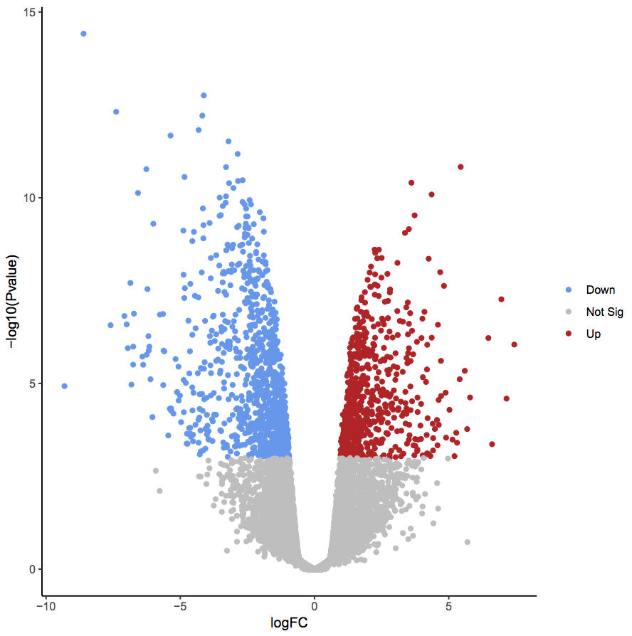
Moreover, if you are lucky enough to have well-behaved data, the plots look very cool
Of course, in real life, the data is messy. Add bad visualization practices to the mess and you get a marvel like this one

The bottom line: if you have two populations to compare, consider volcano plots. But do remember dataviz good practices.
