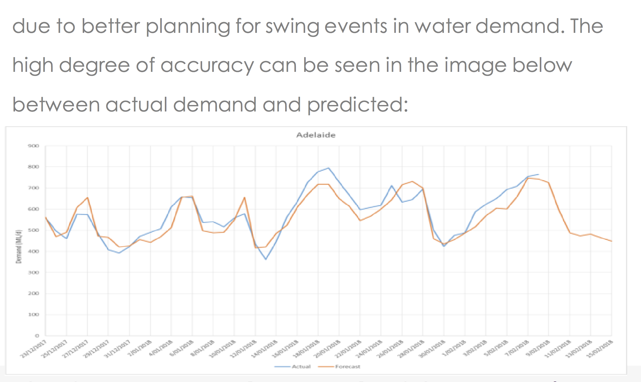
Exposé, an Australian-based data analytics company, published a use case in which they analyze the benefits of a custom-made machine learning solution. The only piece of data in their report [PDF] was a graph which shows the observed and the predicted
Graphs like this one provide an easy-to-digest overview of the data but are meaningless with respect to our ability to judge model accuracy. When predicting values of time series, it is customary to use all the available data to predict the next step. In cases like that, “predicting” the next value to be equal to the last available one will result in an impressive correlation. Below, for example, is my “prediction” of Apple stock price. In my model, I “predict” tomorrow’s prices to be equal to today’s closing price plus random noise.
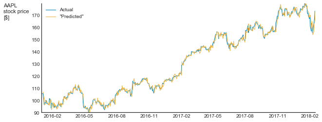
Look how impressive my prediction is!
I’m not saying that Exposé constructed a nonsense model. I have no idea what their model is. I do say, however, that their communication is meaningless. In many time series, such as consumption dynamics, stock price, etc, each value is a function of the previous ones. Thus, the “null hypothesis” of each modeling attempt should be that of a random walk, which means that we should not compare the actual values but rather the changes. And if we do that, we will see the real nature of the model. Below is such a graph for my pseudo-model (zoomed to the last 20 points)
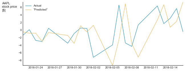
Suddenly, my bluff is evident.
To sum up, a direct comparison of observed and predicted time series can only be used as a starting point for a more detailed analysis. Without such an analysis, this comparison is nothing but a meaningless illustration.