
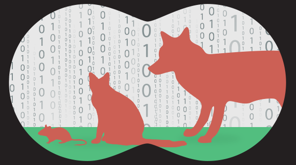
A data giraffe is a situation where a very prominent data point shades everything else. I learned this term from a post by Pini Yakuel and immediately liked it a lot.
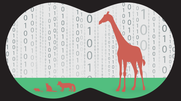 Taken from https://www.optimove.com/blog/beware-the-giraffes-in-your-data
 Taken from https://www.optimove.com/blog/beware-the-giraffes-in-your-data
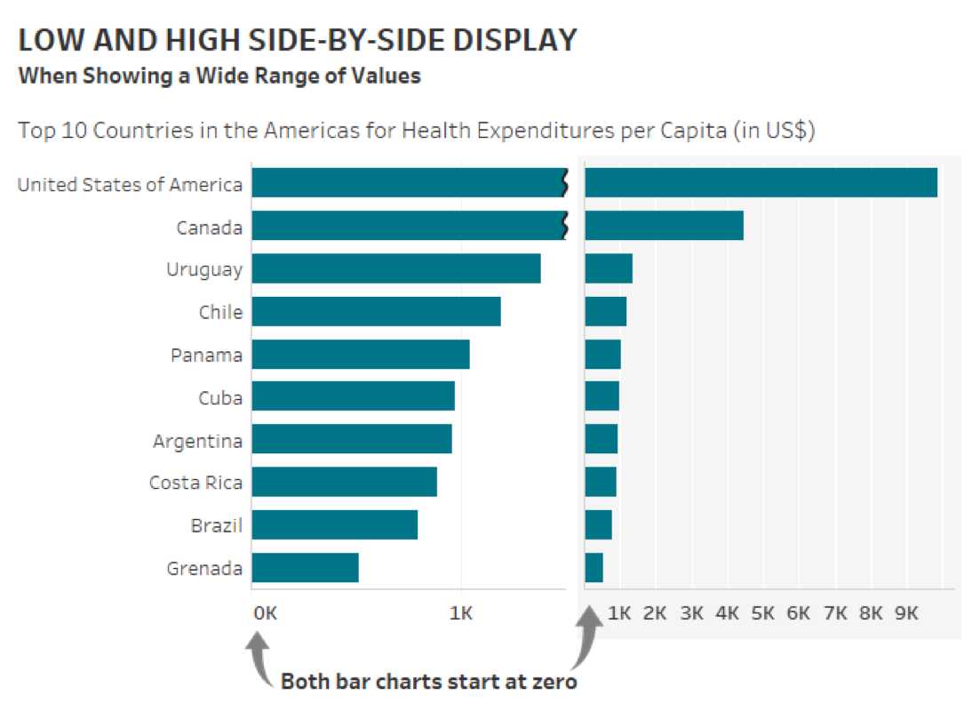
Dealing with data giraffes is hard, especially when dealing with bar charts. Today I saw one interesting approach to this problem
Katherine S. Rowell is a co-funder of a Boston firm that specializes in data visualization. In December, she published apost dedicated to one of the most popular but also most abused graph types, the bar charts. One of the examples in her post demonstrates a nice treatment of data giraffes
 http://ksrowell.com/blog-visualizing-data/2019/12/18/bar-humbug/
In this example, Katherine draws the graph twice. The zoomed-out version shows the giraffes in all their glory, while the zoomed-in one gives the spotlight to the foxes, hyenas, and mice.
Also, note how these graphs respect the rules that every bar chart has to include the zero.