I recently came across a financial update with a plot that looks like the one below: a bar plot of revenue with a line plot of growth rate. The growth rate is on a secondary y-axis, and the x-axis is shared between the two plots. This type of plots are very common in financial reports, and they are often used to show the relationship between two variables that have different scales. However, they are also often criticized for being misleading, as the two variables are not directly comparable. In this post, I will show a better way to visualize this type of data. But first, what’s wrong with the plot below?
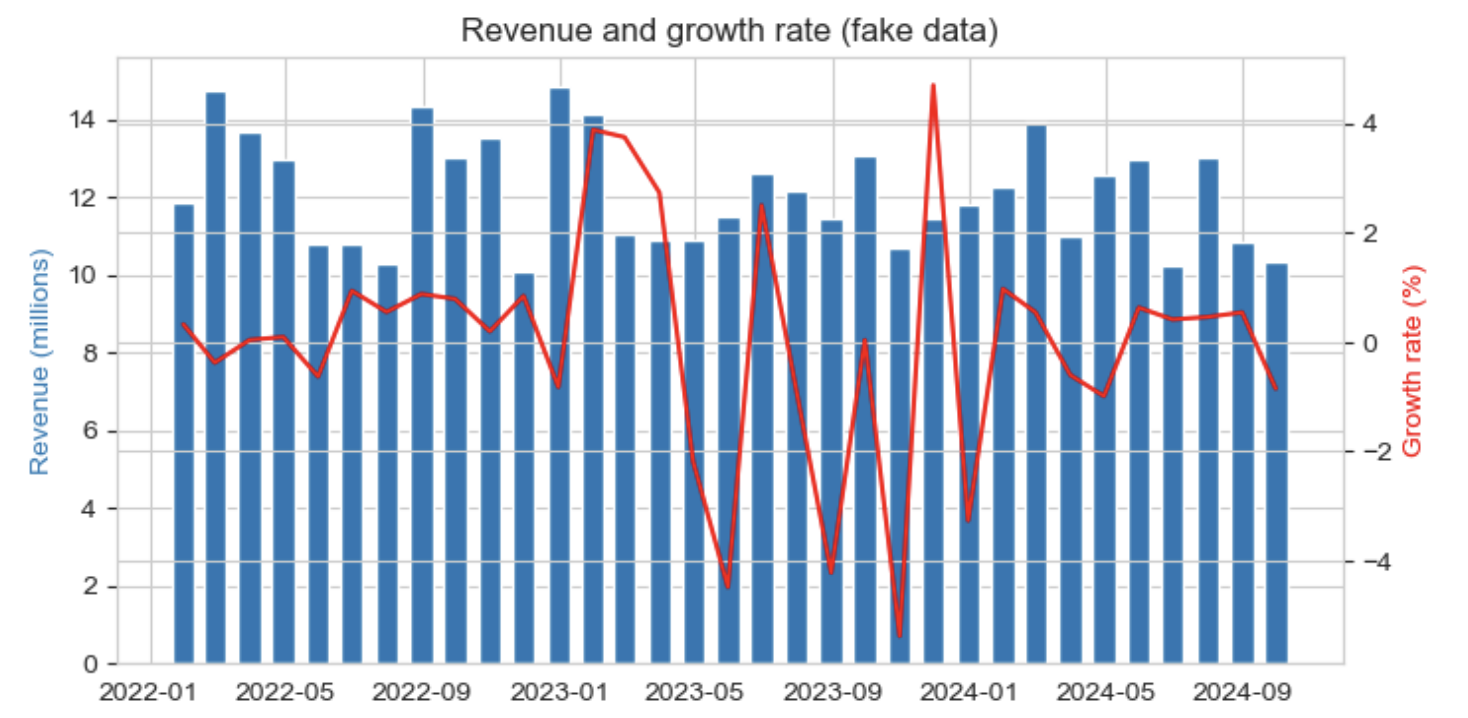
- The secondary y-axis is not aligned with the primary y-axis. This makes it difficult to compare the two variables.
- Two points on a graph that lie one above the other do not necessarily have a relationship of proportionality or a fixed ratio. This is because the two y-axes have different scales.
- Navigation is difficult. The reader has to constantly switch between the two y-axes to understand the relationship between the two variables.
I wrote about double scales a lot in this blog. See the ‘double scale’ tag to read more
The solution: split the plot into two subplots
Let’s split the graph into two subplots, one for each variable, and share the x-axis. This way, the reader can easily compare the two variables, and the relationship between them is clear.
Attempt 1: a bar plot and a line plot
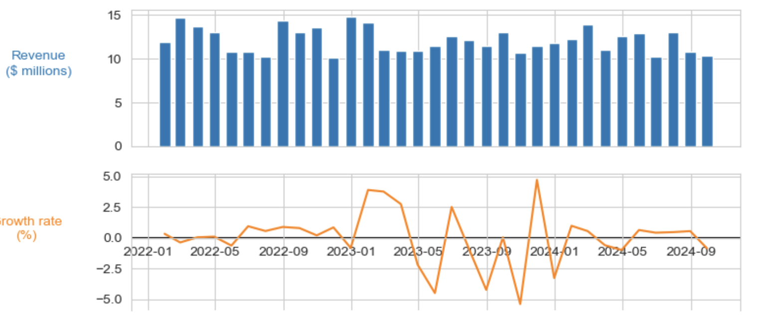
Nice, the two plots are aligned, it’s easy to know what’s happening in the revenue and the growth rate. Note, how I emphasized the zero line in the “growth rate” subplot.
However, showing the evolution of the revenue using bars is not ideal: the bars are not continuous, and the reader may think that the revenue is constant between two months. Let’s try another approach.
Attempt 2: two line plots
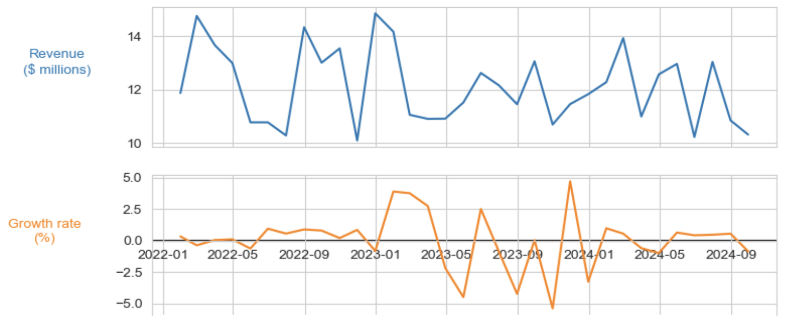
The advantage of the line plot is that it allows zooming in on the data, which is not possible (FORBIDDEN) with a bar plot. However, the colored area that the bars provided gave us the information about the total revenue over the time (recall that total revenue is the area under the curve). Now, this information is lost.
Let’s try to add this information back to the plot.
Attempt 3: line plot with shadowed area
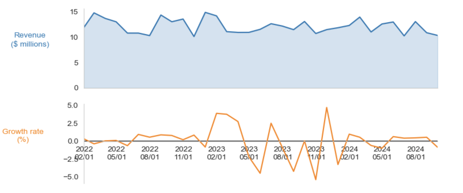
This is the best of both worlds: we have the continuous line plot that gives a proper visualization, and we have the shadowed area that gives us the information about the total revenue over time. The two subplots are aligned, and the relationship between the two variables is clear. The reader can easily see that the revenue is increasing while the growth rate is fluctuating.
Conclusion
The fact you can do something doesn’t mean you should. Dual-axis plots are often misleading and difficult to read. Splitting the plot into two subplots is a much better way to visualize this type of data. It allows the reader to easily compare the two variables and understand the relationship between them. The code to generate the plot is below.