Simplification and ultra-personalization: two responses to a harsh critique
I shipped a feature-rich landing page for my product. About 100 unique visitors came through. Two signed up. The signal was loud; I almost missed it. A friendly but blunt critique from an opinion leader in the field forced two changes I should have made earlier. One was to strip the public landing page until it had a single message. The other was to generate a different landing page for every prospect I plan to contact this week. Both ship today.
What I shipped first
Loud Camel, a tool that helps researchers get cited and recognized, went out with a landing page I was proud of. Three sections, several screenshots, multiple use-case framings, an explainer video, social proof. Every feature got airtime. Every audience got a paragraph. From the inside, the page felt thorough.
What the signal was
Around a hundred unique visitors hit that page during the soft launch. Two signed up. A two-percent conversion rate isn’t a disaster; for a paid SaaS landing page it’s defensible. For a free tool offering a fast first report, it’s a warning. Visitors who arrive curious and bounce without leaving an email are telling you something the analytics dashboard cannot quite spell out: they didn’t understand what to do, or they didn’t believe it would be worth the effort.
I noticed the number. I told myself the launch was soft, the audience was diffuse, the funnel needed time. I was wrong.
The critique
I asked an opinion leader in my field to look at the page. He took the time to do it properly. The note he sent back was direct: too much, too fast, no clear next step, the strongest claim buried in the third paragraph. The page was a writer’s gift to me, not a reader’s path to action.
That kind of critique only lands when you hear it from someone who has nothing to gain by being polite. I am very glad I asked.
Response one: strip the public page
The new public page contains less information than the old one. The headline states one outcome in plain words. The single CTA leads to one form. Anything that does not move a first-time visitor toward ‘is this for me, yes or no’ is gone. Some content moved to a separate page; most of it I cut.
Less material on the page is the easier change. Saying less is not the hard part.
Response two: ultra-personalize per prospect
The harder change is the one I’m running this week as an experiment. With guidance from a mentor in this process, I’m shipping a minimal landing page generated per prospect: their field in the headline, a single sentence promising one specific output, a single email input. Nothing else.
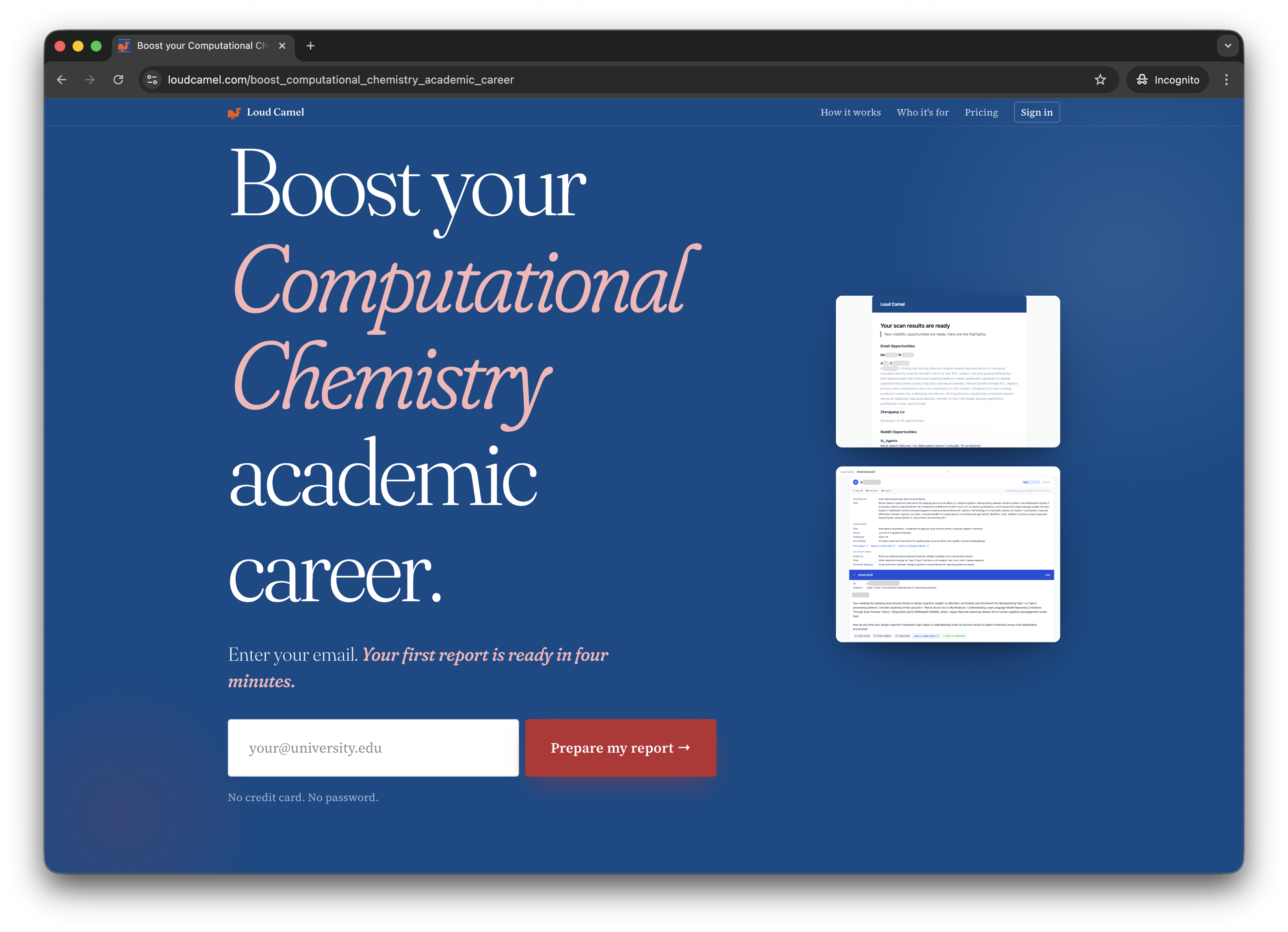
A personalized landing page for computational chemistry researchers. Same template, different field in the headline, different sample preview. The page is dynamically generated for each lead I contact this week. Google Analytics is wired through end-to-end. Each version shares its origin link only with one researcher; conversion gets tracked per page.
The bet: a stranger who arrives via a personal email from me is converted by relevance, not by features. If the headline names their field and the form takes ten seconds, I find out which copy works. If they bounce, I find out which copy doesn’t.
What I’m watching this week
Two metrics. First, signup rate per personalized page versus the simplified public page. Second, time-to-first-action: how fast a visitor who arrives leaves an email. Both numbers go into a Google Analytics dashboard I will read on Sunday.
The general lesson, ahead of the data: when 2% sign up, the page is doing half the work. Simplify until visitors can answer ‘is this for me?’ in under five seconds. If you can also tell them yes by name, do that.