The worst way to visualize geographic data
Country choropleth maps are the wrong chart for visit counts. Or for any kind of count. They encode magnitude as land area, but the question you actually want answered is “where are my users?”, not “which country owns the most square kilometers?” The two have almost nothing in common.
I recently launched Loud Camel, a tool that helps researchers get cited and recognized. I opened the Google Analytics geographic report and got the “before” map below.
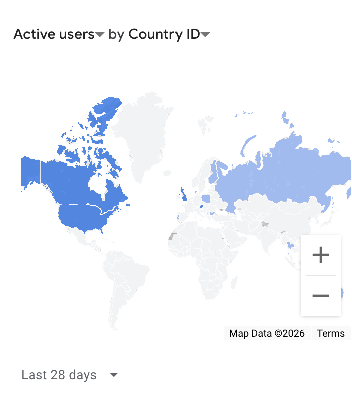
Look at it for five seconds. Cover the title. What are the top five countries by active users?
You probably said the United States. Maybe Canada and Russia. The blue blobs are big and obvious.
Now find Israel.
You can’t. It is one or two pixels somewhere east of the Mediterranean. Israel is currently the country with the most active users on the site. It is the leader. The map hides the leader.
Why country maps mislead about counts
A choropleth fills each country with a color whose intensity encodes a value. In theory the reader compares colors. In practice the reader compares areas, because area is the loudest visual signal on the page.
A country with a huge area and a low value looks important. A country with a tiny area and a high value disappears. The reader’s eye correlates magnitude with land mass, not with the data.
This works only when geographic proximity matters: epidemiology, regional logistics, climate maps. Visit counts have no spatial structure. A user in Texas is not “close” to a user in Mexico in any way that matters to the data. The map adds noise, not insight.
Use a sorted bar chart instead
The same data, sorted from largest to smallest as a horizontal bar chart, looks less sophisticated, but reads in one second.
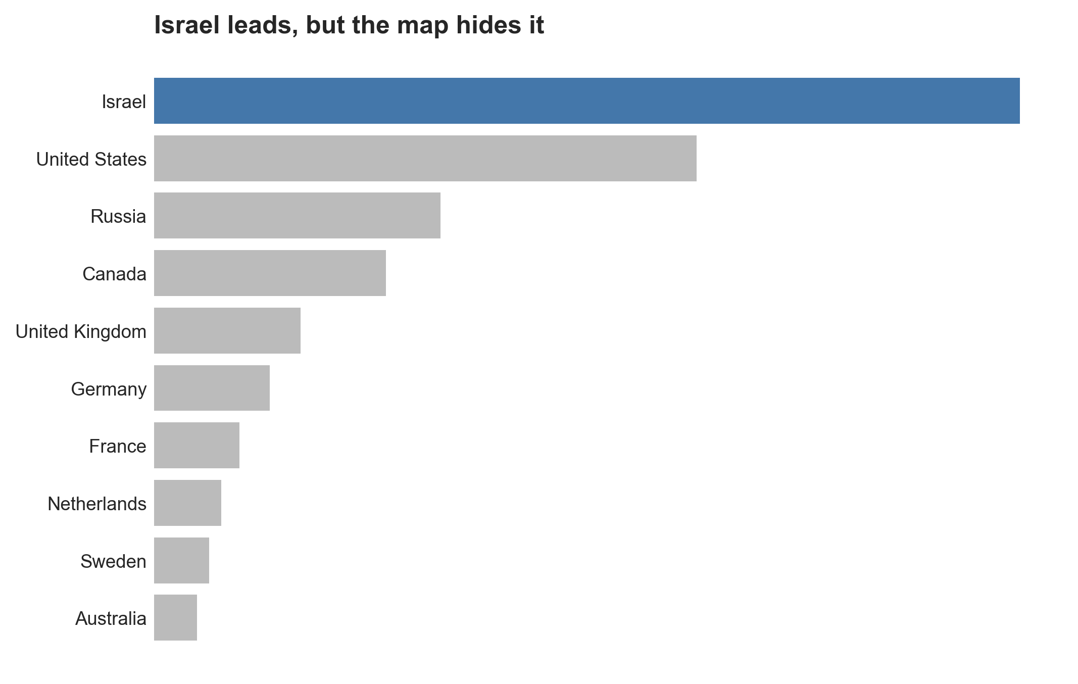
Bar length encodes the value directly. The reader’s eye runs top-down by magnitude. Israel is at the top because Israel has the most users. The United States is second because it has the second-most. There is nothing to interpret.
The numbers in the chart are illustrative; the ordering is not.
What’s with the camel?
It is my new service. If you have an academic career and want to advance it, talk to me.