THE COURSE HAS BEEN CANCELLED DUE TO LACK OF AUDIENCE AND LACK OF FREE TIME. SORRY ABOUT THAT. SOME OF THE COURSE INFORMATION WILL BE PUBLISHED IN MY BLOG. FOLLOW IT!
Don’t miss new lessons. Subscribe to my blog and to my YouTube channel!
Submit your assignments as a GitHub issue here.
For the syllabus, scroll to the end of this page.
Many people know how important data visualization is. However, mastering a visualization tool is not enough to convey a message or and to change others’ minds and actions. For that, you need to rely on concepts from the physiology of vision, color perception, and many aspects of human psychology.
Once you start studying these concepts, you will understand why two graphs can lead to opposite conclusions despite being based on the same data; or why it was possible to reduce the error rate in diagnosing a heart condition by almost 50% by changing a color scheme.
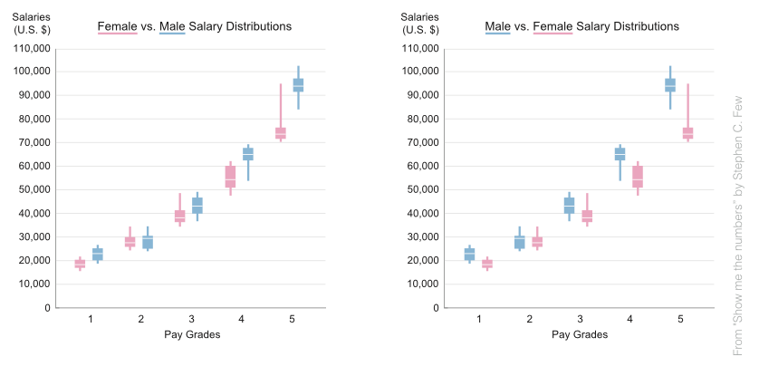 Two graphs. Same data. Different conclusions.
Join this course to learn the science behind many real-life examples. I have designed this course to be tool-neutral. It doesn’t matter if your tool of choice is Python, R, or Excel — you will find the information interesting and applicable.
To provide more applied aspects, some lectures are accompanied by “before and after” demo sessions in which I demonstrate practical aspects of the rules learned in the lectures. These sessions use Python but will be relevant to any practitioner as they concentrate on what you do, not what you use.
Lessons
This course is a “work in progress”. I plan to publish new lesson every two weeks). Click on the links below to watch the lessons
- What, Why, How?
- Data-ink ratio & Information layers
- Gestalt rules
- Text and tables as a dataviz tool
- Visual perception of shapes
- Bar and Pie charts
- Color perception
- … more …