Tag: Data Visualization
-
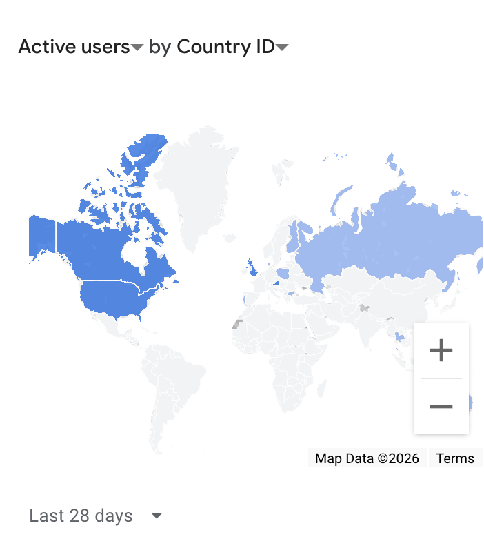
The worst way to visualize geographic data
The worst way to visualize geographic data Country choropleth maps are the wrong chart for visit counts. Or for any kind of count. They encode magnitude as land area, but...
-
AI adoption vastly lags its capability: a better graph
After my previous post about Anthropic’s spider chart, several people asked me how I would actually go about fixing it. So here is how – with a single prompt. I...
-
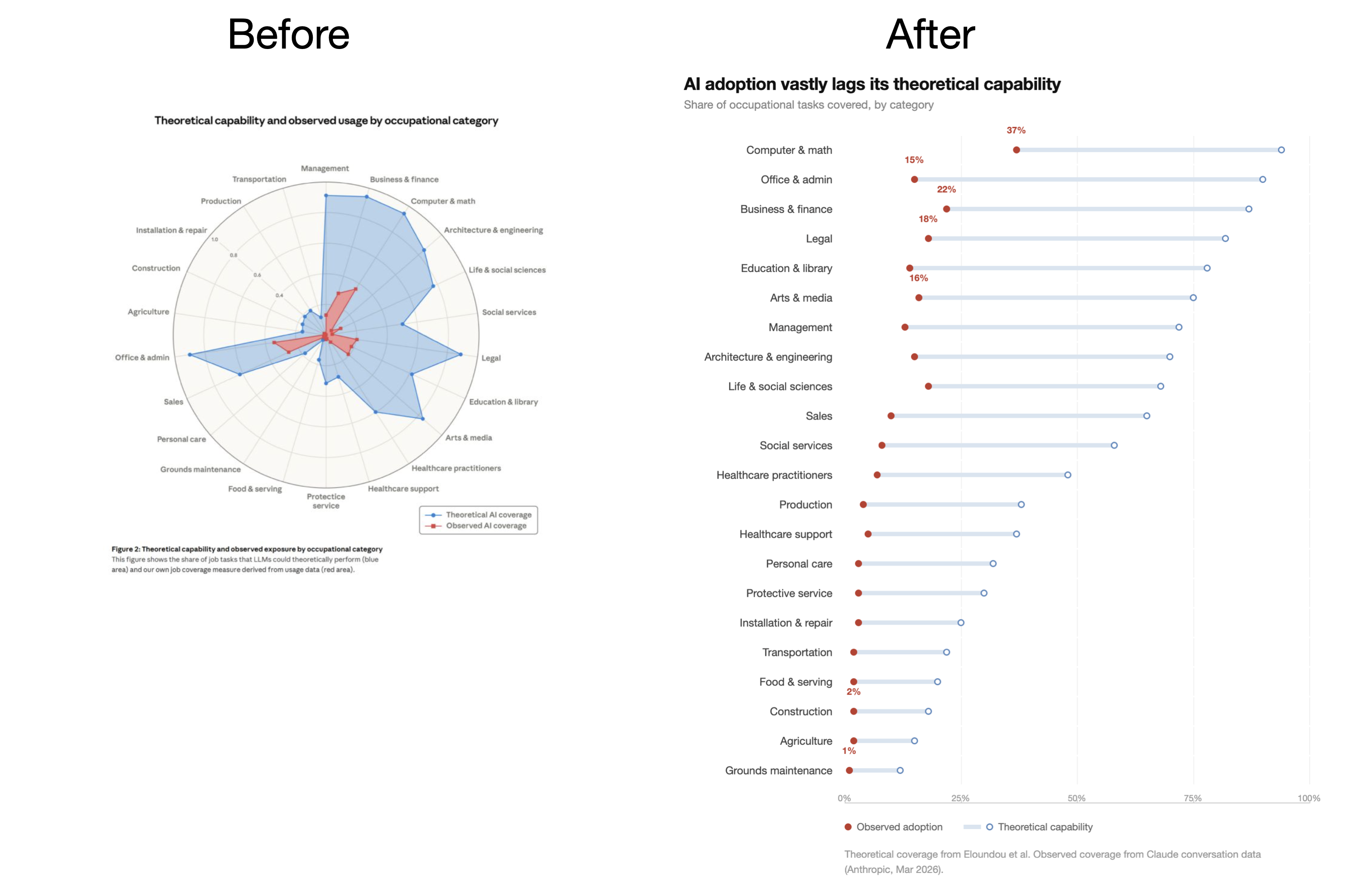
Anthropic: great research, not-so-great graph
Anthropic has published an interesting study about labor market impacts of AI: Labor market impacts of AI: A new measure and early evidence. It is hard to overestimate Anthropic’s contribution...
-
Dual axis with shared x-axis — a much better way
I recently came across a financial update with a plot that looks like the one below: a bar plot of revenue with a line plot of growth rate. The growth...
-
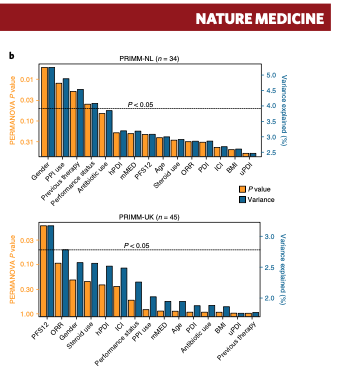
An example of a very bad graph
An example of a very bad graph Nature Medicine is a peer-reviewed journal that belongs to the very prestigious Nature group. Today, I was reading a paper that included THIS...
-

On proper selection of colors in graphs
How do you properly select a colormap for a graph? What makes the rainbow color map a wrong choice, and what are the proper alternatives? Today, I stumbled upon a...
-
Another example of the power of data visualization
I stumbled upon a great graph that tells a complex story compellingly. Comparison of two COVID-19 waves in the UK, taken from here. This graph compares the last two waves...
-
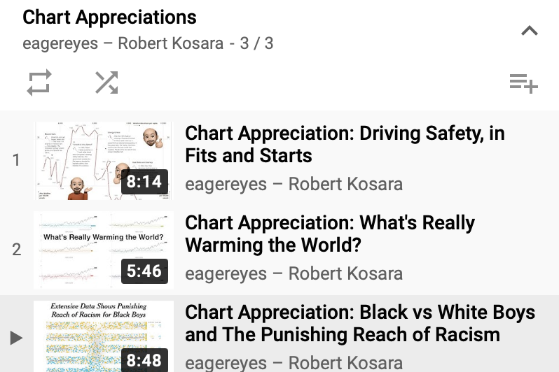
Super useful videos for advanced data visualizers
The great Robert Kosara, also known as the “eager eyes” has started publishing a series of videos he calls Chart Appreciation. In these videos, Robert takes a piece of data...
-
One of the first dataviz blogs that I used to follow is now a book. Better Posters
I started following data visualization news and opinions quite a few years ago. One of the first bloggers who were active in this area NeurDojo, by the (now) professor Zen...
-
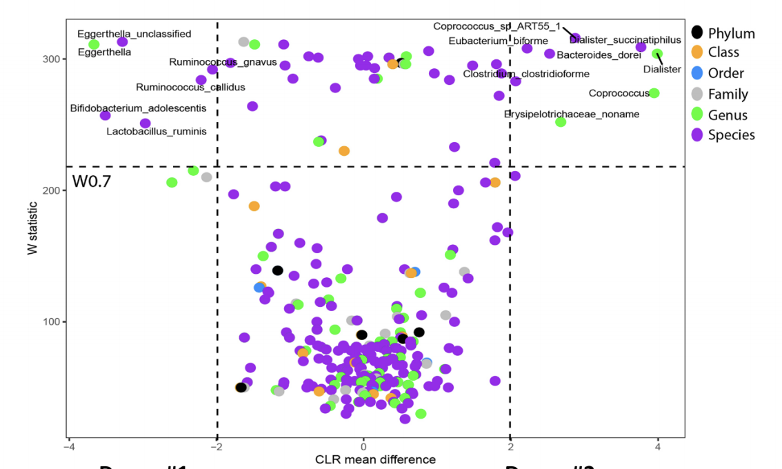
Graphical comparison of changes in large populations with "volcano plots"
I recently rediscovered a volcano plot – a scatter plot that aims to visualize changes in large populations. Volcano plots are very technical and specialized and, most probably, are not...
-
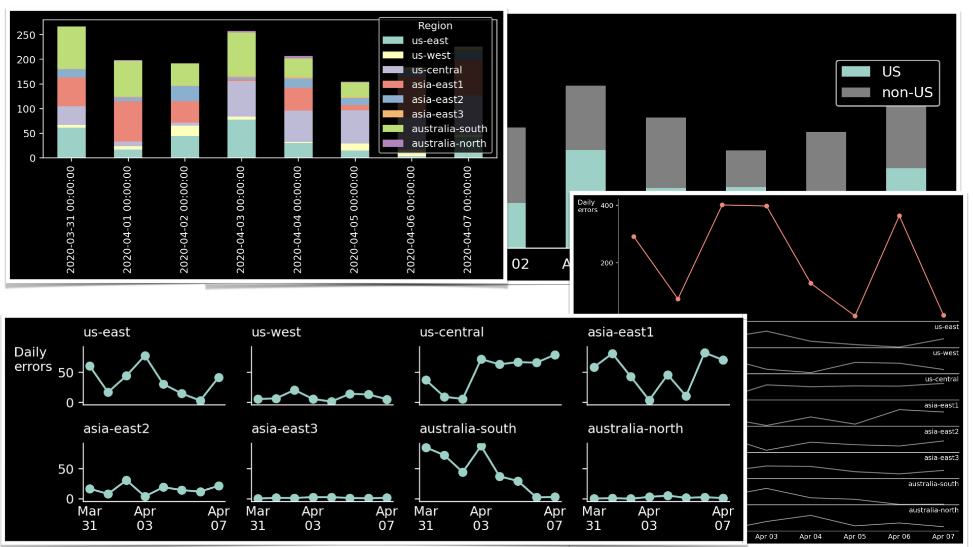
Before and after — stacked bar charts
A fellow data analyst asked a question? What do we do when we need to draw a stacked bar chart that has too many colors? How do we select the...
-
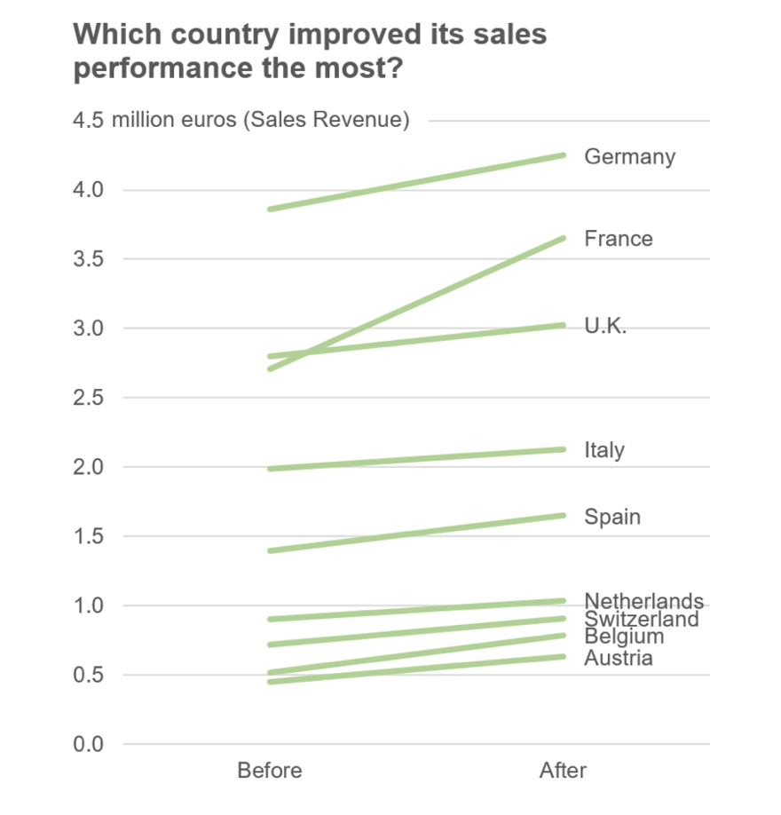
The Problem With Slope Charts (by Nick Desbarats)
Slope charts are often suggested as a valid alternative to clustered bar charts, especially for “before and after” cases. So, instead of a clustered bar char like this we tend...
-
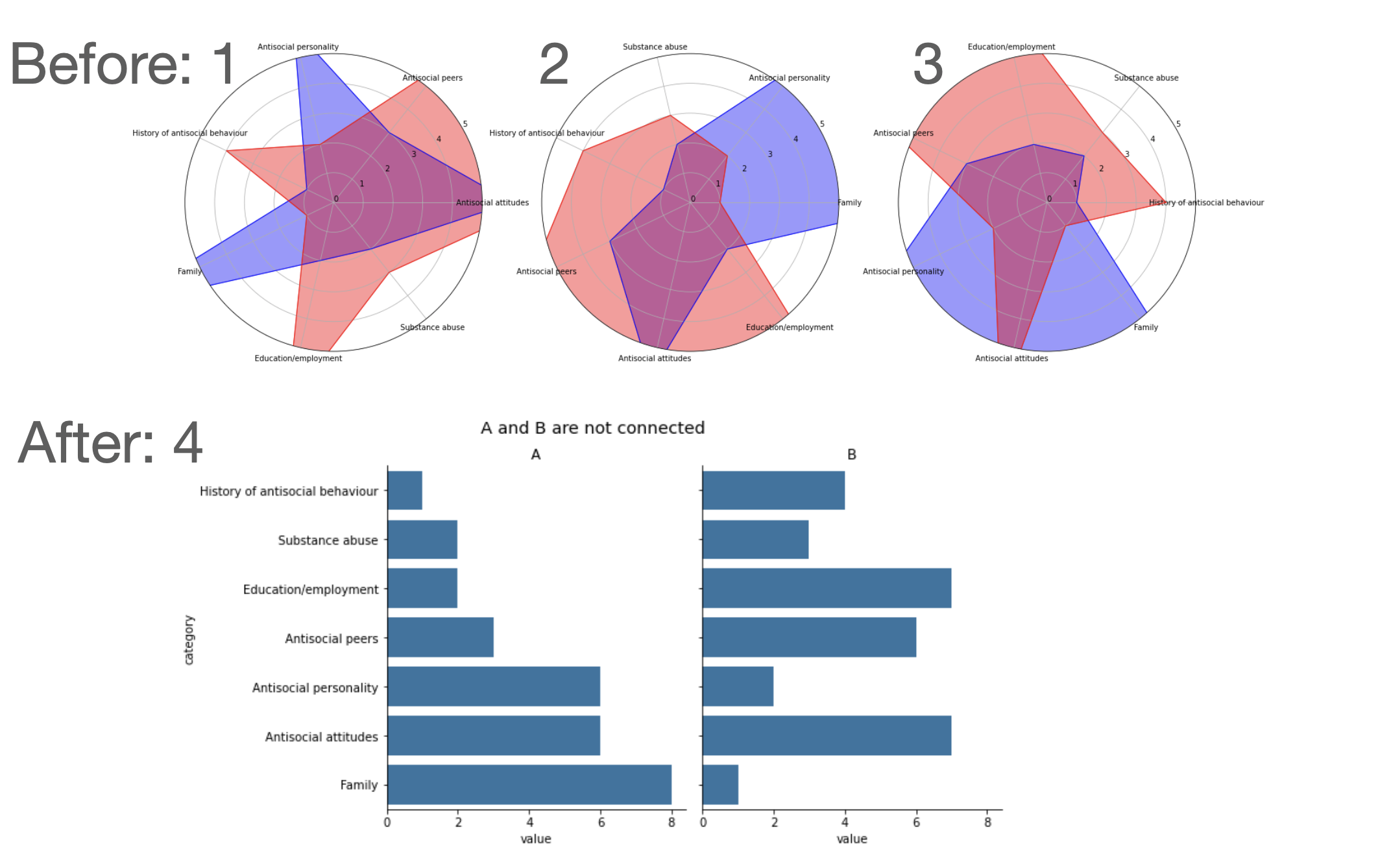
Before and after: Alternatives to a radar chart (spider chart)
A radar chart (sometimes called “spider charts”) look cool but are, in fact, pretty lame. So much so that when the data visualization author Stephen Few mentioned them in his...
-
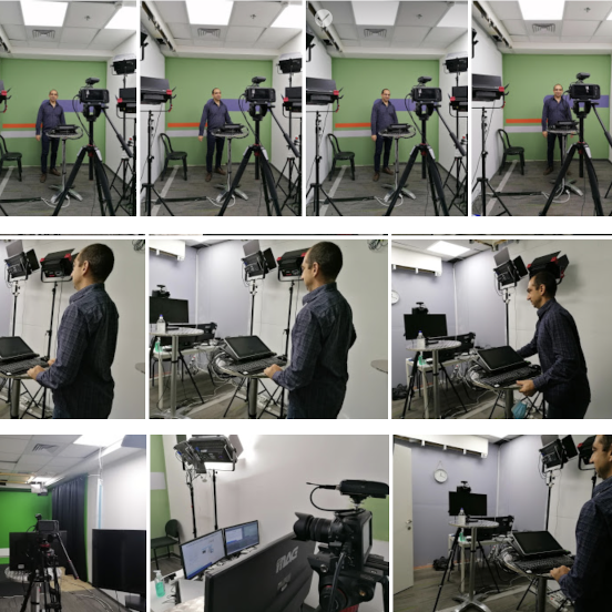
Basic data visualization video course (in Hebrew)
I had the honor to record an introductory data visualization course for high school students as a part of the Israeli national distance learning project. The course is in Hebrew,...
-
Text Visualization Browser
I’ve stumbled upon an exciting project – text visualization browser. It’s a web page that allows one to search for different text visualization techniques using keywords and publication time. Text...
-
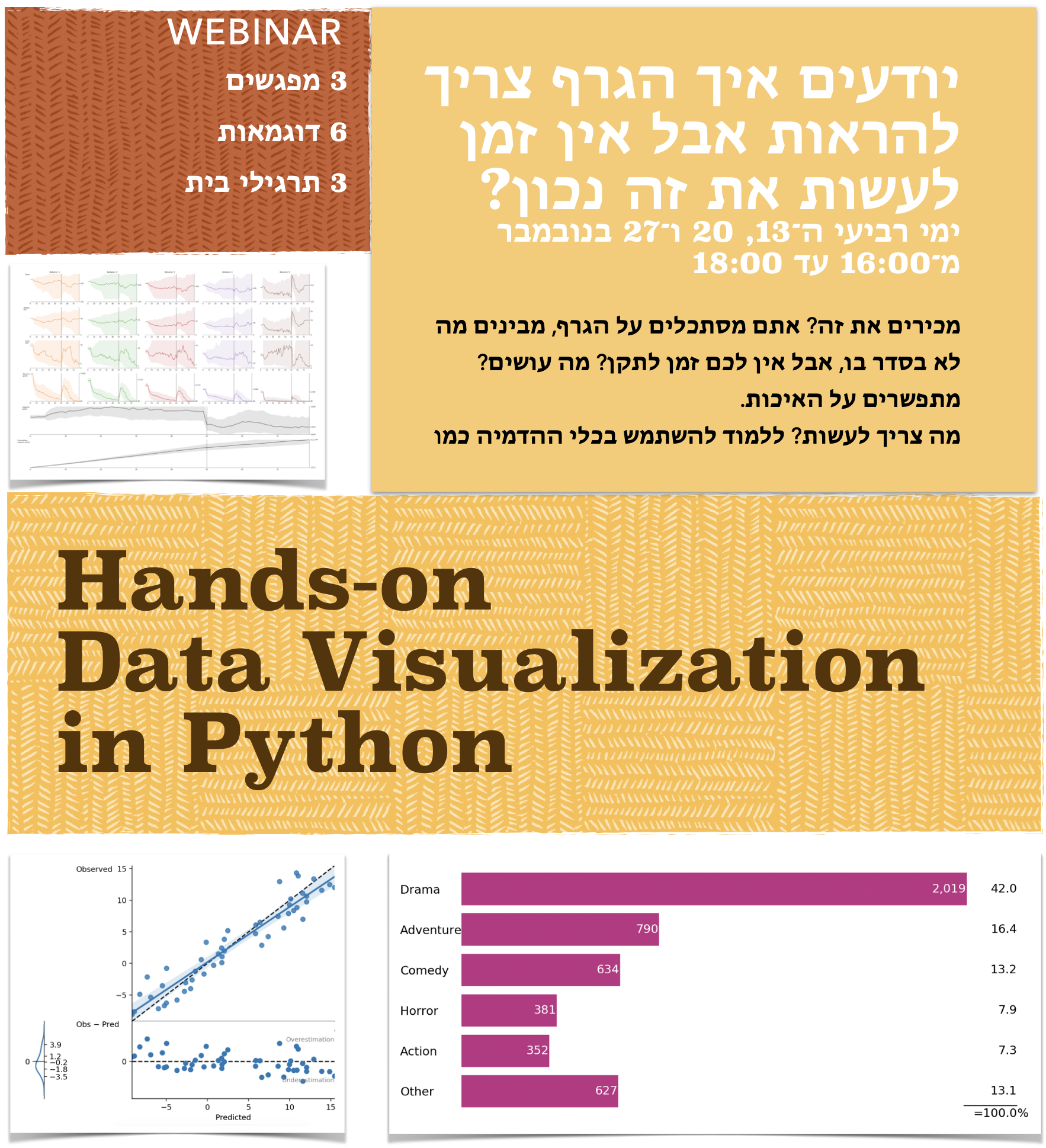
Hands-on Data Visualization in Python
הקליקו כאן לקבלת פרטים והרשמה!
-

The information is beautiful. The graphs are shit!
I apologize for my harsh language, but recently I was exposed to a bunch of graphs on the “information is beautiful” site, and I was offended (well, ot really, but...
-

Exploring alternatives to population pyramids
A population pyramid also called an “age-gender-pyramid”, is a graphical illustration that shows the distribution of various age groups in a population (typically that of a country or region of...
-
ASCII histograms are quick, easy to use and to implement
From time to time, we need to look at a distribution of a group of values. Histograms are, I think, the most popular way to visualize distributions. “Back in the...
-

What is the biggest problem of the Jet and Rainbow color maps, and why is it not as evil as I thought?
There was a consensus among the data visualization purists that the rainbow color map, and it’s close cousin Jet are bad. Really bad. These colormaps used to be popular at...
-
How to suck less in data visualization and professional communication
In technical communication, the main thing is to keep the main thing the main thing. There are multiple ways to ensure this principle. Some of these ways require careful chart...
-
Meet me at the online data science / AI conference
I will be talking about data visualization at the next NDR conference on July 28. All the conferences organized by the NDR team are well organized and of a very...
-
Before and after. Even excellent graphs can be improved
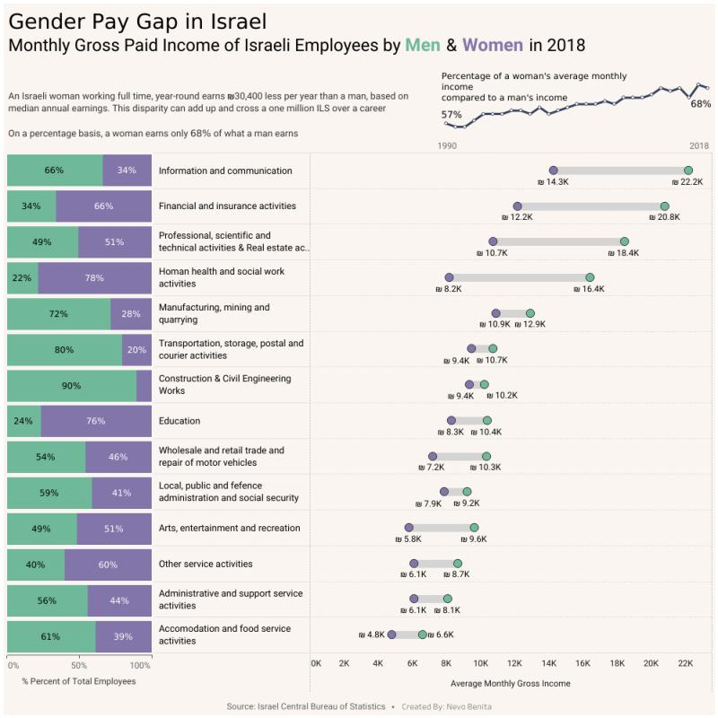
Being a data visualization consultant, I can’t help looking for dataviz problems in graphs that I see. Even if the graph is good. Even if I know that I would...
-
Data visualization is not only dots, bars, and pies
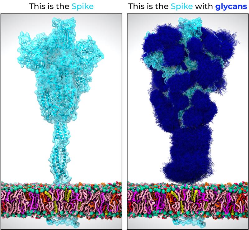
Look at this wonderful piece of data visualization (taken from here). If you know the terms “tertiary structure” and “glycan”, there is NO way you miss the message that the...
-
Lie factor in ad graphs
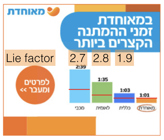
It’s fun to look at the visit statistics and to discover old stories. I wrote this post in 2016. For a reason I don’t know, this post has been one...
-
Nice but useless data visualization
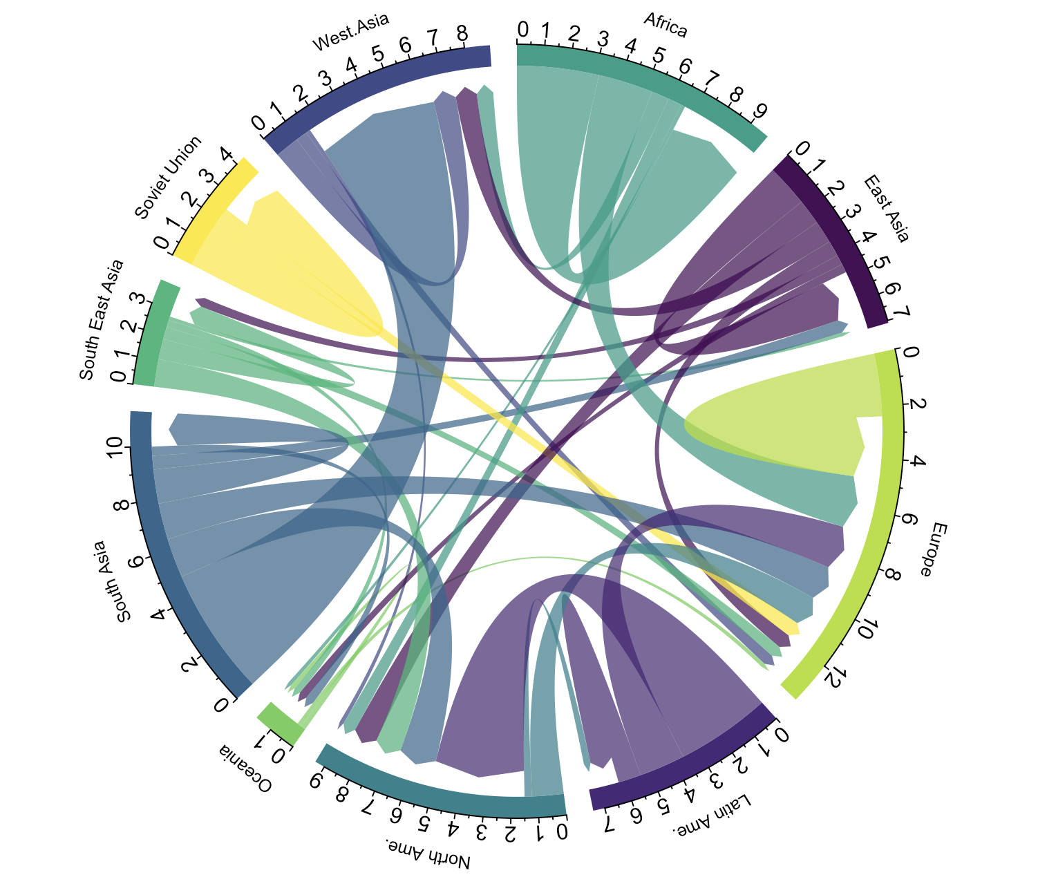
Network visualization can mesmerize and hypnotize. Chord diagrams are especially cool because they are so colorful and smooth. The problem is that sometimes, the result doesn’t provide any actual value,...
-
Logarithmic scale misinforms. Period
Being a data scientist and a self-proclaimed data visualization expert, I like using log scale graphs when I find them appropriate. However, as a speaker and a communicator, I refrain...
-
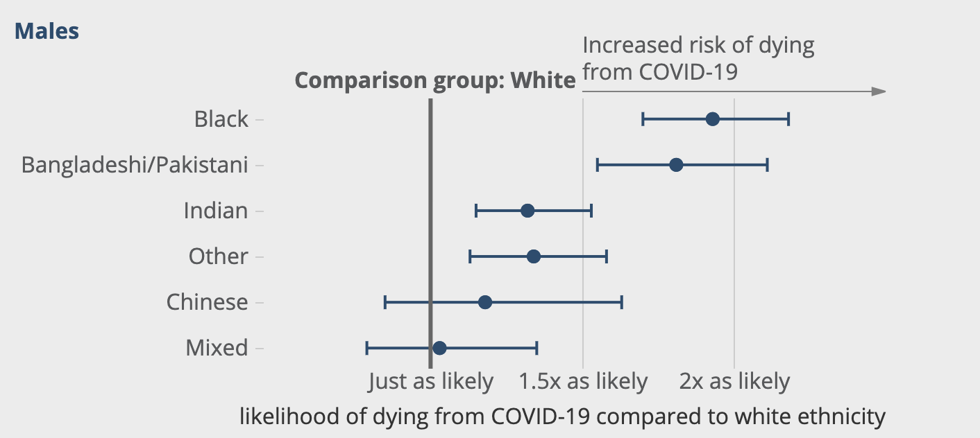
Visualising Odds Ratio — Henry Lau
Besides being a freelancer data scientist and visualization expert, I teach. One of the toughest concepts to teach and to visualize is odds ratio. Today, I stumbled upon a very...
-

Bad advice from a reputable source is bad advice.
Would you buy a grammar book with a clear spelling mistake on its cover? I hope not. That’s what happened to IBM when it published it’s new data visualization guide....
-
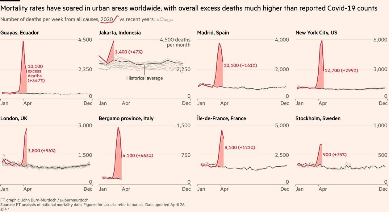
The quintessence of data visualization usefulness
I have to admit, I was skeptical at the beginning of the COVID-19 crisis. I started becoming skeptical now when it seems that the crisis didn’t hit my country too...
-
If there is only one document you can read about data visualization, this is the one
I’m sorting my teaching material, and I found this gem. The UK Government Statistical Service published a guideline for effective data visualization and tables. If you know a busy person...
-

Data giraffe is sometimes a feature, not a problem
I wrote about data giraffes two weeks ago. Usually, “data giraffes” are a problem and we need to work hard in order to solve it. Sometimes, they are a useful...
-

An interesting solution of the data giraffe problem
A data giraffe is a situation where a very prominent data point shades everything else. I learned this term from a post by Pini Yakuel and immediately liked it a...
-
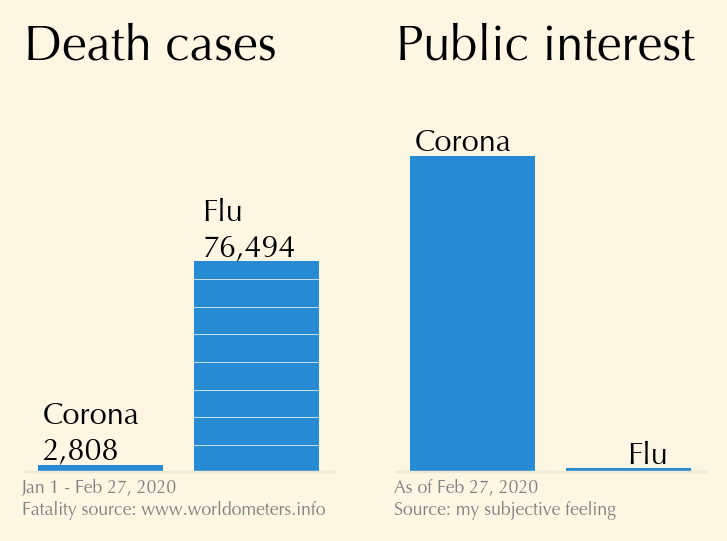
Corona virus vs flu, visualized
Graph code: here.
-
Three most common mistakes in data visualization
People ask me for good intro video to data visualization. I tend to ask them to look for one of my lectures. To save the search, here’s one of the...
-
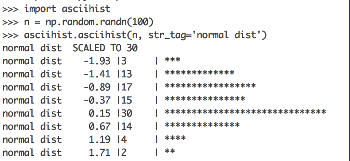
ASCII histograms are quick, easy to use and to implement
From time to time, we need to look at the distribution of a group of values. Histograms are, I think, the most popular way to visualize distributions. “Back in the...
-
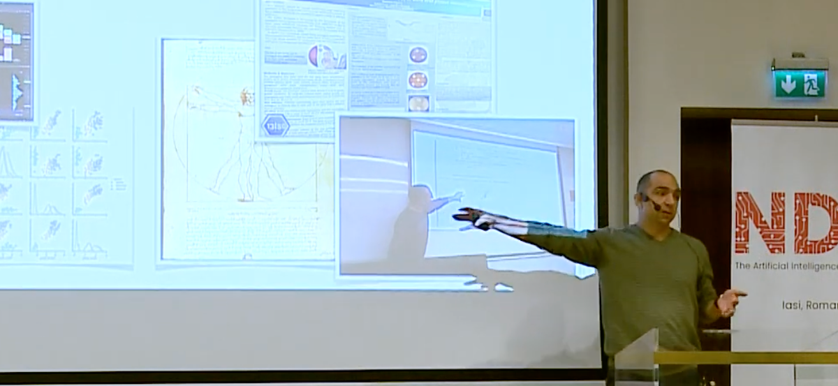
Data visualization as an engineering task - a methodological approach towards creating effective data visualization
In June 2019, I attended the NDR AI conference in Iași, Romania where I also gave a talk. Recently, the organizers uploaded the video recording to YouTube.
-

What do we see when we look at slices of a pie chart?
What do we see when we look at slices of a pie chart? Angles? Areas? Arc length? The answer to this question isn’t clear and thus “experts” recommend avoiding pie...
-
Data visualization with statistical reasoning: seeing uncertainty with the bootstrap — Dataviz - Stats - Bayes
On Sunday, I wrote about bootstrapping. On Monday, I wrote about visualization uncertainty. Let’s now talk about bootstrapping and uncertainty visualization. Robert Grant is a data visualization expert who wrote...
-
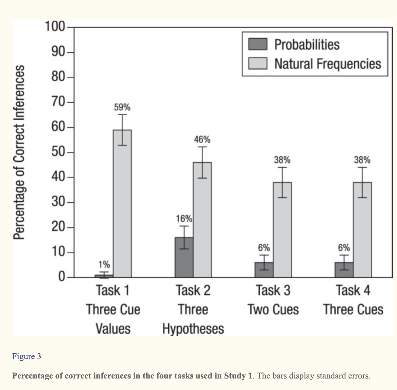
Error bars in bar charts. You probably shouldn't
This is another post in the series Because You Can. This time, I will claim that the fact that you can put error bars on a bar chart doesn’t mean...
-
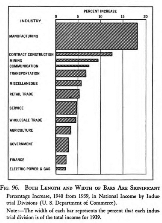
Visualizations with perceptual free-rides
Dr. Richard Brath is a data visualization expert who also blogs from time to time. Each post in Richard’s blog provides a deep, and often unexpected to me, insight into...
-
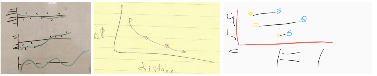
Pseudochart. It's like a pseudocode but for charts
Pseudocode is an informal high-level description of the operating principle of a computer program or other algorithm. People write pseudocode to isolate the “bigger picture” of an algorithm. Pseudocode doesn’t...
-
My slide deck from the NDR conference in Iași
I have published the slide deck from my talk at the NDR conference in Iași, Romania. Enjoy. [slideshare id=149244993&doc=20190604abcofdatavisualizationiasi-190611185232]
-
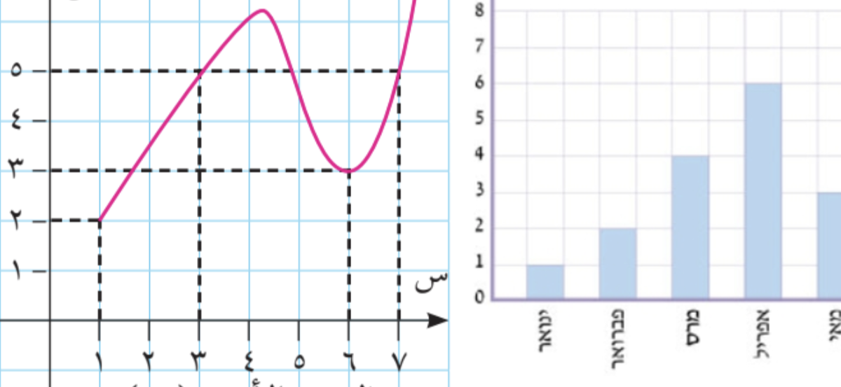
כוון הציר האפקי במסמכים הנכתבים מימין לשמאל
אני מחפש דוגמאות נוספות יש לכם דוגמה של גרף עברי ״הפוך״? גרפים בערבית או פארסי? שלחו לי. This post is a Hebrew translation of the post “X-axis direction in Right-To-Left...
-
X-axis direction in Right-To-Left languages (part two)
I need more examples Do you have more examples of graphs written in Arabic, Farsi, Urdu or another RTL language? Please send them to me. Textbook examples I already wrote...
-
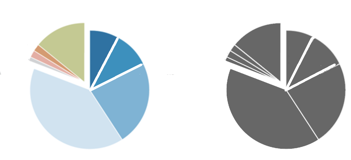
Useful redundancy — when using colors is not completely useless
The maximum data-ink ratio principle implies that one should not use colors in their graphs if the graph is understandable without the colors. The fact that you can do something,...
-
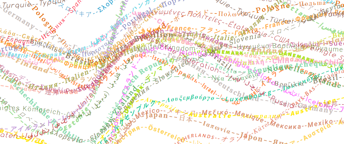
Microtext Line Charts
Why adding text labels to graph lines, when you can build graph lines using text labels? On microtext lines
-
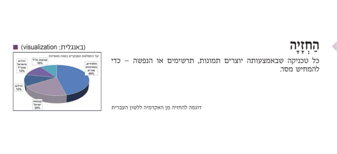
איך אומרים דאטה ויזואליזיישן בעברית?
This post is written in Hebrew about a Hebrew issue. I won’t translate it to English. אני מלמד data visualization בשתי מכללות בישראל — במכללת עזריאלי להנדסה בירושלים ובמכון הטכנולוגי...
-
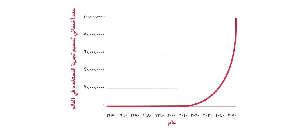
Data visualization in right-to-left languages
If you speak Arabic or Farsi, I need your help. If you don’t speak, share this post with someone who does. Right-to-left (RTL) languages such as Hebrew, Arabic, and Farsi...
-
Conference Recap: EuroSciPy 2018 — Data for Breakfast
See my recap of the recent EuroSciPy, published on https://data.blog In which Boris Gorelik shares his favorite talks and workshops from EuroSciPy 2018. via Conference Recap: EuroSciPy 2018 — Data...
-

"Any questions?" How to fight the awkward silence at the end of a presentation?
If you ever gave or attended a presentation, you are familiar with this situation: the presenter asks whether there are any questions and … nobody asks anything. This is an...
-
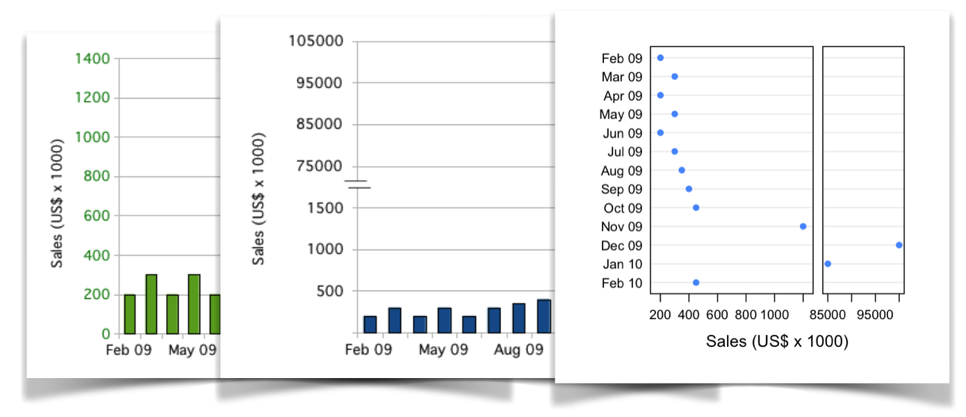
Graphing Highly Skewed Data – Tom Hopper
My colleague, Chares Earl, pointed me to this interesting 2010 post that explores different ways to visualize categories of drastically different sizes. The post author, Tom Hopper, experiments with different...
-

Sometimes, less is better than more
Today, during the EuroSciPy conference, I gave a presentation titled “Three most common mistakes in data visualization and how to avoid them”. The title of this presentation is identical to...
-
An even better data visualization workshop
Yesterday, I gave a data visualization workshop at EuroSciPy 2018 in Trento. I spent HOURs building and improving it. I even developed a “simple to use, easy to follow, never...
-

Meet me at EuroSciPy 2018
I am excited to run a data visualization tutorial, and to give a data visualization talk during the 2018 EuroSciPy meeting in Trento, Italy. My tutorial “Data visualization – from...
-
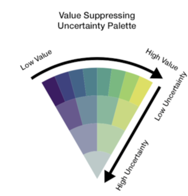
Value-Suppressing Uncertainty Palettes – UW Interactive Data Lab – Medium
Uncertainty is one of the most neglected aspects of number-based communication and one of the most important concepts in general numeracy. Comprehending uncertainty is hard. Visualizing it is, apparently, even...
-
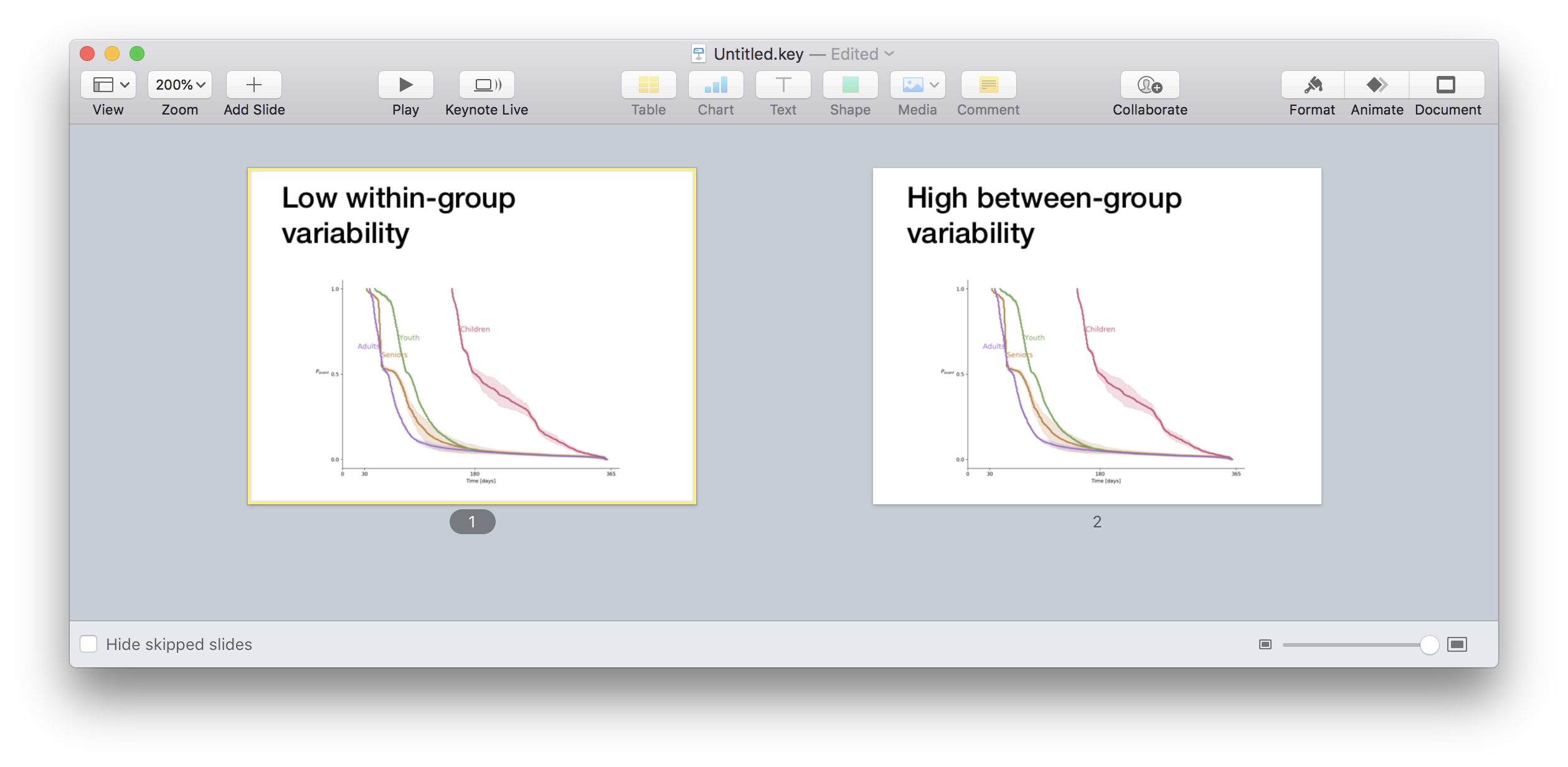
Evolution of a complex graph. Part 1. What do you want to say?
From time to time, people ask me for help with non-trivial data visualization tasks. A couple of weeks ago, a friend-of-a-friend-of-a-friend showed me a set of graphs with the following...
-

C for Conclusion
From time to time, I give a lecture about most common mistakes in data visualization. In this lection, I say that not adding a graph’s conclusion as a title is...
-
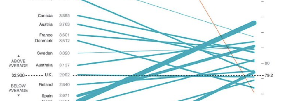
Meaningless slopes
That fact that you can doesn’t mean that you should! I will say it once again.That fact that you can doesn’t mean that you should! Look at this slopegraph that...
-
In defense of three-dimensional graphs
“There is only one thing worse than a pie chart. It’s a 3-D pie chart”. This is what I used to think for quite a long time. Recently, I have...
-

Today's workshop material
Today, I hosted a data visualization workshop, as a part of the workshop day adjacent to the fourth Israeli Data Science Summit. I really enjoyed this workshop, especially the follow-up...
-
I will host a data visualization workshop at Israel’s biggest data science event
TL/DR What: Data Visualization from default to outstanding. Test cases of tough data visualization **Why: ** You would never settle for default settings of a machine learning algorithm. Instead, you...
-
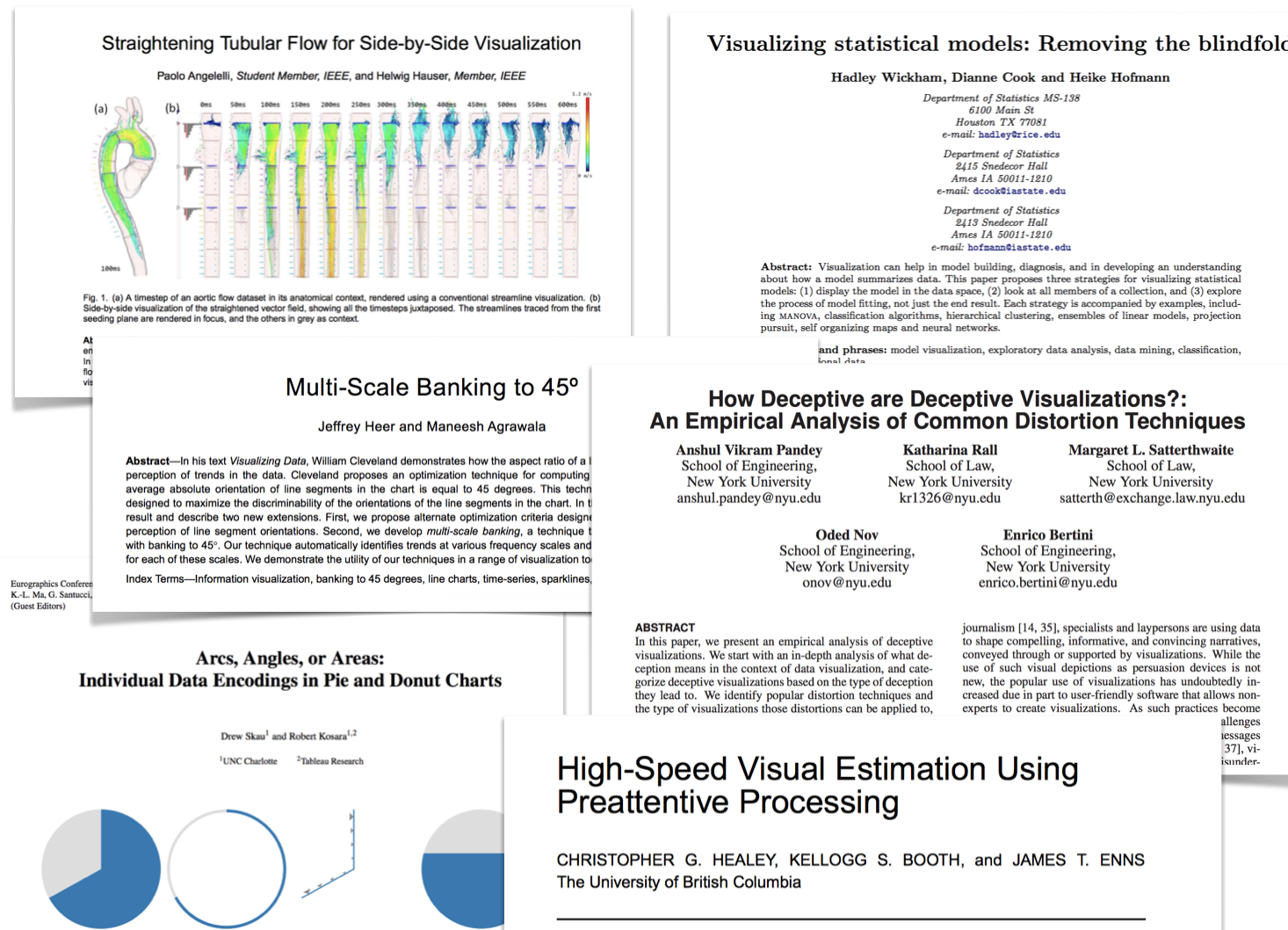
Three most common mistakes in data visualization and how to avoid them. Now, the slides
Yesterday, I talked in front of the Barcelona Data Science and Machine Learning Meetup about the most common mistakes in data visualization. I enjoyed talking with the local community very...
-
Live in Barcelona. Three most common mistakes in data visualization.
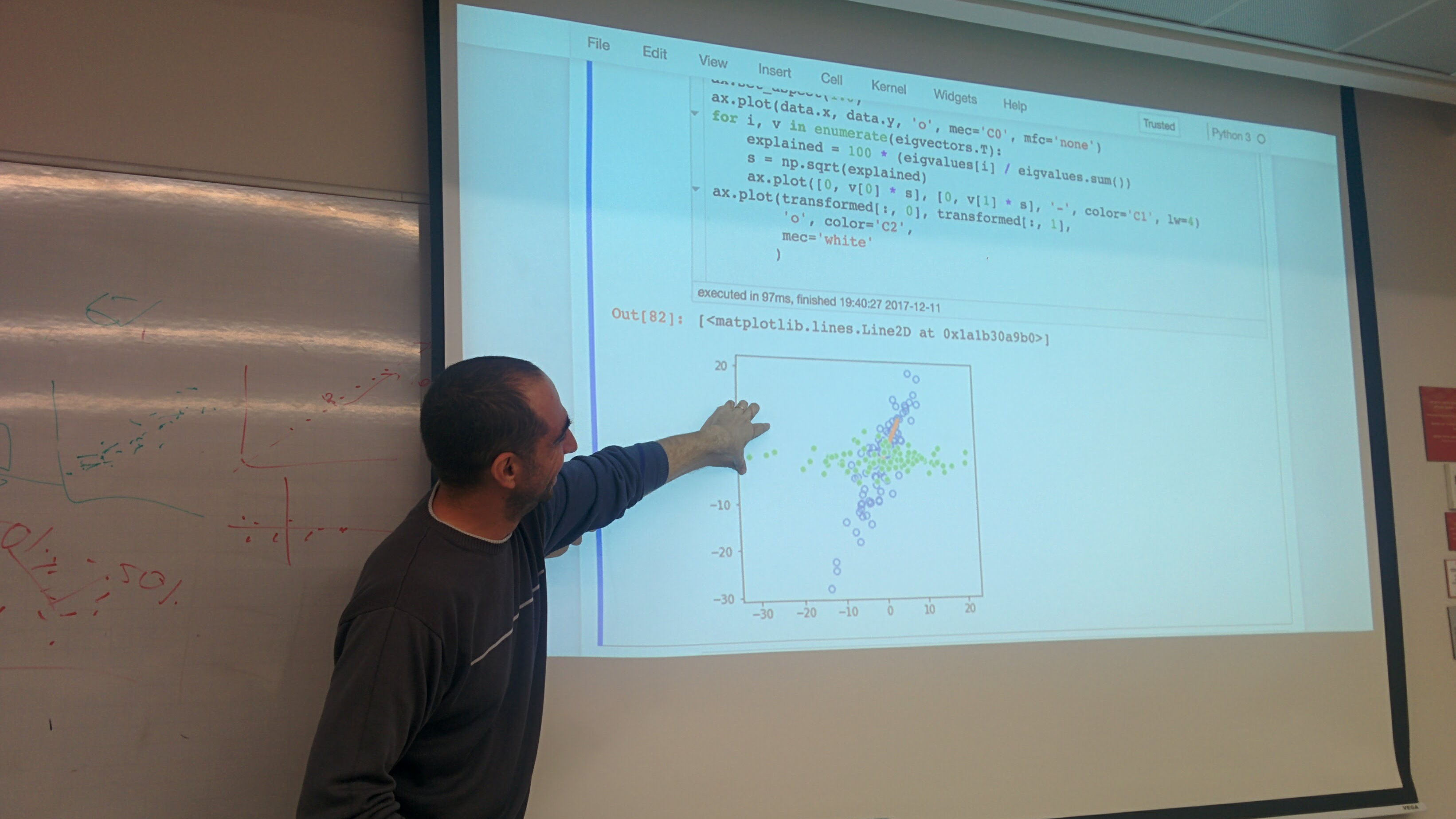
On Thursday, March 20, I will give a talk titled “Three most common mistakes in data visualization and how to avoid them.” I will be a guest of the Barcelona...
-
ASCII histograms are quick, easy to use and implement
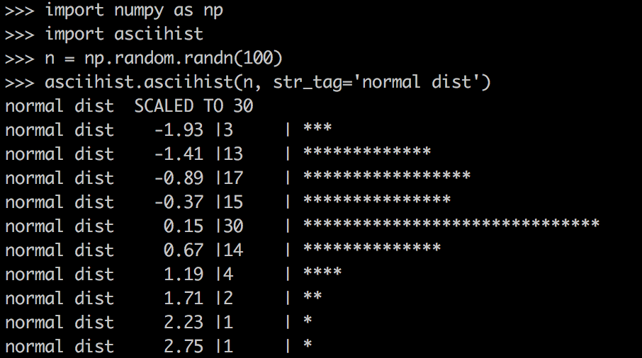
From time to time, we need to look at a distribution of a group of values. Histograms are, I think, the most popular way to visualize distributions. “Back in the...
-
The case of meaningless comparison
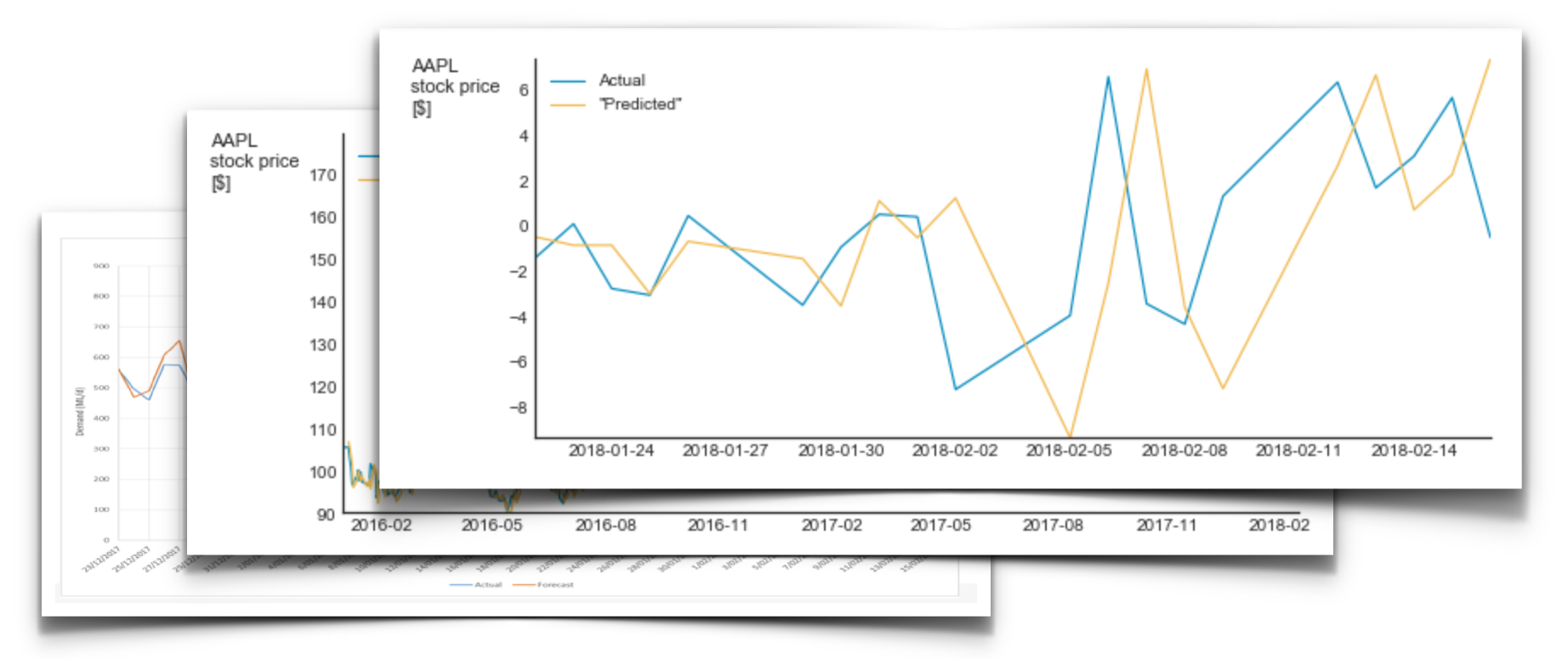
Exposé, an Australian-based data analytics company, published a use case in which they analyze the benefits of a custom-made machine learning solution. The only piece of data in their report...
-
Lie factor in ad graphs
What do you do when you have spare time? I tend to throw graphs from ads to a graph digitizer to compute the “lie factor”. Take the following graph for...
-
Does chart junk really damage the readability of your graph?
Data-ink ratio is considered to be THE guiding principle in data visualization. Coined by Edward Tufte, data-ink is “the non-erasable core of a graphic, the non-redundant ink arranged in response...
-
Why bar charts should always start at zero?
In the data visualization world, not starting a bar chart at zero is a “BIG NO”. Some people protest. “How come can anyone tell me how to start my bar...
-
Gender salary gap in the Israeli high-tech — now the code
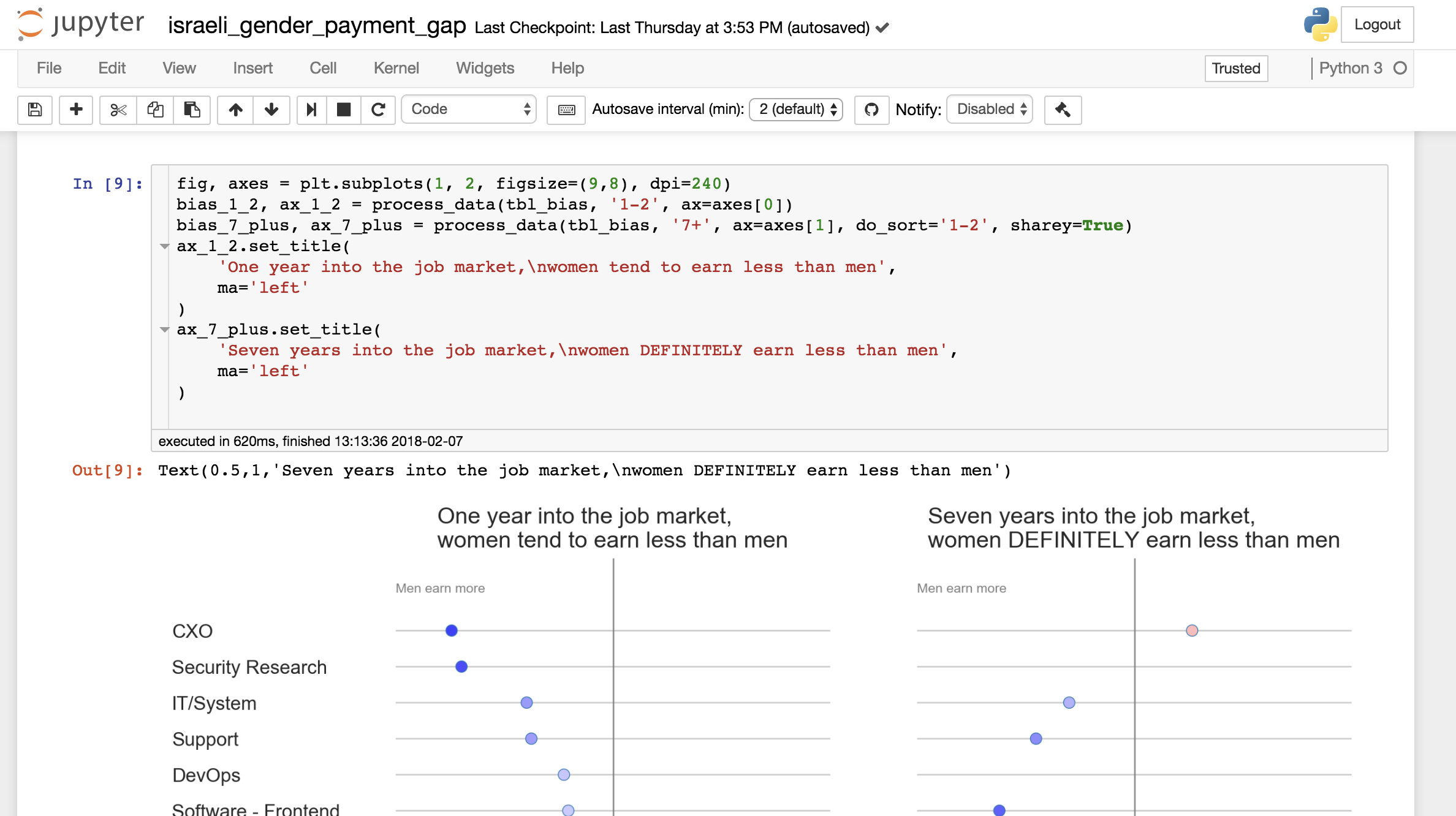
Several people have asked me about the technology I used to create the graphs in my recent post about the gender salary gap in the Israeli high-tech. Like 99% of...
-
In defense of double-scale and double Y axes
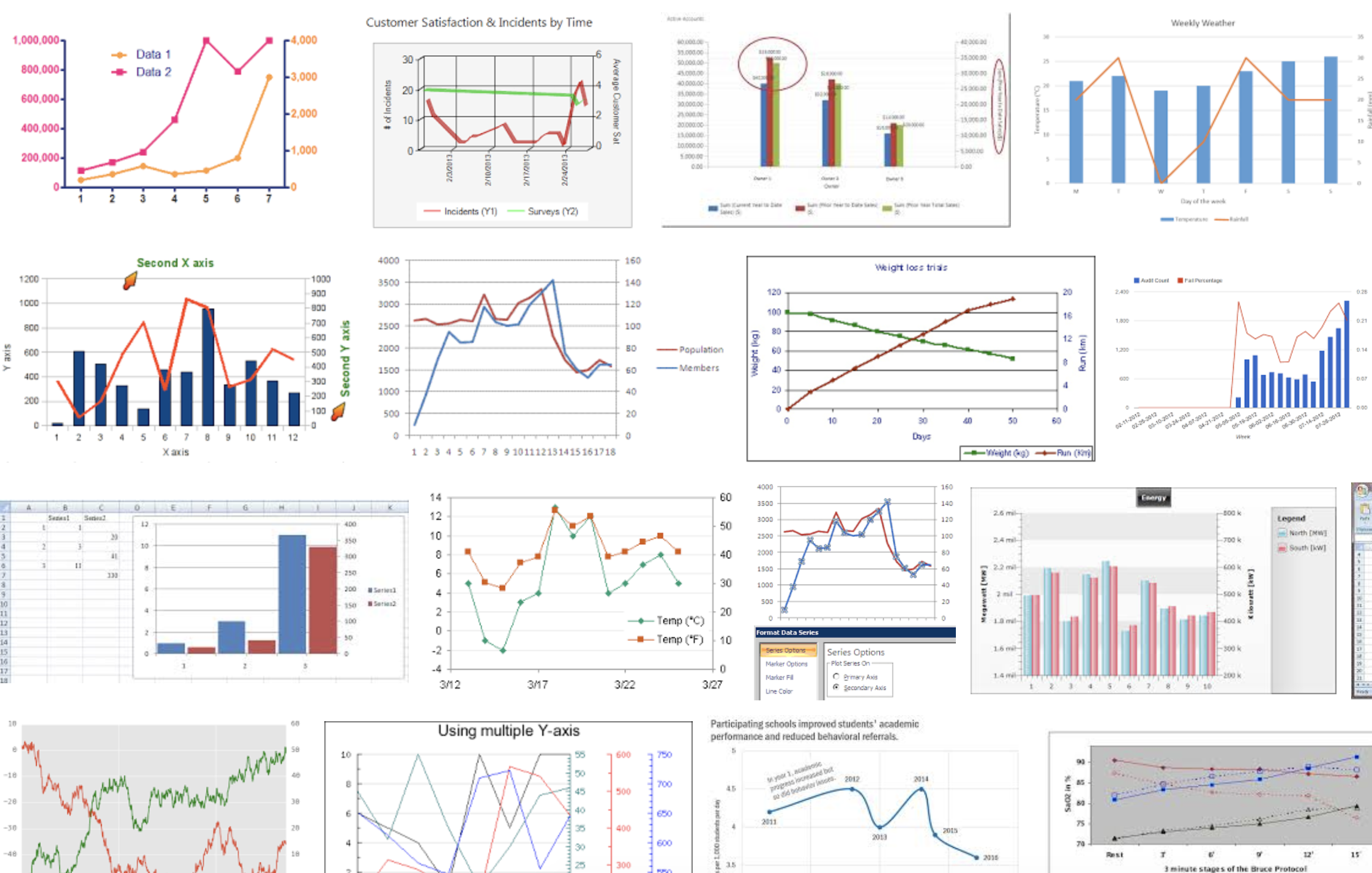
If you had a chance to talk to me about data visualization, you know that I dislike the use of double Y-axis for anything except for presenting different units of...
-
Gender salary gap in the Israeli high-tech
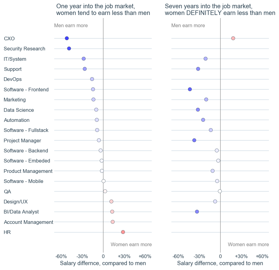
A large and popular Israeli Facebook group, “The High-Tech Troubles,” has recently surveyed its participants. The responders provided personal, demographic, and professional information. The group owners have published the aggregated...
-
Don't take career advises from people who mistreat graphs this badly
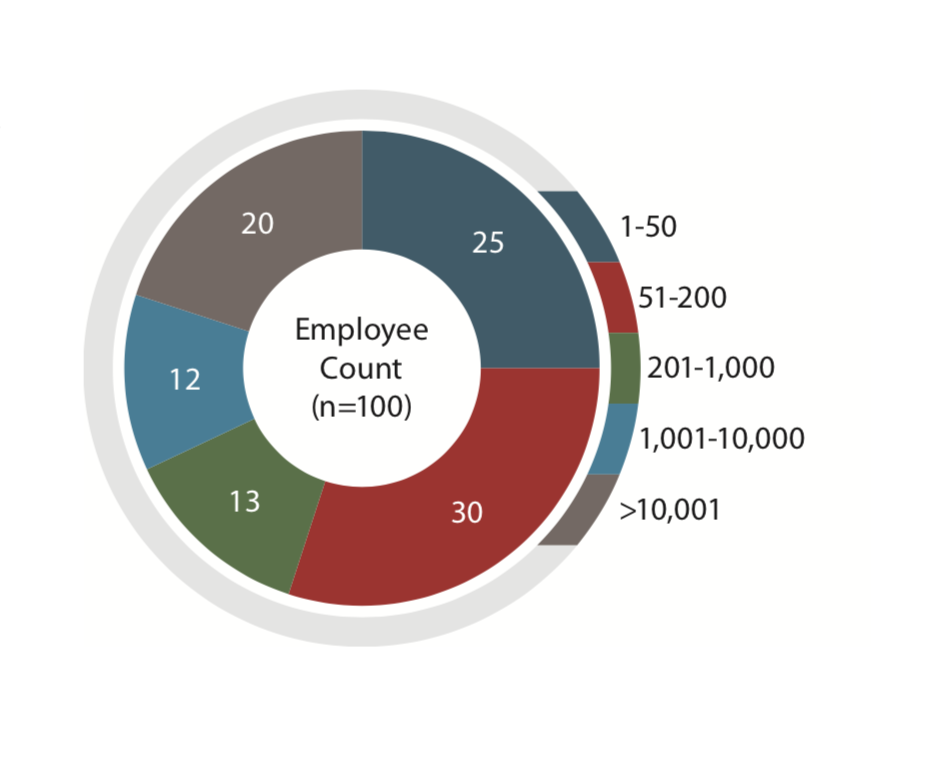
Recently, I stumbled upon a report called “Understanding Today’s Chief Data Scientist” published by an HR company called Heidrick & Struggles. This document tries to draw a profile of the...
-
What's the most important thing about communicating uncertainty?
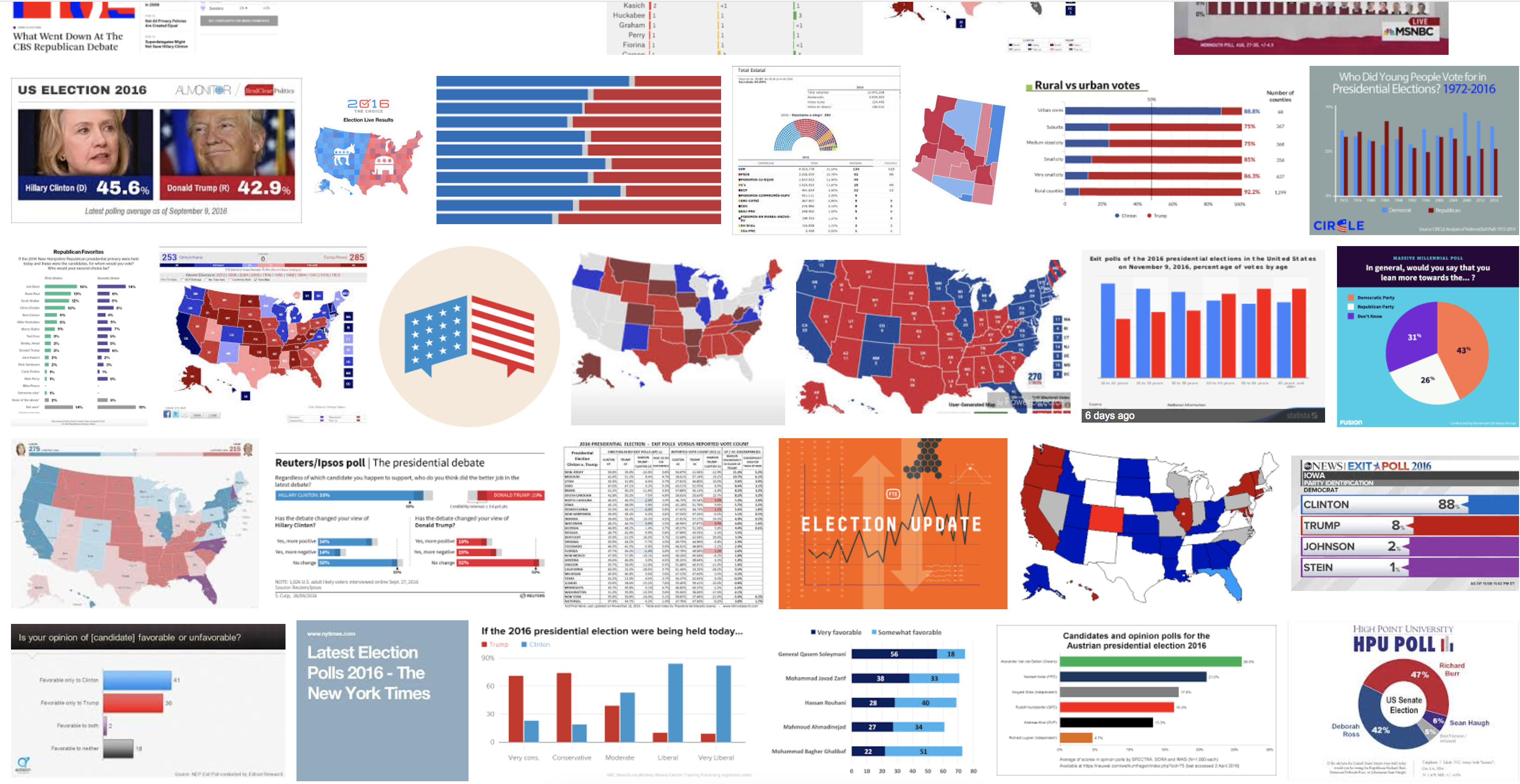
Sigrid Keydana, in her post Plus/minus what? Let’s talk about uncertainty (talk) — recurrent null, said What’s the most important thing about communicating uncertainty? You’re doing it Really? Here, for...
-
The Y-axis doesn't have to be on the left
Line charts are great to convey the evolution of a variable over the time. This is a typical chart. It has three key components, the X-axis that represents the time,...
-

How to make a graph less readable? Rotate the text labels
This is my “because you can” rant. Here, you can see a typical situation. You have some sales data that you want to represent using a bar plot. Immediately, you...
-

Good information + bad visualization = BAD
I went through my Machine Learning tag feed. Suddenly, I stumbled upon a pie chart that looked so terrible, I was sure the post would be about bad practices in...
-
Do you REALLY need the colors?
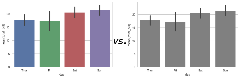
Seaborn is a Python visualization library based on matplotlib. It provides a high-level interface for drawing attractive statistical graphics. Look at this example from the seaborn documentation site >>> import...
-
When scatterplots are better than bar charts, and why?
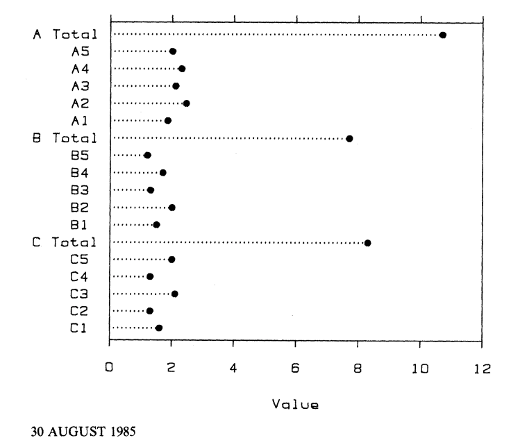
From time to time, you might hear that graphical method A is better at representing problem X than method B. While in case of problem Z, the method B is...
-

Because you can — a new series of data visualization rants
Here’s an old joke: Q: Why do dogs lick their balls? A: Because they can. Canine behavior aside, the fact that you can do something doesn’t mean that you should...
-
1461
I teach data visualization to in Azrieli College of Engineering in Jerusalem. Yesterday, during my first lesson, I was talking about the different ways a chart design selection can lead...
-

Who doesn't like some merciless critique of others' work?
Stephen Few is the author of (among others) “Show Me The Numbers”. Besides writing about what should **be done, in the field of data visualization, Dr. Few also writes a...
-
Can the order in which graphs are shown change people's conclusions?
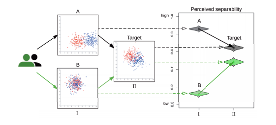
When I teach data visualization, I love showing my students how simple changes in the way one visualizes his or her data may drive the potential audience to different conclusions....
-
Before and after — the Hebrew holiday season chart
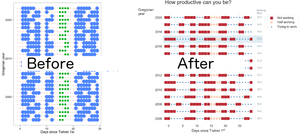
Sometimes, when I see a graph, I think “I could draw a better version.” From time to time, I even consider writing a blog post with the “before” and “after”...
-

On data beauty and communication style
There’s an interesting mini-drama going on in the data visualization world. The moderators of DataIsBeautiful invited Stephen Few for an ask-me-anything (AMA) session. Stephen Few is a data visualization researcher...
-

A successful failure
Almost half a year ago, I decided to create an online data visualization course. After investing hundreds of hours, I managed to release the first lecture and record another one....
-
The first lesson of the data visualization course is available
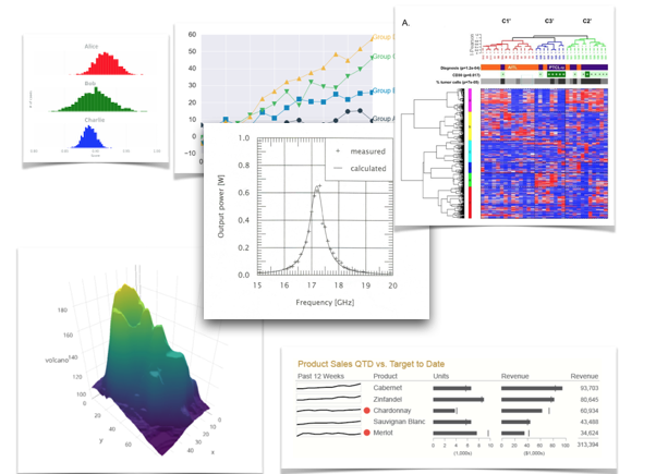
The first lesson of the course Data Visualization Beyond the Tutorial is online! Go to the lesson page to watch the lesson video. There’s also an assignment! Do you know...
-
Correction about the course start date
The first lecture of the data visualization course will be published on July 7 (7/7/17). There was a typo in the original announcement.
-

I have created an online data visualization course
If you create charts using your tool’s default settings and your intuition, chances are you’re doing it wrong. Let me present you an online course that dives into the theory...
-

Chart legends and the Muttonchops
Adding legends to a graph is easy. With matplotlib, for example, you simply call plt.legend() and voilà, you have your legends. The fact that any major or minor visualization platform...
-

Evolution of a Plot: Better Data Visualization, One Step at a Time
My latest post on data.blog
-
Comparing the incomparable — expanding the time map concept
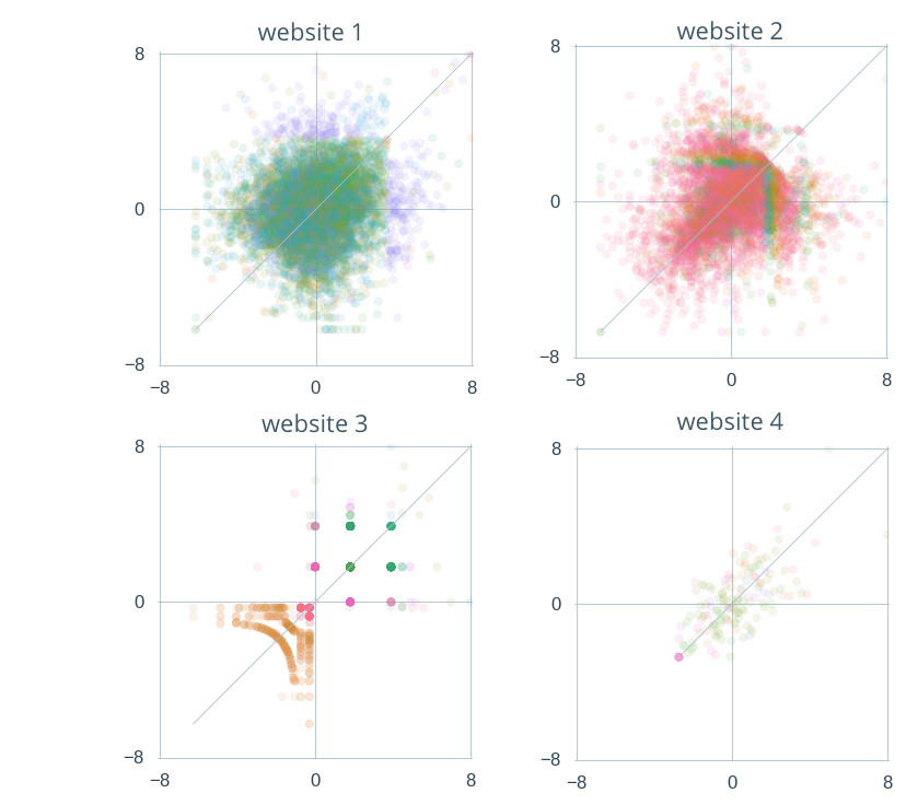
We are surrounded by discrete events: posts and comments, purchases from the online store, page visits are all examples of discrete events. Some of these events happen periodically; others happen...