
Adding legends to a graph is easy. With matplotlib, for example, you simply call plt.legend() and voilà, you have your legends. The fact that any major or minor visualization platform makes it super easy to add a legend doesn’t mean that it should be added. At least, not in graphs that are supposed to be shared with the public.
Take a look at this interesting graph taken from Reddit:
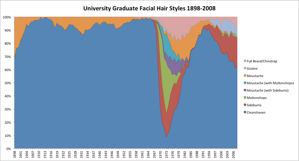
The chart provides fascinating information. However, to “decipher” it, the viewer needs to constantly switch between the chart and the legend to the right. Moreover, having to encode eight different categories, resulted in colors that are hard to distinguish. And if you happen to be a colorblind person, your chances to get the colors right are significantly lower.
What is the solution to this problem? Let’s reduce the distance between the labels and the data by putting the labels and the data together.

Notice the multiple advantages of the “after” version. First, the viewer doesn’t need to jump back-and-forth to decide which segment represents which data series. Secondly, by moving the legends inside the graph, we freed up valuable real estate area. But that’s not all. The new version is readable by the colorblind. Plus, the slightly bigger letters make the reading easier for the visually impaired. It is also readable and understandable when printed out using a black and white printer.
“Wait a minute,” you might say, “there’s not enough space for all the labels! We’ve lost some valuable information. After all,” you might say, “we now only have four labels, not eight”. Here’s the thing. I think that losing four categories is an advantage. By imposing restrictions, we are forced to decide what is it that we want to say, what is important and what is not. By forcing ourselves to only label larger chunks, we are forced to ask questions. Is the distinction between “Moustache with Muttonchops” and “Moustache with Sideburns” THAT important? If it is, make a graph about Muttonchops and Sideburns. If it’s not, combine them into a single category. Even better, combine them with “Mustache”.
[caption id=”attachment_259” align=”alignnone” width=”183”]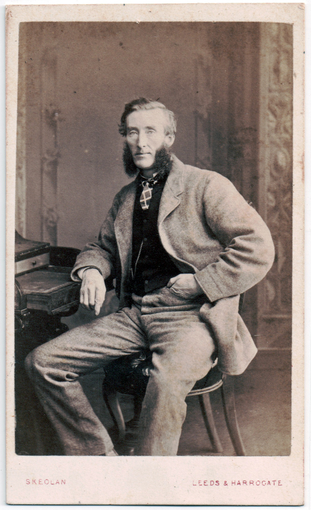 Muttonchops. By Flickr user GSK[/caption]
Having the ability to add a legend with any number of categories, using only one code line is super convenient and useful, especially, during data exploration. However, when shared with the public, graphs need to contain as fewer legends as practically needed. Remove the legends, place the labels close to the data. If doing so results in unreadable overlapping labels, refine the graph, rethink your message, combine categories. This may take time and cause frustration, but the result might surprise you. If none of these is possible, put the legend back. At least you tried.
Chart legends are like Muttonchops – the fact that you can have them doesn’t mean you should.