From time to time, you might hear that graphical method A is better at representing problem X than method B. While in case of problem Z, the method B is much better than A, but C is also a possibility. Did you ever ask yourselves (or the people who tell you that) “Says WHO?”
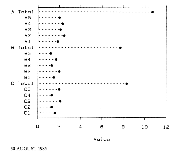
The guidelines like these come from theoretical and empirical studies. One such an example is a 1985 paper “Graphical perception and graphical methods for analyzing scientific data.” by Cleveland and McGill. I got the link to this paper from Varun Raj of https://varunrajweb.wordpress.com/.
It looks like a very interesting and relevant paper, despite the fact that it has been it was published 22 years go. I will certainly read it. Following is the reading list that I compiled for my data visualization students more than two years ago. Unfortunately, they didn’t want to read any of these papers. Maybe some of the readers of this blog will …
- Attention and Mental Primer
- Automating the Design of Graphical Presentations of Relational Information.
- Beyond Weber’s Law: A Second Look at Ranking Visualizations of Correlation
- Exogenous attention and color perception: Performance and appearance of saturation and hue
- High-Speed Visual Estimation Using Preattentive Processing
- How Deceptive are Deceptive Visualizations?: An Empirical Analysis of Common Distortion Techniques
- How NOT to Lie with Visualization
- How to evaluate models: Observed vs. predicted or predicted vs. observed?
- Narrative Visualization: Telling Stories with Data
- Patterns for Visualization Evaluation
- The Data-Ink Ratio and Accuracy of Information Derived from Newspaper Graphs: An Experimental Test of the Theory.
- The Eyes Have It: A Task by Data Type Taxonomy for Information Visualizations