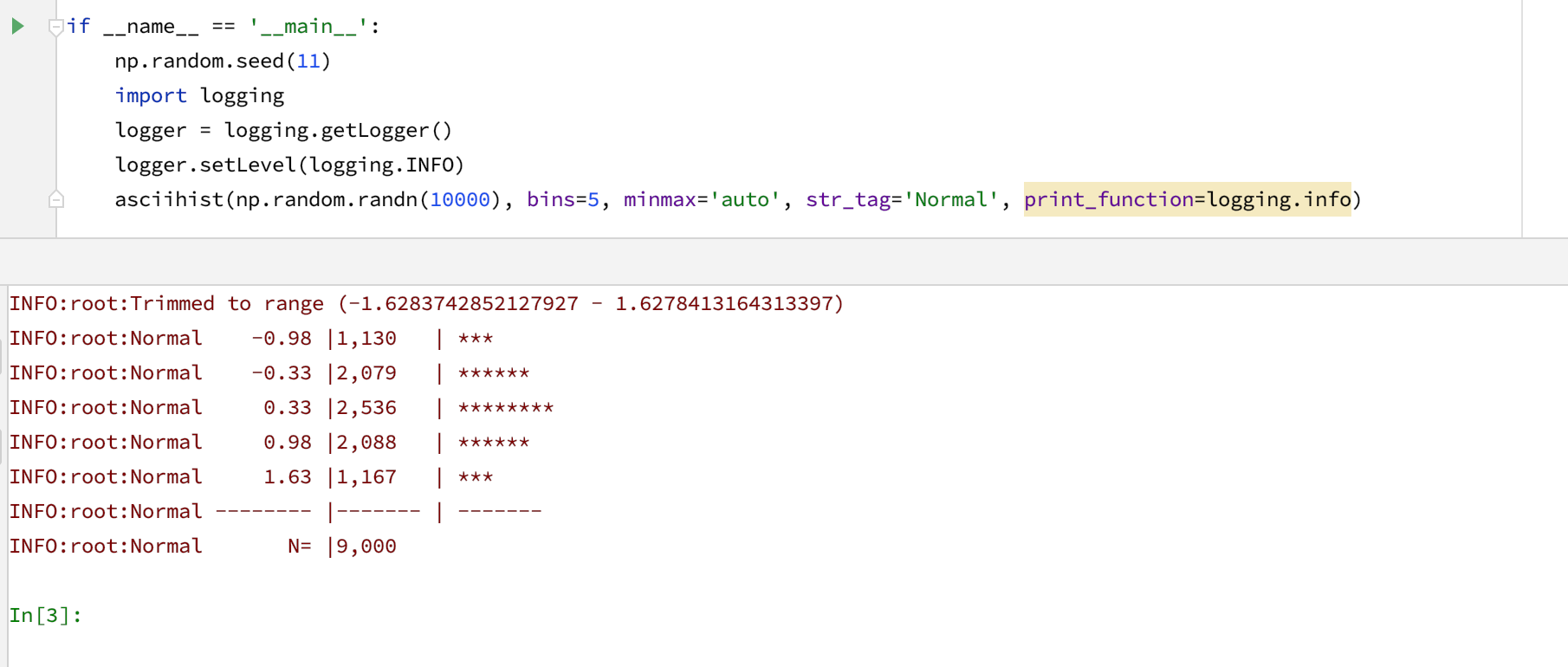
From time to time, we need to look at a distribution of a group of values. Histograms are, I think, the most popular way to visualize distributions. “Back in the old days,” when most of my work was done in the console, and when creating a plot from Python was required too many boilerplate code lines, I found a neat function that produced histograms using ASCII characters.
Recently, I updated the python function that I use to create ASCII histograms. The updated function [link] uses more modern formatting and includes several signal-to-noise improvements. One can also use it with custom output functions, such as logging.info.