Anthropic has published an interesting study about labor market impacts of AI: Labor market impacts of AI: A new measure and early evidence.
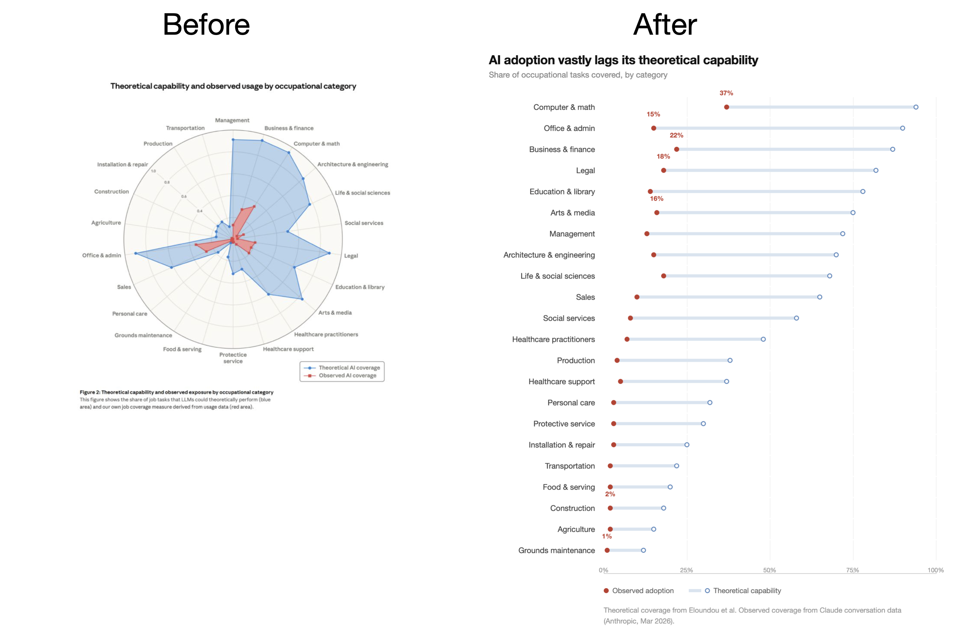
It is hard to overestimate Anthropic’s contribution to the world of technology. Their innovation and professionalism are remarkable. But sadly, in the report they included a spider graph that leaves their entire post with a bad taste. (I wrote about spider charts many times before.)
It takes a good minute or two to understand what the image is about. Spider charts are almost always a bad data visualization technique. So how do we fix it?
First, we need to define the conclusion. A short sentence of up to 8 words that conveys the general idea of the graph. After that, we create a graph that does exactly that – conveys the conclusion.
Here, the conclusion is the difference between theoretical AI capability and the observed AI adoption across occupational categories. So we need to show exactly that difference.
Look at the improved graph. All the categories are sorted according to the observed adoption rate. The differences are immediately visible, and the conclusion is right at the top of the graph, leaving no room for guessing.