After my previous post about Anthropic’s spider chart, several people asked me how I would actually go about fixing it. So here is how – with a single prompt.
I gave Claude the original graph and the following instruction, based on my C for Conclusion approach:
the visualization is not good. First, formalize the image into a single-sentence conclusion of up to 8 words.
Then, use the approach of Stephen Few and Edward Tufte, maximize the data-ink ratio, use Information layers (Jean-luc Doumont) to generate the graph based on the same data that is much better and that conveys the conclusion you made above
That’s it. Here is the before and after:
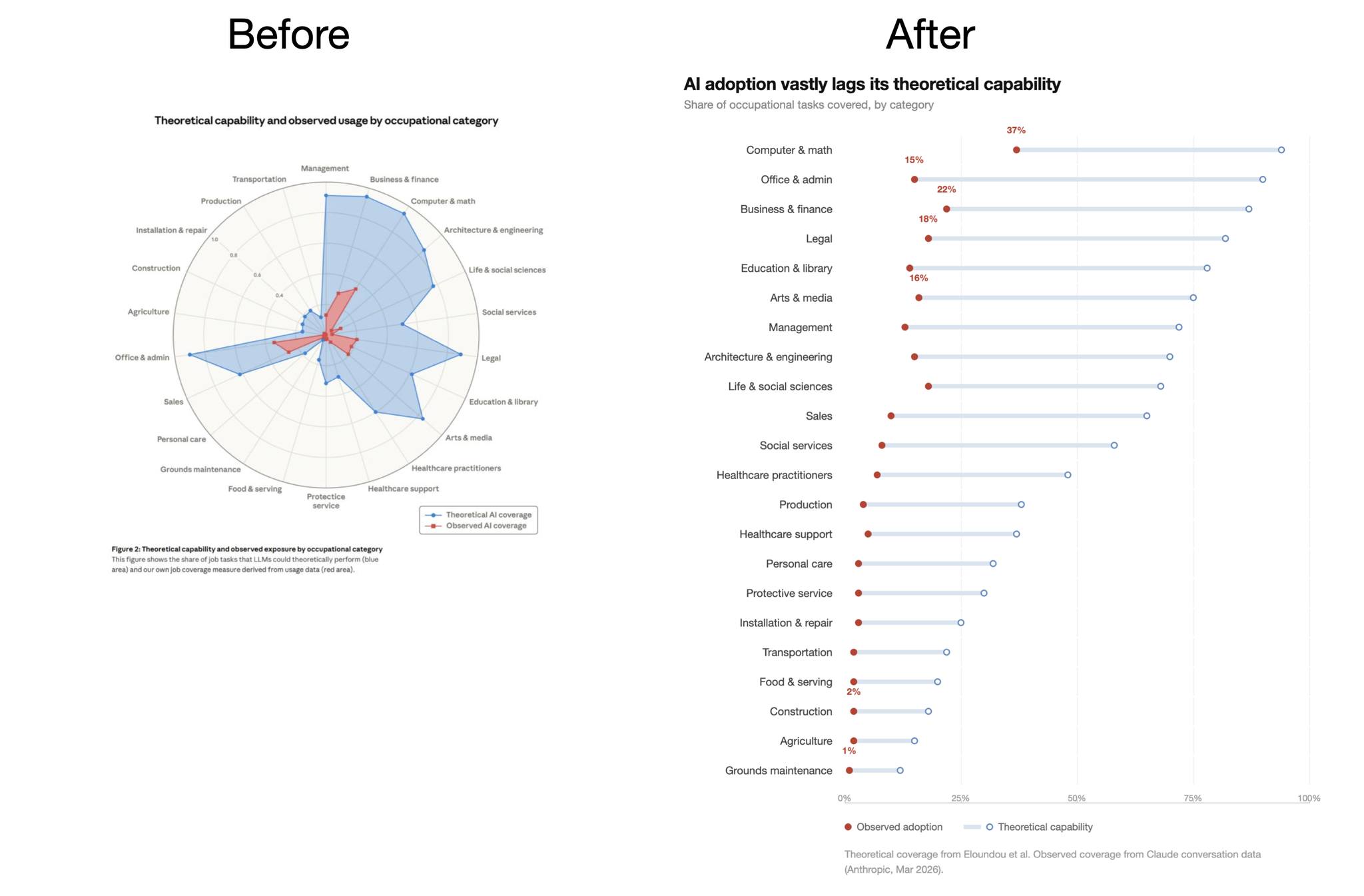
The conclusion – “AI adoption vastly lags its theoretical capability” – is now the title. Categories are sorted, the gap is immediately visible, and there is nothing left to decode.
See the standalone version of the graph (the raw data, as extracted by Claude, is in that file).
For more on why radar charts are almost always a bad choice, see my earlier posts on spider charts and radar charts.
But, Boris, vibe plotting is not a real expertise!
Sure, but Anthropic people have access to the same vibe plotting tool I have (even better). It’s knowing what to ask for that is the real expertise. And if you don’t have that, you can always ask someone who does.