Why adding text labels to graph lines, when you can build graph lines using text labels? On microtext lines
-
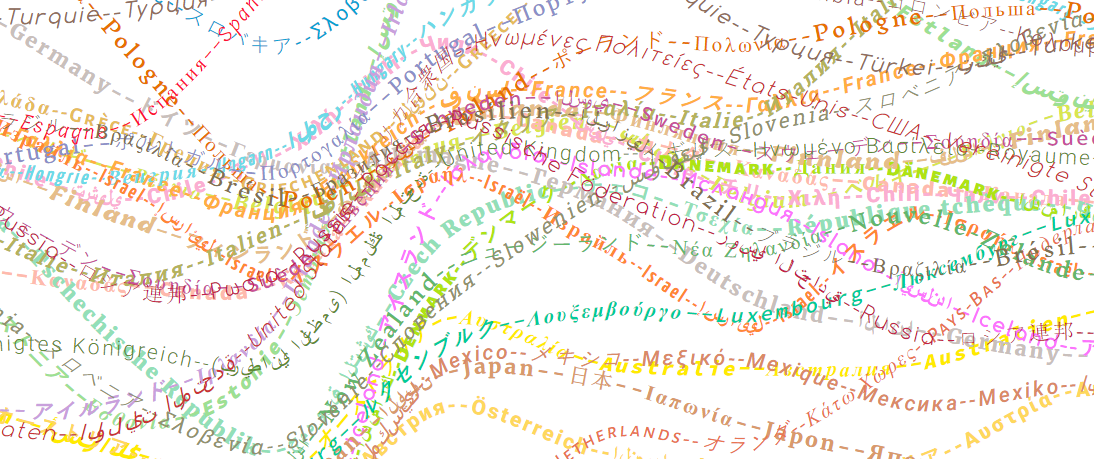
Microtext Line Charts
November 12, 2018 -
איך אומרים דאטה ויזואליזיישן בעברית?
October 23, 2018This post is written in Hebrew about a Hebrew issue. I won’t translate it to English.
אני מלמד data visualization בשתי מכללות בישראל — במכללת עזריאלי להנדסה בירושלים ובמכון הטכנולוגי בחולון. כשכתבתי את הסילבוס הראשון שלי הייתי צריך למצוא מונח ל־data visualization וכתבתי “הדמיית נתונים״ אומנם זה הזכיר לי קצת תהליך של סימולציה, אבל האופציה האחרת ששקלתי היתה ״דימות״ וידעתי שהיא שמורה ל־imaging, דהיינו תהליך של יצירת דמות או צורה של עצם, בעיקר בעולם הרפואה.
הבנתי שהמונח בעייתי בשיעור הראשון שהעברתי. מסתברששניים מארבעת הסטודנטים שהגיעו לשיעור חשבו שקורס ״הדמיית נתונים בתהליך מחקר ופיתוח״ מדבר על סימולציות.
מתישהו שמעתי מחבר של חבר שהמונח הנכון ל־visualization זה הדמאה, אבל זה נשמע לי פלצני מדי, אז השארתי את ה־״הדמיה״ בשם הקורס והוספתי “data visualization” בסוגריים.
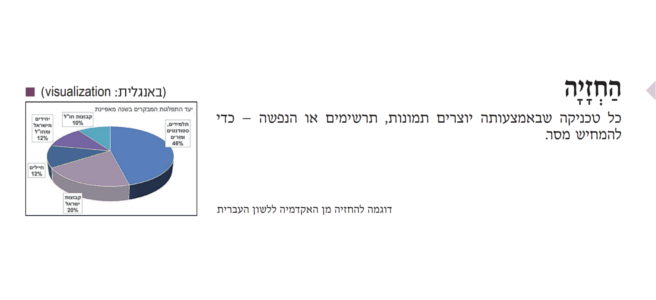
היום, שלוש שנים אחרי ההרצאה הראשונה שהעברתי, ויומיים לפני פתיחת הסמסטר הבא, החלטתי לגגל (יש מילה כזאת? יש!) את התשובה. ומה מסתבר? עלון ״למד לשונך״ מס׳ 109 של האקדמיה ללשון עברית שיצא לאור בשנת 2015 קובע שהמונח ל־visualization הוא הַחְזָיָה. לא יודע מה אתכם, אבל אני לא משתגע על החזיה. עוד משהו שאני לא משתגע עליו הוא שבתור הדוגמא להחזיה, האקדמיה החלטיה לשים תרשים עוגה עם כל כך הרבה שגיאות!

נראה לי שאני אשאר עם הדמיה. ויקימילון מרשה לי.
נ.ב. שמתם לב שפוסט זה השתמשתי במקף עברי? אני מאוד אוהב את המקף העברי.
-
Innumeracy
October 22, 2018Innumeracy is “inability to deal comfortably with the fundamental notions of number and chance”.
I which there was a better term for “innumeracy”, a term that would reflect the importance of analyzing risks, uncertainty, and chance. Unfortunately, I can’t find such a term. Nevertheless, the problem is huge. In this long post, Tom Breur reviews many important aspects of “numeracy”. -

Working Remotely and the Virtue of Aggressive Transparency
October 16, 2018Excellent post by my colleague Simon Ouderkirk on working in a distributed company. It’s a three-year-old post. I wonder how I missed it.
-
Data visualization in right-to-left languages
October 15, 2018If you speak Arabic or Farsi, I need your help. If you don’t speak, share this post with someone who does.
Right-to-left (RTL) languages such as Hebrew, Arabic, and Farsi are used by roughly 1.8 billion people around the world. Many of them consume data in their native languages. Nevertheless, I have never seen any research or study that explores data visualization in RTL languages. Until a couple of days ago, when I saw this interesting observation by Nick Doiron “Charts when you read right-to-left”.
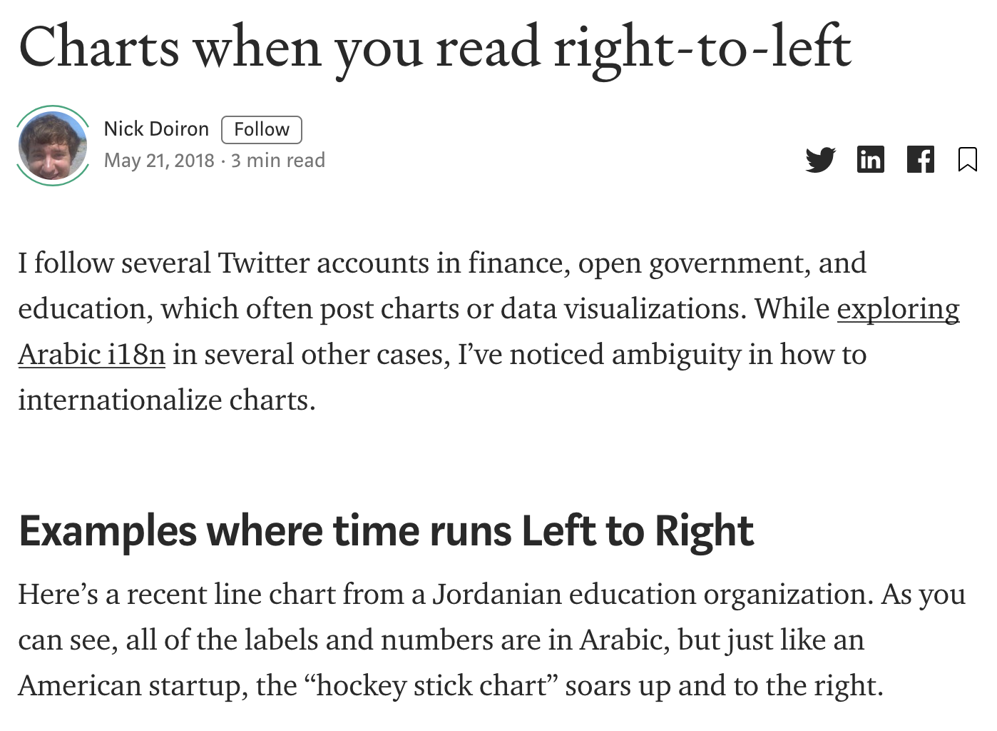
I teach data visualization in Israeli colleges. Whenever a student asks me RTL-related questions, I always answer something like “it’s complicated, let’s not deal with that”. Moreover, in the assignments, I even allow my students to submit graphs in English, even if they write the report in Hebrew.
Nick’s post made me wonder about data visualization do’s and don’ts in RTL environments. Should Hebrew charts differ from Arabic or Farsi? What are the accepted practices?
If you speak Arabic or Farsi, I need your help. If you don’t speak, share this post with someone who does. I want to collect as many examples of data visualization in RTL languages. Links to research articles are more than welcome. You can leave your comments here or send them to boris@gorelik.net.
Thank you.
The image at the top of this post is a modified version of a graph that appears in the post that I cite. Unfortunately, I wasn’t able to find the original publication.
-

A World Without the Number 6 — Math with Bad Drawings
October 11, 2018What will happen if number 6 disappears one day? Ben Orlin, the author of “Math with bad drawings” elaborates on this interesting thought experiment in this 2017 post.
-
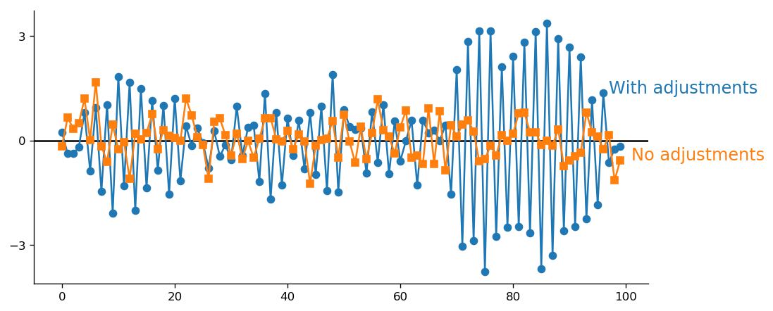
Can error correction cause more error? (The answer is yes)
October 9, 2018This is an interesting thought experiment. Suppose that you have some appliance that acts in a normally distributed way. For example, a nerf gun. Let’s say now that you aim and fire the gun. What happens if you miss by some amount of X? Should you correct your aim in the opposite direction? My intuition says “yes.” So does the intuition of many other people with whom I talked about this problem. However, when we start thinking about this problem, we realize that the intuition is wrong. Since we aim the gun, our assumption should be that the deviation is zero. A single observation is not sufficient to reject this assumption. By continually adjusting the data generating process based on a single observation, we reduce the precision (increase the dispersion).
Below is a simulation of adjusted and non-adjusted processes (the code is here). The broader spread of the adjusted data (blue line) is evident.Due to the nature of the normal random variable, a single large accidental deviation can cause an extreme “correction,” which in turn will create a prolonged period of highly inaccurate points. This is precisely what you see in my simulation.
The moral of this simple experiment is that you shouldn’t let a single affect your actions. -

Me
October 1, 2018 -

Conference Recap: EuroSciPy 2018 — Data for Breakfast
September 20, 2018See my recap of the recent EuroSciPy, published on https://data.blog
In which Boris Gorelik shares his favorite talks and workshops from EuroSciPy 2018.
-

"Any questions?" How to fight the awkward silence at the end of a presentation?
September 20, 2018If you ever gave or attended a presentation, you are familiar with this situation: the presenter asks whether there are any questions and … nobody asks anything. This is an awkward situation. Why aren’t there any questions? Is it because everything is clear? Not likely. Everything is never clear. Is it because nobody cares? Well, maybe. There are certainly many people that don’t care. It’s a fact of life. Study your audience, work hard to make the presentation relevant and exciting but still, some people won’t care. Deal with it.
However, the bigger reasons for lack of the questions are human laziness and the fear of being stupid. Nobody likes asking a question that someone will perceive as a stupid one. Sometimes, some people don’t mind asking a question but are embarrassed and prefer not being the first one to break the silence.
What can you do? Usually, I prepare one or two questions by myself. In this case, if nobody asks anything, I say something like “Some people, when they see these results ask me whether it is possible to scale this method to larger sets.”. Then, depending on how confident you are, you may provide the answer or ask “What do you think?”.
You can even prepare a slide that answers your question. In the screenshot below, you may see the slide deck of the presentation I gave in Trento. The blue slide at the end of the deck is the final slide, where I thank the audience for the attention and ask whether there are any questions.
My plan was that if nobody asks me anything, I would say “Thank you again. If you want to learn more practical advises about data visualization, watch the recording of my tutorial, where I present this method <SLIDE TRANSFER, show the mockup of the “book”>. Also, many people ask me about reading suggestions, this is what I suggest you read: <SLIDE TRANSFER, show the reading pointers>
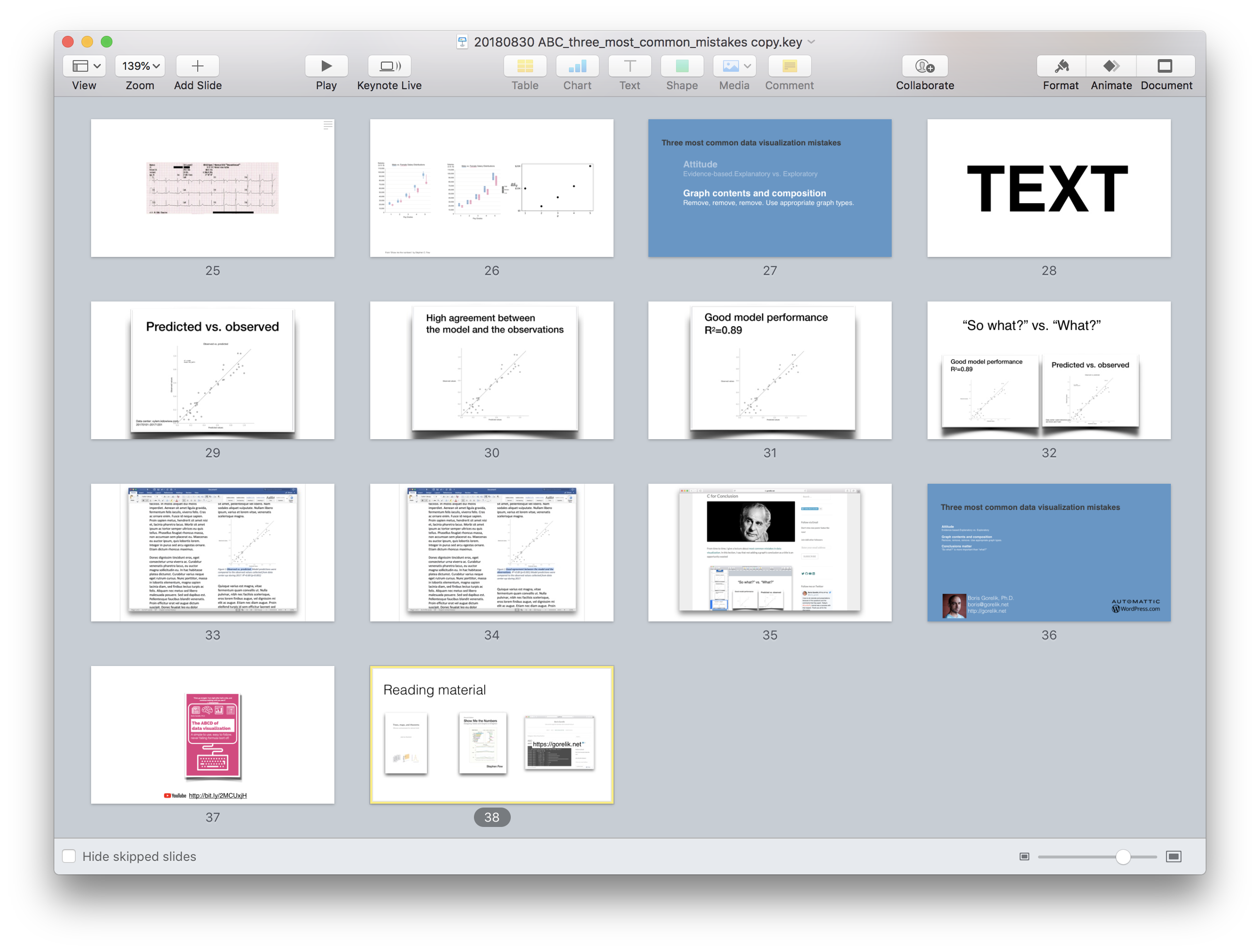
Luckily for me, there were questions after my talk. Luckily, one of these questions was about practical advice so I had a perfect excuse to show the next, pre-prepared, slide. Watch this moment on YouTube here.
-
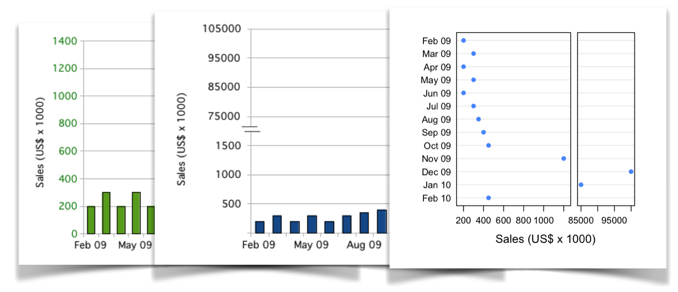
Graphing Highly Skewed Data – Tom Hopper
September 16, 2018My colleague, Chares Earl, pointed me to this interesting 2010 post that explores different ways to visualize categories of drastically different sizes.
The post author, Tom Hopper, experiments with different ways to deal with “Data Giraffes”. Some of his experiments are really interesting (such as splitting the graph area). In one experiment, Tom Hopper draws bar chart on a log scale. Doing so is considered as a bad practice. Bar charts value (Y) axis must include meaningful zero, which log scale can’t have by its definition.
Other than that, a good read Graphing Highly Skewed Data – Tom Hopper
-
On privacy, security, and irony
September 9, 2018About a week ago, I met Justin Mayer and had a really interesting chat with him about internet privacy. Today, his 30-minutes talk on that subject appeared in my youtube suggestion list
https://www.youtube.com/watch?v=2rrP_aW-jNA
How ironic. The talk, by the way, is very interesting.
-

Back to Mississippi: Black migration in the 21st century. By Charles Earl
September 4, 2018I wonder how this analysis of remained unnoticed by the social media
The recent election of Doug Jones […] got me thinking: What if the Black populations of Southern cities were to experience a dramatic increase? How many other elections would be impacted?
via Back to Mississippi: Black migration in the 21st century — Charlescearl’s Weblog
-

Please leave a comment to this post
September 3, 2018Please leave a comment to this post. It doesn’t matter what. It doesn’t matter when or where you see it. I want to see how many real people are actually reading this blog.
[caption id=”attachment_media-15” align=”alignnone” width=”1880”]
Photo by Pixabay on Pexels.com[/caption]
-
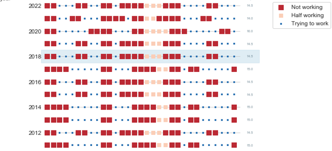
16-days-work-month — The joys of the Hebrew calendar
September 2, 2018Tishrei is the seventh month of the Hebrew calendar that starts with Rosh-HaShana — the Hebrew New Year. It is a 30 days month that usually occurs in September-October. One interesting feature of Tishrei is the fact that it is full of holidays: Rosh-HaShana (New Year), Yom Kippur (Day of Atonement), first and last days of Sukkot (Feast of Tabernacles) **. All these days are rest days in Israel. Every holiday eve is also a *de facto rest day in many industries (high tech included). So now we have 8 resting days that add to the usual Friday/Saturday pairs, resulting in very sparse work weeks. But that’s not all: the period between the first and the last Sukkot days are mostly considered as half working days. Also, the children are at home since all the schools and kindergartens are on vacation so we will treat those days as half working days in the following analysis.
I have counted the number of business days during this 31-day period (one day before the New Year plus the entire month of Tishrei) between 2008 and 2023 CE, and this is what we get:

Overall, this period consists of between 15 to 17 non-working days in a single month (31 days, mind you). This is how the working/not-working time during this month looks like this:
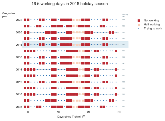
Now, having some vacation is nice, but this month is absolutely crazy. There is not a single full working week during this month. It is very similar to the constantly interrupt work day, but at a different scale.
So, next time you wonder why your Israeli colleague, customer or partner barely works during September-October, recall this post.
(*) New Year starts in the seventh’s month? I know this is confusing. That’s because we number Nissan – the month of the Exodus from Egypt as the first month.
(**)If you are an observing Jew, you should add to this list Fast of Gedalia, but we will omit it from this discussion -

Sometimes, less is better than more
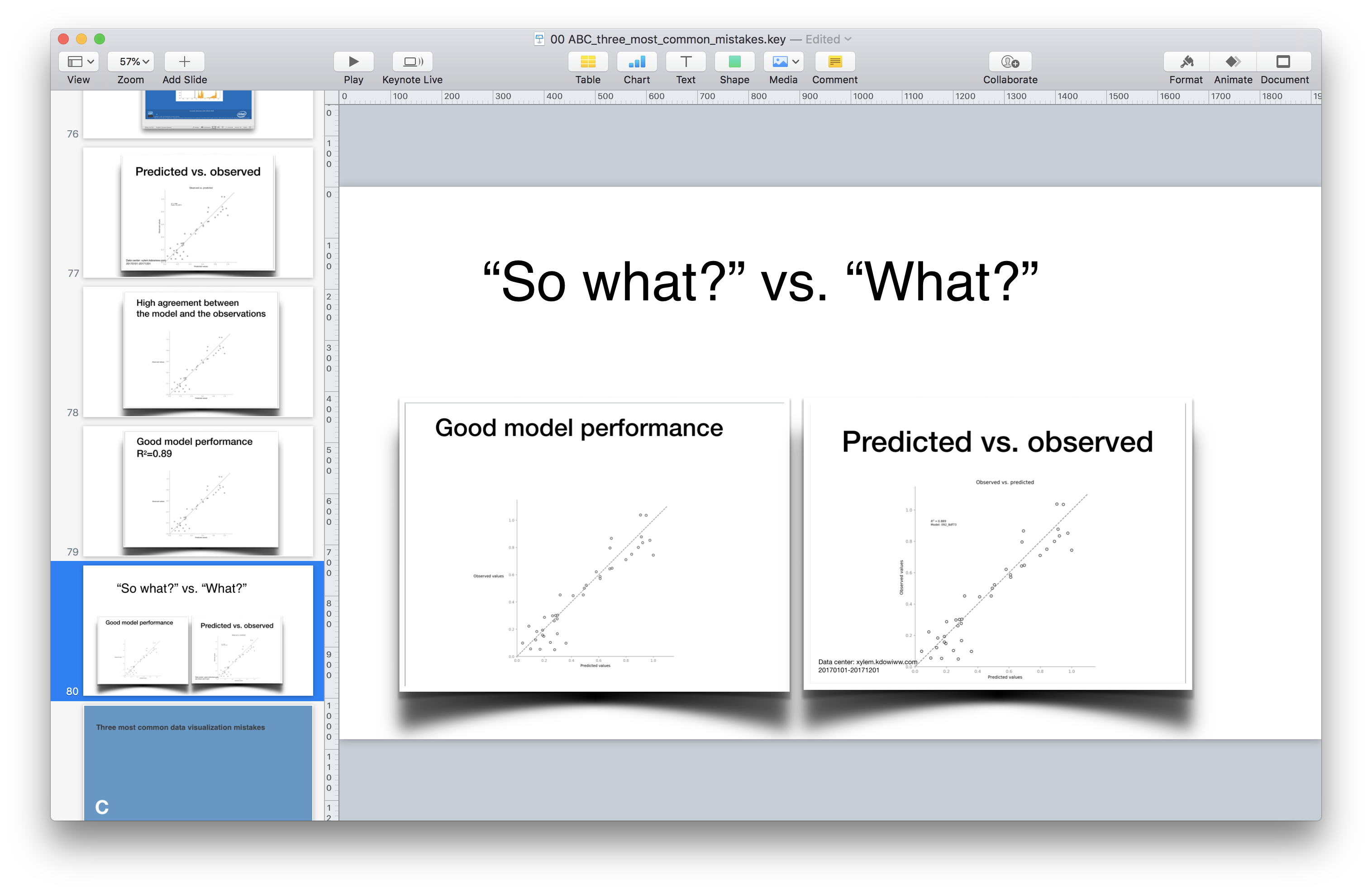
August 30, 2018Today, during the EuroSciPy conference, I gave a presentation titled “Three most common mistakes in data visualization and how to avoid them”. The title of this presentation is identical to the title of the presentation that I gave in Barcelona earlier this year. The original presentation was approximately one and a half hours long. I knew that EuroSciPy presentations were expected to be shorter, so I was prepared to shorten my talk to half an hour. At some point, a couple of days before departing to Trento, I realized that I was only allocated 15 minutes. Fifteen minutes! Instead of ninety.
Frankly speaking, I was in a panic. I even considered contacting EuroSciPy organizers and asking them to remove my talk from the program. But I was too embarrassed, so I decided to take the risk and started throwing slides away. Overall, I think that I spent eight to ten working hours shortening my presentation. Today, I finally presented it. Based on the result, and on the feedback that I got from the conference audience, I now know that the 15-minutes version is better than the original, longer one. Video recording of my talk is available on Youtube and is embedded below. Below is my slide deck
[slideshare id=112261825&doc=20180830abcthreemostcommonmistakescopy-180830134825]
Illustration image credit: Photo by Jo Szczepanska on Unsplash
-
An even better data visualization workshop
August 30, 2018Yesterday, I gave a data visualization workshop at EuroSciPy 2018 in Trento. I spent HOURs building and improving it. I even developed a “simple to use, easy to follow, never failing formula” for data visualization process (I’ll write about it later).
I enjoyed this workshop so much. Both preparing it, and (even more so) delivering it. There were so many useful questions and remarks. The most important remark was made by Gael Varoquaux who pointed out that one of my examples was suboptimal for vision impaired people. The embarrassing part is that one of the last lectures that I gave in my college data visualization course was about visual communication for the visually impaired. That is why the first thing I did when I came to my hotel after the workshop was to fix the error. You may find all the (corrected) material I used in this workshop on GitHub. Below, is the video of the workshop, in case you want to follow it.
https://www.youtube.com/watch?v=H-K_fSA54AM
Photo credit: picture of me delivering the workshop is by Margriet Groenendijk
-

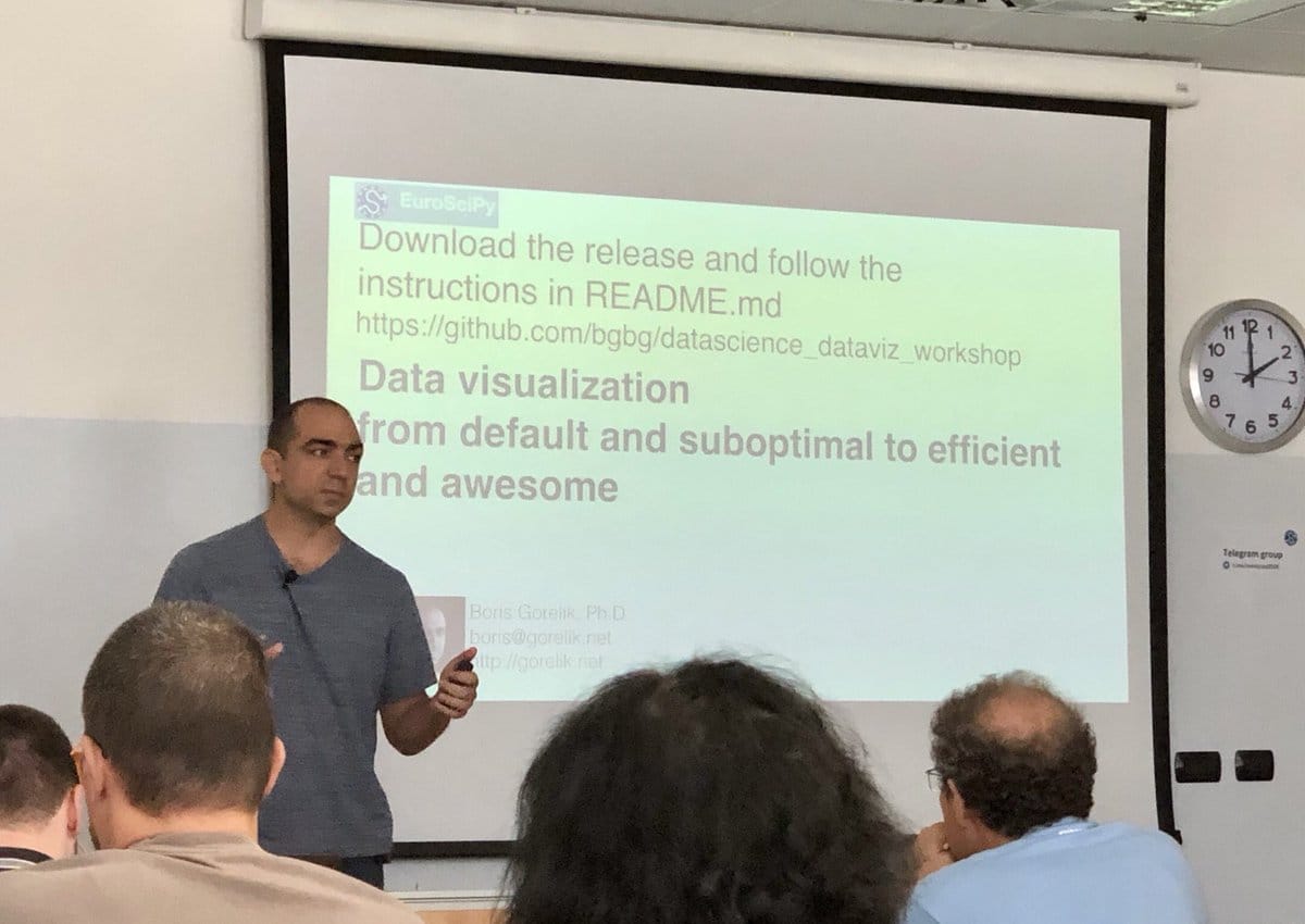
Meet me at EuroSciPy 2018
August 26, 2018I am excited to run a data visualization tutorial, and to give a data visualization talk during the 2018 EuroSciPy meeting in Trento, Italy.
My tutorial “Data visualization – from default and suboptimal to efficient and awesome”will take place on Sep 29 at 14:00. This is a two-hours tutorial during which I will cover between two to three examples. I will start with the default Matplotlib graph, and modify it step by step, to make a beautiful aid in technical communication. I will publish the tutorial notebooks immediately after the conference.
My talk “Three most common mistakes in data visualization” will be similar in nature to the one I gave in Barcelona this March, but more condensed and enriched with information I learned since then.
If you plan attending EuroSciPy and want to chat with me about data science, data visualization, or remote working, write a message to boris@gorelik.net.
Full conference program is available here.
-
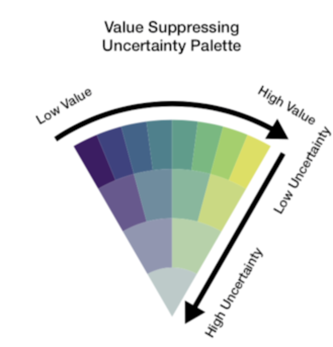
Value-Suppressing Uncertainty Palettes – UW Interactive Data Lab – Medium
August 14, 2018Uncertainty is one of the most neglected aspects of number-based communication and one of the most important concepts in general numeracy. Comprehending uncertainty is hard. Visualizing it is, apparently, even harder.
Last week I read a paper called Value-Suppressing Uncertainty Palettes, by M.Correll, D. Moritz, and J. Heer from the Data visualization and interactive analysis research at the University of Washington. This paper describes an interesting approach to color-encoding uncertainty.
Uncertainty visualization is commonly done by reducing color saturation and opacity. Cornell et al suggest combining saturation reduction with limiting the number of possible colors in a color palette. Unfortunately, there the authors used Javascript and not python for this paper, which means that in the future, I might try implementing it in python.
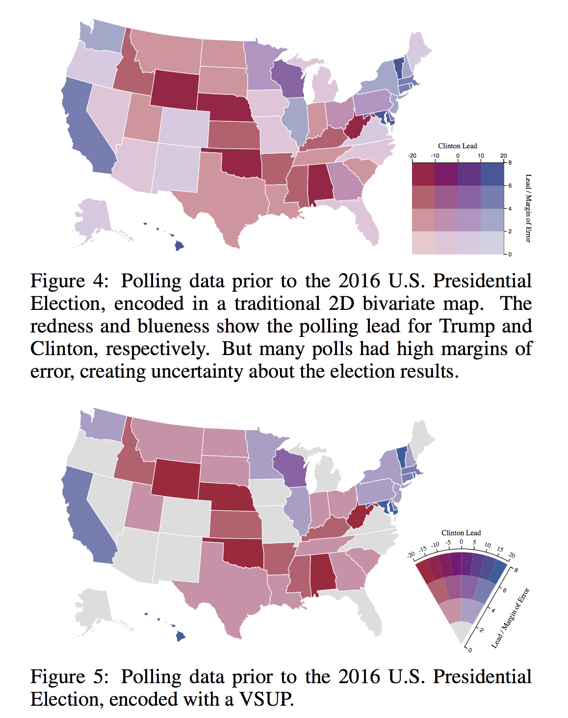
Visualizing uncertainty is one of the most challenging tasks in data visualization. Uncertain
via Value-Suppressing Uncertainty Palettes – UW Interactive Data Lab – Medium
-
Investigating Seasonality in a Time Series: A Mystery in Three Parts
August 12, 2018Excellent piece (part one of three) about time series analysis by my colleague Carly Stambaugh
-

Me
July 26, 2018 -
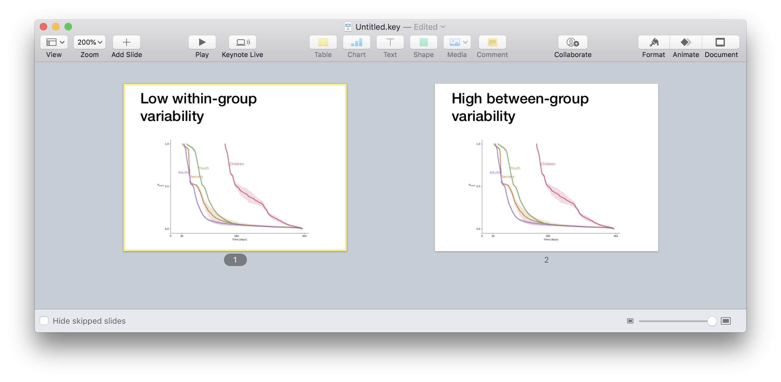
Evolution of a complex graph. Part 1. What do you want to say?
July 23, 2018From time to time, people ask me for help with non-trivial data visualization tasks. A couple of weeks ago, a friend-of-a-friend-of-a-friend showed me a set of graphs with the following note:
Each row is a different use case. Each use case was tested on three separate occasions – columns 1,2,3. We hope to show that the lines in each row behave similarly, but that there are differences between the different rows.
Before looking at the graphs, note the last sentence in the above comment. Knowing what you want to show is an essential and not trivial part of a data visualization task. Specifying what is it precisely that you want to say is the first required task in any communication attempt, technical or not.
For the obvious reasons, I cannot share the original graphs that that person gave me. I managed to re-create the spirit of those graphs using a combination of randomly generated arrays.
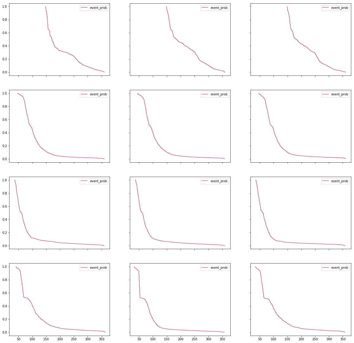
Notice how the X- and Y- axes are aligned between all the subplots. Such alignment is a smart move that provides a shared scale and allows faster and more natural comparison between the curves. You should always try aligning your axes. If aligning isn’t possible, make sure that it is absolutely, 100%, clear that the scales are different. Slight differences are very confusing.
There are several small things that we can do to improve this graph. First, the identical legends in every subplot are a useless waste of ink and thus, of your viewers’ processing power. Since they are identical, these legends do nothing but distracting the viewer. Moreover, while I understand how a variable name such as
event_probappeared on a graph, showing such names outside technical teams is a bad practice. People who don’t share intimate knowledge with the underlying data will find human-readable labels easier to comprehend, making your message “stickier.”
Let’s improve the signal-to-noise ratio of this plot.
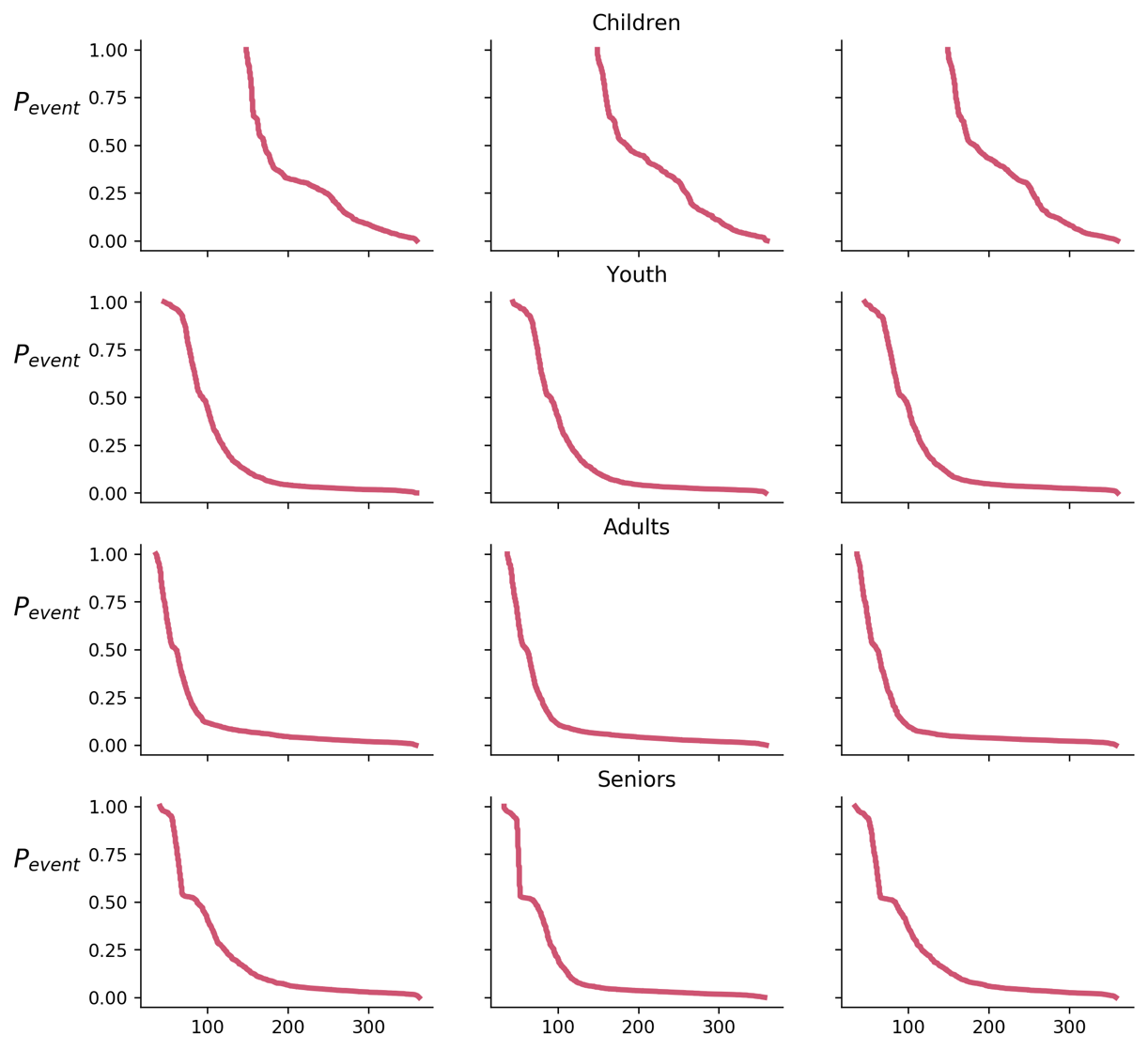
According to our task, each row is a different use case. Notice that I accompanied each row with a human-readable label. I didn’t use cryptic code such as
group_001,age_0_10or the such.
Now, let’s go back to the task specification. “We hope to show that the lines in each row behave similarly, but that there are differences between the separate rows.” Remember my advice to always use conclusions as graph titles? Let’s test how such a title will look like
Really? Is there a better way to justify the title? I claim that there is.
Let’s experiment a little bit. What will happen if we will plot all the lines on the same graph? By doing so, we might create a stronger emphasize of the similarities and the differences.
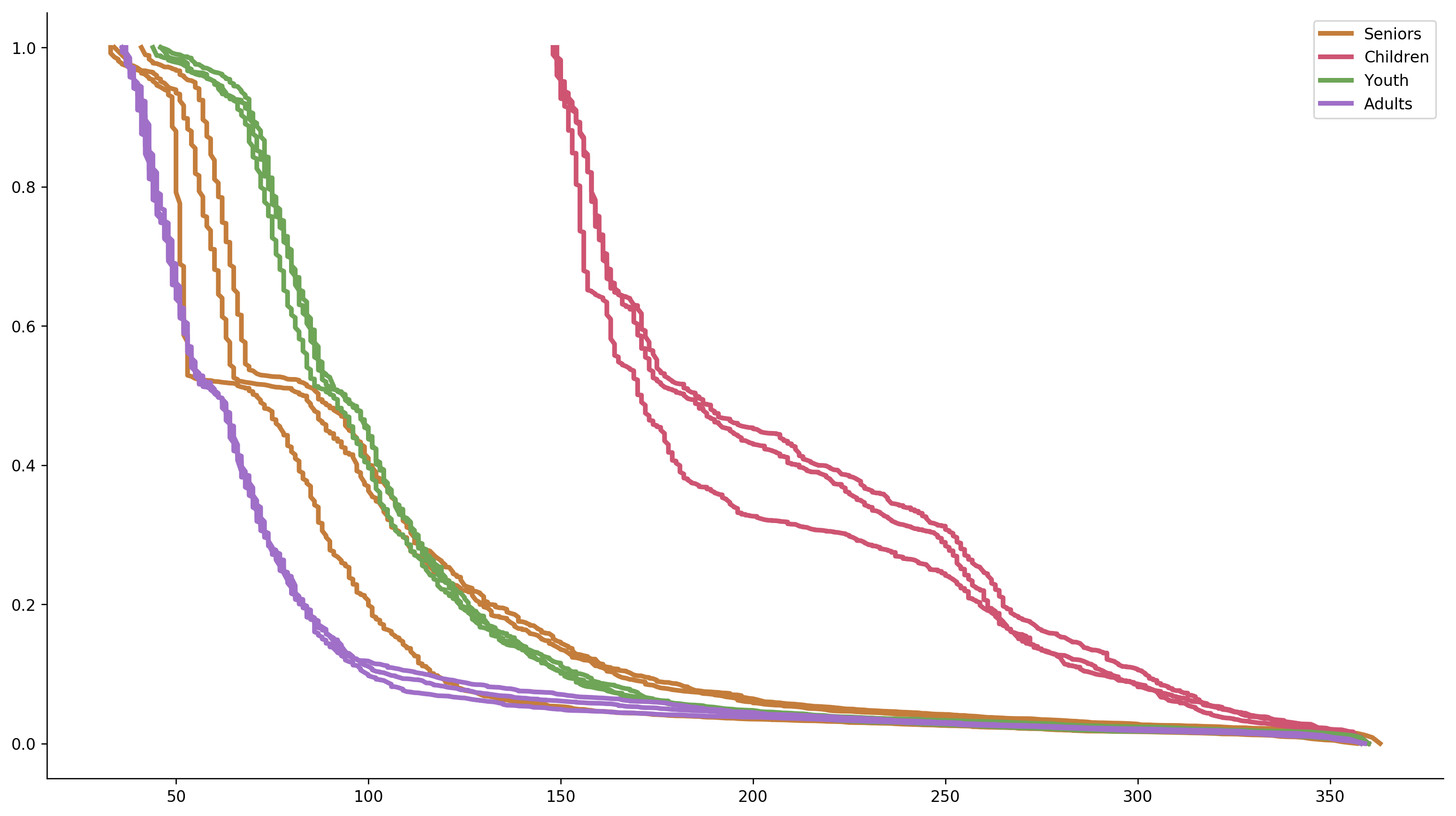
Not bad. The separate lines create some excessive noise, and the legend isn’t the best way to label multiple lines, so let’s improve the graph even further.
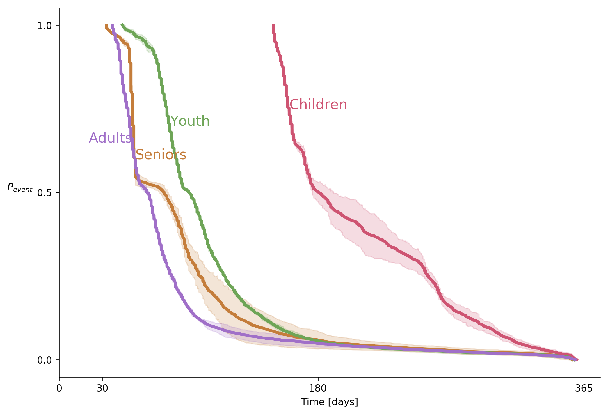
Note that meaningful ticks on the X-axis. The 30, 180, and 365-day marks provide useful anchors.
Now, let us go back to our title. “Low intra- and high inter- group variability” is, in fact, two conclusions. If you have ever read any text about technical presentations, you should remember the “one point per slide” rule. How do we solve this problem? In cases like these, I like to use the same graph in two different slides, one for each conclusion.
During a presentation, I would show this graph with the first conclusion as a title. I would talk about the implications of that conclusion. Next, I will say “wait! There is more”, will promote the slide and start talking about the second conclusion.
To sum up,
First, decide what is it that you want to say. Then ask whether your graph says what you want to say. Next, emphasize what you want to say, and finally, say what you want to say.
To be continued
The case that you see in this post is a relatively easy one because it only compares four groups. What will happen if you will need to compare six, sixteen or sixty groups? I will try answering this question in one of my next posts
-
Hugo the cat
July 5, 2018[gallery ids=”2190,2189” type=”rectangular” link=”none”]
-

C for Conclusion
June 25, 2018From time to time, I give a lecture about most common mistakes in data visualization. In this lection, I say that not adding a graph’s conclusion as a title is an opportunity wasted
In one of these lectures, a fresh university graduate commented that in her University, she was told to never write a conclusion in a graph. According to to the logic she was tought, a scientist is only supposed to show the information, and let his or her peer scientists draw the conclusions by themselves. This sounds like a valid demand except that it is, in my non-humble opinion, wrong. To understand why is that, let’s review the arguments in favor of spelling out the conclusions.
The cynical reason
We cannot “unlearn” how to read. If you show a piece of graphic for its aesthetic value, it is perfectly OK not to suggest any conclusions. However, most of the time, you will show a graph to persuade someone, to convince them that you did a good job, that your product is worth investing in, or that your opponent is ruining the world. You hope that your audience will reach the conclusion that you want them to reach, but you are not sure. Spelling out your conclusion ensures that the viewers use it as a starting point. In many cases, they will be too lazy to think of objections and will adopt your point of view. You don’t have to believe me on this one. The Nobel Prize winner Daniel Kahneman wrote a book about this phenomenon.
What if you want to hear genuine criticism? Use the same trick to ask for it. Write an open question instead of the conclusion to ensure everybody wakes up and start thinking critically.
The self-discipline reason
Some people are not comfortable with the cynical way I suggest to exploit the limitations of the human mind. Those people might be right. For them, I have another reason, self-discipline. Coming up with a short, concise and descriptive title requires effort. This effort slows you down and ensures that you start thinking critically and asking questions. “What does this graph really tells?” “Is this the best way to demonstrate this conclusion?” “Is this conclusion relevant to the topic of my talk, is it worth the time?”. These are very important questions that someone has to ask you. Sure, having a professional and devoted reviewer on your prep team is great but unless you are a Fortune-500 CEO, you are preparing your presentations by yourself.
The philosophical reason
You will notice that my two arguments sound like a hack. They do not talk about the “pure science attitude”, and seem to be detached from the theoretical picture of the idealized scientific process. That is why, when that student objected to my suggestion, I admitted defeat. Being a data scientist, I want to feel good about my scientific practice. It took me a while but at some point, I realized that writing a conclusion as the sole title of a graph or a slide is a good scientific practice and not a compromise.
According to the great philosopher Karl Popper, a mandatory characteristic of any scientific theory is that they make claims that future observations might show to be false. Popper claims that without taking a risk of being proved wrong, a scientist misses the point [ref]. And what is the best way to make a clear, risky statement, if not spelling it out as a clear, non-ambiguous title of your graph?
Don’t feel bad, your bases are covered
To sum up, whenever you create a graph or a slide, think hard about what conclusion you want your audience to make out of it. Use this conclusion as your title. This will help you check yourself, and will help your fellow scientists assess your theory. And if a purist professor says you shouldn’t write your conclusions, tell him or her that the great Karl Popper thought otherwise.
-
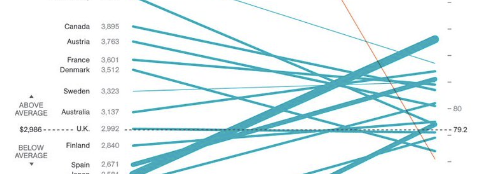
Meaningless slopes
June 20, 2018That fact that you can doesn’t mean that you should! I will say it once again.That fact that you can doesn’t mean that you should! Look at this slopegraph that was featured by “Information is Beautiful”
https://twitter.com/infobeautiful/status/994510514054139904
What does it say? What do the slopes mean? It’s a slopegraph, its slopes should have a meaning. Sure, you can draw a line between one point to another but can you see the problem here? In this nonsense graph, the viewer is invited to look at slopes of lines that connect dollars with years. The proverbial “apples and oranges” are not even close to the nonsense degree of this graph. Not even close.
Thispage attributes this graph to National Geographic, which makes me even sadder.
- Older posts Newer posts