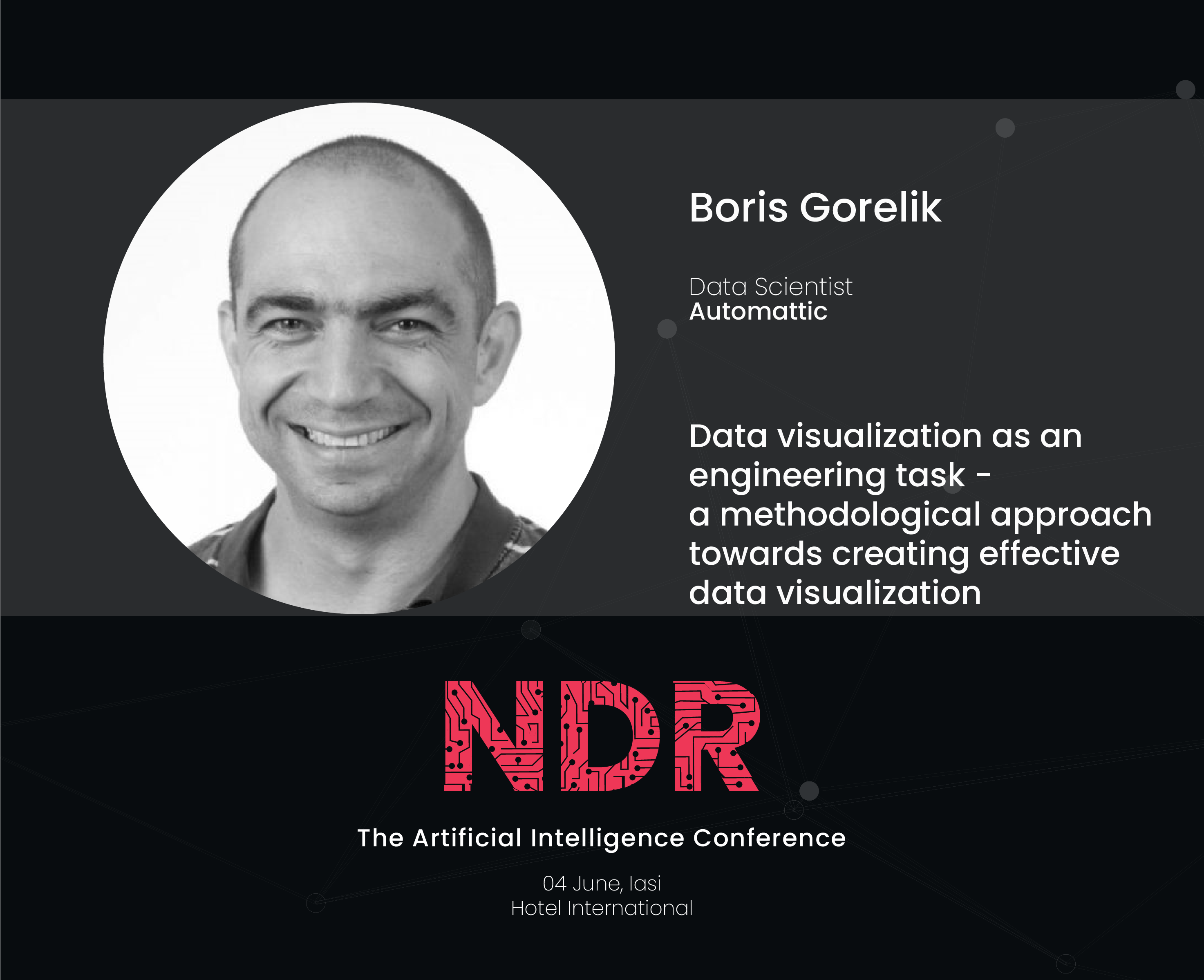
TL/DR: Studying data science is OK as long as you know that it’s only a starting point.
Almost two years ago, I wrote a post titled “Don’t study data science as a career move.” Even today, this post is the most visited post on my blog. I was reminded about this post a couple of days ago during a team meeting in which we discussed what does a “data scientist” mean today. I re-read my original post, and I think that I was generally right, but there is a but…
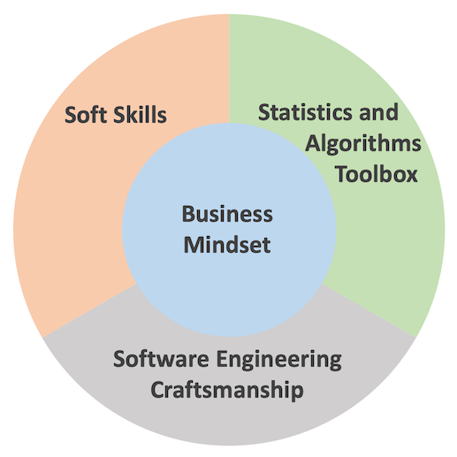
The term “data science” was born as an umbrella term that meant to describe people who know programming, statistics, and business logic. We all saw those numerous Venn diagrams that tried to describe the perfect data scientist. Since its beginning, the field of “data science” has finally matured. There are more and more people that question the mere definition of data science.
Here’s what an entrepreneur Chuck Russel has to say:
Now don’t get me wrong — some of these folks are legit Data Scientists but the majority is not. I guess I’m a purist –calling yourself a scientist indicates that you practice science following a scientific method. You create hypotheses, test the hypothesis with experimental results and after proving or disproving the conjecture move on or iterate.
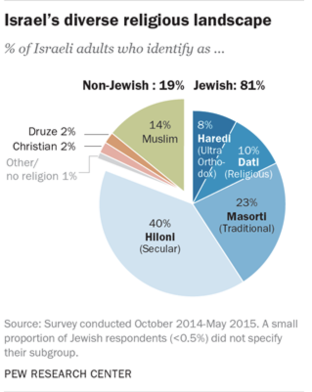
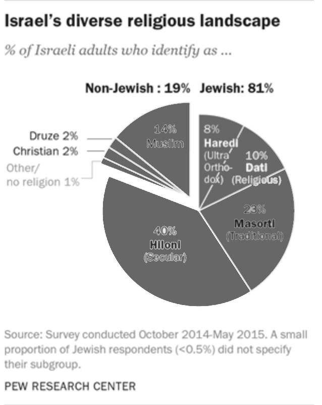
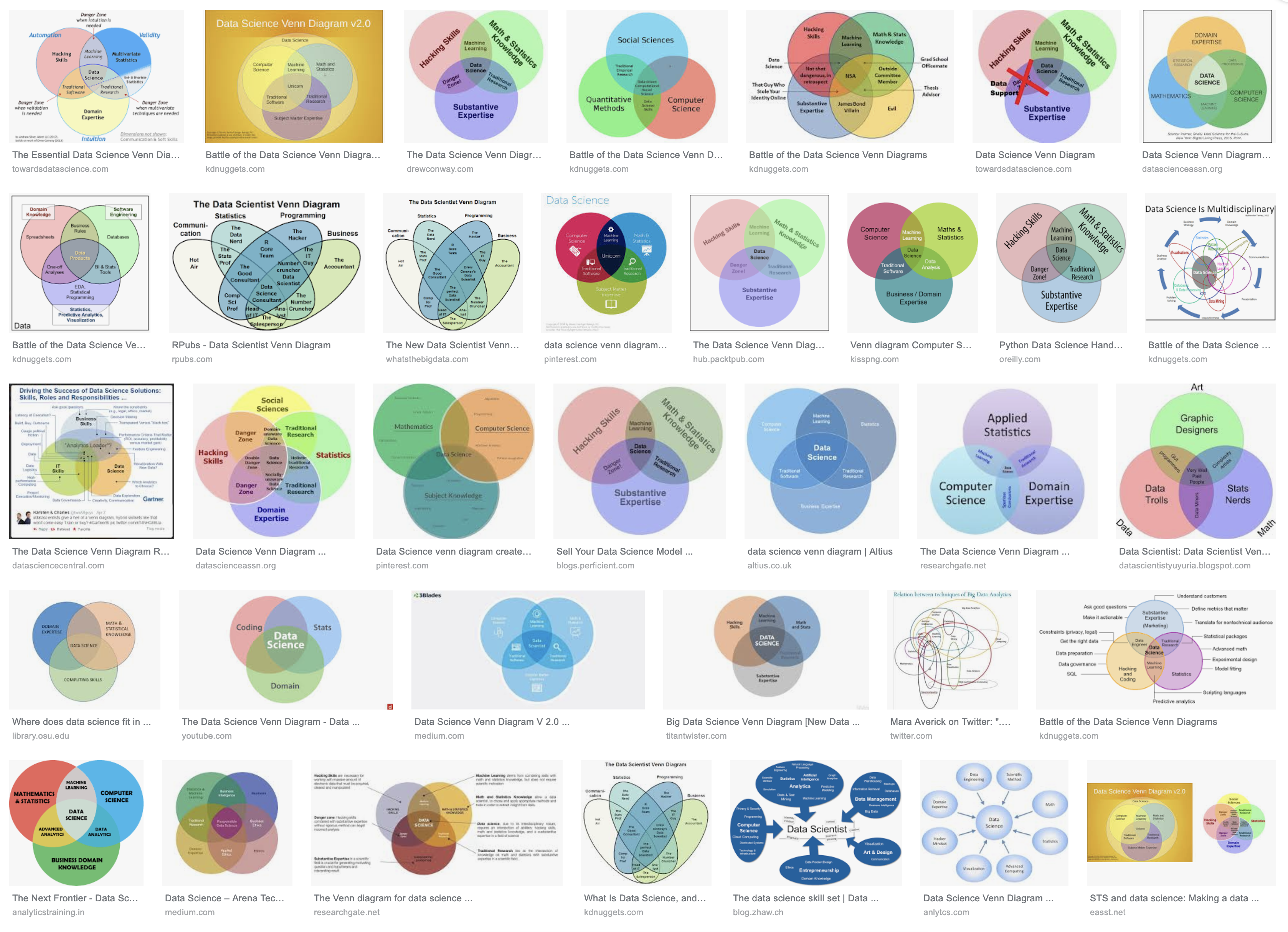 There can’t be enough Venn diagrams
Now, “create and test hypotheses” is a very vague requirement. After all, any A/B test is a process of “creating and testing hypotheses” using data. Is anyone who performs A/B tests a data scientist? I think not.
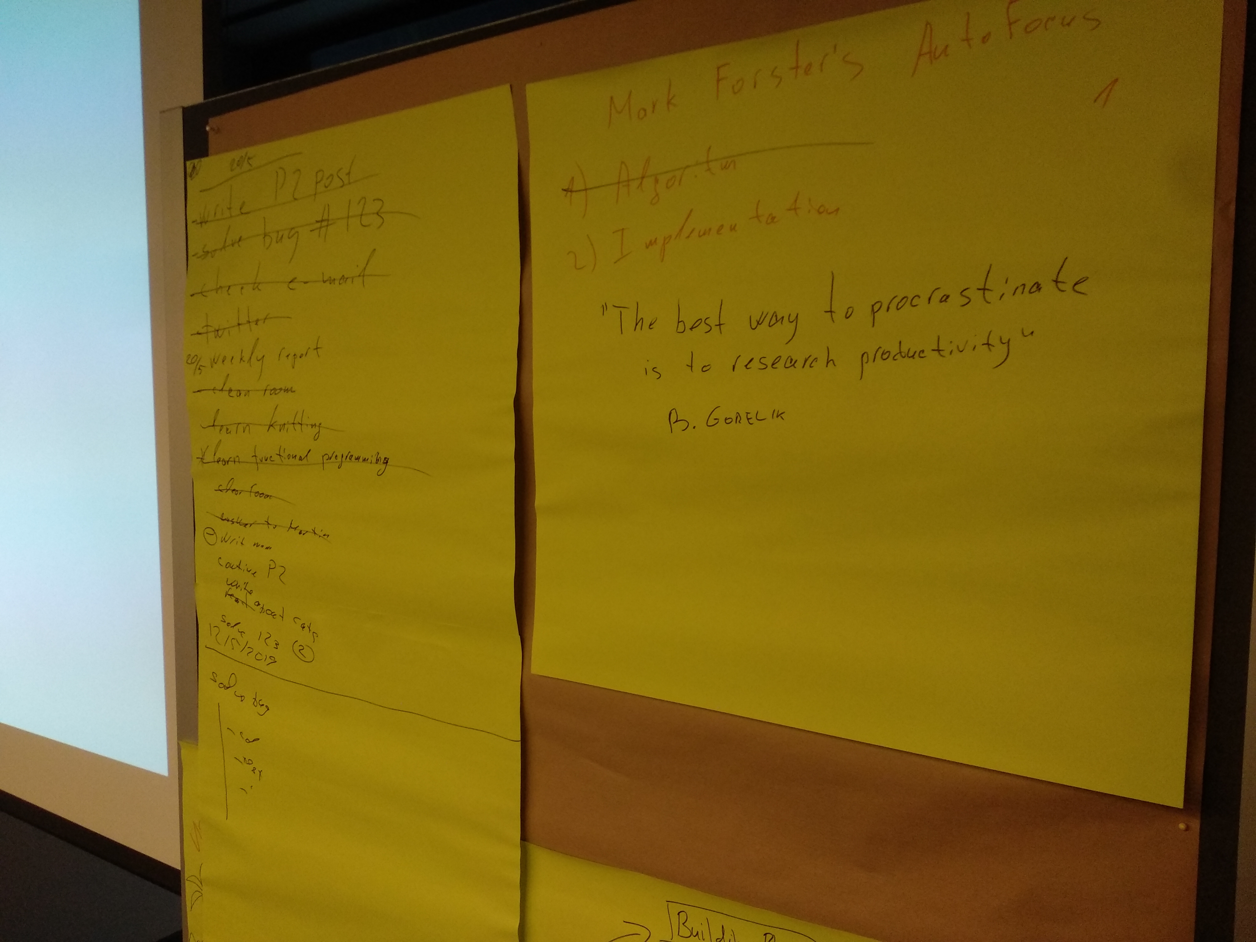
Moreover, a couple of years ago, if you wanted to run an A/B test, perform a regression analysis, build a classifier, you would have to write numerous lines of code, debug and tune it. This tedious and intriguing process certainly felt very “sciency,” and if it worked, you would have been very proud of our job. Today, on the other hand, we are lucky to have general-purpose tools that require less and less coding. I don’t remember the last time I had to implement an analysis or an algorithm from the first principles. With the vast amount of verified tools and libraries, writing an algorithm from scratch feels like a huge waste of time.
On the other hand, I spend more and more time trying to understand the “business logic” that I try to improve: why has this test fail? Who will use this algorithm and what will make them like the results? Does effort justify the potential improvement?
I (a data scientist) have all this extra time to think of a business logic thanks to the huge arsenal of generalized tools to choose from. These tools were created mostly by those data scientists whose primary job is to implement, verify, and tune algorithms. My job and the job of these data scientists is different and requires different sets of skills.
There is another ever-growing group of professionals who work hard to make sure someone can apply all those algorithms to any amount of data they feel suitable. These people know that any model is at most as good as the data it is based on. Therefore, they build systems that deliver the right information on time, distribute the data among computation nodes, and make sure no crazy “scientist” sends a production server to a non-responsive state due to a bad choice of parameters. We already have a term for professionals whose job is to build fail-proof systems. We call them engineers, or “data engineers” in this case.
The bottom line
Up till now, I mentioned three major activities that used to be covered by the data science umbrella: building new algorithms, applying algorithms to business logic, and engineering reliable data systems. I’m sure there are other areas under that umbrella that I forgot. In 2019, we reached the point where one has to decide what field of data science does one want to practice. If you consider stying data science think of it as studying medicine. The vast majority of physicians don’t end up general practitioners but rather invest at least five more years of their lives professionalize. Treat your data science studies as an entry ticket into the life-long learning process, and you’ll be OK. Otherwise, (I’mciting myself here): You might end up a mediocre Python or R programmer who can fiddle with the parameters of various machine learning libraries, one of the many. Sometimes it’s good enough. Frequently, it’s not.
PS. Here’s a one-week-old article on Forbes.com with very similar theses: link.


 A fragment from an 1850 painting by the Russian Armenian marine painter Ivan Aivazovsky named “The Ninth Wave.” I wonder what the “ninth wave data scientist” will be.