• Pseudo-rehearsal: A simple solution to catastrophic forgetting for NLP

    Pseudo-rehearsal: A simple solution to catastrophic forgetting for NLP

    October 2, 2017

    Frequently, training a machine learning model in a single session is impossible. Most commonly, this happens when one needs to update a model with newly obtained observations. The generic term for such an update is “online learning.” In the scikit-learn world, this concept is also known as partial fit. The problem is that some models or their implementations don’t allow for partial fit. Even if the partial fitting is technically possible, the weight assigned to the new observations is may not be under your control. What happens when you re-train a model from scratch, or when the new observations are assigned too high weights? Recently, I stumbled upon an interesting concept of Pseudo-rehearsal that addresses this problem. Citing Matthew Honnibal:

    Sometimes you want to fine-tune a pre-trained model to add a new label or correct some specific errors. This can introduce the “catastrophic forgetting” problem. Pseudo-rehearsal is a good solution: use the original model to label examples, and mix them through your fine-tuning updates.

    This post is written by Matthew Honnibal from the team behind the excellent Spacy NLP library. This post is valuable in many aspects. First, it demonstrates a simple-to-implement technique. More importantly, it provides the True Name for a problem I encounter from time to time: Catastrophic forgetting.

    Featured image is by Flickr user Herr Olsen under CC-by-nc-2.0


    October 2, 2017 - 1 minute read -
    machine learning blog
  • 16-days work month — The joys of the Hebrew calendar

    16-days work month — The joys of the Hebrew calendar

    September 27, 2017

    Tishrei is the seventh month of the Hebrew calendar that starts with Rosh-HaShana — the Hebrew New Year. It is a 30 days month that usually occurs in September-October. One interesting feature of Tishrei is the fact that it is full of holidays: Rosh-HaShana (New Year), Yom Kippur (Day of Atonement), first and last days of Sukkot (Feast of Tabernacles) **. All these days are rest days in Israel. Every holiday eve is also a *de facto rest day in many industries (high tech included). So now we have 8 resting days that add to the usual Friday/Saturday pairs, resulting in very sparse work weeks. But that’s not all: the period between the first and the last Sukkot days are mostly considered as half working days. Also, the children are at home since all the schools and kindergartens are on vacation, so we will treat those days as half working days in the following analysis.

    I have counted the number of business days during this 31-day period (one day before the New Year plus the entire month of Tishrei) between 1993 and 2020 CE, and this is what we get:

    tishrei_working_days

    Overall, this period consists of between 15 to 17 non-working days in a single month (31 days, mind you). This is how the working/not-working time during this month looks like this:

    tishrei_workign_weeks.png

    Now, having some vacation is nice, but this month is absolutely crazy. There is not a single full working week during this month. It is very similar to constantly interrupted work day, but at a different scale.

    So, next time you wonder why your Israeli colleague, customer or partner barely works during September-October, recall this post.

    (*) New Year starts in the seventh’s month? I know this is confusing. That’s because we number Nissan – the month of the Exodus from Egypt as the first month.
    (**)If you are an observing Jew, you should add to this list Fast of Gedalia, but we will omit it from this discussion

    September 27, 2017 - 2 minute read -
    Israel blog
  • On data beauty and communication style

    On data beauty and communication style

    August 18, 2017

    There’s an interesting mini-drama going on in the data visualization world. The moderators of DataIsBeautiful invited Stephen Few for an ask-me-anything (AMA) session. Stephen Few is a data visualization researcher and an opinionated blogger. I use his book “Show Me the Numbers” when I teach data visualization. Both in his book and even more so, on his blog, Dr. Few is not afraid of criticizing practices that fail to meet his standards of quality. That is why I wasn’t surprised when I read Stephen Few’s public response to the AMA invitation:

    I stridently object to the work of lazy, unskilled creators of meaningless, difficult to read, or misleading data displays. … Many data visualizations that are labeled “beautiful” are anything but. Instead, they pander to the base interests of those who seek superficial, effortless pleasure rather than understanding, which always involves effort.

    This response triggered some backlash. Randal Olson (a prominent data scientists and a blogger, for example, called his response “petty”:

    https://twitter.com/randal_olson/status/898244310600228865

    I have to respectfully disagree with Randy. Don’t get me wrong. Stephens Few’s response style is indeed harsh. However, I have to agree with him. Many (although not all) data visualization cases that I saw on DataIsBeatiful look like data visualization for the sake of data visualization. They are, basically, collections of lines and colors that demonstrate cool features of plotting libraries but do not provide any insight or tell any (data-based) story. From time to time, we see pieces of “data art,” in which the data plays a secondary role, and have nothing to do with “data visualization” where the data is the “king.” I don’t consider myself an artistic person, but I don’t appreciate the “art” part of most of the data art pieces I see.

    So, I do understand Stephen Few’s criticism. What I don’t understand is why he decided to pass the opportunity to preach to the best target audience he can hope for. It seems to me that if you don’t like someone’s actions and they ask you for advice, you should be eager to give it to them. Certainly not attacking them. Hillel, an ancient Jewish scholar, said

    He who is bashful can’t learn, and he who is harsh can’t teach

    Although I don’t have a fraction of teaching experience that Dr. Few has, I’m sure he would’ve achieved better results had he chosen to accept that invitation.

    Disclaimer: Stephen Few was very generous to allow me using the illustrations from his book in my teaching.

    August 18, 2017 - 2 minute read -
    argument Data Visualization dataviz teaching blog
  • Accepting payments on a WordPress.com site? Easy!

    Accepting payments on a WordPress.com site? Easy!

    August 18, 2017

    This is an exciting feature available to any WordPress.com Premium and Business users, and on Jetpack sites running version 5.2 or higher. The button looks like this:

    [simple-payment id=”757”]

    This page has all the information you need to know about the PayPal button.

    August 18, 2017 - 1 minute read -
    blogging feature wordpress-com blog
  • On procrastination

    On procrastination

    August 17, 2017

    I don’t know anyone, except my wife, who doesn’t consider themselves procrastinator. I procrastinate a lot. Sometimes, when procrastinating, I read about procrastination. Here’s a list of several recent blog posts about this topic. Read these posts if you have something more important to do*.

    procrastination_quote

    An Ode to the Deadlines competes with An Ode to Procrastination.

    I’ll Think of a Title Tomorrow Talks about procrastination from a designer’s point of view. Although it is full of known truths, such as “stop thinking, start doing”, “fear is the mind killer”, and others, it is nevertheless a refreshing reading.

    The entire blog called Unblock Results is written by Nancy Linnerooth who seems to position herself as a productivity coach. I liked her last post The Done ListThe Done List that talks about a nice psychological trick of running Done lists instead of Todo lists. This trick plays well with the productivity system that I use in my everyday life. One day, I might describe my system in this blog.

    We all know that reading can sometimes be hard. Thus, let me suggest a TED talk titled Inside the mind of a master procrastinator. You’ll be able to enjoy it with a minimal mental effort.


    *The pun is intended
    Featured image is by Flickr user Vic under CC-by-2.0 (cropped)
    The graffiti image is by Flickr user katphotos under CC-by-nc-nd

    August 17, 2017 - 2 minute read -
    procrastination productivity blog Productivity & Procrastination
  • Fashion, data, science

    Fashion, data, science

    August 16, 2017

    Zalando is an e-commerce company that sells shoes, clothing and other fashion items. Zalando isn’t a small company. According to Wikipedia, it’s 2015 revenue was almost 3 billion Euro. As you might imagine, you don’t run this kind of business without proper data analysis. Recently, we had Thorsten Dietzsch, a product manager for personalization at the fashion e-commerce at Zalando, joining our team meeting to tell us about how data science works at Zalando. It was an interesting conversation, which is now publically available online.

    [wpvideo 9BSbPlBe]

    In the first of our Data Speaker Series posts, Thorsten Dietzsch shares how data products are managed at Zalando, a fashion ecommerce company.

    via Data Speaker Series: Thorsten Dietzsch on Building Data Products at Zalando — Data for Breakfast

    Featured image: By Flickr user sweetjessie from here. Under the CC BY-NC 2.0 license

    August 16, 2017 - 1 minute read -
    data science fashion industry blog
  • Anomaly detection in time series — now the video

    Anomaly detection in time series — now the video

    August 14, 2017

    Two months ago, on the PyCon-IL conference, I gave a lecture called “Time Series Analysis: When “Good Enough” is Good Enough”. You may find the written version of this talk here. Today, the conference organizers published all the conference talks on YouTube. Here’s mine:

    https://youtu.be/UwkNmXhWmfI?t=15s

    August 14, 2017 - 1 minute read -
    a2f2 anomaly-detection conference presenting talking video blog
  • Эээх-ухнем. Как не забросить свой блог

    Эээх-ухнем. Как не забросить свой блог

    August 12, 2017

    Как это не печально, большинство начинающих блоггеров забрасывают свой блог вскоре после его открытия. Что отличает успешных (стойких?) блоггеров от тех, которым не удаётся продержаться? Стоит ли вести коллективные блоги, и если да, как важно распределение труда между авторами?
    В этой лекции мы попытаемся пролить свет на эти вопросы, анализируя поведение более пяти миллионов пользователей WordPress.com.

    Слайды презентации находятся здесь.

    По этой ссылке находится пост на английском, который я написал, когда впервые опубликовал результаты этого исследования.

    August 12, 2017 - 1 minute read -
    blogging research blog
  • This Week in Data Reading

    This Week in Data Reading

    July 26, 2017
    July 26, 2017 - 1 minute read -
    blog
  • Avoiding being a 'trophy' data scientist

    Avoiding being a 'trophy' data scientist

    July 24, 2017

    In this excellent post, Peadar Coyle lists several anti-patterns in running a data science team. This is an excellent post to read (and a blog to follow).

    July 24, 2017 - 1 minute read -
    blog
  • A successful failure

    A successful failure

    July 23, 2017

    Almost half a year ago, I decided to create an online data visualization course. After investing hundreds of hours, I managed to release the first lecture and record another one. However, I decided not to publish new lectures and to remove the existing one from the net. Why? The short answer is a huge cost-to-benefit ratio. For a longer answer, you will have to keep reading this post.

    Why creating a course?

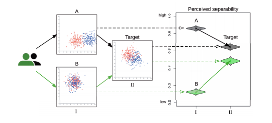
    It’s not that there are no good courses. There are. However, most of them are tightly coupled with one tool or another. Moreover, many of the courses I have reviewed online are act as an advanced tutorial of a certain plotting tool. The course that I wanted to create was supposed to be tool-neutral, full of theoretical knowledge and bits of practical advice. Another decision that I made was not to write a set of text files (online book, set of Jupyter notebooks, whatever) but to create a course in which the majority of the knowledge is brought to the audience by the means of frontal video lectures. I assumed that this kind of format will be the easiest for the audience to consume.

    What went wrong?

    So, what went wrong? First of all, you should remember that I work full time at Automattic, which means that every side project is a … side project, that I have to do during my free time. I realized that since the very beginning. However, since I already teach data visualization in different institutions in Israel, I already have a well-formed syllabus with accompanying slide decks full of examples. I assumed that it will take me not more than one hour to prepare every online lecture.

    [caption id=”attachment_630” align=”alignright” width=”225”]Green screen and a camera in a typical green room setup

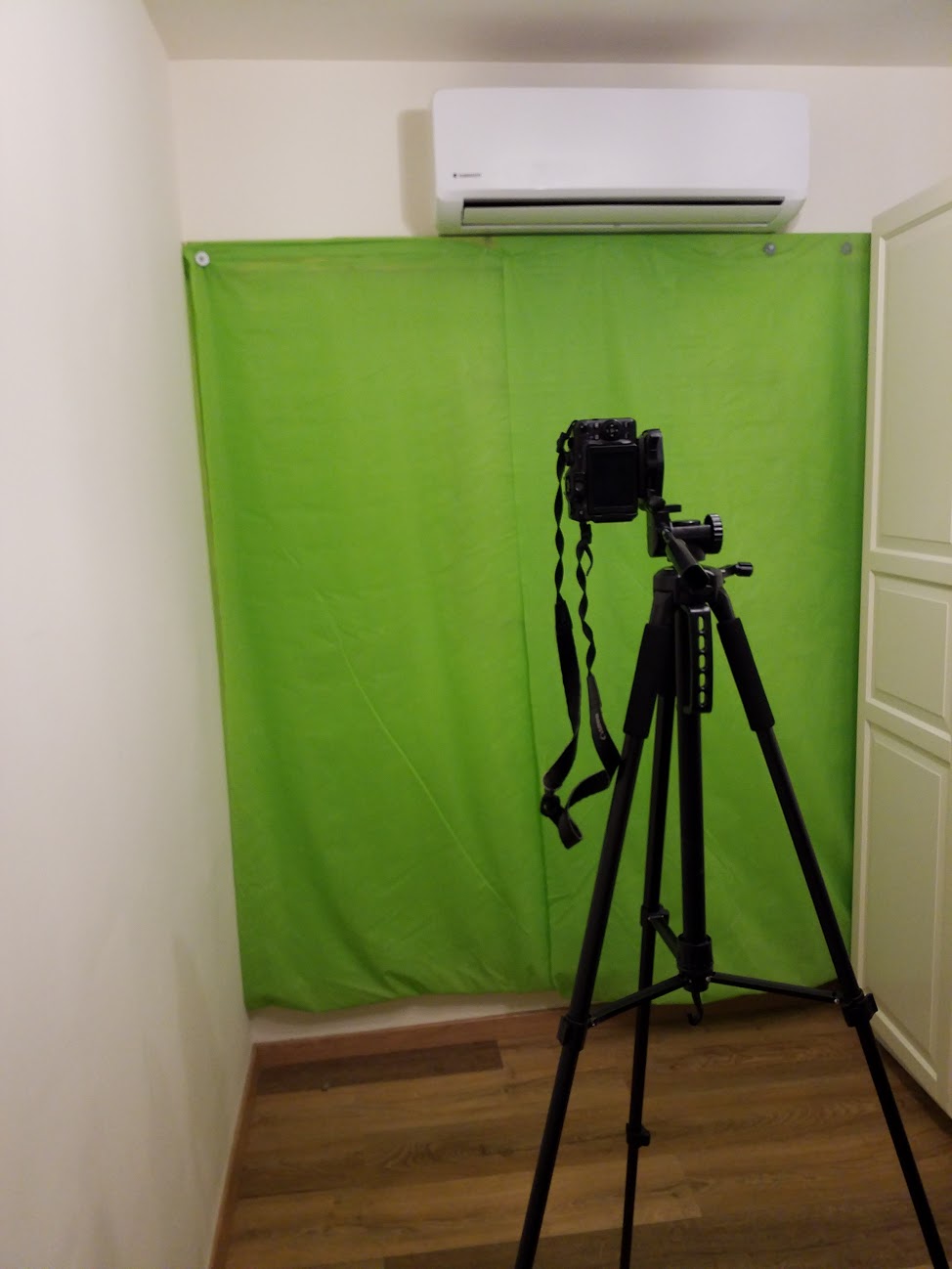
    Green room. All my friends were very impressed to see it[/caption]

    So, instead of verifying this assumption, I started solving the technical problems, such as buying a nice microphone (which turned out to be a crap), tripods, building a green room in my home office, etc. Once I was satisfied with my technical setup, I decided to record a promo video. Here, I faced a big problem. You see, talking to people and to the camera are completely different things. I feel pretty comfortable talking to people but when I face the camera, I almost freeze. Also, in person-to-person communication, we are somewhat tolerant to small studdering and longish pauses. However, when watching recorded video clips, we expect television quality narration. It turns out that achieving this kind of narration is very hard. Add the fact that English is my third language, and you get a huge time drain. To be able to record a two-minute promo video, I had to write the entire script, rehearse it for a dozen of times, and record it in front of a teleprompter. The filming session alone took around half an hour, as I had to repeat almost every line, time after time.

    [caption id=”attachment_648” align=”alignright” width=”300”]
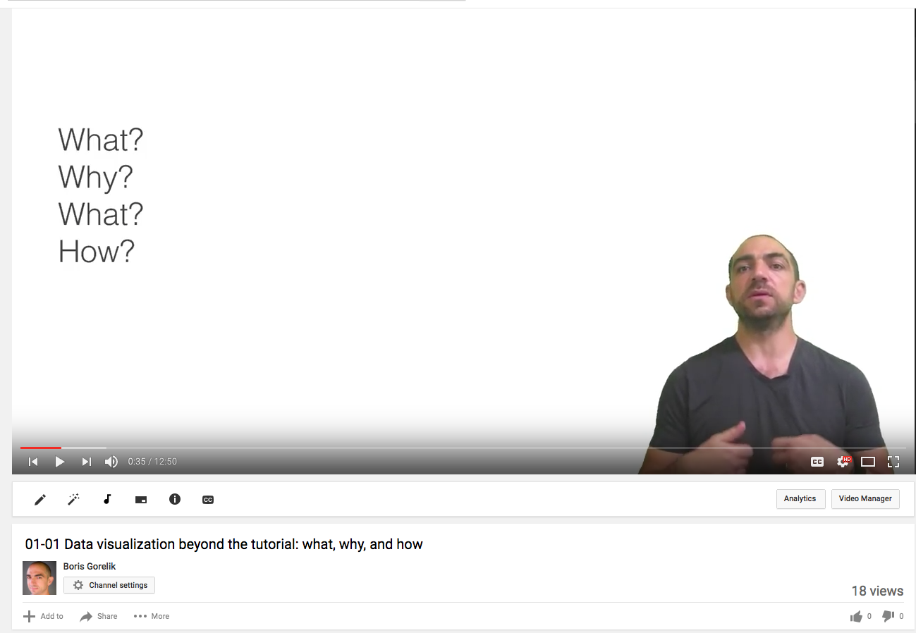
Screenshot of my YouTube video with 18 views

    18 views.[/caption]

    Preparing slide decks for the lectures wasn’t an easy task either. Despite the fact that I had pretty good slide decks, I realized that they are good for an in-class lecture, where I can point to the screen, go back and forth within a presentation, open external URL’s etc. Once I had my slide decks ready, I faced the narration problem once again. So, I had to write the entire lesson’s script, edit it, rehearse for several days, and shoot. At this time, I became frustrated. I might have been more motivated had my first video received some real traffic. However, with 18 (that’s eighteen) views, most of which lasted not more than a minute or two, I hardly felt a YouTube super star. I know that it’s impossible to get a real traction in such a short period, without massive promotion. However, after I completed shooting the second lecture, I realized that I will not be able to do it much longer. Not without quitting my day job. So, I decided to quit.

    What now?

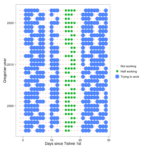
    Since I already have pretty good texts for the first two lectures, I might be able to convert them to posts in this blog. I also have material for some before-and-after videos that I planned to have as a part of this course. I will make convert them to posts, too, similar to this post on the data.blog.

    Was it worth it?

    It certainly was! During the preparations, I learned a lot. I learned new things about data visualization. I took a glimpse into the world of video production. I had a chance to restructure several of my presentations.


    Featured image for this post by Nicolas Nova under the CC-by license.

    July 23, 2017 - 4 minute read -
    advice Data Visualization dataviz failure online-education blog
  • The first lesson of the data visualization course is available

    The first lesson of the data visualization course is available

    July 7, 2017

    The first lesson of the course Data Visualization Beyond the Tutorial is online! Go to the lesson page to watch the lesson video. There’s also an assignment!

    Do you know a friend, a colleague, a classmate who needs to communicate numbers as part of their works? Let them know about this course. They will thank you :-)

    https://youtu.be/N54OeCNTaLU

    July 7, 2017 - 1 minute read -
    course Data Visualization data-visualization-beyond-the-tutorial tutorial blog
  • Correction about the course start date

    Correction about the course start date

    June 27, 2017

    The first lecture of the data visualization course will be published on July 7 (7/7/17). There was a typo in the original announcement.

    June 27, 2017 - 1 minute read -
    course Data Visualization data-visualization-beyond-the-tutorial dataviz teaching blog
  • I have created an online data visualization course

    I have created an online data visualization course

    June 26, 2017

    Free online course. Data Visualization Beyond the Tutorial. https://gorelik.net/course

    If you create charts using your tool’s default settings and your intuition, chances are you’re doing it wrong.

    Let me present you an online course that dives into the theory of data visualization and its practical aspects. Every lecture is accompanied by before & after case studies and learner assignments. The course is tool-neutral. It doesn’t matter if you use Python, R, Excel, or pen, and paper.

    The first lecture will be published on July 7th. Future lectures will follow every two weeks. Meanwhile, you may visit the course page and watch the intro video. Follow this blog so that you don’t miss new lectures!

    Please spread the word! Reblog this post, share it on Twitter (@gorelik_boris), Facebook, LinkedIn or any other network. Tell about this course to your colleagues and friends. The more learners will take this course, the happier I will be.

    June 26, 2017 - 1 minute read -
    course Data Visualization data-visualization-beyond-the-tutorial dataviz teaching blog
  • Data is NOT the new gold

    Data is NOT the new gold

    June 18, 2017

    A couple of days ago, I read the excellent post by Bob Rudis about data ethics and the importance of keeping users’ data safe. In this post, Bob recited the mantra I have heard for the past several years that “data is the new gold.” Comparing something to gold implies that it is scarce, unchangeable and has zero utility value. Data is neither, it’s ubiquitous, ever-changing and has some utility value of its own.

    I think that oil (petroleum) is a better analogy for data. Much like the oil, data has some utility value by itself but is most valuable when properly distilled, processed and transformed.

    Regardless of the analogy, I highly recommend reading Bob Rudis’ post.

    I caught a mention of this project by Pete Warden on Four Short Links today. If his name sounds familiar, he’s the creator of the DSTK, an O’Reilly author, and now works at Google. A decidedly clever and decent chap. The project goal is noble: crowdsource and make a repository of open speech data for…

    via Keeping Users Safe While Collecting Data — rud.is

    June 18, 2017 - 1 minute read -
    ethics read-recommendation blog

  • "Deliver first, improve later"

    June 13, 2017

    This is the approach behind “minimal viable product”. It is also valid for data science solutions.

    June 13, 2017 - 1 minute read -
    blog
  • Time Series Analysis: When “Good Enough” is Good Enough

    Time Series Analysis: When “Good Enough” is Good Enough

    June 12, 2017

    My today’s talk at PyCon Israel in a post format.

    June 12, 2017 - 1 minute read -
    anomaly-detection conference machine learning talking blog
  • The strange loop in deep learning — a recommended reading

    The strange loop in deep learning — a recommended reading

    June 8, 2017

    https://medium.com/intuitionmachine/the-strange-loop-in-deep-learning-38aa7caf6d7d

    June 8, 2017 - 1 minute read -
    blog
  • Don't study data science as a career move; you'll waste your time!

    Don't study data science as a career move; you'll waste your time!

    May 29, 2017

    March 2019: Two years after the completion of this post I wrote a follow-up. Read it here.

    January 2020: Three years after the completion of this post, I realized that I wrote a whole bunch of career advices. Make sure you check this link that collects everything that I have to say about becoming a data scientist

    No, this account wasn’t hacked. I really think that studying data science to advance your career is wasting your time. Briefly, my thesis is as follows:

    • Data science is a term coined to bridge between problems and experts.
    • The current shortage of data scientists will go away, as more and more general purpose tools are developed.
    • When this happens, you’d better be an expert in the underlying domain, or in the research methods. The many programs that exist today are too shallow to provide any of these.

    To explain myself, let me start from a Quora answer that I wrote a year ago. The original question was:

    I am a pharmacist. I am interested in becoming a data scientist. My > interests are pharmacoeconomics and other areas of health economics. What do I need to study to become a data scientist?

    To answer this question, I described how I gradually transformed from a pharmacist to a data scientists by continuous adaptation to the new challenges of my professional career. In the end, I invited anyone to ask personal questions via e-mail (it’s boris@gorelik.net). Two days ago, I received a follow-up question:

    I would like to know how to learn data science. Would you suggest a master’s degree in analytics? Or is there another way to add “data scientist” label on my resume?

    Here’s my answer that will explain why, in my opinion, studying data science won’t give you job security.

    Data scientists are real. Data science isn’t.

    I think that while “data scientists” are real, “data science” isn’t. We, the data scientists, analyze data using the scientific methods we know and using the tools we mastered. The term “data scientist” was coined about five years ago for the job market. It was meant to help to bring the expertise and the positions together. How else would you explain a person who knows scientific analysis, machine learning, writes computer code and isn’t too an abstract thinker to understand the business need of a company? Before “data scientist,” there was a less catchy “dataist” http://www.dataists.com/. However, “data scientist” sounded better. It is only after the “data scientist” became a reality, people started searching for “data science.” In the future, data science may become a scientific field, similar to statistics. Currently, though, it is not mature enough. Right now, data science is an attempt to merge different disciplines to answer practical questions. Sometimes, this attempt is successful, which makes my life and the lives of many my colleagues so exciting.

    Hilary Mason, from whom I learned the term dataist Hilary Mason, from whom I learned the term “dataist”

    One standard feature of most if not all, the data science tasks is the requirement to understand the underlying domain. A data scientist in a cyber security team needs to have an understanding of data security, a bioinformatician needs to understand the biological processes, and a data scientist in a financial institution needs to know how money works.

    That is why, career-wise, I think that the best strategy is to study an applied field that requires data-intense solutions. By doing so, you will learn how to use the various data analysis techniques. More importantly, you will also learn how to conduct a complicated research, and how the analysis and the underlying domain interact. Then, one of the two alternatives will happen. You will either specialize in your domain and will become an expert; or, you will switch between several domains and will learn to build bridges between the domains and the tools. Both paths are valuable. I took the second path, and it looks like most of the today’s data scientists took that route too. However, sometimes, I am jealous with the specialization I could have gained had I not left computational chemistry about ten years ago.

    Who can use the “data scientist” title?

    Who can use the “data scientist” title? I started presenting myself as a “data scientist and algorithm developer” not because I passed some licensing exams, or had a diploma. I did so because I was developing algorithms to answer data-intense questions. Saying “I’m a data scientist” is like saying “I’m an expert,” or “I’m an analyst,” or “I’m a manager.” If you feel comfortable enough calling yourself so, and if you can defend this title before your peers, do so. Out of the six data scientists in my current team, we have a pharmacist (me), a physicist, an electrical engineer, a CS major, and two mathematicians. We all have advanced degrees (M.A. or Ph.D.), but none of us had any formal “data science” training. I think that the many existing data science courses and programs are only good for people with deep domain knowledge who need to learn the data tools. Managers can benefit from these courses too. However, by taking such a program alone, you will lack the experience in scientific methodology, which is central to any data research project. Such a program will not provide you the computer science knowledge and expertise to make you a good data engineer. You might end up a mediocre Python or R programmer who can fiddle with the parameters of various machine learning libraries, one of the many. Sometimes it’s good enough. Frequently, it’s not.

    You might end up a mediocre Python or R programmer who can fiddle with the parameters of various machine learning libraries, one of the many. Sometimes it’s good enough. Frequently, it’s not.

    Lessons from the past

    When I started my Ph.D. (in 2001), bioinformatics was HUGE. Many companies had bioinformatics departments that consisted of dozens, sometimes, hundreds of people. Every university in Israel (where I live), had a bioinformatics program. I knew at least five bioinformatics startups in my geographic area. Where is it now? What do these bioinformaticians do? I don’t know any bioinformatician who kept their job description. Most of those who I know transformed into data science, some became managers. Others work as governmental clerks.

    The same might happen to data science. Two years ago, Barb Darrow from the Fortune magazine wrote quoting industry experts:

    Existing tools like Tableau have already sweated much of the complexity out of the once-very-hard task of data visualization, said Raghuram. And there are more higher-level tools on the way … that will improve workflow and automate how data interpretations are presented. “That’s the sort of automation that eliminates the need for data scientists to a large degree,” … And as the technology solves more of these problems, there will also be a lot more human job candidates from the 100 graduate programs worldwide dedicated to churning out data scientists

    Supply, meet demand. And bye-bye perks.

    My point is, you have to be versatile and expert. The best way to become one isn’t to take a crash course but to solve hard problems, preferably, under supervision. Usually, you do so by obtaining an advanced degree. By completing an advanced degree, you learn, you learn to learn, and you prove to yourself and your potential employees that you’re capable of bridging the knowledge gaps that will always be there. That is why is why I advocate obtaining a degree in an existing field, keeping the data science as a tool, not a goal.

    I might be wrong.

    Giving advice is easy. Living the life is not. The path I’m advocating for worked for me. I might be completely wrong here.

    I may be completely wrong about data science not being a mature scientific field. For example, deep learning may be the defining concept of data science as a scientific field on its own.

    <span style="color:#999999;">Credits: The crowd image is by Flicker user <a style="color:#999999;" href="https://www.flickr.com/photos/amy_elizabeth_west/3876549126/in/photolist-6UyjZU-orf5pg-tA6Nv-Dv28A-7RyYPq-5pCtii-6qFvbn-5UjCyB-dD1eJD-8VzMAM-6qLJkL-Qir8nU-3Wmme-m9JK-cF9pBh-45TwyD-Wd54U-dhsmLZ-dBvZA8-7dsL4T-bCDeQi-egnkuU-nP3Rob-6QpueS-4oGRW-74pu2C-bdiibX-5kwKeH-JSoWr-eT6YzG-oVyQMX-2goJU-9SJLio-7Hudme-6GRNcS-bpH9BC-gJcqG7-7dsL9p-5zy27v-nULmFB-4ZKdjS-xe9VqS-89nFia-4YHDDh-6Rt6kk-ndrQnx-5UvRvJ-hG6i5P-4xucoj-opou6x">Amy West</a>. Hilary Mason's photo is from her site https://hilarymason.com/about/</span>
    
    May 29, 2017 - 6 minute read -
    advice bioinformatics career blog Career advice
  • Come to PyData at the Bar Ilan University to hear me talking about anomaly detection

    Come to PyData at the Bar Ilan University to hear me talking about anomaly detection

    May 24, 2017

    On June 12th, I’ll be talking about anomaly detection and future forecasting when “good enough” is good enough. This lecture is a part of PyCon Israel that takes place between June 11 and 14 in the Bar Ilan University. The conference agenda is very impressive. If “python” or “data” are parts of your professional life, come to this conference!

    May 24, 2017 - 1 minute read -
    a2f2 anomaly-detection conference machine learning talking blog
  • This Week in Data Reading (and Watching!)

    This Week in Data Reading (and Watching!)

    May 17, 2017

    Data-related reading and watching recommendations by me and my teammates

    May 17, 2017 - 1 minute read -
    blog
  • This Week in Data Reading

    This Week in Data Reading

    April 18, 2017

    My input to This Week’s data reading on data.blog

    April 18, 2017 - 1 minute read -
    blog
  • Welcoming New Colleagues — a Data-Based Story

    Welcoming New Colleagues — a Data-Based Story

    April 12, 2017

    My latest post on data.blog

    April 12, 2017 - 1 minute read -
    blog
  • Chart legends and the Muttonchops

    Chart legends and the Muttonchops

    April 12, 2017

    Adding legends to a graph is easy. With matplotlib, for example, you simply call plt.legend() and voilà, you have your legends. The fact that any major or minor visualization platform makes it super easy to add a legend doesn’t mean that it should be added. At least, not in graphs that are supposed to be shared with the public.

    Take a look at this interesting graph taken from Reddit:

    The chart provides fascinating information. However, to “decipher” it, the viewer needs to constantly switch between the chart and the legend to the right. Moreover, having to encode eight different categories, resulted in colors that are hard to distinguish. And if you happen to be a colorblind person, your chances to get the colors right are significantly lower.

    What is the solution to this problem? Let’s reduce the distance between the labels and the data by putting the labels and the data together.

    Notice the multiple advantages of the “after” version. First, the viewer doesn’t need to jump back-and-forth to decide which segment represents which data series. Secondly, by moving the legends inside the graph, we freed up valuable real estate area. But that’s not all. The new version is readable by the colorblind. Plus, the slightly bigger letters make the reading easier for the visually impaired. It is also readable and understandable when printed out using a black and white printer.

    “Wait a minute,” you might say, “there’s not enough space for all the labels! We’ve lost some valuable information. After all,” you might say, “we now only have four labels, not eight”. Here’s the thing. I think that losing four categories is an advantage. By imposing restrictions, we are forced to decide what is it that we want to say, what is important and what is not. By forcing ourselves to only label larger chunks, we are forced to ask questions. Is the distinction between “Moustache with Muttonchops” and “Moustache with Sideburns” THAT important? If it is, make a graph about Muttonchops and Sideburns. If it’s not, combine them into a single category. Even better, combine them with “Mustache”.

    [caption id=”attachment_259” align=”alignnone” width=”183”]Muttonchops Muttonchops. By Flickr user GSK[/caption]

    Having the ability to add a legend with any number of categories, using only one code line is super convenient and useful, especially, during data exploration. However, when shared with the public, graphs need to contain as fewer legends as practically needed. Remove the legends, place the labels close to the data. If doing so results in unreadable overlapping labels, refine the graph, rethink your message, combine categories. This may take time and cause frustration, but the result might surprise you. If none of these is possible, put the legend back. At least you tried.

    Chart legends are like Muttonchops – the fact that you can have them doesn’t mean you should.

    April 12, 2017 - 2 minute read -
    because you can before-after Data Visualization dataviz blog
  • Near Kibbutz Hulda, Israel

    Near Kibbutz Hulda, Israel

    December 7, 2016
    December 7, 2016 - 1 minute read -
    blog
  • Older posts Newer posts