I developed an anomaly detection system for Automattic internal dashboard. When presenting this system (“When good enough is just good enough”), I used to tell that in our particular case, the cost of false alerts was almost zero. I used to explain this claim by the fact that no automatic decisions were made based on the alerts, and that the only subscribers of the alert messages were a limited group of colleagues of mine. Automattic CFO, Stu West, who was the biggest stakeholder in this project, asked me not to stop claiming the “zero cost” claim. When the CFO of the company you work for asks you to do something, you comply. So, I stopped saying “zero cost” but I still listed the error costs as a problem I can safely ignore for the time being. I didn’t fully believe Stu, which is evident from the speaker notes of my presentation deck:
[caption id=”attachment_1942” align=”alignnone” width=”2298”]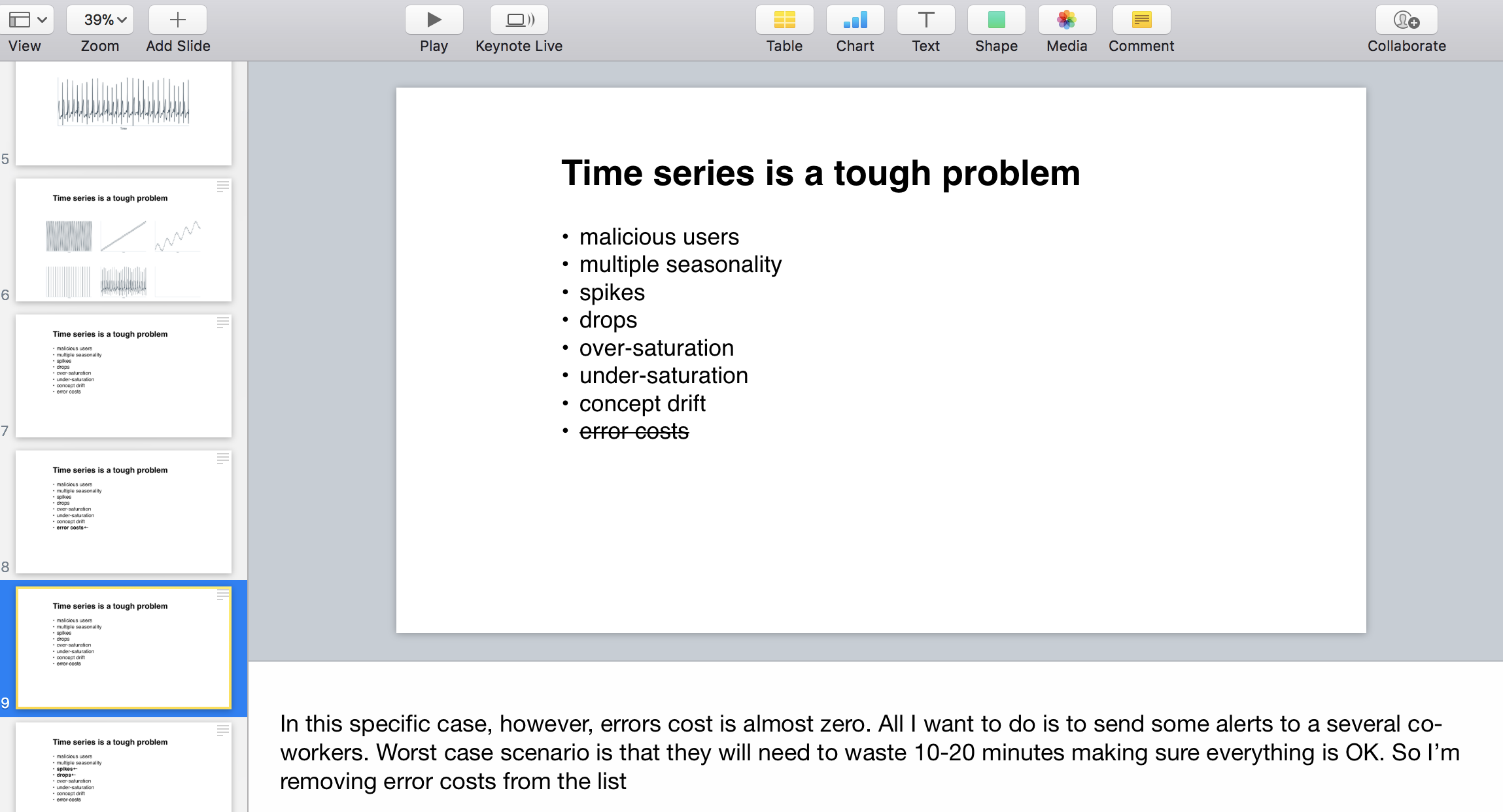
My speaker notes. Note how “error costs” was the first problem I dismissed.[/caption]
I recalled about Stu’s request to stop talking about “zero cost” of false alerts today. Today, I noticed more than 10 unread messages in the Slack channel that receives my anomaly alerts. The oldest unread message was two weeks old. The only reason this could happen is that I stopped caring about the alerts because there were too many of them. I witnessed the classical case of “alert fatigue”, described in “The Boy Who Cried Wolf”, many centuries ago.
The lesson of this story is that there is no such a thing as zero-cost false alarms. Lack of specificity is a serious problem.

Feature image by Ray Hennessy