-

Word Sequentialization
September 2, 2019 -
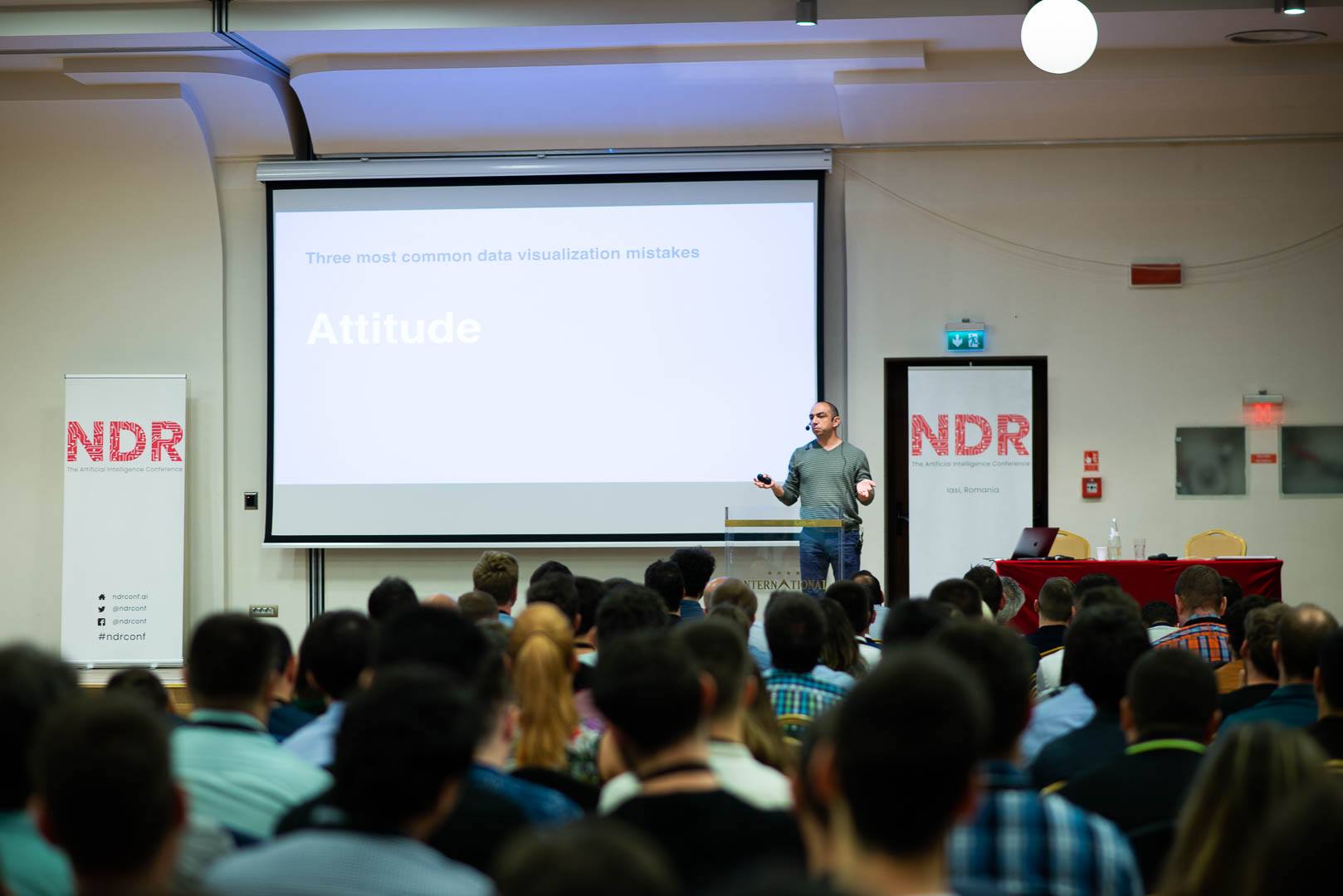
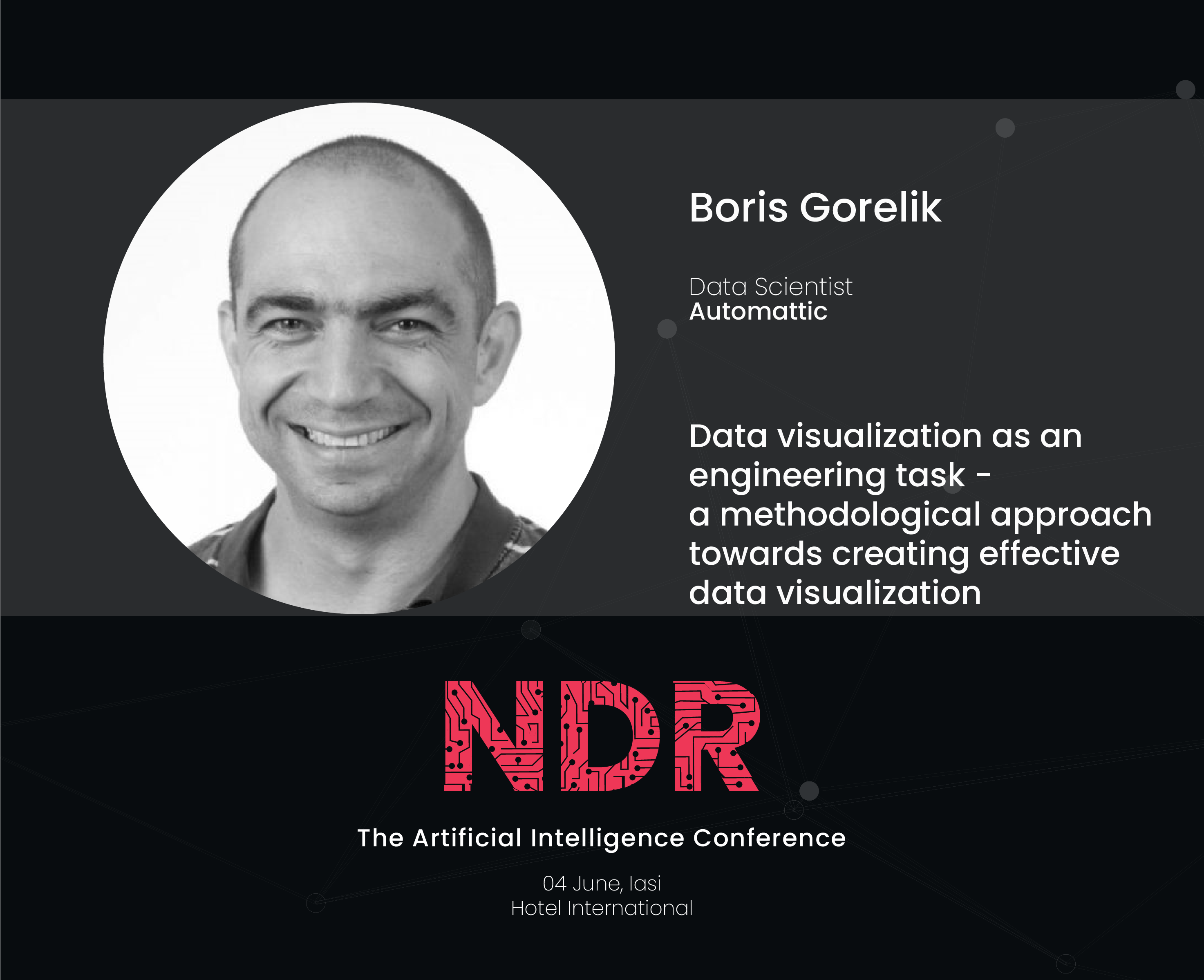
My slide deck from the NDR conference in Iași
June 11, 2019I have published the slide deck from my talk at the NDR conference in Iași, Romania.
Enjoy.
[slideshare id=149244993&doc=20190604abcofdatavisualizationiasi-190611185232]
-
Why you should speak at conferences?
June 6, 2019In this post, I will try to convince you that speaking at a conference is an essential tool for professional development.
Many people are afraid of public speaking, they avoid the need to speak in front of an audience and only do that when someone forces them to. This fear has deep evolutional origins (thousands of years ago, if dozens of people were staring at you that would probably mean that you were about to become their meal). However, if you work in a knowledge-based industry, your professional career can gain a lot if you force yourself to speak.
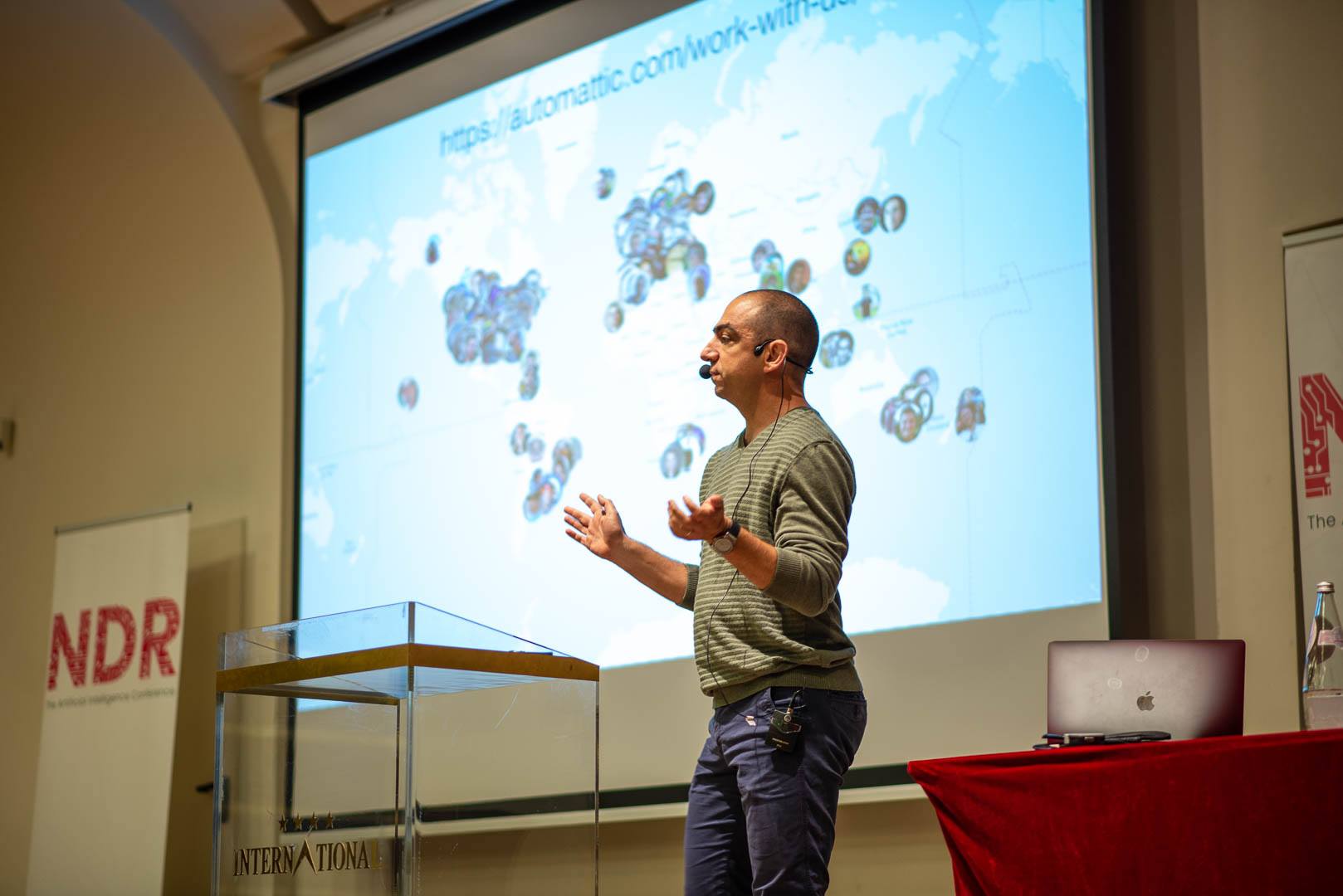
Two days ago, I spoke at NDR, a machine learning/AI conference in Iași, Romania. That was a very interesting conference, with a diverse panel of speakers from different branches of the data-related industry. However, the talk that I enjoyed the most was mine. Not because I’m a narcist self-loving egoist. What I enjoyed the most were the questions that the attendees asked me during the talk, and in the coffee breaks after it. First of all, these questions were a clear signal that my message resonated with the audience, and they cared about what I had to say. This is a nice touch to one’s ego. But more importantly, these questions pointed out that there are several topics that I need to learn to become more professional in what I’m doing. Since most of the time, we don’t know what we don’t know, such an insight is almost priceless.
That is why even (and especially) if you are afraid of public speaking, you should jump into the cold water and do it. Find a call for presentations and submit a proposal TODAY.
And if you are afraid of that awkward silence when you ask “are there any questions” and nobody reacts, you should read my post “Any Questions? How to fight the awkward silence at the end of the presentation”.
-

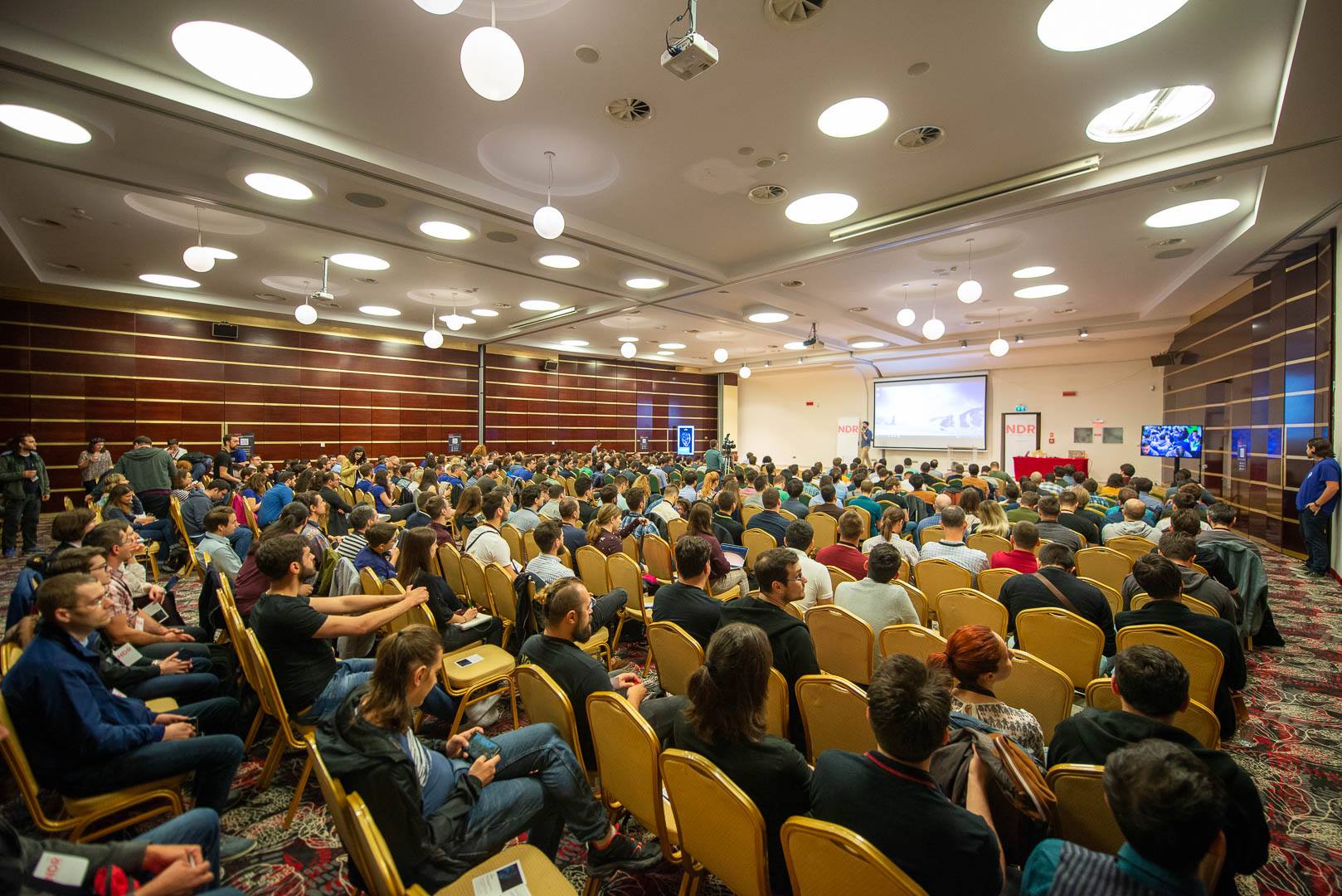
Iași, Romania
June 5, 2019The NDR conference in Iași is over. It’s a good time to sit, relax and work.
-

Curated list of established remote tech companies
May 23, 2019Someone asked me about distributed companies or companies that offer remote positions. Of course, my first response was Automattic but that person didn’t think that Automattic was a good fit for them. So I googled and was surprised to discover that my colleague, Yanir Seroussi, maintains a list of companies that offer remote jobs.
I work at Automattic, one of the biggest distributed-only companies in the world (if not the biggest one). Recently, Automattic founder and CEO, Matt Mullenweg started a new podcast called (surprise) Distributed.
-
כוון הציר האפקי במסמכים הנכתבים מימין לשמאל
May 21, 2019אני מחפש דוגמאות נוספות
יש לכם דוגמה של גרף עברי ״הפוך״? גרפים בערבית או פארסי? שלחו לי.
This post is a Hebrew translation of the post “X-axis direction in Right-To-Left languages (part two)”
ספרי לימוד
בעבר כתבתי על העניין שלי בגרפים בשפות שנכתבות מימין לשמאל. לאחרונה קיבלתי לידי שני ספרי לימוד במתמטיקה - האחד מירדן והשני מהרשות הפלסטינית.
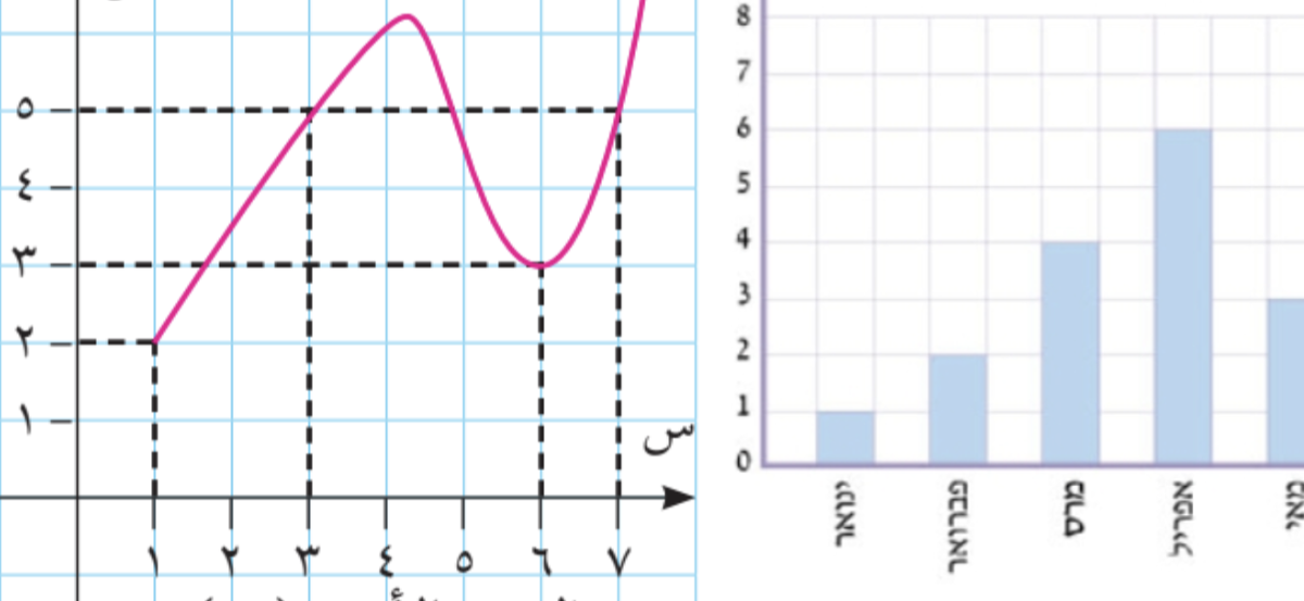
תוכנית הלימוד של הרשות הפלסטינית מבוססת על התוכנית הירדנית. בשני המקרים הופתעתי לגלות שהשכנים שלנו לא משתמשים באותיות ערביות כדי ״לכתוב מתמטיקה״ - כמעט ואין שימוש באותיות לטיניות או יווניות. לא רק זה, כל כוון הכתיבה בספרים אלו - מימין מימין לשמאל. לא רק זה, גם הסימנים המוכרים לנו כגון סימן השורש ״הפוכים״. הנה דוגמה מהספר הפלסטיני.
והנה דוגמה ירדנית.
מה אנחנו רואים כאן?
- שימוש בספריות ״הודיות־ערביות״
- אותיות ערביות س (שין) ו־ص (ס׳אד) משמשות במקום ה־x וה־y המוכרים. אות קאף (ق) שמשמשת לציון פונקציות
- כוון הכתיבה וגם הסימונים עצמם ״הפוכים״ ממה שאנחנו רגילים לראות בספרים בעברית או באנגלית
לאור כל זאת, ניתן היה לצפות שכוון הציר האופקי יהיה גם ״הפוך״ - מימין לשמאל. אך לא כך הדבר
מה עם ספרי לימוד בעברית?
הנה דוגמה מספר לימוד של כיתה ה׳. גם כאשר הקטגוריות בגרף נכתבות בעברית, הכוון שלהם הוא כוון ״אנגלי״ - משמאל לימין.
שלחו לי עוד דוגמאות
יש לכם דוגמה של גרף עברי ״הפוך״? גרפים בערבית או פארסי? שלחו לי.
-
X-axis direction in Right-To-Left languages (part two)
May 19, 2019I need more examples
Do you have more examples of graphs written in Arabic, Farsi, Urdu or another RTL language? Please send them to me.
Textbook examples
I already wrote about my interest in data visualization in Right-To-Left (RTL) languages. Recently, I got copies of high school calculus books from Jordan and the Palestinian Authority.
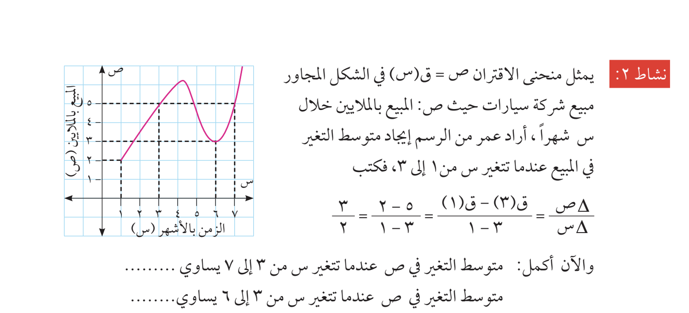
Both Jordan and PA use the same (Jordanian) school program. In both cases, I was surprised to discover that they almost never use Latin or Greek letters in their math notation. Not only that, the entire direction of the the mathematical notation is from right to left. Here’s an illustrative example from the Palestinian book.
And here is an example from Jordan
What do we see here?
- the use of Arabic numerals (which are sometimes called Eastern Arabic numerals)
- The Arabic letters س (sin) and ص (saad) are used “instead of” x and y (the Arabic alphabet doesn’t have the notion of capital letters). The letter qaf (ق) is used as the archetypical function name (f). For some reason, the capital Greek Delta is here.
- More interestingly, the entire math is “mirrored”, compared to the Left-To-Write world – including the operand order. Not only the operand order is “mirrored”, many other pieces of math notation are mirrored, such as the square root sign, limits and others.
Having said all that, one would expect to see the numbers on the X-axis (sorry, the س-axis) run from right to left. But no. The numbers on the graph run from left to right, similarly to the LTR world.
What about mathematics textbooks in Hebrew?
Unfortunately, I don’t have a copy of a Hebrew language book in calculus, so I will use fifth grade math book
Despite the fact that the Hebrew text flows from right to left, we (the Israelis) write our math notations from left to right. I have never saw any exceptions of this rule.
In this particular textbook, the X axis is set up from left to right. This direction is obvious in the upper example. The lower example lists months – from January to December. Despite the fact the the month names are written in Hebrew, their direction is LTR. Note that this is not an obvious choice. In many version of Excel, for example, the default direction of the X axis in Hebrew document is from right to left.
I need more examples
Do you have more examples of graphs written in Arabic, Farsi, Urdu or another RTL language? Please send them to me.
-
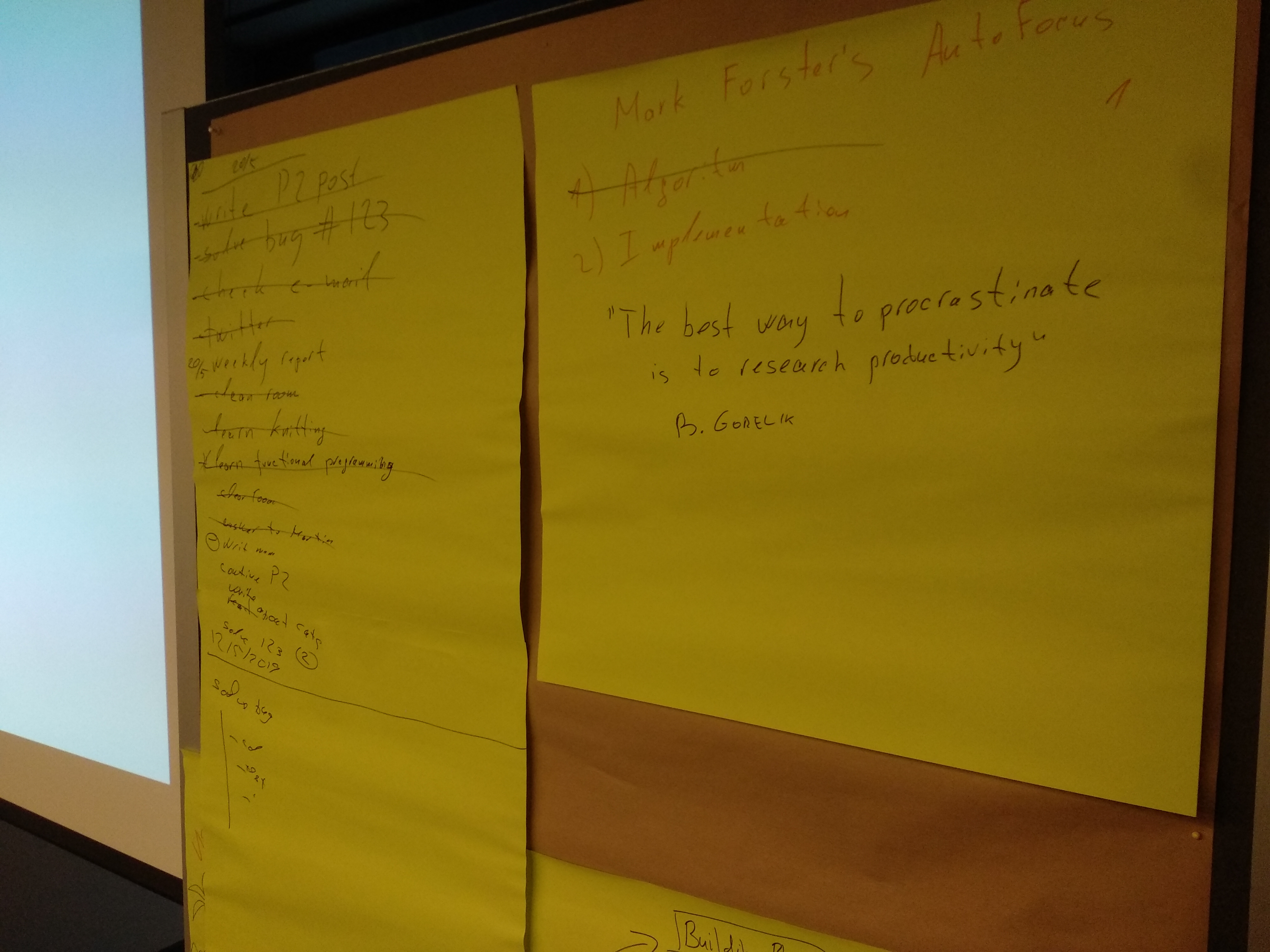
Talking about productivity methods
May 13, 2019The best way to procrastinate is to research productivity.
Boris Gorelik
This week, the majority of Automattic Data Division meets in person in Vienna. During one of the sessions I presented my productivity method to my friends and coworkers.
Presenting this method was a fun and enjoyable experience for me. I decided to try doing this again, in a more formal and structured way. If you know of a productivity-oriented meetups that might be interested in hearing me, let me know.
Some post-talk notes
It turns out that the method I’m using much closer to Mark Forster’s “Final Version” than to his AutoFocus
During the years, Mark Forster created and tested many time management approaches. Scan through this page http://markforster.squarespace.com/tm-systems to find something that might work for you to find something that might work for you.
-

An interesting way to beat procrastination when working from home
May 1, 2019Working from home (or a coffee shop, or a library) is great. However, there is one tiny problem: the temptation not to work is sometimes much bigger than the temptation in a traditional office. In the traditional office you are expected to look busy which is the first step to do an actual work. When you work from home, nobody cares if you get up to have a cup of coffee or water the plants. This is GREAT but sometimes this freedom is too much. Sometimes, you wish someone would give you that look to encourage you to keep working.
This is the exact problem that Taylor Jacobson, the founder of https://focusmate.com is trying to solve. Here’s how Focusmate works. You schedule a fifty-minutes appointment with a random partner. During the session, you and your partner have exactly sixty seconds to tell each other what you want to achieve during the next fifty minutes and then start working, keeping the camera on. At the end of t the session, you and your partner tell each other how was your session. That’s it.
I signed up for this service and participated in two such session. I really liked the result. During that hour, I had the urge to get up for a coffee, to make phone calls, etc. But the fact that I saw someone on my screen, and the fact that they saw me stopped me. The result — 50 minutes of uninterrupted work. I even didn’t check Twitter, despite the fact that my buddy couldn’t see my screen.
I heard about this service in a podcast episode that was recommended to me by my coworker Ian Dunn. Focusmate is absolutely free for now. In that podcast show, Taylor (the founder) talks about the possible business models. Interestingly, when Taylor tried to crowd-fund this project he managed to get almost five time more money than he eventually planned to ([ref]).
One more thing. This podcast show, https://productivitycast.net, looks like an interesting podcast to follow if you are interested in productivity and procrastination.
-
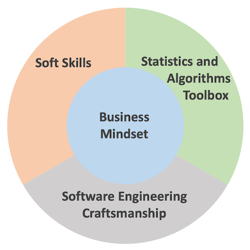
The third wave data scientist - a useful point of view
April 8, 2019In 2019, it’s hard to find a data-related blogger who doesn’t write about the essence and the future of data science as a profession. Most of these posts (like this one for example) are mostly useless both for existing data scientists who think about their professional plans and for people who consider data science as their career.
Today I saw yet another post which I find very useful. In this post, Dominik Haitz identifies a “third wave data scientist.” In Dominik’s opinion, a successful data scientist has to combine four features: (1) Business mindset (2) Software engineering craftsmanship (3) Statistics and algorithmic toolbox, and (4) Soft skills. In Dominik’s classification, the business mindset is not “another skill” but the central pillar.
The professional challenges that I have been facing during the past eighteen months or so, made me realize the importance of points 1, 2, and 3 from Dominik’s list (number 4 was already very important on my personal list). However, it took reading his post to put the puzzle parts in place.
Dominik’s additional contribution to the discussion is ditching the famous data science Venn Diagram in favor of another, “business-oriented” visual which I used as the “featured image” to this post.
 A fragment from an 1850 painting by the Russian Armenian marine painter Ivan Aivazovsky named “The Ninth Wave.” I wonder what the “ninth wave data scientist” will be.
 -

To specialize, or not to specialize, that is the data scientists' question
March 14, 2019In my last post on data science career, I heavily promoted the idea that a data scientist needs to find his or her specialization. I back my opinion with my experience and by citing other people opinions. However, keep in mind that I am not a career advisor, I never surveyed the job market, and I might not know what I’m talking about. Moreover, despite the fact that I advocate for specialization, I think that I am more of a generalist.
Since I published the last post, I was pointed to some other posts and articles that either support or contradict my point of view. The most interesting ones are: “Why you shouldn’t be a data science generalist” and “Why Data Science Teams Need Generalists, Not Specialists”, both are very recent and very articulated but promote different points of view. Go figure
The featured image is based on a photo by Tom Parsons on Unsplash
-

The data science umbrella or should you study data science as a career move (the 2019 edition)?
March 7, 2019TL/DR: Studying data science is OK as long as you know that it’s only a starting point.
Almost two years ago, I wrote a post titled “Don’t study data science as a career move.” Even today, this post is the most visited post on my blog. I was reminded about this post a couple of days ago during a team meeting in which we discussed what does a “data scientist” mean today. I re-read my original post, and I think that I was generally right, but there is a but…
The term “data science” was born as an umbrella term that meant to describe people who know programming, statistics, and business logic. We all saw those numerous Venn diagrams that tried to describe the perfect data scientist. Since its beginning, the field of “data science” has finally matured. There are more and more people that question the mere definition of data science.
Here’s what an entrepreneur Chuck Russel has to say:
Now don’t get me wrong — some of these folks are legit Data Scientists but the majority is not. I guess I’m a purist –calling yourself a scientist indicates that you practice science following a scientific method. You create hypotheses, test the hypothesis with experimental results and after proving or disproving the conjecture move on or iterate.
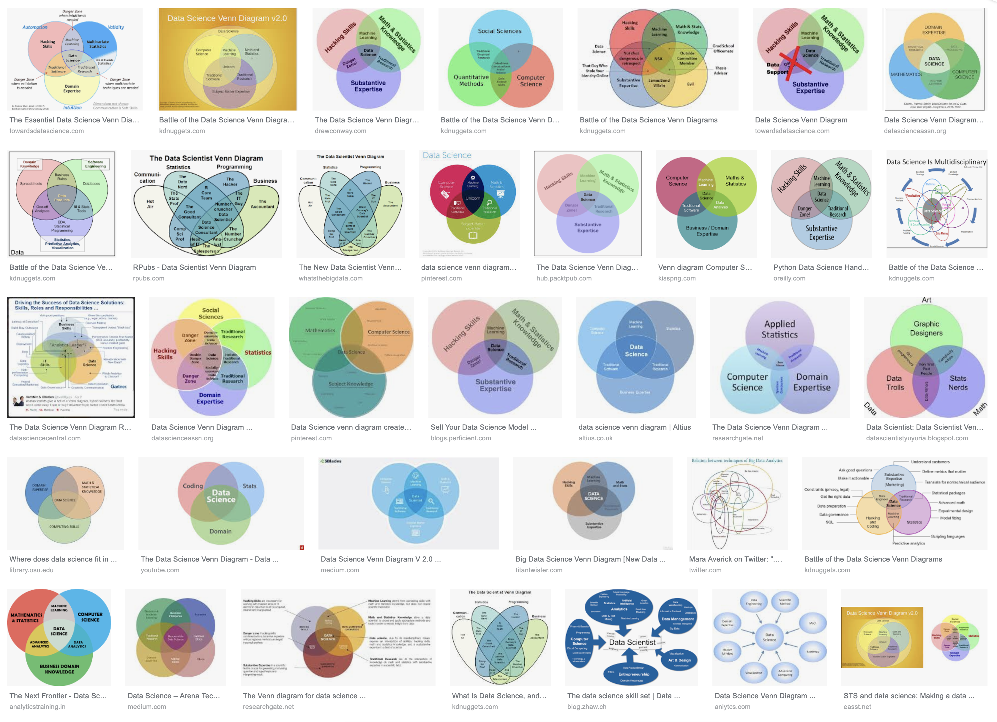 There can’t be enough Venn diagrams
Now, “create and test hypotheses” is a very vague requirement. After all, any A/B test is a process of “creating and testing hypotheses” using data. Is anyone who performs A/B tests a data scientist? I think not. Moreover, a couple of years ago, if you wanted to run an A/B test, perform a regression analysis, build a classifier, you would have to write numerous lines of code, debug and tune it. This tedious and intriguing process certainly felt very “sciency,” and if it worked, you would have been very proud of our job. Today, on the other hand, we are lucky to have general-purpose tools that require less and less coding. I don’t remember the last time I had to implement an analysis or an algorithm from the first principles. With the vast amount of verified tools and libraries, writing an algorithm from scratch feels like a huge waste of time. On the other hand, I spend more and more time trying to understand the “business logic” that I try to improve: why has this test fail? Who will use this algorithm and what will make them like the results? Does effort justify the potential improvement?
I (a data scientist) have all this extra time to think of a business logic thanks to the huge arsenal of generalized tools to choose from. These tools were created mostly by those data scientists whose primary job is to implement, verify, and tune algorithms. My job and the job of these data scientists is different and requires different sets of skills.
There is another ever-growing group of professionals who work hard to make sure someone can apply all those algorithms to any amount of data they feel suitable. These people know that any model is at most as good as the data it is based on. Therefore, they build systems that deliver the right information on time, distribute the data among computation nodes, and make sure no crazy “scientist” sends a production server to a non-responsive state due to a bad choice of parameters. We already have a term for professionals whose job is to build fail-proof systems. We call them engineers, or “data engineers” in this case.
The bottom line
Up till now, I mentioned three major activities that used to be covered by the data science umbrella: building new algorithms, applying algorithms to business logic, and engineering reliable data systems. I’m sure there are other areas under that umbrella that I forgot. In 2019, we reached the point where one has to decide what field of data science does one want to practice. If you consider stying data science think of it as studying medicine. The vast majority of physicians don’t end up general practitioners but rather invest at least five more years of their lives professionalize. Treat your data science studies as an entry ticket into the life-long learning process, and you’ll be OK. Otherwise, (I’mciting myself here): You might end up a mediocre Python or R programmer who can fiddle with the parameters of various machine learning libraries, one of the many. Sometimes it’s good enough. Frequently, it’s not.
PS. Here’s a one-week-old article on Forbes.com with very similar theses: link.
-

Please leave a comment to this post
March 5, 2019Please leave a comment to this post. It doesn’t matter what, it can be a simple Hi or an interesting link. It doesn’t matter when or where you see it. I want to see how many real people are actually reading this blog.
[caption id=”attachment_media-15” align=”alignnone” width=”1880”]
Photo by Pixabay on Pexels.com[/caption]
-
בניית אתרים עם תמיכה בארץ
March 4, 2019מדי פעם אנשים ששומעים שאני עובד בחברה שמפעילה את וורדפרקס.קום מבקשים ממני עזרה אם בניית האתר שלהם. אני חוקר נתונים, לא בונה אתרים. ברור שהחברה בה אני עובד עושה המון מאמצים כדי לאפשר לאנשים לבנות אתרים בעצמם, אבל לפעםמים אנשים צריכים להאציל את הסמכות הזאת למומחים, רוצים גמישות ושליטה וגם תמיכה. אני מכיר אישית את דידי אריאלי מהאתר ״קליקי בניית אתרים״ שעושה בדיוק את זה: בנייה ותחזוקת אתרים מותאמים אישית. מה שנחמד הוא שדידי נאמן לעקרונות הקוד הפתוח: הלקוח לא קשור אליו ושומר על השליטה בתוכן ובקוד של האתר.
דרך אגב, באתר של ״קליקי״ יש גם בלוג עם פרטי מידע שימושיים לבוני האתרים בוורדפרס
נ.ב. אני מכיר את דידי אישית אבל אין לי אתו קשרי עסקים. אני לא מרוויח שום דבר מהפוסט הזה.
-

Chișinău Jewish cemetery
March 4, 2019Two years ago I visited Chișinău (Kishinev), the city in Moldova where I was born and where I grew up until the age of fifteen. Today I saw a post with photos from the ancient Chișinău Jewish cemetery and recalled that I too, took many pictures from that sad place. Less than half of the original cemetery survived to these days. The bigger part of it was demolished in the 1960s in favor of a park and a residential area. If you scroll through the pictures below, you will be able to see how they used tombstones to build the park walls.
Another notable feature of many Jewish cemeteries is memorial plates in memoriam of the relatives who don’t have their own graves – the relatives who were murdered over the course of the Jewish history.


-

How to Increase Retention and Revenue in 1,000 Nontrivial Steps
February 13, 2019The journey of a thousand miles begins with one step. My coworker, Yanir Seroussi, wrote about the work of data scientists in the marketing team.
-

On procrastination, or why too good can be bad
February 4, 2019I’m a terrible procrastinator. A couple of years ago, I installed RescueTimeto fight this procrastination. The idea behind RescueTime is simple — it tracks the sites you visit and the application you use and classifies them according to how productive you are. Using this information, RescueTime provides a regular report of your productivity. You can also trigger the productivity mode, in which RescueTime will block all the distractive sites such as Facebook, Twitter, news sites, etc. You can also configure RescueTime to trigger this mode according to different settings. This sounded like a killer feature for me and was the main reason behind my decision to purchase a RescueTime subscription. Yesterday, I realized how wrong I was.

When I installed RescueTime, I was full of good intentions. That is why I configured it to block all the distractive sites for one hour every time I accumulate more than 10 minutes of surfing such sites. However, from time to time, I managed to find a good excuse to procrastinate. Although RescueTime allows you to open a “bad” site after a certain delay, I found this delay annoying and ended up killing the RescueTime process (killing a process is faster than temporary disabling a filter). As a result, most of my workday stayed untracked, unmonitored, and unfiltered.
So, I decided to end this absurd situation. As of today, RescueTime will never block any sites. Instead of blocking, I configured it to show a reminder and to open my RescueTime dashboard, as a reminder to behave myself. I don’t know whether this non-intrusive reminder will be effective or not but at least I will have correct information about my day.
-
"Why it burns when you P" and other statistics rants
January 20, 2019“Sunday grumpiness” is an SFW translation of Hebrew phrase that describes the most common state of mind people experience on their first work weekday. My grumpiness causes procrastination. Today, I tried to steer this procrastination to something more productive, so I searched for some statistics-related terms and stumbled upon a couple of interesting links in which people bitch about p-values.
“Why it burns when you P” is a five-years-old rant about P values. It’s funny, informative and easy to read
“Everything Wrong With P-Values Under One Roof” is a recent rant about p-values written in a form of a scientific paper. William M. Briggs, the author of this paper, ends it with an encouraging statement: “No, confidence intervals are not better. That for another day.”
“Everything wrong with statistics (and how to fix it)” is a one-hour video lecture by Dr. Kristin Lennox who talks about the same problems. I saw this video, and two more talks by Dr. Lennox on a flight I highly recommend all her videos on YouTube.
“Do You Hate Statistics as Much as Everyone Else?” – A Natan Yau’s (from flowingdata.com) attempt to get thoughtful comments from his knowledgeable readers.
This list will not be complete without the classics:
“Why Most Published Research Findings Are False”, “Mindless Statistics”, and “Cargo Cult Science”. If you haven’t read these three pieces of wisdom, you absolutely should, they will change the way you look at numbers and research.
*The literal meaning of שביזות יום א is Sunday dick-brokenness.
-

Hackers beware: Bootstrap sampling may be harmful
January 15, 2019Anything is better when bootstrapped. Read my co-worker’s post on bootstrapping. Also make sure following the links Yanir gives to support his claims
-

I have 101 followers!
January 14, 2019Yesterday, the follower list of my blog exceeded one hundred followers! Even though I know that some of these followers are bots, this number makes me happy! Thank you all (humans and bots) for clicking the “follow” button.
-
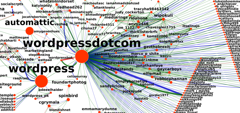
A Brand Image Analysis of WordPress and Automattic on Twitter
January 13, 2019My coworker analyzed Twitter social network around Automattic, WordPress, and other related projects.
-

Against A/B tests
December 12, 2018Traditional A/B testsing rests on a fundamentally flawed premise. Most of the time, version A will be better for some subgroups, and version B will be better for others. Choosing either A or B is inherentlyinferior to choosing a targeted mix of A and B.
Michael Kaminsky locallyoptimistic.com
The quote above is from a post by Michael Kaminsky “Against A/B tests”. I’m still not fully convinced by Michael’s thesis but it is very interesting and thought-provoking.
-
Links Worth Sharing: What Makes People Successful
November 27, 2018 -
Useful redundancy — when using colors is not completely useless
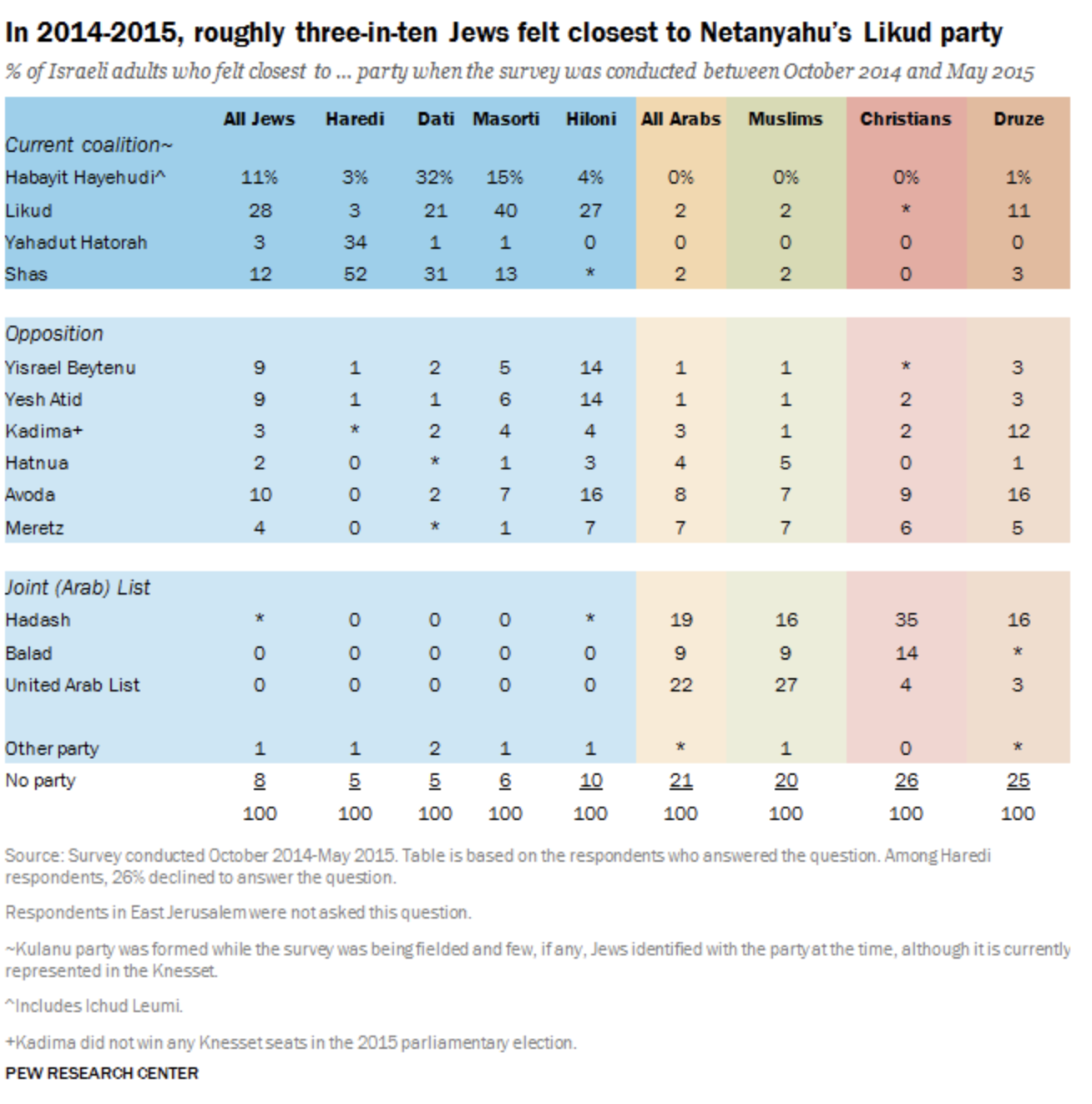
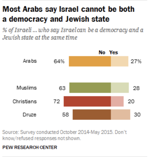
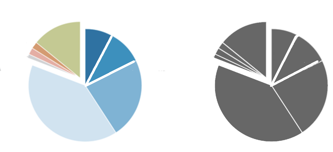
November 26, 2018The maximum data-ink ratio principle implies that one should not use colors in their graphs if the graph is understandable without the colors. The fact that you can do something, such as adding colors, doesn’t mean you should do it. I know it. I even have a dedicated tag on this blog for that. Sometimes, however, consistent use of colors serves as a useful navigation tool in a long discussion. Keep reading to learn about the justified use of colors.
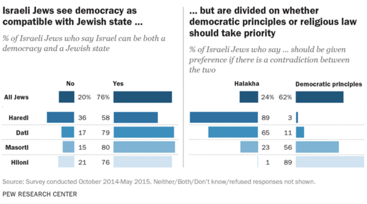
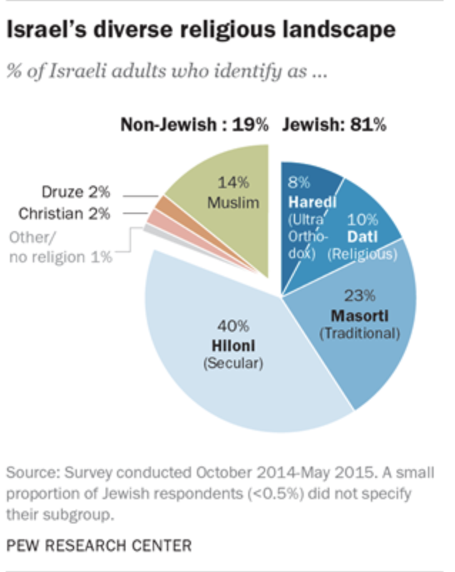
Pew Research Center is a “is a nonpartisan American fact tank based in Washington, D.C. It provides information on social issues, public opinion, and demographic trends shaping the United States and the world.” Recently, I read a report prepared by the Pew Center on the religious divide in the Israeli society. This is a fascinating report. I recommend reading without any connection to data visualization.
But this post does not deal with the Isreali society but with graphs and colors.
Look at the first chart in that report. You may see a tidy pie chart with several colored segments.
Aha! Can’t they use a single color without losing the details? Of course the can! A monochrome pie chart would contain the same information:
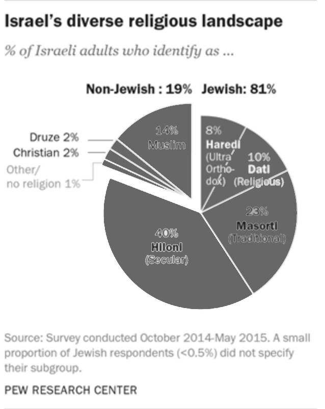
In most of the cases, such a transformation would make a perfect sense. In most of the cases, but not in this report. This report is a multipage research document packed with many facts and analyses. The pie chart above is the first graph in that report that provides a broad overview of the Israeli society. The remaining of this report is dedicated to the relationships between and within the groups represented by the colorful segments in that pie chart. To help the reader navigating through this long report, its authors use a consistent color scheme that anchors every subsequent graph to the relevant sections of the original pie chart.
All these graphs and tables will be readable without the use of colors. Despite the fact that the colors here are redundant, this is a useful redundancy. By using the colors, the authors provided additional information layers that make the navigation within the document easier. I learned about the concept of useful redundancy from “Trees, Maps, and Theorems” by Jean-luc Dumout. If you can only read one book about data communication, it should be this book.
-

On the importance of perspective
November 12, 2018Stalin was a relatively short man, his height was 1.65 m. Khrushchev was even shorter, his height was 1.60. It seems that the difference wasn’t enough for the official Soviet propaganda of that time. Take a look at this photo. We can clearly see that Stalin is taller than Khrushchev.
Do you notice something strange? Take a look at the windows in the background. I added horizontal and vertical guides for your convenience.

Now, look what happens when we fix the horizontal and vertical lines

Now, Khrushchev is still shorter than Stalin but not by that much.
- Older posts Newer posts