Graph code: here.
Graph code: here.
People ask me for good intro video to data visualization. I tend to ask them to look for one of my lectures. To save the search, here’s one of the most relevant talks that I gave
Being a data science freelancer, and a long-time AnnMaria’s fan, I HAVE to repost here latest post on consulting success
Last week, I mentioned that successful consultants have five categories of skills; communication, testing, statistics, programming and generalist. COMMUNICATION Communication is the number one most important skill. All five are necessary to some extent, but a terrific communicator with mediocre statistical analysis skills will get more business than a stellar statistician that can’t communicate. Communication…

From time to time, I get emails from people who seek advice in their career paths. If I have time, I write them an extended reply and if they agree, I publish the questions and my replies here, in my blog. Here’s one such email exchange. All similar pieces of advice, as well as other rants about a career in data science, can be found here.
“Hi Boris :)
My name is XXXXX. I came across your blog while searching for people with a mix of pharmacy and data science skillsets. Your blog has been so informative to me so far but I was compelled to write to you to ask for your advice.
I am a clinical pharmacist by background but decided to leave the clinical pharmacy to pursue public health. Whilst doing my MPH, I fell in love with epidemiology and statistics and am now doing a Ph.D. in biostatistics. Your blog has made me feel very happy that I made this career move <…> I feel better about my decision to leave the pharmacy and pursue a quant Ph.D. I have gone from pharmacy, to internships at
In the past, I also felt that the pharmacy degree was confusing many potential employers, and since I wanted to leave the bio/pharma world and move to “pure data” positions, I omitted the B.Pharm title & studies from my CV. Ten years ago, the salaries in the bio sector, here in Israel, were much lower than the salaries in the “high tech” field. I think that today this situation is more or less normalized and that the people got used to the fact that a typical “data scientist” can have a very wide range of degrees.
“I was just wondering if I could get your opinion on the three questions I have. 1. I work part-time as a clinical pharmacist to not forget my clinical skills. What do you think about the future of the pharmacy career overall?”
 My last shift as a pharmacist
This is a huge question and I don’t have answers to it. Moreover, the answer depends heavily on legal regulations in the given country. I say that if you enjoy treating people, and can afford this time, why not? I, personally, was a very lousy pharmacist :-) so I was very happy to leave the pharmacy.
“I am wondering if I should keep up my pharmacist title or pursue data science full-time.”
Again, it depends. For many years, I didn’t have my pharmacy title in my CV because it felt unrelated to what I was doing. It was also a nice icebreaker to tell people with whom I worked “by the way, I’m a pharmacist” and it was fun to see their reactions. If I were you, I would ask two-three HR people or people who recruit employees what they think. Different countries may behave differently.
“2. At what point can someone call themselves a data scientist?”
In my opinion, as long as you are comfortable enough to call yourself a data scientist, you are good to go. Note that unlike many people who got their data science “title” after taking some online courses, you already have a very strong theoretical base. Not only are your Master’s and the future Ph.D. degree relevant to data science, but they also give you strong and unique advantages.
“I am looking at DS jobs at large tech companies. I am not sure how qualified and experienced I have to be for these jobs. I code in R using regression, clustering and time series methods and I am quite fluent in this language. I have just started to learn ML algorithms. I have a basic foundation in Python and SQL. I use Tableau for visualization and love communicating my research at any opportunity I get. I was wondering…how good do I have to be able to apply to DS jobs? What are the methods that data scientists use mostly? Would I be able to learn on the job?”
It sounds like a good combination of techniques. I am not recruiting but if I would, I would definitely like this list of skills. Personally, I don’t like R too much and prefer Python. But once you program one language, moving to another one is a doable task. As to what methods do data scientists use mostly, this hugely depends on your job. Most of my time, I clean data and write wrapper functions around known algorithms. The task that I have been facing during my professional life required regression, classification, network analysis. I never did real deep learning stuff, but I know people who only do deep learning for image and sound analysis. Also, in many cases, the data science part takes only 10% of your time because the “customer” doesn’t care about an algorithm, they want a solution. See this post for a nice example.
“3. If you had the opportunity to start your career again, say you were in your early twenties, what would you study and why? What advice would you have for your younger self? I would be so keen to hear what you think.”
It’s a philosophical task which I never like doing. What is done is done. The fact that I am a pretty successful data scientist may mean that I took the right decisions or that I was super lucky.

Being a freelancer data scientist, I get to talk to people about proposals that don’t materialize into projects. These conversations take time, but strangely enough, I enjoy them very much, I also find these conversations educating. How else could I have learned about a business model X, or what really happens behind the scenes of company Y?
I can’t elaborate yet, but in case you wondered how scientific satisfaction looks like, here’s a perfect illustration.
Stay tuned

Gilad Almosnino is an internationalization expert. I’m reading his post “Eight emojis that will create a more inclusive experience for Middle Eastern markets,” in which he mentions “Turkish or Arabic Coffee,” which reminded me of my last visit to Athens. When, in one restaurant, I asked for a Turkish coffee, the waiter looked at me harshly and said: “It’s not Turkish coffee; it’s Greek coffee!”
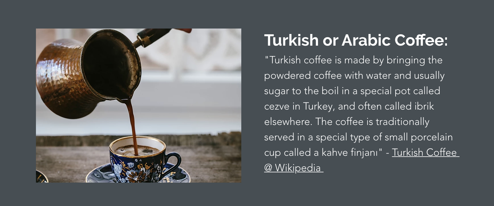
Turkish, Arabic, or Greek
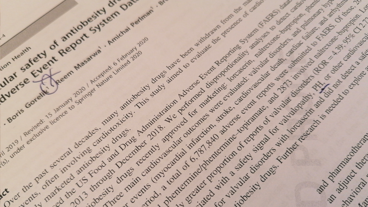
Do you believe in telepathy? Yesterday, I submitted final proofs of a paper in which I actively participated. During the proofreading, I noticed that our abstract ends with “further research is needed” and scratched my head. I submitted the proofs and then then, I saw this pearl in my blog feed

TL;DR shallow and disappointing
The Great Mental Models by Shane Parrish was highly praised by Automattic’s CEO Matt Mullenweg. Since I appreciate Matt’s opinion a lot, I decided to buy the book. I read it and was disappointed.

This book is very ambitious but yet shallow and non-engaging. If you consider reading a book on mental models, then chances are you already know some of them. I expected the book to shed light on aspects I didn’t know or didn’t think of. Nothing like that happened. I didn’t learn new facts, neither was I impressed by a new way of thinking. I also think that this book won’t do the job with teenagers who still don’t have the arsenal of mental models, for them this book is full of unclear shortcuts.
The book is based on the materials of a highly praised blog fs.blog and is a good example how some stuff can work well as a blog post but feel bad as a book.
The bottom line: 2/5 Skip it.

Which data scientists can refuse more computing power? None. My collection of computing devices has a new addition a Soviet arithmometer Felix M.


Many years ago, I needed a way to measure execution times. I didn’t like the existing solutions so I wrote my own class. As time passed by, I added small changes and improvements, and recently, I decided to publish the code on GitHub, first as a gist, and now as a full-featured Github repository, and a pip package.
TicToc provides a simple mechanism to measure the wall time (a stopwatch) with reasonable accuracy.
Crete an object. Run tic() to start the timer, toc() to stop it. Repeated tic-toc’s will accumulate time. The tic-toc pair is useful in interactive environments such as the shell or a notebook. Whenever toc is called, a useful message is automatically printed to stdout. For non-interactive purposes, use start and stop, as they are less verbose.
Following is an example of how to use TicToc:
def leibniz_pi(n):
    ret = 0
    for i in range(n * 1000000):
        ret += ((4.0 * (-1) ** i) / (2 * i + 1))
    return ret

tt_overall = TicToc('overall')  # started  by default
tt_cumulative = TicToc('cumulative', start=False)
for iteration in range(1, 4):
    tt_cumulative.start()
    tt_current = TicToc('current')
    pi = leibniz_pi(iteration)
    tt_current.stop()
    tt_cumulative.stop()
    time.sleep(0.01)  # this inteval will not be accounted for by `tt_cumulative`
    print(
        f'Iteration {iteration}: pi={pi:.9}. '
        f'The computation took {tt_current.running_time():.2f} seconds. '
        f'Running time is {tt_overall.running_time():.2} seconds'
    )
tt_overall.stop()
print(tt_overall)
print(tt_cumulative)
TicToc objects are created in a “running” state, i.e you don’t have to start them using tic. To change this default behaviour, use
tt = TicToc(start=False)
# do some stuff
# when ready
tt.tic()
Install the package using pip
pip install tictoc-borisgorelik
Any dispute that is for the sake of Heaven is destined to endure; one that is not for the sake of Heaven is not destined to endure
Chapters of the Fathers 5:27
One day, I had an intense argument with a colleague at my previous place of work, Automattic. Since most of the communication in Automattic happens in internal blogs that are visible to the entire company, this was a public dispute. In a matter of a couple of hours, some people contacted me privately on Slack. They told me that the message exchange sounded aggressive, both from my side and from the side of my counterpart. I didn’t feel that way. In this post, I want to explain why it is OK to have a loud argument with your co-workers.
I’m a data scientist and algorithm developer. I like doing data science and developing algorithms. Sometimes, to be better at my job, I need to show my work to my colleagues. In a “regular” company, I would ask my colleagues to step into my office and play with my models. Automattic isn’t a “regular” company. At Automattic, people from more than sixty countries from in every possible time zone. So, I wanted to start a server that will be visible by everyone in the company (and only by them), that will have access to the relevant data, and that will be able to run any software I install on it.

X is a system administrator. He likes administrating the systems that serve more than 2000,000,000 unique visitors in the US alone. To be good at his job, X needs to make sure no bad things happen to the systems. That’s why when X saw my request for the new setup (made on a company-visible blog page), his response was, more or less, “Please tell me why do you think you need this, and why can’t you manage with what you already have.”
Frankly, I was furious. Usually, they tell you to count to ten before answering to someone who made you angry. Instead, I went to my mother-in-law’s birthday party, and then I wrote an answer (again, in a company-visible blog). The answer was, more or less, “because I know what I’m doing.” For which, X replied, more or less, “I know what I do too.”
At this point, I started realizing that X is not expected to jeopardize his professional reputation for the sake of my professional aspirations. It was true that I wanted to test a new algorithm that will bring a lot of value to the company for which I work. It is also true that X doesn’t resent to comply with every developers’ request out of caprice. His job is to keep the entire system working. Coincidentally, X contacted me over Slack, so I took the opportunity to apologize for something that sounded as aggression from my side. I was pleased to hear that X didn’t notice any hostility, so we were good.
I don’t know whether it was possible to achieve the same or a better result without the loud argument. I admit: I was angry when I wrote some of the things that I wrote. However, I wasn’t mad at X as a person. I was angry because I thought I knew what was best for the company, and someone interfered with my plans.
I assume that X was angry when he wrote some of the things he wrote. I also believe that he wasn’t angry at me as a person but because he knew what was best for the company, and someone tried to interfere with his plans.
I’m sure though that it was this argument that enabled us to define the main “pain” points for both sides of the dispute. As long as the dispute was about ideas, not personas, and as long as the dispute’s goal was for the sake of the common good, it was worth it. To my current and future colleagues: if you hear me arguing loudly, please know that this is a “dispute that is for the sake of Heaven [that] is destined to endure.”
Featured image: Source: http://mimiandeunice.com/; Bees image: Photo by Flickr user silangel, modified. Under the CC-BY-NC license.

I don’t have much hair on my head, but recently, I encountered a funny peculiarity in Python due to which I have been pulling my hair for a couple of hours. In retrospect, this feature makes a lot of sense. In retrospect.
First, let’s start with the mental model that I had in my head: inheritance.
Let’s say you have a base class that defines a function f
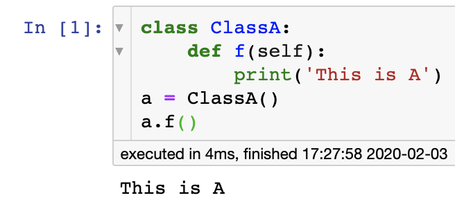
Now, you inherit from that class and rewrite f
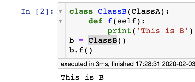
What happens? The fact that you defined f in ClassB means that, to a rough approximation, the old definition of f from ClassA does not exist in all the ClassB objects.
Now, let’s go to decorators.
@dataclass_json
@dataclass
class Message2:
    message: str
    weight: int
    def to_dict(self, encode_json=False):
        print('Custom to_dict')
        ret = {'MESSAGE': self.message, 'WEIGHT': self.weight}
        return ret
m2 = Message2('m2', 2)
What happened here? I used a decorator dataclass_json that, among other things, provides a to_dict function to Python’s data classes. I created a class Message2, but I needed s custom to_dict definition. So, naturally, I defined a new version of to_dict only to discover several hours later that the new to_dict doesn’t exist.
Do you get the point already? In inheritence, the custom implementations are added ON TOP of the base class. However, when you apply a decorator to a class, your class’s custom code is BELOW the one provided by the decorator. Therefore, you don’t override the decorating code but rather “underride” it (i.e., give it something it can replace).
As I said, it makes perfect sense, but still, I missed it. I don’t know whether I would have managed to find the solution without Stackoverflow.

Queeng is an ambitious project to change the way we play cards.

Today, I read a post about Ziph’s law and Alzheimer’s disease. I liked the post very much and decided to press the “like” button only to discover that I already “liked” this post more than two years ago.
Indeed this is an interesting post.

You know that I’m a data science consultant now, don’t you? You know that AnnMaria De Mars, Ph.D. (the statistician, game developer, the world Judo champion) is one of my favorite bloggers, and her blog is the second blog I started to follow don’t you?
A couple of months ago, AnnMaria wrote an extensive post about 30 things she learned in 30 years as a statistical consultant. One week ago, she wrote another great piece of advice.

I’ll be speaking about being a statistical consultant at SAS Global Forum in D.C. in March/ April. While I will be talking a little bit about factor analysis, repeated measures ANOVA and logistic regression, that is the end of my talk. The first things a statistical consultant should know don’t have much to do with…
The first things a statistical consultant needs to know — AnnMaria’s Blog

TL;DR: excellent fiction reading, makes you think about your life choices. 5/5

“Replay” by Ken Grimwood is the first fiction book that I read in ages. The book is about a forty-three years old man with a failing family and a boring career. The man suddenly dies and re-appears in his own eighteen-years old body. He then lives his life again, using the knowledge of his future self. Then he dies again, and again, and again.
I liked the concept (reminded me of the Groundhog Day movie). The book managed to “suck me in,” and I finished it in two days. It also made me think hard about my life choices. I think that my decision to quit and become a freelancer was partially affected by this book.
What did I not like? Some parts of the book are somewhat pornographic. It doesn’t bother me per se, but I think the plot would stay as good as it is without those parts. Also, I find it a little bit sad that every reincarnation in “Replay” starts with making easy money. Not that I don’t like money; it just makes me sad.
Bottom line: Read! 5/5
(Read in Nov 2019)
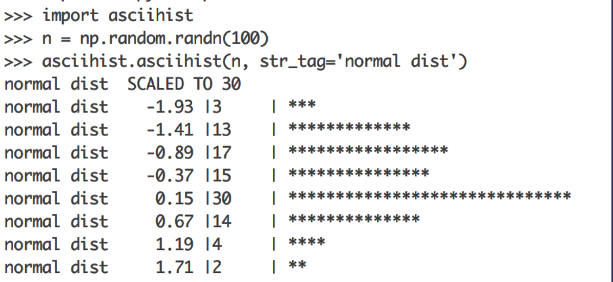
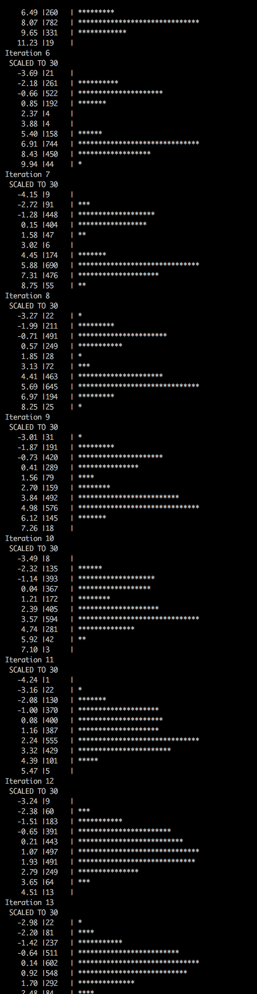
From time to time, we need to look at the distribution of a group of values. Histograms are, I think, the most popular way to visualize distributions. “Back in the old days,” when we did most of our work in the console, and when creating a plot from Python required too many boilerplate code lines, I found a neat function that produced histograms using ASCII characters.
Surely, today, when most of us work in a notebook environment, ASCII histograms aren’t as useful as they used to be. However, they are still helpful. One scenario in which ASCII diagrams are useful is when you write a log file for an iterative process. A quick glimpse at the log file will let you know when the distribution of some scoring function reached convergence.
That is why I keep my version of asciihist updated since 2005. You may find it on Github here.
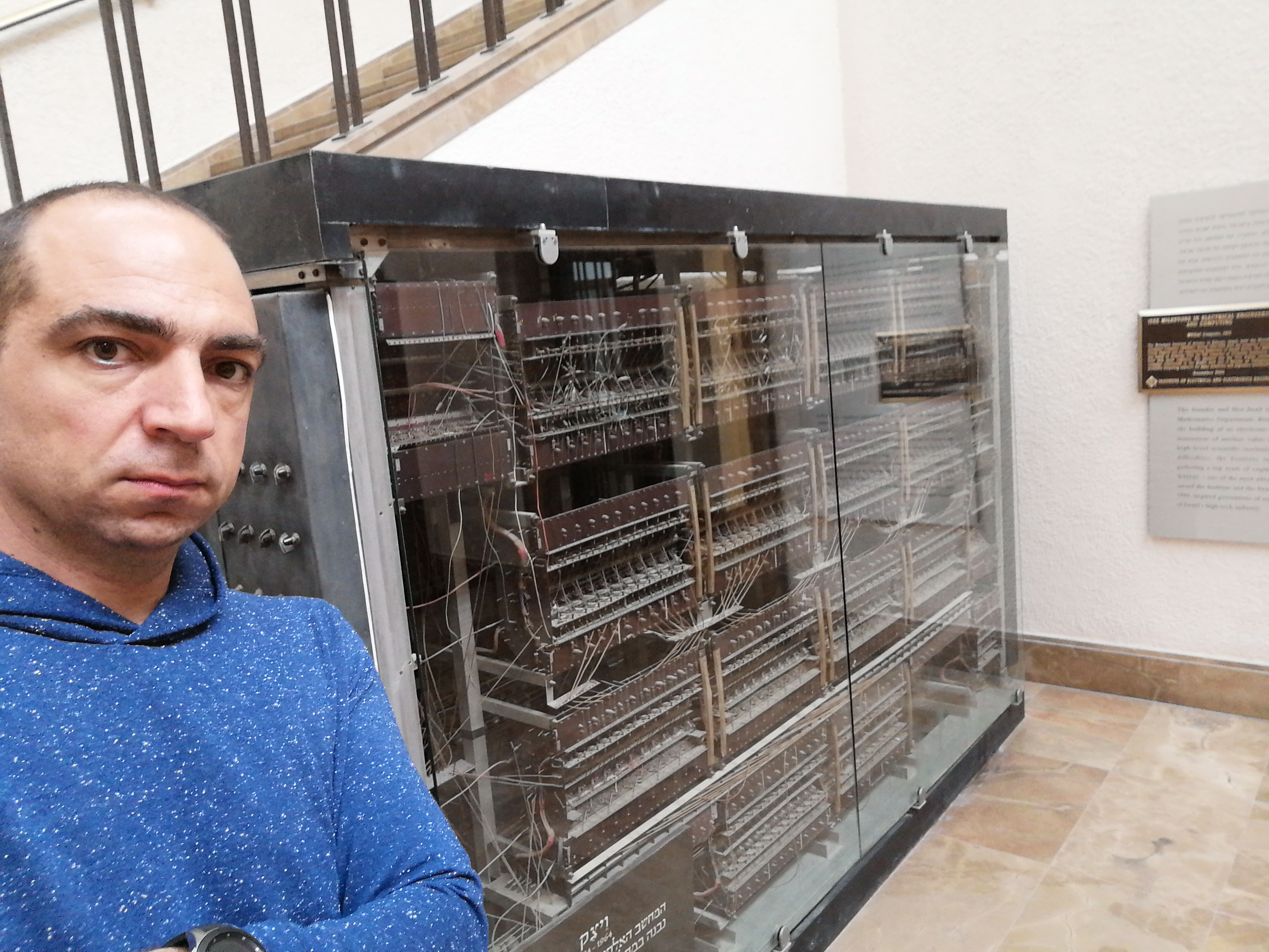
Some people, in face of important changes visit tombs of the righteous for a blessing. I went to see WEIZAC – Israel’s first computer (and one of the first ones in the world) that was built in 1955.
One night, in January 2014, I came back home from work after spending two hours commuting in each direction. I was frustrated and started Googling for “work from home” companies. After a couple of minutes, I arrived at https://automattic.com/work-with-us/. Surprisingly to me, I couldn’t find any job postings for data scientists, and a quick LinkedIn search revealed no data scientists at Automattic. So I decided to write a somewhat arrogant letter titled “Why you should call me?”. After reading the draft, I decided that it was too arrogant and kept it in my Drafts folder so that I can sleep over it. A couple of days later, I decided to delete that mail. HOWEVER, entirely unintentionally, I hit the send button. That’s how I became the first data scientist hired by Automattic (Carly Staumbach, the data scientist and the musician, was already Automattician, but she arrived there by an acquisition).
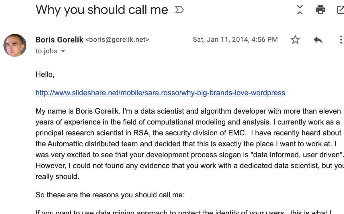 The email is pretty long.
I even forgot to remove a link that I planned to read BEFORE sending that email.
The email is pretty long.
I even forgot to remove a link that I planned to read BEFORE sending that email.
The past five and a half years have been the best five and a half years in my professional life. I met a TON of fascinating people from different cultural and professional backgrounds. I re-discovered blogging. My idea of what a workplace is has changed tremendously and for good.
Until now, every time I left a workplace, I did that for external reasons. I simply had to. I left either due to company’s poor financial situation, due to long commute time, or both. Now, it’s the first time I am leaving a place of work entirely for internal reasons: despite, and maybe a little bit because, the fact that everything was so good. (Of course, there are some problems and disruptions, but nothing is ideal, right?)
What happened? In June, I left for a sabbatical. The sabbatical was so good that I already started making plans for another one. However, I also started thinking about my professional growth, the opportunities I have, and the opportunities I previously missed. I realized that right now, I am in the ideal position to exit the comfort zone and to take calculated professional risks. That’s how, after about four sleepless weeks, I decided to quit my dream job and to start a freelance career.
On January 22, I will become an Automattic alumnus.
BTW, Automattic is constantly looking for new people. Visit their careers page and see whether there is something for you. And if not, find the chutzpah and write them anyhow.
 2018 Grand Meetup.
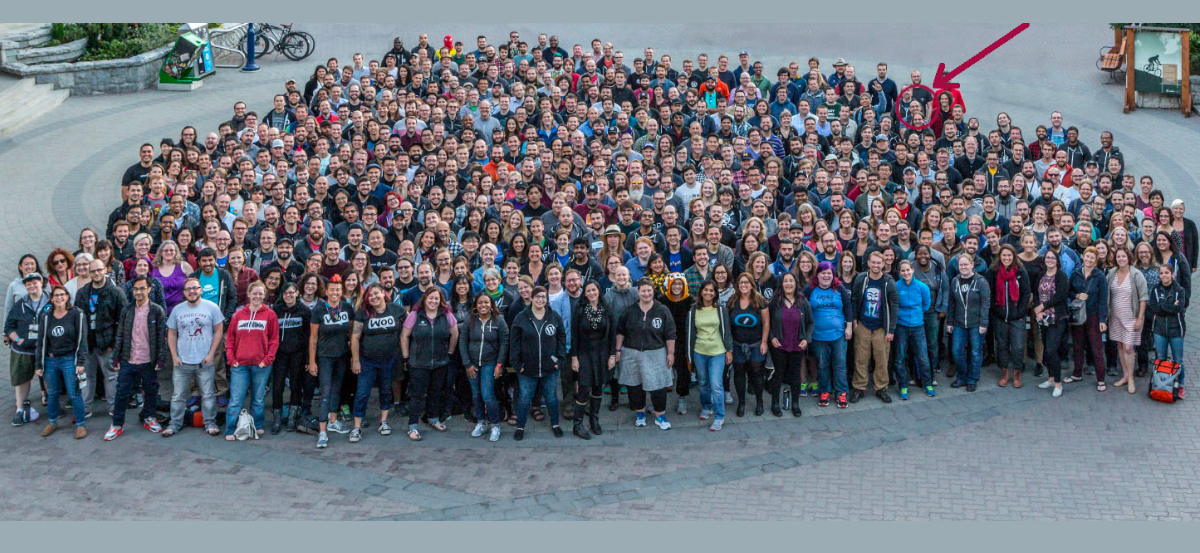
2019 Grand Meetup. I have no idea where I am at this picture

If you read my shortish post about staying employable as a data scientist, you might like a longer post by a colleague, Yanir Seroussi. In his post, Yanir lists four possible paths for a data scientist: (1) become an engineer; (2) reinvent the wheel; (3) search for niches; and (4) expand the cutting edge.
To this list, I would also add two other options.
(5) Manage. Managing is not developing, it’s a different profession. However, some developers and data scientists that I know choose this path. I am not a manager myself, so I hope I don’t insult the managers who read these lines, but I think that it is much easier for a good manager to stay good, than for a good developer or data scientist.
(6) Teach. I teach as a part-time job. One reason for teaching is that I sometimes enjoy it. Another reason is that I feel that at some point, I might not be good enough to stay on the cutting edge but still sharp enough to teach the new generations the basics.
Anyhow, read Yanir’s post linked below.
The passage of time makes wizards of us all. Today, any dullard can make bells ring across the ocean by tapping out phone numbers, cause inanimate toys to march by barking an order, or activate remote devices by touching a wireless screen. Thomas Edison couldn’t have managed any of this at his peak—and shortly before […]
Software commodities are eating interesting data science work — Yanir Seroussi

Recently, I received an email from a pharmacist who considers becoming a data scientist. Since this is not a first (or last) similar email that I receive, I think others will find this message exchange interesting.
Here’s the original email with minor edits, followed by my response.
Hi Boris,
My name is XXXXX, and I came across your information and your advice on data science as I was researching career opportunities.
I currently work at a hospital as a research pharmacist, mainly involved in managing drugs for clinical trials.
Initially, I wanted to become a clinical pharmacist and pursued 1-year post-graduate residency training. However, it was not something I could envision myself enjoying for the rest of my career.
I then turned towards obtaining a Ph.D. in translational research, bridging the benchwork research to the bedside so that I could be at the forefront of clinical trial development and benefit patients from the rigorous stages of pre-clinical research outcomes. I much appreciate learning all the meticulous work dedicated before the development of Phase I clinical trials. However, Ph.D. in pharmaceutical sciences was overkill for what I wanted to achieve in my career (in my opinion), and I ended up completing with master’s in pharmaceutical sciences.
Since I wanted to be involved in both research and pharmacy areas in my career, I ended up where I am now, a research pharmacist.
My main job description is not any different from typical hospital pharmacists. I do have a chance of handling investigational medications, learning about new medications and clinical protocols, overseeing side effects that may be a crucial barrier in marketing the trial medications, and sometimes participating in development of drug preparation and handling for investigator-initiated trials. This does keep my job interesting and brings variety in what I do. However, I do still feel I am merely following the guidelines to prepare medications and not critically thinking to make interventions or manipulate data to see the outcomes. At this point, I am preparing to find career opportunities in the pharmaceutical industry where I will be more actively involved in clinical trial development, exchanging information about targeting the diseases and analyzing data. I believe gaining knowledge and experiences in critical characteristics for the data science field would broaden my career opportunities and interest. Still, unfortunately, I only have pharmacy background and have little to no experience in computer science, bioinformatics, or machine learning.
First of all, thank you for asking me. I’m genuinely flattered. I assume that you found me through my blog posts, and if not, I suggest that you read at least the following posts
All my thoughts on the career path of a data scientist appear in this page https://gorelik.net/category/career-advice/
Now, specifically to your questions.

My path towards data science was through gradual evolution. Every new phase in my career used my previous experience and knowledge. From B.Sc studies in pharmacy to doctorate studies in computational drug design, from computational drug design to biomathematical modeling, from that to bioinformatics, and from that to cybersecurity. Of course, my path is not unique. I know at least three people who followed a similar career from pharmacy to data science. Maybe other people made different choices and are even more successful than I am. My first advice to everyone who wants to transition into data science is not to (see the first link in the list above). I was lucky to enter the field before it was a field, but today, we live in the age of specialization. Today we have data analysts, data engineers, machine learning engineers, NLP scientists, image processing specialists, etc. If computational modeling is something that a person likes and sees themselves doing for living, I suggest pursuing a related advanced degree with a project that involves massive modeling efforts. Examples of such degrees for a pharmacist are computational chemistry, pharmacoepidemiology, pharmacovigilance, bioinformatics. This way, one can utilize the knowledge that they already have to expand the expertise, build a reputation, and gain new knowledge. If staying in academia is not an option, consider taking a relevant real-life project. For example, if you work in a hospital, you could try identifying patterns in antibiotics usage, a correlation between demographics and hospital re-admission, … you get the idea.
Whatever you do, you will not be able to work as a data scientist if you can’t write computer programs. Modifying tutorial scripts is not enough; knowing how to feed data into models is not enough.
Also, my most significant knowledge gap is in maths. If you do go back to academia, I strongly suggest taking advantage of the opportunity and taking several math classes: at least calculus and linear algebra and, of course, statistics.
If you have questions, feel free writing them here, in the comments section or writing to boris@gorelik.net


On November 7, 2016, I started an experiment in personal productivity. I decided to use a notebook for thirty days to manage all of my tasks. The thirty days ended more than three years ago, and I still use notebooks to manage myself. Today, I started the thirteenth notebook.
Read about my time management system here.
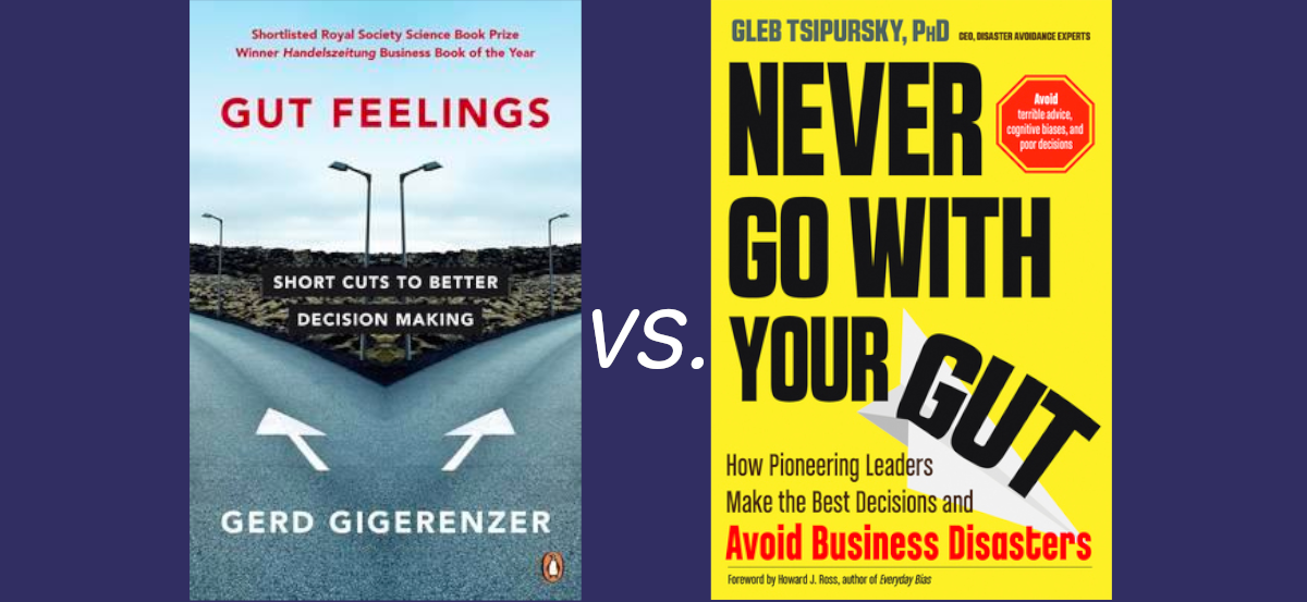
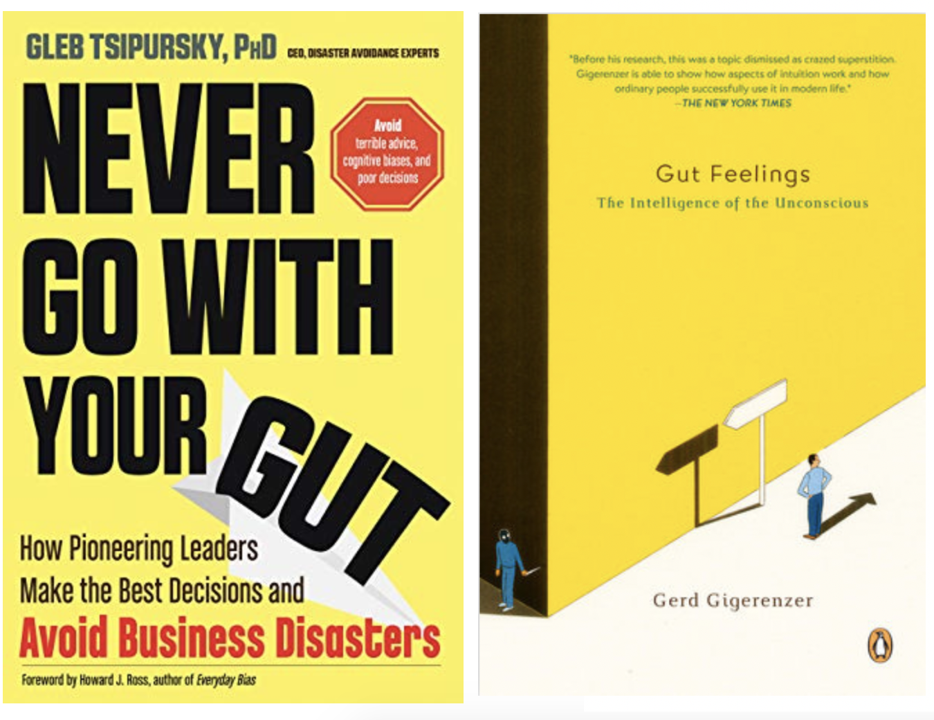
I am a huge fan of Gerd Gigerenzer who preaches numeracy and uncertainty education. One of Prof. Gigerenzer’s pivotal theses is “Fast and Frugal Heuristics” which is also popularized in his book “Gut Feelings” (listen to this podcast if you don’t want to read the book). I like this approach.
Today, I listened to the latest episode of the Brainfluence podcast that hosted the psychologist Dr. Gleb Tsipursky who wrote an extensive book called “Never Trust your Gut” with a seemingly contradicting thesis. I added this book to my TOREAD list.