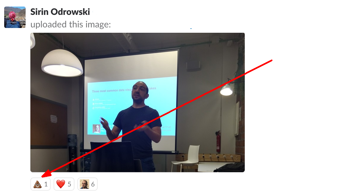
“There is only one thing worse than a pie chart. It’s a 3-D pie chart”. This is what I used to think for quite a long time. Recently, I have revised my attitude towards pie charts, mainly due to the works of Rober Kosara from Tableau. I am no so convinced that pie charts can be a good visualization choice, I even included a session “Pie charts as an alternative to bar charts” in my recent workshop.
What about three-dimensional graphs? I’m not talking about the situations where the data is intrinsically three-dimensional. Such situations lie within the consensus. I’m talking about adding a third dimension to graphs that can work in two dimensions. Like the example below that is taken from a 2017 post by Deven Wisner.
![Screenshot: a 3D pie chart with text "The only good thing about this pie chart is that it's starting to look more like [a] real pie"](/assets/img/2018/05/screen-shot-2018-05-28-at-14-41-43.png)
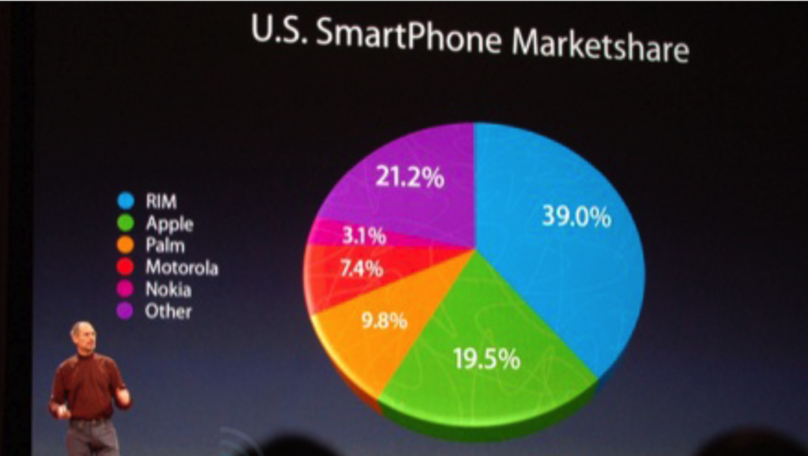
Of course, this is not a hypothetical example. We all remember how the late Steve Jobs tried to create a false impression of Apple market share
Having said all that, can you think of a legitimate case where adding the third dimension adds more value than distraction? I worked hard, and I finally found it.
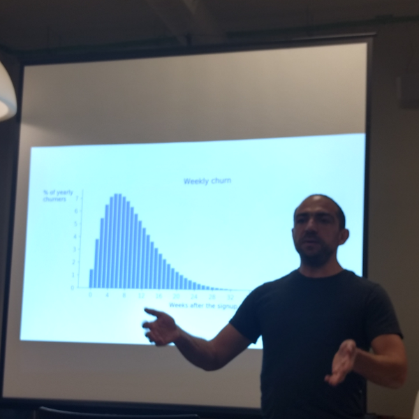
Take a look at the overlapping density plot (a.k.a “joy plot”).
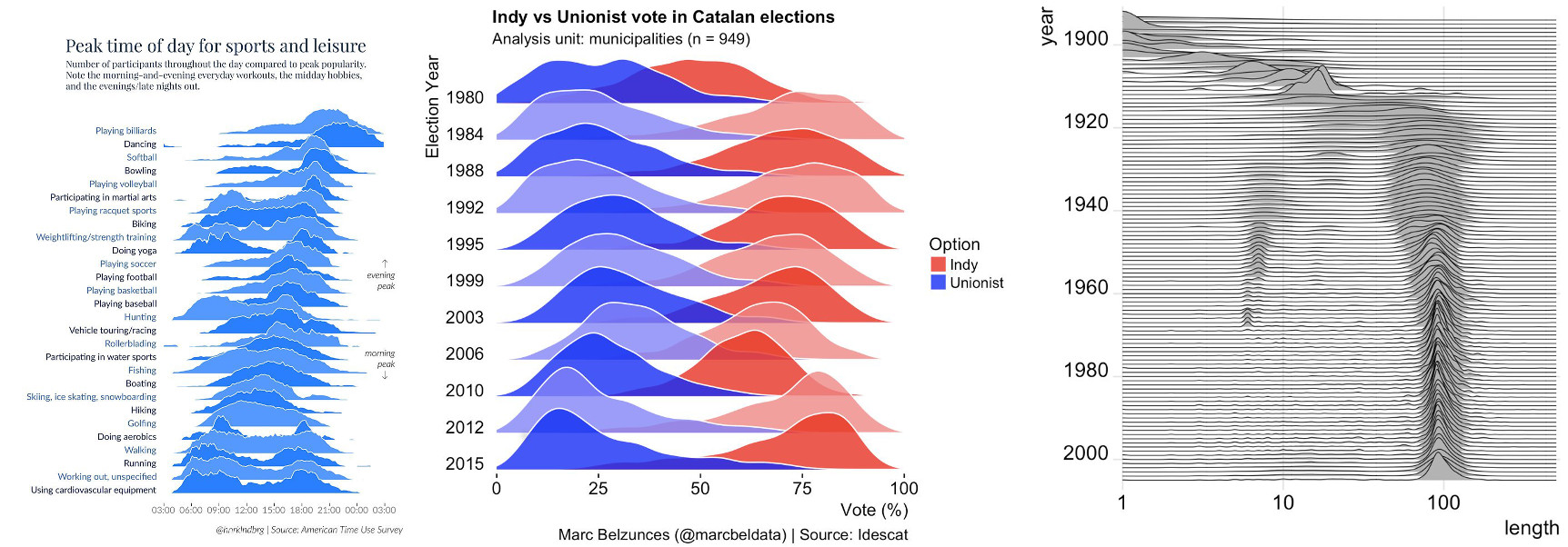
If you think of this, joyplots are nothing more than 3-d line graphs done well. Most of the time, they provide information-rich data overview that also enables digging into fine details. I really like joyplots. I included one in my recent workshop. Many libraries now provide ready-to-use implementations of joyplots. This is a good thing to have. The only reservation that I have about those implementations is the fact that many of them, including my favorite seaborn, add meaningless colors to the curves. But this is a topic for another rant.