[gallery ids=”2190,2189” type=”rectangular” link=”none”]
-
Hugo the cat
July 5, 2018 -

C for Conclusion
June 25, 2018From time to time, I give a lecture about most common mistakes in data visualization. In this lection, I say that not adding a graph’s conclusion as a title is an opportunity wasted
In one of these lectures, a fresh university graduate commented that in her University, she was told to never write a conclusion in a graph. According to to the logic she was tought, a scientist is only supposed to show the information, and let his or her peer scientists draw the conclusions by themselves. This sounds like a valid demand except that it is, in my non-humble opinion, wrong. To understand why is that, let’s review the arguments in favor of spelling out the conclusions.
The cynical reason
We cannot “unlearn” how to read. If you show a piece of graphic for its aesthetic value, it is perfectly OK not to suggest any conclusions. However, most of the time, you will show a graph to persuade someone, to convince them that you did a good job, that your product is worth investing in, or that your opponent is ruining the world. You hope that your audience will reach the conclusion that you want them to reach, but you are not sure. Spelling out your conclusion ensures that the viewers use it as a starting point. In many cases, they will be too lazy to think of objections and will adopt your point of view. You don’t have to believe me on this one. The Nobel Prize winner Daniel Kahneman wrote a book about this phenomenon.
What if you want to hear genuine criticism? Use the same trick to ask for it. Write an open question instead of the conclusion to ensure everybody wakes up and start thinking critically.
The self-discipline reason
Some people are not comfortable with the cynical way I suggest to exploit the limitations of the human mind. Those people might be right. For them, I have another reason, self-discipline. Coming up with a short, concise and descriptive title requires effort. This effort slows you down and ensures that you start thinking critically and asking questions. “What does this graph really tells?” “Is this the best way to demonstrate this conclusion?” “Is this conclusion relevant to the topic of my talk, is it worth the time?”. These are very important questions that someone has to ask you. Sure, having a professional and devoted reviewer on your prep team is great but unless you are a Fortune-500 CEO, you are preparing your presentations by yourself.
The philosophical reason
You will notice that my two arguments sound like a hack. They do not talk about the “pure science attitude”, and seem to be detached from the theoretical picture of the idealized scientific process. That is why, when that student objected to my suggestion, I admitted defeat. Being a data scientist, I want to feel good about my scientific practice. It took me a while but at some point, I realized that writing a conclusion as the sole title of a graph or a slide is a good scientific practice and not a compromise.
According to the great philosopher Karl Popper, a mandatory characteristic of any scientific theory is that they make claims that future observations might show to be false. Popper claims that without taking a risk of being proved wrong, a scientist misses the point [ref]. And what is the best way to make a clear, risky statement, if not spelling it out as a clear, non-ambiguous title of your graph?
Don’t feel bad, your bases are covered
To sum up, whenever you create a graph or a slide, think hard about what conclusion you want your audience to make out of it. Use this conclusion as your title. This will help you check yourself, and will help your fellow scientists assess your theory. And if a purist professor says you shouldn’t write your conclusions, tell him or her that the great Karl Popper thought otherwise.
-
Meaningless slopes
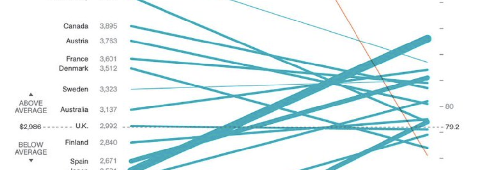
June 20, 2018That fact that you can doesn’t mean that you should! I will say it once again.That fact that you can doesn’t mean that you should! Look at this slopegraph that was featured by “Information is Beautiful”
https://twitter.com/infobeautiful/status/994510514054139904
What does it say? What do the slopes mean? It’s a slopegraph, its slopes should have a meaning. Sure, you can draw a line between one point to another but can you see the problem here? In this nonsense graph, the viewer is invited to look at slopes of lines that connect dollars with years. The proverbial “apples and oranges” are not even close to the nonsense degree of this graph. Not even close.
Thispage attributes this graph to National Geographic, which makes me even sadder.
-
In defense of three-dimensional graphs
May 28, 2018“There is only one thing worse than a pie chart. It’s a 3-D pie chart”. This is what I used to think for quite a long time. Recently, I have revised my attitude towards pie charts, mainly due to the works of Rober Kosara from Tableau. I am no so convinced that pie charts can be a good visualization choice, I even included a session “Pie charts as an alternative to bar charts” in my recent workshop.
What about three-dimensional graphs? I’m not talking about the situations where the data is intrinsically three-dimensional. Such situations lie within the consensus. I’m talking about adding a third dimension to graphs that can work in two dimensions. Like the example below that is taken from a 2017 post by Deven Wisner.
![Screenshot: a 3D pie chart with text "The only good thing about this pie chart is that it's starting to look more like [a] real pie"](/assets/img/2018/05/screen-shot-2018-05-28-at-14-41-43.png)
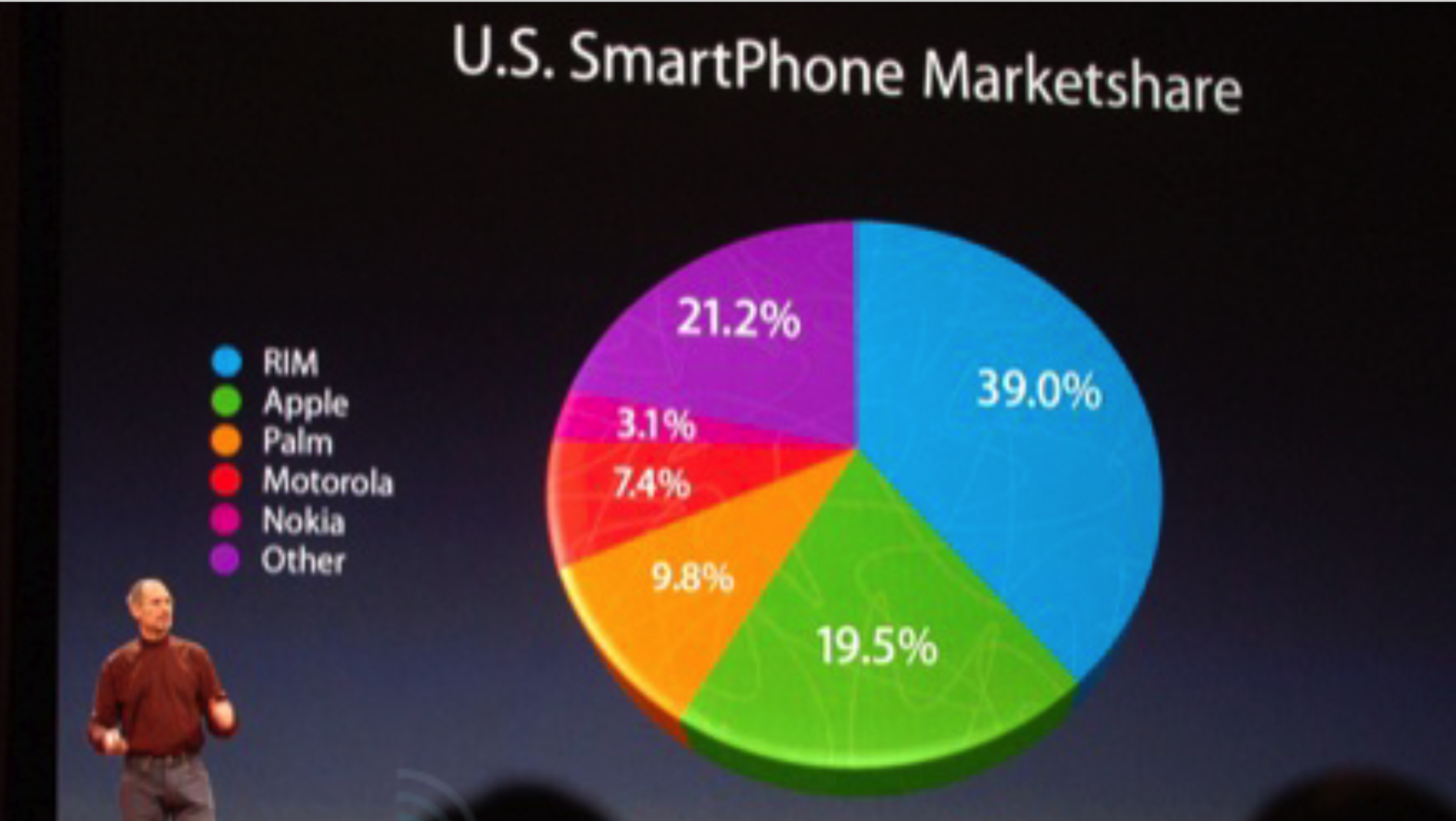
Of course, this is not a hypothetical example. We all remember how the late Steve Jobs tried to create a false impression of Apple market share
Having said all that, can you think of a legitimate case where adding the third dimension adds more value than distraction? I worked hard, and I finally found it.
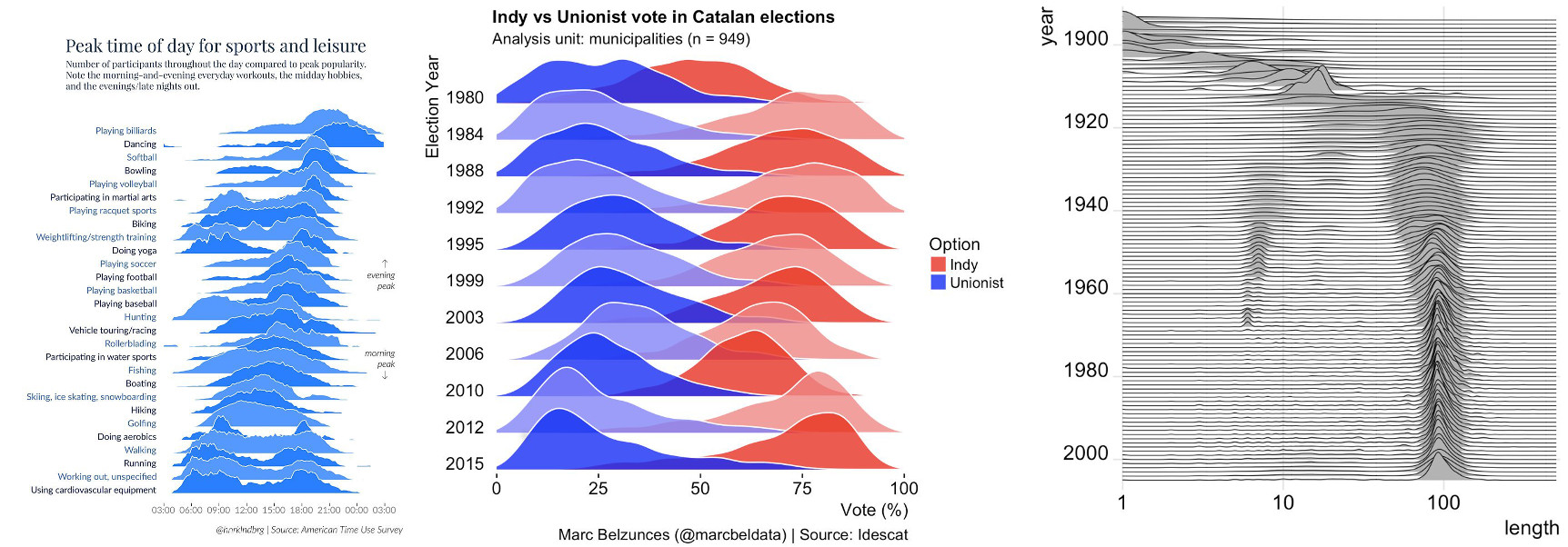
Take a look at the overlapping density plot (a.k.a “joy plot”).
If you think of this, joyplots are nothing more than 3-d line graphs done well. Most of the time, they provide information-rich data overview that also enables digging into fine details. I really like joyplots. I included one in my recent workshop. Many libraries now provide ready-to-use implementations of joyplots. This is a good thing to have. The only reservation that I have about those implementations is the fact that many of them, including my favorite seaborn, add meaningless colors to the curves. But this is a topic for another rant.
-
Today's workshop material
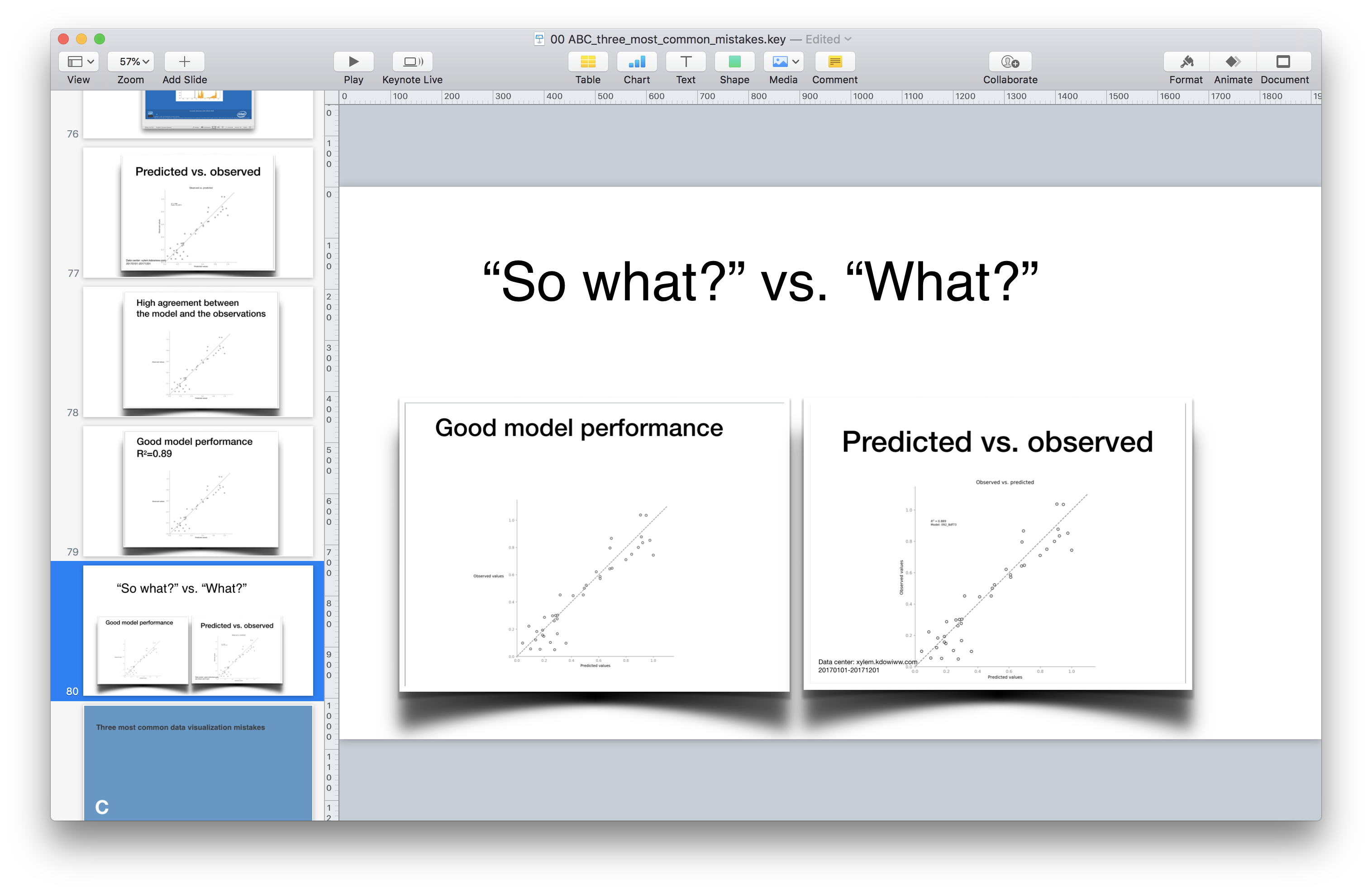
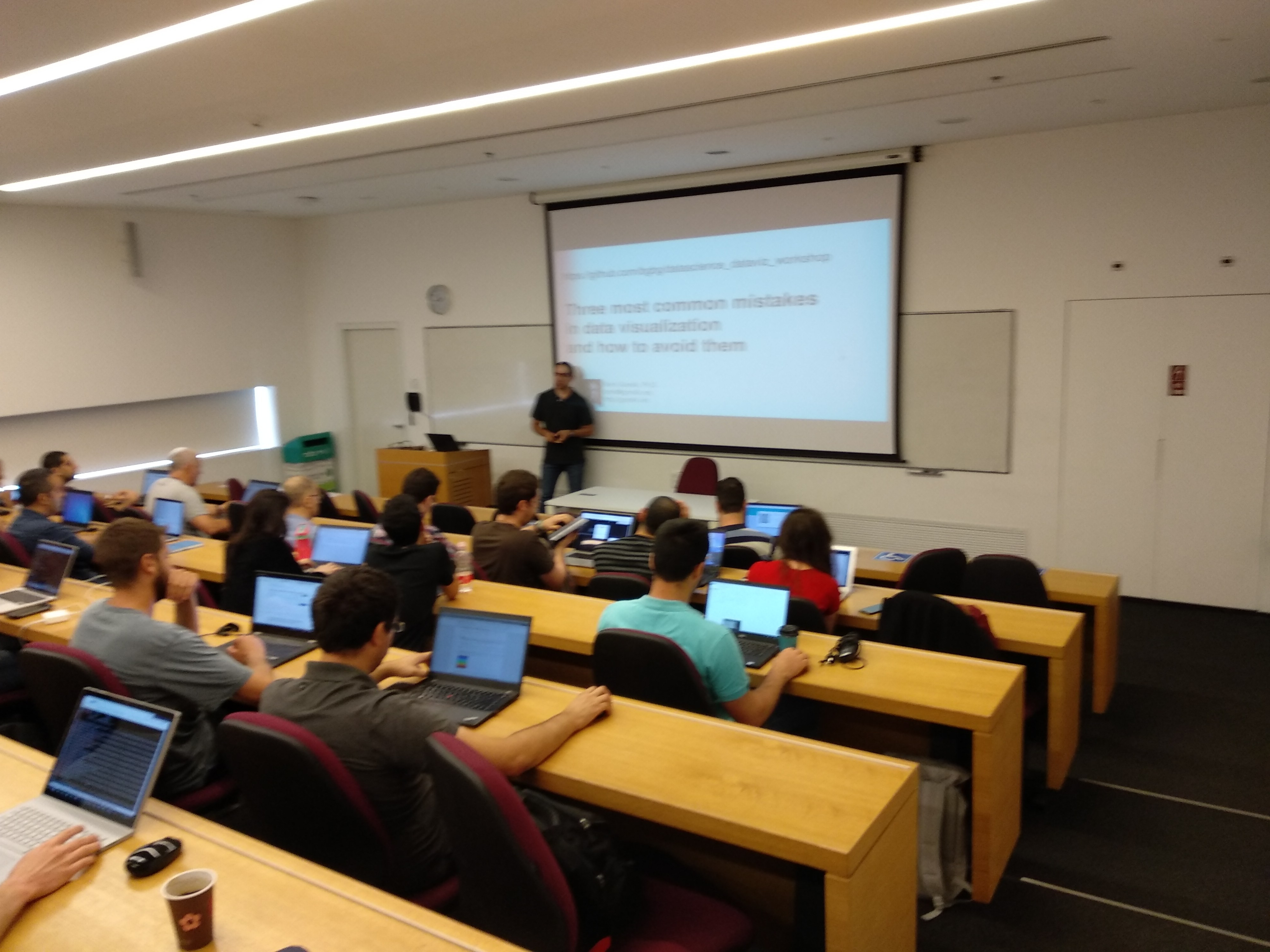
May 27, 2018Today, I hosted a data visualization workshop, as a part of the workshop day adjacent to the fourth Israeli Data Science Summit. I really enjoyed this workshop, especially the follow-up questions. These questions are the reason I volunteer talking about data visualization every time I can. It may sound strange, but I learn a lot from the questions people ask me.
If you want to see the code, you may find it on GitHub. The slide deck is available on Slideshare
[slideshare id=99058016&doc=00abcthreemostcommonmistakes-180527153252]
-
Prerequisites for the upcoming data visualization workshop
May 15, 2018I have been told that the data visualization workshop (“Data Visualization from default to outstanding. Test cases of tough data visualization”) is completely sold out. If you plan to attend this workshop, please check out the repository that I created for it [link]. In that repository, you will find a list of pre-requisites that you absolutely need to meet before the workshop. Also, it will be very helpful if you could fill this poll which will help me prepare for the workshop.
See you soon
-

If you know matplolib and are in Israel on May 27th, I need your help
May 15, 2018So, the data visualization workshop is fully booked. The organizers told me to expect 40-50 attendees and I need some assistance. I am looking for a person who will be able to answer technical questions such as “I got a syntax error”, “why can’t I see this graph?”, “my graph has different colors”.
It’s a good opportunity to attend the workshop for free, to learn a lot of useful information, and to meet a lot of smart people.
It’s a win-win situation. Contact me now at boris@gorelik.net
-
I will host a data visualization workshop at Israel’s biggest data science event
May 1, 2018TL/DR
What: Data Visualization from default to outstanding. Test cases of tough data visualization
**Why: ** You would never settle for default settings of a machine learning algorithm. Instead, you would tweak them to obtain optimal results. Similarly, you should never stop with the default results you receive from a data visualization framework. Sadly, most of you do.
When: May 27, 2018 (a day before the DataScience summit)/ 13:00 - 16:00
Where: Interdisciplinary Center (IDC) at Herzliya.
More info: here.
Timeline:
1. Theoretical introduction: three most common mistakes in data visualization (45 minutes)
2. Test case (LAB): Plotting several radically different time series on a single graph (45 minutes)
3. Test case (LAB): Bar chart as an effective alternative to a pie chart (45 minutes)
4. Test case (LAB): Pie chart as an effective alternative to a bar chart (45 minutes)More words
According to the conference organizers, the yearly Data Science Summit is the biggest data science event in Israel. This year, the conference will take place in Tel Aviv on Monday, May 28. One day before the main conference, there will be a workshop day, hosted at the Herzliya Interdisciplinary Center. I’m super excited to host one of the workshops, during the afternoon session. During this workshop, we will talk about the mistakes data scientist make while visualizing their data and the way to avoid them. We will also have some fun creating various charts, comparing the results, and trying to learn from each others’ mistakes.
-
Whoever owns the metric owns the results — don't trust benchmarks
April 13, 2018Other factors being equal, what language would you choose for heavy numeric computations: Python or PHP? This is not a language war but a serious question. For me, the choice seems to be obvious: I would choose Python, and I’m not the only one. In this survey, for example, 45% of data scientist use Python, compared to 24% who use PHP. The two sets of data scientists aren’t mutually exclusive, but we do see the picture.
This is why I was very surprised when a colleague of mine suggested switching to PHP due to a three times faster performance in a benchmark. I was very surprised and intrigued. Especially, when I noticed that they used a heavy number crunching for the benchmark.
In that benchmark, the authors compute prime numbers using the following Python code
[code lang=”python”]
def get_primes7(n): “”” standard optimized sieve algorithm to get a list of prime numbers — this is the function to compare your functions against! — “”” if n < 2: return [] if n == 2: return [2] # do only odd numbers starting at 3 if sys.version_info.major <= 2: s = range(3, n + 1, 2) else: # Python 3 s = list(range(3, n + 1, 2)) # n0.5 simpler than math.sqr(n) mroot = n ** 0.5 half = len(s) i = 0 m = 3 while m <= mroot: if s[i]: j = (m * m - 3) // 2 # int div s[j] = 0 while j =6, Returns a array of primes, 2 <= p < n “”” sieve = np.ones(n//3 + (n%6==2), dtype=np.bool) sieve[0] = False for i in range(int(n0.5)//3+1): if sieve[i]: k=3i+1|1 sieve[ ((kk)//3) ::2k] = False sieve[(kk+4k-2k(i&1))//3::2k] = False return np.r_[2,3,((3*np.nonzero(sieve)[0]+1)|1)]
[/code]Did you notice the problem? The code above is a pure Python code. I can’t think of a good reason to use pure python code for computationally-intensive, time-sensitive tasks. When you need to crunch numbers with Python, and when the computational time is even remotely important, you will most certainly use tools that were specifically optimized for such tasks. One of the most important such tools is numpy, in which the most important loops are implemented in C++ or in Fortran. Many other packages, such as Pandas, scipy, sklearn, and others rely on numpy or other form of speed optimization.
The following snippet uses numpy to perform the same computation as the first one.
[code lang=”python”]
def numpy_primes(n): # http://stackoverflow.com/questions/2068372/fastest-way-to-list-all-primes-below-n-in-python/3035188#3035188 “”” Input n>=6, Returns a array of primes, 2 <= p < n “”” sieve = np.ones(n//3 + (n%6==2), dtype=np.bool) sieve[0] = False for i in range(int(n*0.5)//3+1): if sieve[i]: k=3i+1|1 sieve[ ((kk)//3) ::2k] = False sieve[(kk+4k-2k(i&1))//3::2k] = False return np.r_[2,3,((3np.nonzero(sieve)[0]+1)|1)]
[/code]On my computer, the timings to generate primes smaller than 10,000,000 is 1.97 seconds for the pure Python implementation, and 21.4 milliseconds for the Numpy version. The numpy version is 92 times faster!
**What does that mean? **
Whoever owns the metric owns the results. Never trust a benchmark result before you understand how the benchmark was performed, and before making sure the benchmark was performed under the conditions that are relevant to you and your problem. -

When "a pile of shit" is a compliment — On context importance in remote communication
March 28, 2018What would you do, if someone left a “Pile of Poo” emoji as a reaction to your photo in your team Slack channel?
This is exactly what happened to me a couple of days ago, when Sirin, my team lead, posted a picture of me talking to the Barcelona Machine Learning Meetup Group about data visualization.
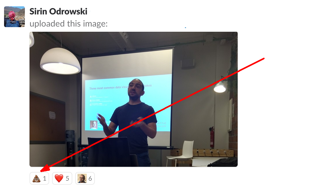
Did I feel offended? Not at all. It was pretty funny, actually. To understand why, let’s talk about the importance of context in communication, especially in a distributed team.
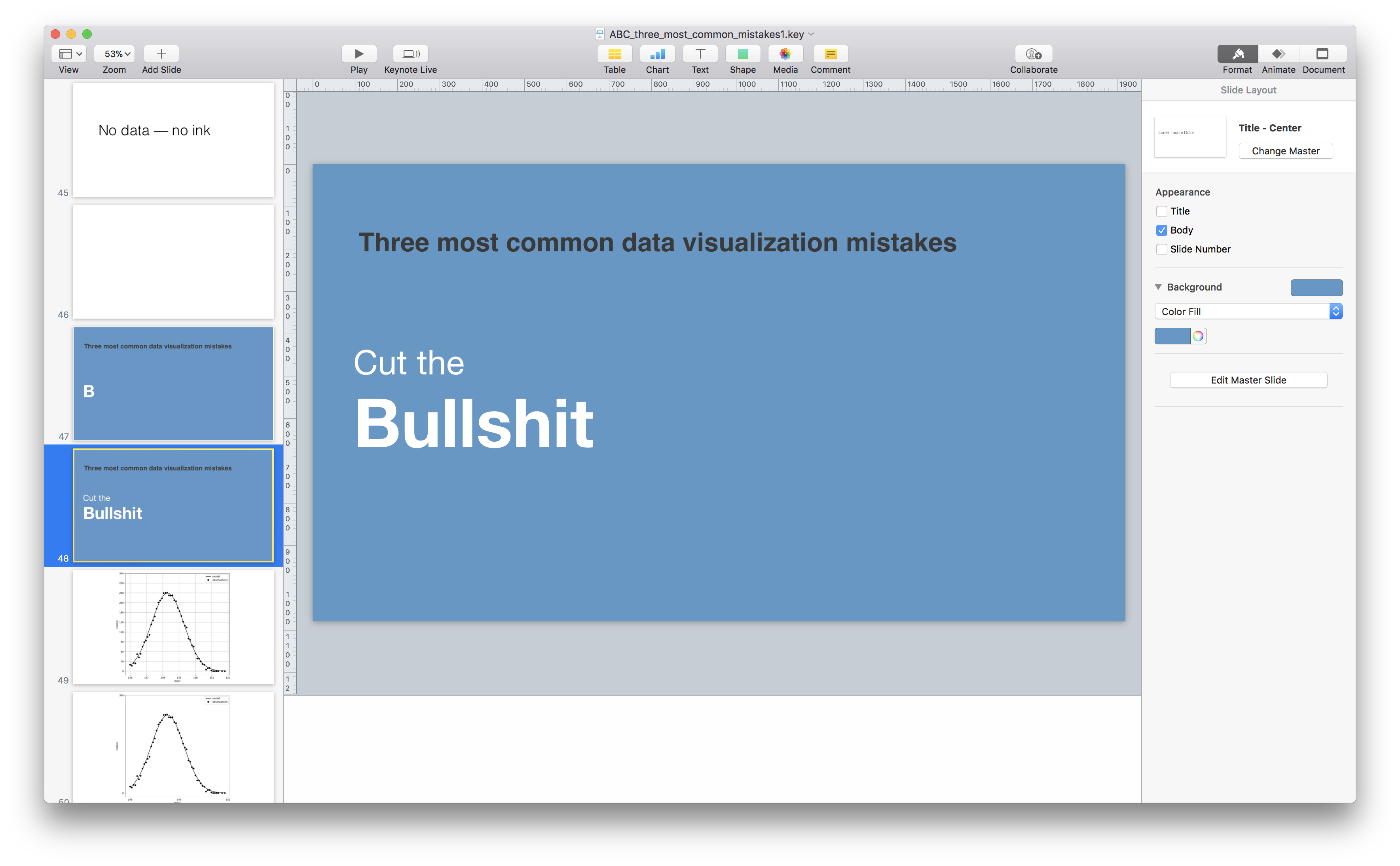
The context
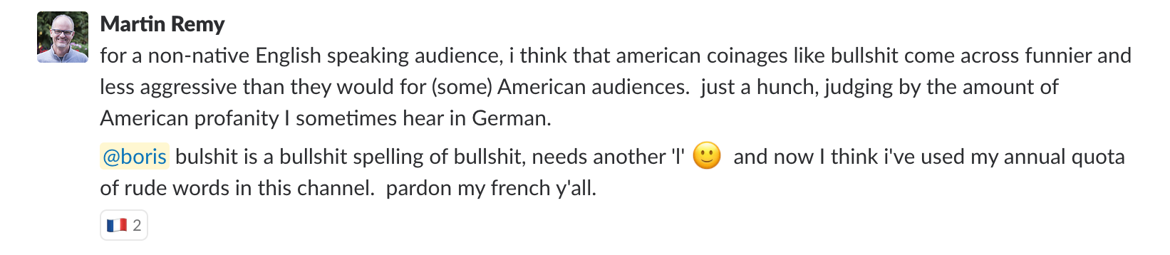
My Barcelona talk is titled “Three most common mistakes in data visualization and how to avoid them”. During the preparation, I noticed that the first mistake is about keeping the wrong attitude, and the third one is about not writing conclusions. I noticed the “A”, and “C”, and decided to abbreviate the talk as “ABC”. Now, I had to find the right word for the “B” chapter. The second point in my talk deals with low signal-to-noise ratio. How do you summarize signal-to-noise ratio using a word that starts with “B”? My best option was “bullshit”, as a reference to “noise” – the useless pieces of information that appear in so many graphs. I was so happy about “bullshit,” but I wasn’t sure it was culturally acceptable to use this word in a presentation. After fruitless searches for a more appropriate alternative, I decided to ask my colleagues.
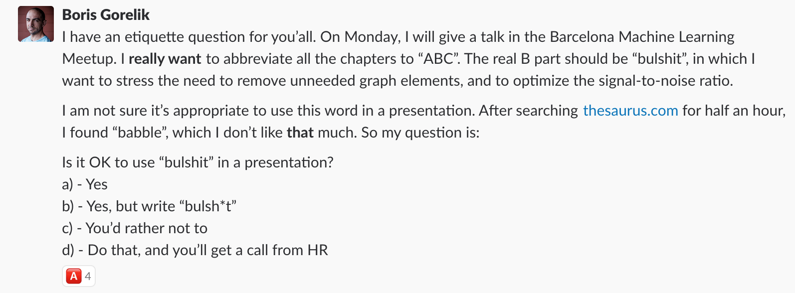
All the responders agreed that using bullshit in a presentation was OK. Martin, the head of Data division at Automattic, provided the most elaborate answer.
I was excited that my neat idea was appropriate, so I went with my plan:
Understandably, the majority of the data community at Automattic became involved in this presentation. That is why, when Sirin posted a photo of me giving that presentation, it was only natural that one of them responded with a pile of poo emoji. How nice and cute! 💩
The lesson
This bullshit story is not the only example of something said about me (if you can call an emoji “saying”) that sounded very bad to the unknowing person, but was in fact very correct and positive. I have a couple of more examples that may be even funnier than this one but require more elaborate and boring explanations.
However, the lesson is clear. Next time you hear someone saying something unflattering about someone else, don’t jump to conclusions. Think about bullshit, and assume the best intentions. -
Three most common mistakes in data visualization and how to avoid them. Now, the slides
March 21, 2018Yesterday, I talked in front of the Barcelona Data Science and Machine Learning Meetup about the most common mistakes in data visualization. I enjoyed talking with the local community very much. Judging by the feedback I received during and after the talk, they too, enjoyed my presentation. I uploaded my slides to Slideshare.
Enjoy!
-

Engineering Data Science at Automattic
March 21, 2018Data Scientist? Data Engineer? Analyst? My teammate, Yanir Seroussi writes about bridging the gaps between the different professions.
-
Live in Barcelona. Three most common mistakes in data visualization.
March 2, 2018On Thursday, March 20, I will give a talk titled “Three most common mistakes in data visualization and how to avoid them.” I will be a guest of the Barcelona Data Science and Machine Learning Meetup Group. Right now, less than twenty-four hours after the lecture announcement, there are already seventeen people on the waiting list. I feel a lot of responsibility and am very excited.
-
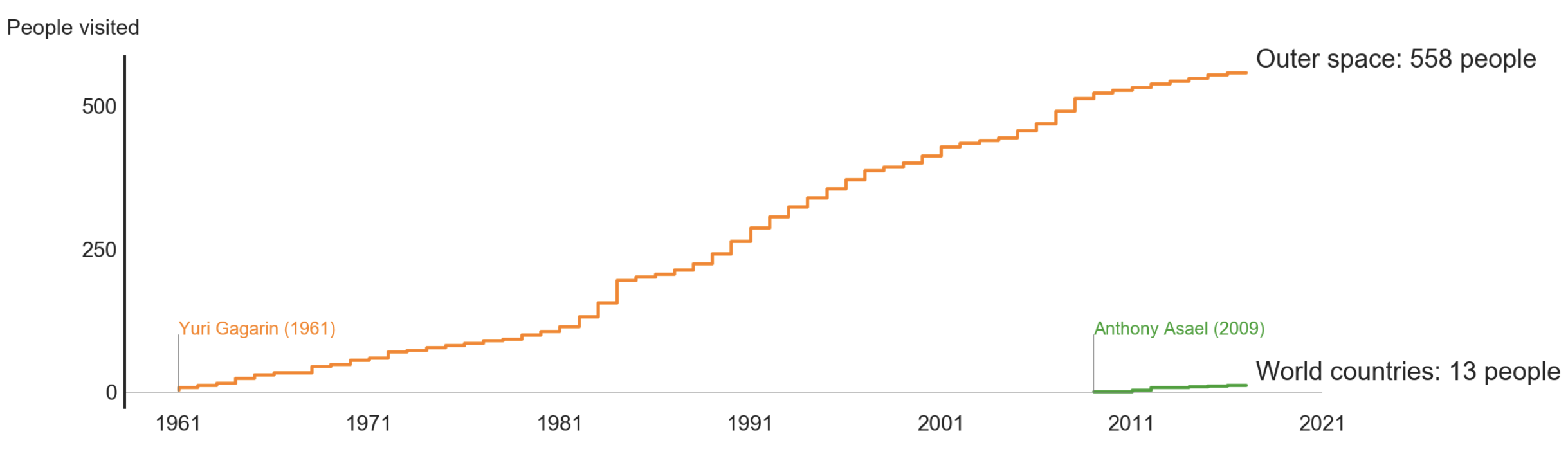
Visiting the outer space isn't such a big deal
March 1, 2018I know a lot of people who dreamt of being a cosmonaut or an astronaut. I was one of them. Did you know that visiting the outer space isn’t such a big deal? Since the Yuri Gagarin’s first flight to space in 1961, 557 more people flew to space. Unfortunately, not all of them survived the trip [ref].
On the other hand
There are 193 UN member countries. Do you know that, according to Wikipedia, there are only 13 (thirteen!) people who are confirmed to visit all of these countries? [ref] It’s 43 times less than the number of astronauts!
-

On algorithmic fairness & transparency
February 28, 2018My teammate, Charles Earl has recently attended the Conference on Fairness, Accountability, andTransparency (FAT*). The conference site is full of very interesting material, including proceedings and video recording of lectures and tutorials.
Reading through the conference proceedings, I found a very interesting paper titled “The Cost of Fairness in Binary Classification.” This paper talks about the measures one needs to take in order not use sensitive features (such as race) as the means to discrimination, with a reasonable accuracy tradeoff.
Skimming through this paper, I recalled a conversation I had about a year ago with a chief data scientist in a startup that provides short-term loans to people who need some money now. The major job of the data science team in that company was to assess the risk of a customer. From the explanation the chief data scientist gave, and from the data sources she described, it was clear that they train their model on the information whether a person is likely to receive a loan from a financial institution. When I pointed out that they exclude categories of people that are rejected but are likely to return the money. “Yes?” she said in a tone as if she couldn’t see what the problem that I tried to raise was. “Well,” I said, it’s unfair for many customers, plus you’re missing the chance to recruit customers who were rejected by others”. “We have enough potential customers,” she said. She didn’t think fairness was an issue worth talking about.
The featured image is by Søren Astrup Jørgensen from Unsplash
-
Five misconceptions about data science
February 27, 2018One item on my todo list is to write a post about “three common misconceptions about data science. Today, I found this interesting post that lists misconceptions much better than I would have been able to do. Plus, they list five of them. That 67% more than I intended to do ;-)
I especially liked the section called “What is a Data Scientist” that presents six Venn diagrams of a dream data scientist.
The analogy between the data scientist and a purple unicorn is still apt – finding an individual that satisfies any one of the top four diagrams above is rare.
Enjoy reading Five Misconceptions About Data Science – Knowing What You Don’t Know — Track 2 Analytics
-
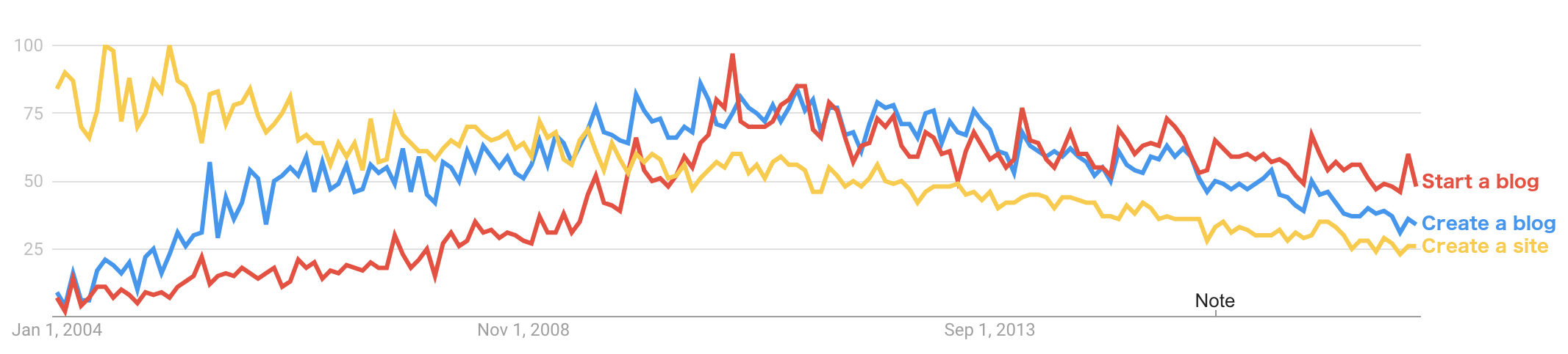
Blogging isn't what it used to be
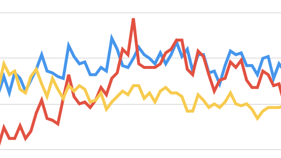
February 26, 2018From time to time, I assume something, evaluate that assumption, and discover that the reality is opposite to what I thought it was. That’s exactly what happened when I thought about the dynamics of Google searches for “create a site,” compared to the searches for “create a blog.” I was sure that there would be much more searches for “create a site.” I was wrong
There are several interesting insights that one can drive from that small analysis.
1. The number of people who search for "create a site" is continuously dropping.
2. Ever since 2009, the number of searches for "create a site" is smaller than the number of searches for "create a blog." Why? I have no idea
3. Blog creation search dynamics is also interesting. Both "start a blog" and "create a blog" have been decreasing since January 2011. However, despite the fact that both the curves started at the same height, and reached the same peak, they did so in different trajectories. "Create a blog" reached a peak gradually, following a concave path. "Start a blog," on the other hand, reached the peak following a convex path that resembles exponential growth. For some reason, in January 2009 growth of both the searches stopped.
Usually, in posts like this, you would expect an analysis that explains the difference. I don’t have any answers. However, if you have any hypothesis, I will be glad to hear.
-
ASCII histograms are quick, easy to use and implement
February 25, 2018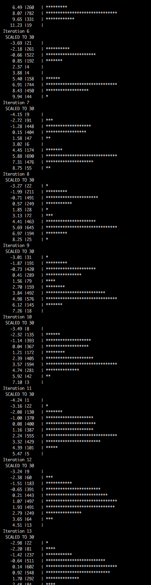
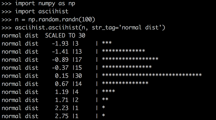
From time to time, we need to look at a distribution of a group of values. Histograms are, I think, the most popular way to visualize distributions. “Back in the old days,” when most of my work was done in the console, and when creating a plot from Python was required too many boilerplate code lines, I found a neat function that produced histograms using ASCII characters.
Surely, today, when most of us work in a notebook environment, ASCII histograms aren’t as useful as they used to be. However, they are still helpful. One scenario in which ASCII diagrams are useful is when you write a log file for an iterative process. A quick glimpse at the log file will let you know when the distribution of some scoring function reached convergence.
That is why I keep my version of
asciihistupdated since 2005. You may find it on Github here. -

Mammogram, breast cancer, and manipulative statistics
February 24, 2018Here’s a quiz
A healthy woman with no risk factors gets a positive mammogram result during a routine annual check. What is the probability that she actually has a breast cancer?
Baseline data: The probability that a woman has breast cancer is 0.8%. If she has breast cancer, the probability that a mammogram will show a positive result is 90%. If a woman does not have breast cancer, the probability of a positive result is 7%.Prof. Gerd Gigerenzer gave this quiz to numerous students, physicians, and professors. Most of them failed this quiz. The correct answer is 9%. The probability that a healthy woman has a breast cancer if she has a positive mammogram test is only nine percent! This means that ninety percent of women who get a positive result will undergo stressful and painful series of tests only to discover that that was a false alarm. In his book “Calculated Risks”, prof. Gigerenzer uses this low probability as a starting (but not the only) argument against the common practice of routine population-wide mammogram tests. However, I would like to propose another way to look at this problem.
To understand my concern, let me first explain how we get the 9% figure.
There are several ways to get to this result. One of them is as follows. Eighty out of 10,000 women have breast cancer. Of those women, 72 (90% of 80) will test positive during a mammogram. Of the remaining 9,920 healthy women, about 694 (7%) will also have a positive mammogram test. The total number of women with a positive test is 766. Of those 766 women, only 72 have breast cancer, which is about 9%. The following diagram will help you track the numbers.Nine percent is indeed a low number. If a woman gets ten mammogram tests in her lifetime, there is a 60+% chance that she will have at least one false positive test. This is not something that can be easily ignored.
However
Let’s think about another way to look at this problem. Yes, the probability of a woman to have a breast cancer given that she has a positive mammogram result is nine percent (72 out of 697+72=766). However, the probability of a woman to have a breast cancer given that she has a negative mammogram result is 8 out of (9,223+8)=9,231 which is approximately 0.09%. That means that a woman with a positive mammogram test is 100 times more likely to have a breast cancer, compared to the woman with a negative result. Increase by a factor of 100 sounds like a serious threat. Much more serious than the nine percent! Moreover, a woman with a negative mammogram result knows that she is approximately ten times less likely to have a breast cancer than an average woman who didn’t undergo the test (0.09% vs 0.8%).
Conclusion?
Frankly, I don’t know. One thing is for sure; one can use statistics to steer an “average person” towards the desired decision. If my goal is to increase reduce the number of women who undergo routine mammogram tests, I will talk in terms of absolute risk (9%). If, on the other hand, I’m selling mammogram equipment, I will definitely talk in terms of the odds ratio, i.e., the 100-times risk increase. Think about this every time someone is talking to you about hazards.
-
One of the reasons I don't like R
February 23, 2018I never liked R. I didn’t like it for the first time I tried to learn it, I didn’t like it when I had to switch to R as my primary work tool at my previous job. And didn’t like it one and a half year later, when I was comfortable enough to add R to my CV, right before leaving my previous job.
Today, I was reminded of one feature (out of so many) that made dislike R. It’s its import (or
library, as they call it in R) feature. In Python, you canimport a_moduleand then use its components by callinga_model.a_function. Simple and predictable. In R, you have to read the docs in order to understand what will happen to your namespace after you havelibrary(a.module)(I know, those dots grrrr) in your code. This feature is so annoying that people write modules that help them using other modules. Like in [this blog post](http://(https://trinkerrstuff.wordpress.com/2018/02/22/minimal-explicit-python-style-package-loading-for-r/), which looks like an interesting thing to do, but … wouldn’t it be easier to use Python? -
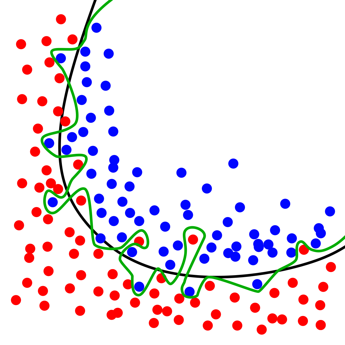
Overfitting reading list
February 22, 2018Overfitting is a situation in which a model accurately describes some data but not the phenomenon that generates that data. Overfitting was a huge problem in the good old times, where each data point was expensive, and researchers operated on datasets that could fit a single A4 sheet of paper. Today, with mega- giga- and tera-bytes datasets, overfitting is … still a problem. A very painful one. Following is a short reading list on overfitting.
I would like to start with Mehmet Suzen mllib.wordpress.com who treats overfitting as “inaccurate meme in supervised learning”
cross-validation does not prevent your model to overfit and good out-of-sample performance does not guarantee not-overfitted model.
Another blogger, whose name I couldn’t find, has two very detailed posts on overfitting:
Understanding overfitting from bias-variance trade-off and Understanding overfitting from Haussler 1988 theorem
Finally, Adrian from the “morning paper” (please don’t tell me you don’t follow that blog) has a summary of another paper, titled “Understanding deep learning requires re-thinking generalization” (I only read Adrian’s summary).
Conclusion
No conclusions here. It’s a reading list.
Featured image credit: https://en.wikipedia.org/wiki/Overfitting#/media/File:Overfitting.svg
-
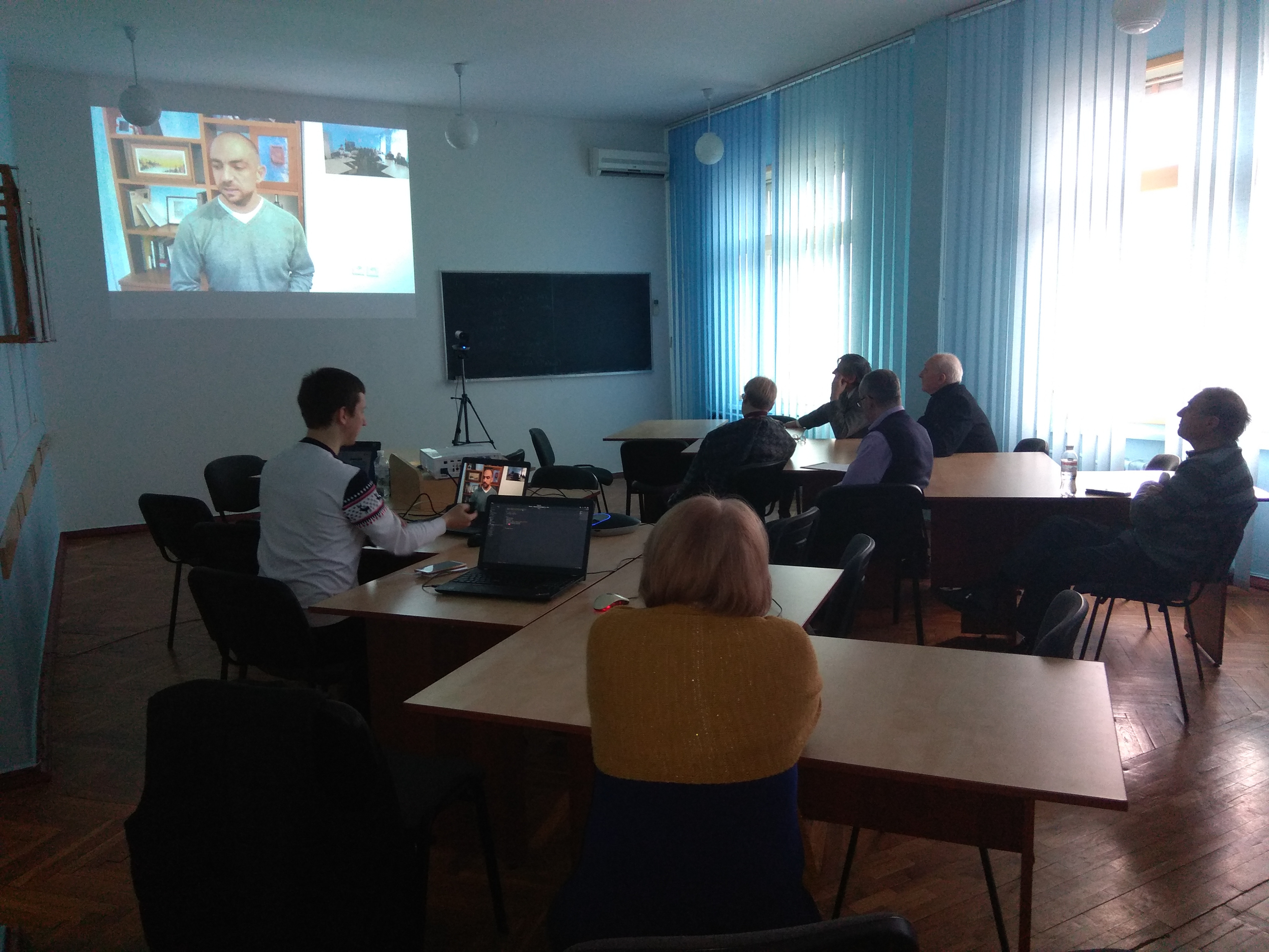
Tips on making remote presentations
February 21, 2018Today, I made a presentation to the faculty of the Chisinau
Institute of Mathematics and Computer Science. The audience gathered in a conference room in Chisinau, and I was in my home office in Israel.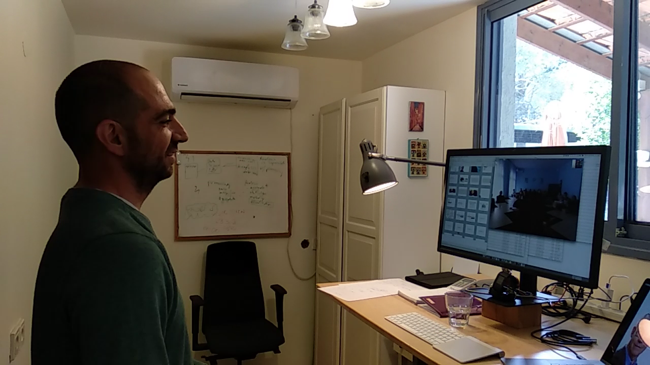
Following is a list of useful tips for this kind of presentations.
* When presenting, it is very important to see your audience. Thus, use two monitors. Use one monitor for screen sharing, and the other one to see the audience * Put the (Skype) window that shows your audience under the camera. This way you'll look most natural on the other side of the teleconference. * Starting a presentation in Powerpoint or Keynote "kidnaps" all the displays. You will not be able to see the audience when that happens. I export the presentation to a PDF file and use Acrobat Reader in full-screen mode. The up- and down- buttons in my presentation remote control work with the Reader. The "make screen black" button doesn't. * I open a "lightable view" of my presentation and put it next to the audience screen. It's not as useful as seeing the presenter's notes using a "real" presentation program, but it is good enough. * Stand up! Usually, we stand up when we present in front of live audience. For some reason, when presenting remotely, people tend to sit. A sitting person is less dynamic and looks less engaging. I have a standing desk which allows me to stand up and to raise the camera to my face level. If you can't raise the camera, stay sitting. You don't want your audience staring at your groin. -
The best productivity system I know
February 20, 2018I am an awful procrastinator. I realized that, many years ago. Once I did, I started searching for productivity tips and systems. Of course, most of these searches are another form of procrastination. After all, it’s much more fun to read about productivity than writing that boring report. In 2012, I discovered a TiddlyWiki that implements AutoFocus – a system developed by Mark Forster (AutoFocus instructions: link, TiddlyWiki page link)
I loved the simplicity of that system and used it for a while. I also started following Mark Forster’s blog. Pretty soon after that, Mark published another, even simpler version of that system, which he called “The Final Version.” I loved it even better and readily adopted it. For many reasons, I moved from TiddlyWiki to Trello and made several personal adjustments to the system.
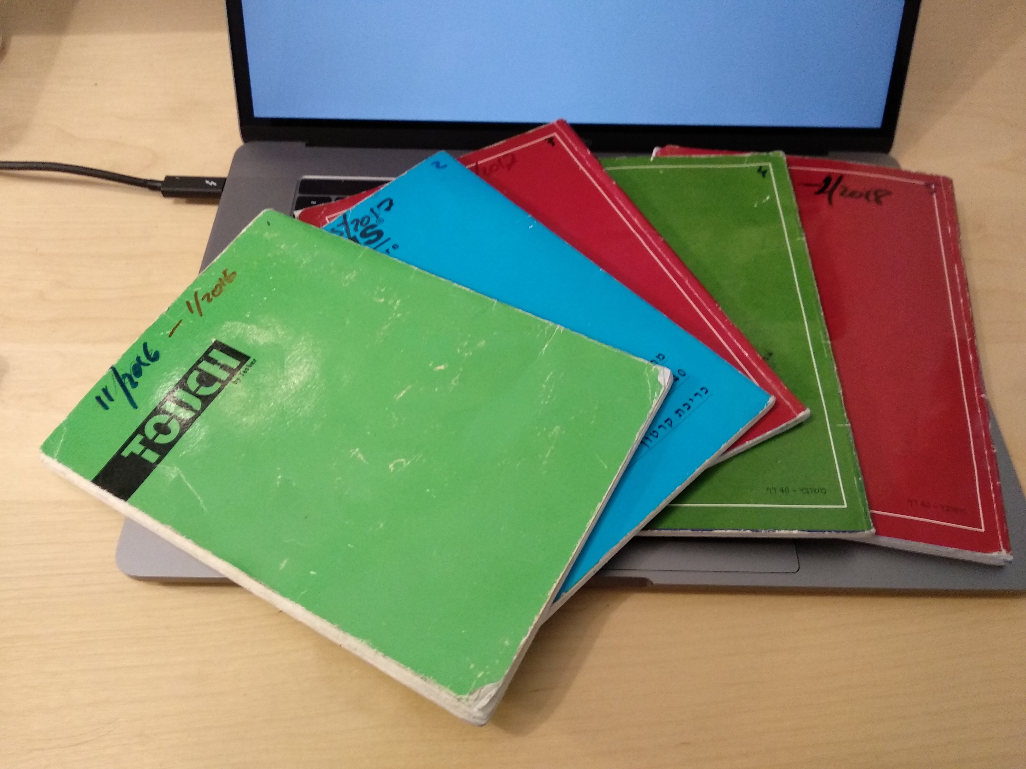
At some point, I read “59 seconds” in which the psychologist Richard Wiseman summarizes many psychological studies in the field of happiness, productivity, decision making, etc. From that book, I learned about the power of writing things down. It turns out, that when you write things down, your brain gets a better chance to analyze your thoughts and to make better decisions. I also learned from other sources about the importance to disconnect from the Internet several times a day. So, on November 2016, I made a transition from electronic productivity system to an old school notebook. In the beginning, I decided to keep that notebook as a month-long experiment, but I loved that very much. Since then, I have always had my analog productivity system and an introspection device with me. Today, I started my sixth notebook. I love my system so much, I actually consider writing a book about it.
[caption id=”attachment_2088” align=”alignnone” width=”4000”]
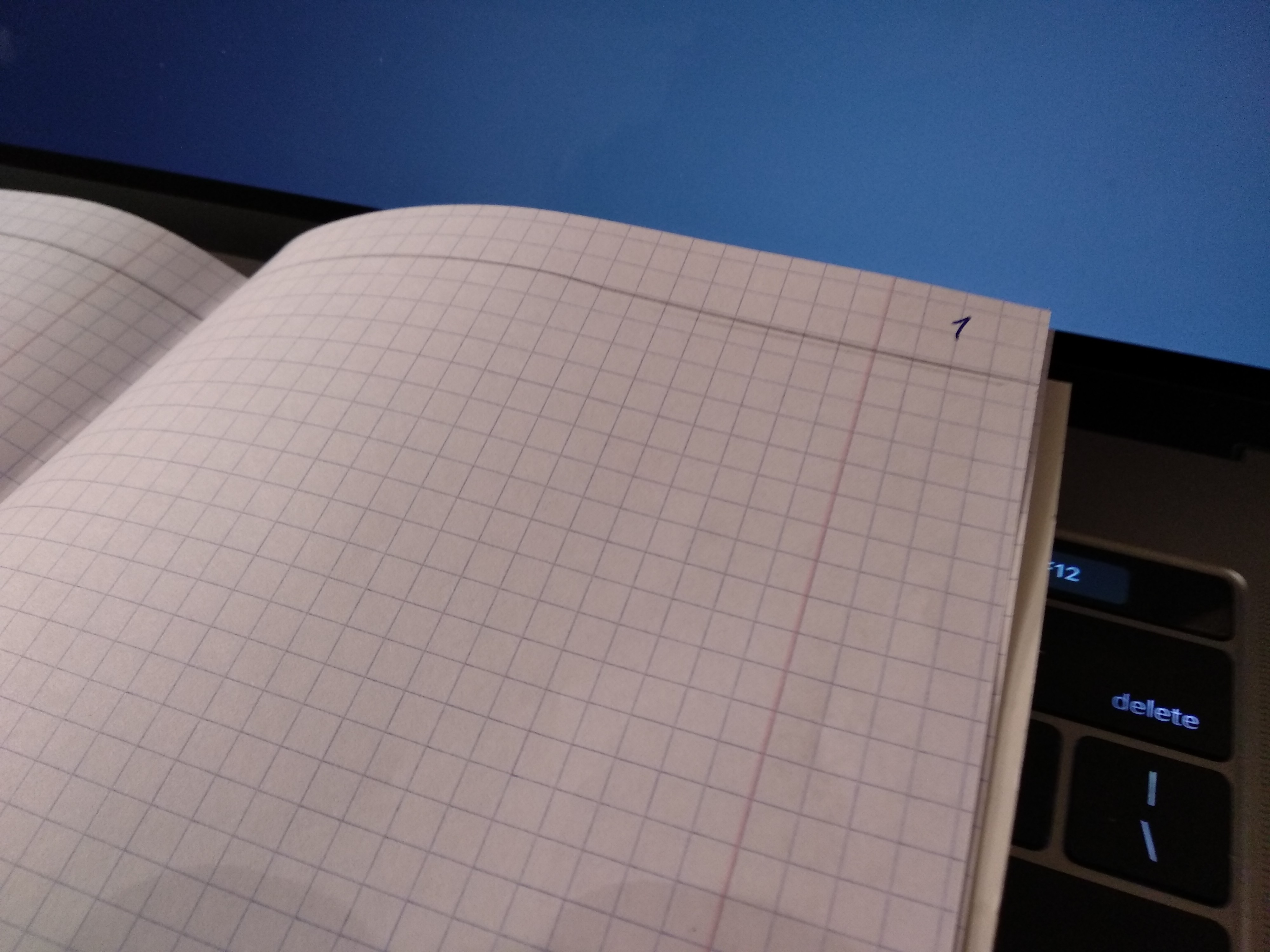
The first page of my new notebook. The notebook is left-to-right since I write in Hebrew[/caption]
-
Once again on becoming a data scientist
February 19, 2018My stand on learning data science is known: I think that learning “data science” as a career move is a mistake. You may read this long rant of mine to learn why I think so. This doesn’t mean that I think that studying data science, in general, is a waste of time.
Let me explain this confusion. Take this blogger for example https://thegirlyscientist.com/. As of this writing, “thegirlyscientst” has only two posts: “Is my finance degree useless?” and “How in the world do I learn data science?”. This person (whom I don’t know) seems to be a perfect example of someone may learn data science tools to solve problems in their professional domain. This is exactly how my professional career evolved, and I consider myself very lucky about that. I’m a strong believer that successful data scientists outside the academia should evolve either from domain knowledge to data skills or from statistical/CS knowledge to domain-specific skills. Learning “data science” as a collection of short courses, without deep knowledge in some domain, is in my opinion, a waste of time. I’m constantly doubting myself with this respect but I haven’t seen enough evidence to change my mind. If you think I miss some point, please correct me.
-
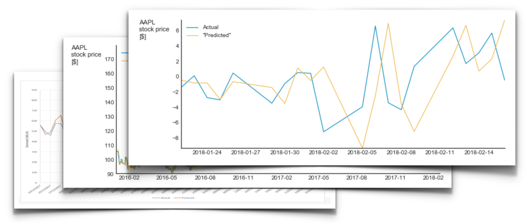
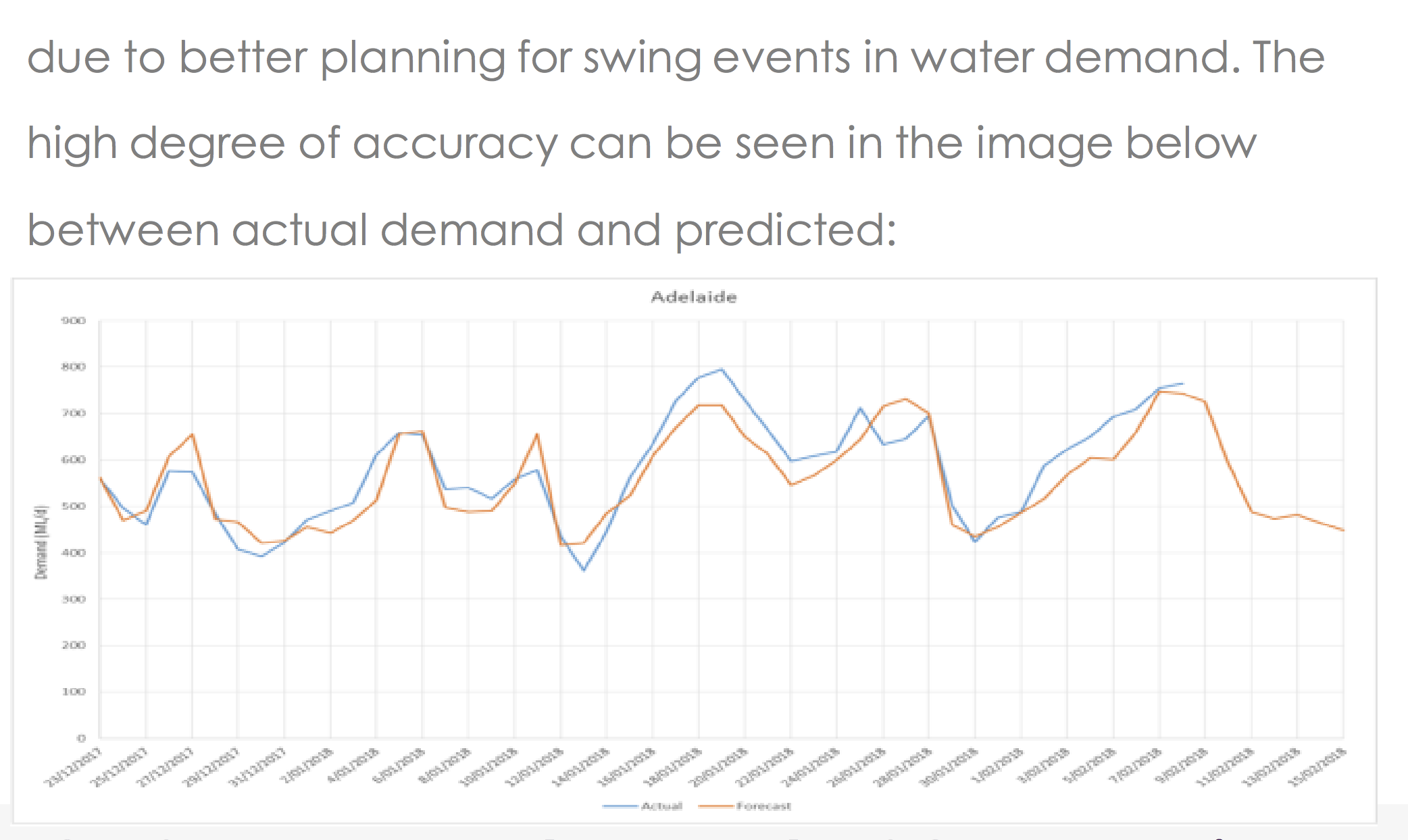
The case of meaningless comparison
February 18, 2018Exposé, an Australian-based data analytics company, published a use case in which they analyze the benefits of a custom-made machine learning solution. The only piece of data in their report [PDF] was a graph which shows the observed and the predicted
Graphs like this one provide an easy-to-digest overview of the data but are meaningless with respect to our ability to judge model accuracy. When predicting values of time series, it is customary to use all the available data to predict the next step. In cases like that, “predicting” the next value to be equal to the last available one will result in an impressive correlation. Below, for example, is my “prediction” of Apple stock price. In my model, I “predict” tomorrow’s prices to be equal to today’s closing price plus random noise.
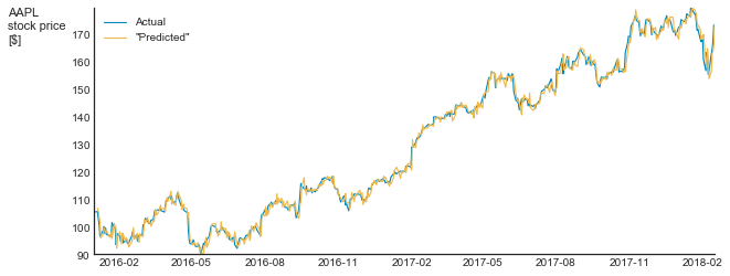
Look how impressive my prediction is!
I’m not saying that Exposé constructed a nonsense model. I have no idea what their model is. I do say, however, that their communication is meaningless. In many time series, such as consumption dynamics, stock price, etc, each value is a function of the previous ones. Thus, the “null hypothesis” of each modeling attempt should be that of a random walk, which means that we should not compare the actual values but rather the changes. And if we do that, we will see the real nature of the model. Below is such a graph for my pseudo-model (zoomed to the last 20 points)
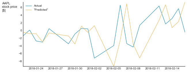
Suddenly, my bluff is evident.
To sum up, a direct comparison of observed and predicted time series can only be used as a starting point for a more detailed analysis. Without such an analysis, this comparison is nothing but a meaningless illustration.
- Older posts Newer posts