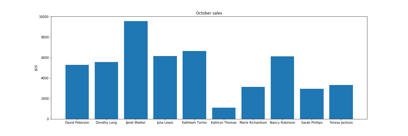
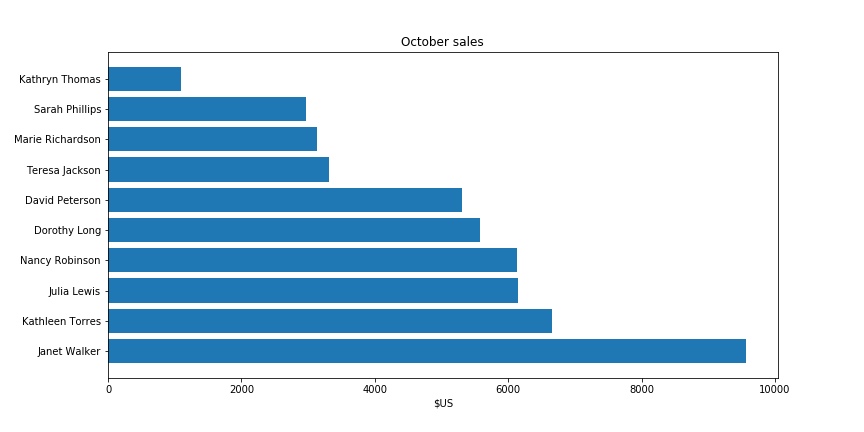
Line charts are great to convey the evolution of a variable over the time. This is a typical chart. It has three key components, the X-axis that represents the time, the Y-axis that represents the tracked value, and the line itself.
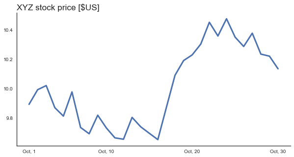
Usually, you will see the Y-axis at the left part of the graph. Unless you design for a Right-To-Left language environment, placing the Y-axis on the left makes perfect sense. However, left-side Y-axis isn’t a hard rule.
In many cases, more importance is given to the most recent data point. For example, it might be interesting to know a stock price dynamics but today’s price is what determines how much money I can get by selling my stock portfolio.
What happens if we move the axis to the right?
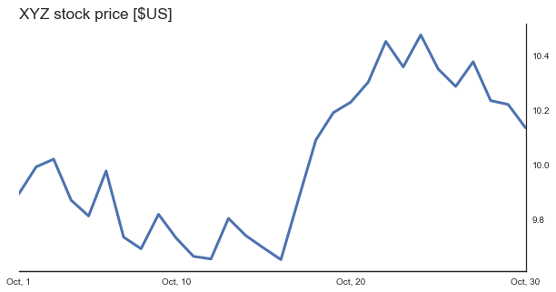
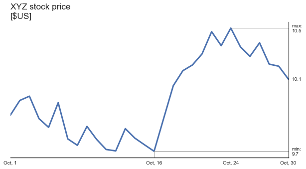
Now, today’s price of XYZ stock is visible more clearly. Let’s make the most important values explicitly clear:
There are two ways to obtain right-sided Y axis in matplotib. The first way uses a combination of
[code language=”python”]
ax.yaxis.tick_right()
ax.yaxis.set_label_position(“right”)
[/code]
The second one creates a “twin X” axis and makes sure the first axis is invisible. It might seem that the first option is easier. However, when combined with seaborn’s despine function, strange things happen. Thus, I perform the second option. Following is the code that I used to create the last version of the graph.
[code language=”python”]
np.random.seed(123)
days = np.arange(1, 31)
price = (np.random.randn(len(days)) * 0.1).cumsum() + 10
fig = plt.figure(figsize=(10, 5))
ax = fig.gca()
ax.set_yticks([]) # Make 1st axis ticks disapear.
ax2 = ax.twinx() # Create a secondary axis
ax2.plot(days,price, ‘-‘, lw=3)
ax2.set_xlim(1, max(days))
sns.despine(ax=ax, left=True) # Remove 1st axis spines
sns.despine(ax=ax2, left=True, right=False)
tks = [min(price), max(price), price[-1]]
ax2.set_yticks(tks)
ax2.set_yticklabels([f’min:\n{tks[0]:.1f}’, f’max:\n{tks[1]:.1f}’, f’{tks[-1]:.1f}’])
ax2.set_ylabel(‘price [$]’, rotation=0, y=1.1, fontsize=’x-large’)
ixmin = np.argmin(price); ixmax = np.argmax(price);
ax2.set_xticks([1, days[ixmin], days[ixmax], max(days)])
ax2.set_xticklabels([‘Oct, 1’,f’Oct, {days[ixmin]}’, f’Oct, {days[ixmax]}’, f’Oct, {max(days)}’ ])
ylm = ax2.get_ylim()
bottom = ylm[0]
for ix in [ixmin, ixmax]:
y = price[ix]
x = days[ix]
ax2.plot([x, x], [bottom, y], ‘-‘, color=’gray’, lw=0.8)
ax2.plot([x, max(days)], [y, y], ‘-‘, color=’gray’, lw=0.8)
ax2.set_ylim(ylm)
[/code]
Next time when you create a “something” vs time graph, ask yourself whether the last available point has a special meaning to the viewer. If it does, consider moving the Y axis to the left part of your graph and see whether it becomes more readable.
This post was triggered by a nice write-up by Plotting a Course: Line Charts by a new blogger David (he didn’t mention his last name) from https://thenumberist.wordpress.com/