• Sometimes, you don't really need a legend

    Sometimes, you don't really need a legend

    October 28, 2019

    This is another “because you can” rant, where I claim that the fact that you can do something doesn’t mean that you necessarily need to.

    This time, I will claim that sometimes, you don’t really need a legend in your graph. Let’s take a look at an example. We will plot the GDP per capita for three countries: Israel, France, and Italy. Plotting three lines isn’t a tricky task. Here’s how we do this in Python

    plt.plot(gdp.Year, gdp.Israel, '-', label='Israel')
    plt.plot(gdp.Year, gdp.France, '-', label='France')
    plt.plot(gdp.Year, gdp.Italy, '-', label='Italy')
    plt.legend()
    

    The last line in the code above does a small magic and adds a nice legend

    This image has an empty alt attribute; its file name is image.png

    In Excel, we don’t even need to do anything, the legend is added for us automatically.

    This image has an empty alt attribute; its file name is image-1.png

    So, what is the problem?

    What happens when a person wants to know which line represents which country? That person needs to compare the line color to the colors in the legend. Since our working memory has a limited capacity, we do one of the following. We either jump from the graph to the legends dozens of times, or we try to find a heuristic (a shortcut). Human brains don’t like working hard and always search for shortcuts (I recommend reading Daniel Kahneman’s “Think Fast and Slow” to learn more about how our brain works).

    What would be the shortcut here? Well, note how the line for Israel lies mostly below the line for Italy which lies mostly below the line for France. The lines in the legend also lie one below the other. However, the line order in these two pieces of information isn’t conserved. This results in a cognitive mess; the viewer needs to work hard to decipher the graph and misses the point that you want to convey.

    And if we have more lines in the graph, the situation is even worse.

    This image has an empty alt attribute; its file name is image-2.png

    Can we improve the graph?

    Yes we can. The simplest way to improve the graph is to keep the right order. In Python, we do that by reordering the plotting commands.

    plt.plot(gdp.Year, gdp.Australia, '-', label='Australia')
    plt.plot(gdp.Year, gdp.Belgium, '-', label='Belgium')
    plt.plot(gdp.Year, gdp.France, '-', label='France')
    plt.plot(gdp.Year, gdp.Italy, '-', label='Italy')
    plt.plot(gdp.Year, gdp.Israel, '-', label='Israel')
    plt.legend()
    

    This image has an empty alt attribute; its file name is image-3.png

    We still have to work hard but at least we can trust our brain’s shortcut.

    If we have more time

    If we have some more time, we may get rid of the (classical) legend altogether.

    countries = [c for c in gdp.columns if c != 'Year']
    fig, ax = plt.subplots()
    for i, c in enumerate(countries):
        ax.plot(gdp.Year, gdp[c], '-', color=f'C{i}')
        x = gdp.Year.max()
        y = gdp[c].iloc[-1]
        ax.text(x, y, c, color=f'C{i}', va='center')
    seaborn.despine(ax=ax)
    

    (if you don’t understand the Python in this code, I feel your pain but I won’t explain it here)

    This image has an empty alt attribute; its file name is image-4.png

    Isn’t it better? Now, the viewer doesn’t need to zap from the lines to the legend; we show them all the information at the same place. And since we already invested three minutes in making the graph prettier, why not add one more minute and make it even more awesome.

    This image has an empty alt attribute; its file name is image-5.png

    This graph is much easier to digest, compared to the first one and it also provides more useful information.

    .

    This image has an empty alt attribute; its file name is image-6.png

    I agree that this is a mess. The life is tough. But if you have time, you can fix this mess too. I don’t, so I won’t bother, but Randy Olson had time. Look what he did in a similar situation.

    percent-bachelors-degrees-women-usa

    I also recommend reading my older post where I compared graph legends to muttonchops.

    In conclusion

    Sometimes, no legend is better than legend.

    This post, in Hebrew: [link]

    October 28, 2019 - 3 minute read -
    because you can data visualisation data-visualizatin dataviz legend blog Data Visualization
  • What do we see when we look at slices of a pie chart?

    What do we see when we look at slices of a pie chart?

    October 21, 2019

    What do we see when we look at slices of a pie chart? Angles? Areas? Arc length? The answer to this question isn’t clear and thus “experts” recommend avoiding pie charts at all.

    Robert Kosara is a Senior Research Scientist at Tableau Software (you should follow his blog https://eagereyes.org), who is very active in studying pie charts. In 2016, Robert Kosara and his collaborators published a series of studies about pie charts. There is a nice post called “An Illustrated Tour of the Pie Chart Study Results” that summarizes these studies.

    Last week, Robert published another paper with a pretty confident title (“Evidence for Area as the Primary Visual Cue in Pie Charts”) and a very inconclusive conclusion

    While this study suggests that the charts are read by area, itis not conclusive. In particular, the possibility of pie chart usersre-projecting the chart to read them cannot be ruled out. Furtherexperiments are therefore needed to zero in on the exact mechanismby which this common chart type is read.

    Kosara. “Evidence for Area as the Primary Visual Cue in Pie Charts.” OSF, 17 Oct. 2019. Web.

    The previous Kosara’s studies had strong practical implications, the most important being that pie charts are not evil provided they are done correctly. However, I’m not sure what I can take from this one. As far as I understand the data, the answer to the questions in the beginning of this post are still unclear. Maybe, the “real answer” to these questions is “a combination of thereof”.

    October 21, 2019 - 2 minute read -
    data visualisation Data Visualization dataviz kosara pie-chart research blog
  • The problem with citation count as an impact metric

    The problem with citation count as an impact metric

    October 18, 2019

    Inspired by A citation is not a citation is not a citation by Lior Patcher, this rant is about metrics.

    Lior Patcher is a researcher in Caltech. As many other researchers in the academy, Dr. Patcher is measured by, among other things, publications and their impact as measured by citations. In his post, Lior Patcher criticised both the current impact metrics and also their effect on citation patterns in the academic community.

    PROBLEM POINTED: citations don’t really measure “actual” citations. Most of the appeared citations are “hit and run citations” i.e: people mention other people’s research without taking anything from that research.

    In fact this author has cited [a certain] work in exactly the same way in several other papers which appear to be copies of each other for a total of 7 citations all of which are placed in dubious “papers”. I suppose one may call this sort of thing hit and run citation.

    via A citation is not a citation is not a citation — Bits of DNA

    I think that the biggest problem with citation counts is that it costs nothing to cite a paper. When you add a research (or a post, for that matter) to your reference list, you know that most probably nobody will check whether actually read it, that nobody will check whether you got that publication correctly and that nobody will that the chances are super (SUUPER) low nobody will check whether you conclusions are right. All it takes is to click a button.

    October 18, 2019 - 2 minute read -
    barabasi impact blog
  • Book review. The War of Art by S. Pressfield

    Book review. The War of Art by S. Pressfield

    October 10, 2019

    TL;DR: This is a long motivational book that is “too spiritual” for the cynic materialist that I am.

    The War of Art by [Pressfield, Steven]

    The War of Art is a strange book. I read it because “everybody” recommended it. This is what Derek Sivers’ book recommendation page says about this book

    Have you experienced a vision of the person you might become, the work you could accomplish, the realized being you were meant to be? Are you a writer who doesn’t write, a painter who doesn’t paint, an entrepreneur who never starts a venture? Then you know what “Resistance” is.
    

    As a known procrastinator, I was intrigued and started reading. In the beginning, the book was pretty promising. The first (and, I think, the biggest) part of the book is about “Resistance” – the force behind the procrastination. I immediately noticed that almost every sentence in this chapter could serve a motivational poster. For example

    • It’s not the writing part that’s hard. What’s hard is sitting down to write.
    • The danger is greatest when the finish line is in sight.
    • The most pernicious aspect of procrastination is that it can become a habit.
    • The more scared we are of a work or calling, the more sure we can be that we have to do it.

    Individually, each sentence makes sense, but their concentration was a bit too much for me. The way Pressfield talks about Resistance resembles the way Jewish preachers talk about Yetzer Hara: it sits everywhere, waiting for you to fail. I’ tdon’t like this approach.

    The next chapters were even harder for me to digest. Pressfield started talking about Muses, gods, prayers, and other “spiritual” stuff; I almost gave up. But I fought the Resistance and finished the book.

    My main takeaways:

    • Resistance is real
    • It’s a problem
    • The more critical the task is, the stronger is the Resistance. OK, I kind of agree with this. Pressfield continues to something do not agree with: thus (according to the author), we can measure the importance of a task by the Resistance it creates.
    • Justifying not pursuing a task by commitments to the family, job, etc. is a form of Resistance.
    • The Pro does stuff.
    • The Artist is a Pro (see above) who does stuff even if nobody cares.
    October 10, 2019 - 2 minute read -
    book review pressfield procrastination resistance the-war-of-art blog
  • Data visualization with statistical reasoning: seeing uncertainty with the bootstrap — Dataviz - Stats - Bayes

    Data visualization with statistical reasoning: seeing uncertainty with the bootstrap — Dataviz - Stats - Bayes

    October 8, 2019

    On Sunday, I wrote about bootstrapping. On Monday, I wrote about visualization uncertainty. Let’s now talk about bootstrapping and uncertainty visualization.

    Robert Grant is a data visualization expert who wrote a book about interactive data visualization (which I should read, BTW).

    Robert runs an interesting blog from which I learned another approach to uncertainty visualization, bootstrapping.

    Source: Robert Grant.

    Read the entire post: Data visualization with statistical reasoning: seeing uncertainty with the bootstrap — Dataviz - Stats - Bayes

    October 8, 2019 - 1 minute read -
    bootstrapping data visualisation Data Visualization dataviz repost uncertainty blog
  • On MOOCs

    On MOOCs

    October 7, 2019

    When Massive Online Open Courses (a.k.a MOOCs) emerged some X years ago, I was ecstatic. I was sure that MOOCs were the Big Boom of higher education. Unfortunately, the MOOC impact turned out to be very modest. This modest impact, combined with the high production cost was one of the reasons I quit making my online course after producing two or three lectures. Nevertheless, I don’t think MOOCs are dead yet. Following are some links I recently read that provide interesting insights to MOOC production and consumption.

    • A systematic study of academic engagement in MOOCs that is scheduled for publication in the November issue of Erudit.org. This 20+ page-long survey summarizes everything we know about MOOCs today (I have to admit, I only skimmed through this paper, I didn’t read all of it)
    • A Science Magazine article from January, 2019. The article, “The MOOC pivot,” sheds light to the very low retention numbers in MOOCs.

    • On MOOCs and video lectures. Prof. Loren Barbara from George Washington University explains why her MOOCs are not built for video. If you consider creating an online class, you should read this.
    • The economic consequences of MOOCs. A concise summary of a 2018 study that suggest that MOOC’s economic impact is high despite the high churn rates.
    • Thinkful.com, an online platform that provides personalized training to aspiring data professionals, got in the news three weeks ago after being purchased for $80 million. Thinkful isn’t a MOOC per-se but I have a special relationship with it: a couple of years ago I was accepted as a mentor at Thinkful but couldn’t find time to actually mentor anyone.

    The bottom line

    We still don’t know how this future will look like and how MOOCs will interplay with the legacy education system but I’m sure the MOOCs are the future

    October 7, 2019 - 2 minute read -
    education future mooc thinkful blog Career advice
  • Error bars in bar charts. You probably shouldn't

    Error bars in bar charts. You probably shouldn't

    October 7, 2019

    This is another post in the series Because You Can. This time, I will claim that the fact that you can put error bars on a bar chart doesn’t mean you should.

    It started with a paper by prof. Gerd Gigerenzer whose work in promoting numeracy I adore. The paper, “Natural frequencies improve Bayesian reasoning in simple and complex inference tasks” contained a simple graph that meant to convince the reader that natural frequencies lead to more accurate understanding (read the paper, it explains these terms). The error bars in the graph mean to convey uncertainty. However, the data visualization selection that Gigerenzer and his team selected is simply wrong.

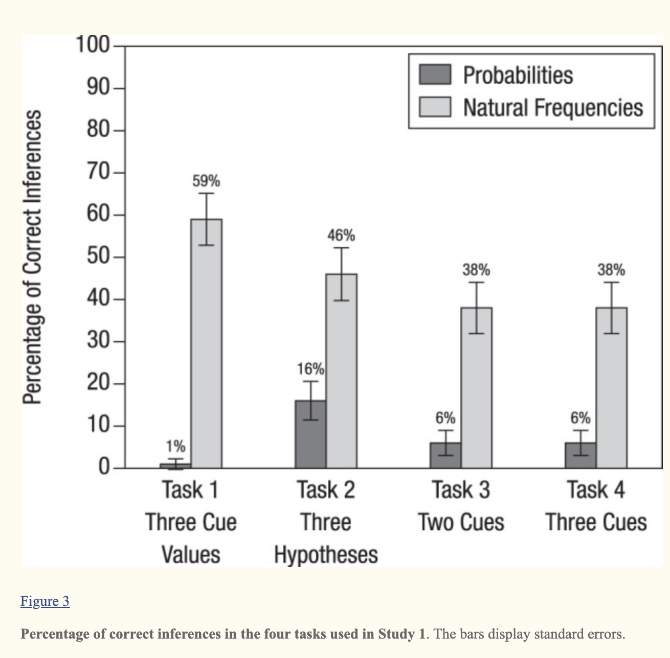
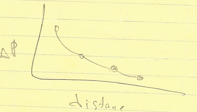
    First of all, look at the leftmost bar, it demonstrates so many problems with error bars in general, and in error bars in barplots in particular. Can you see how the error bar crosses the X-axis, implying that Task 1 might have resulted in negative percentage of correct inferences?

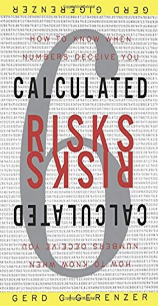
    The irony is that Prof. Gigerenzer is a worldwide expert in communicating uncertainty. I read his book “Calculated risk” from cover to cover. Twice.

    Why is this important?

    Communicating uncertainty is super important. Take a look at this 2018 study with the self-explaining title “Uncertainty Visualization Influences how Humans Aggregate Discrepant Information.” From the paper: “Our study repeatedly presented two [GPS] sensor measurements with varying degrees of inconsistency to participants who indicated their best guess of the “true” value. We found that uncertainty information improves users’ estimates, especially if sensors differ largely in their associated variability”.

    Image result for clinton trump pollsSource HuffPost

    Also recall the surprise when Donald Trump won the presidential elections despite the fact that most of the polls predicted that Hillary Clinton had higher chances to win. Nobody cared about uncertainty, everyone saw the graphs!

    Why not error bars?

    Keep in mind that error bars are considered harmful, and I have a reference to support this claim. But why?

    First of all, error bars tend to be symmetric (although they don’t have to) which might lead to the situation that we saw in the first example above: implying illegal values.

    Secondly, error bars are “rigid”, implying that there is a certain hard threshold. Sometimes the threshold indeed exists, for example a threshold of H0 rejection. But most of the time, it doesn’t.

    stacked round gold-colored coins on white surface

    More specifically to bar plots, error lines break the bar analogy and are hard to read. First, let me explain the “bar analogy” part.

    The thing with bar charts is that they are meant to represent physical bars. A physical bar doesn’t have soft edges and adding error lines simply breaks the visual analogy.

    Another problem is that the upper part of the error line is more visible to the eye than the lower one, the one that is seen inside the physical bar. See?undefined

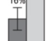
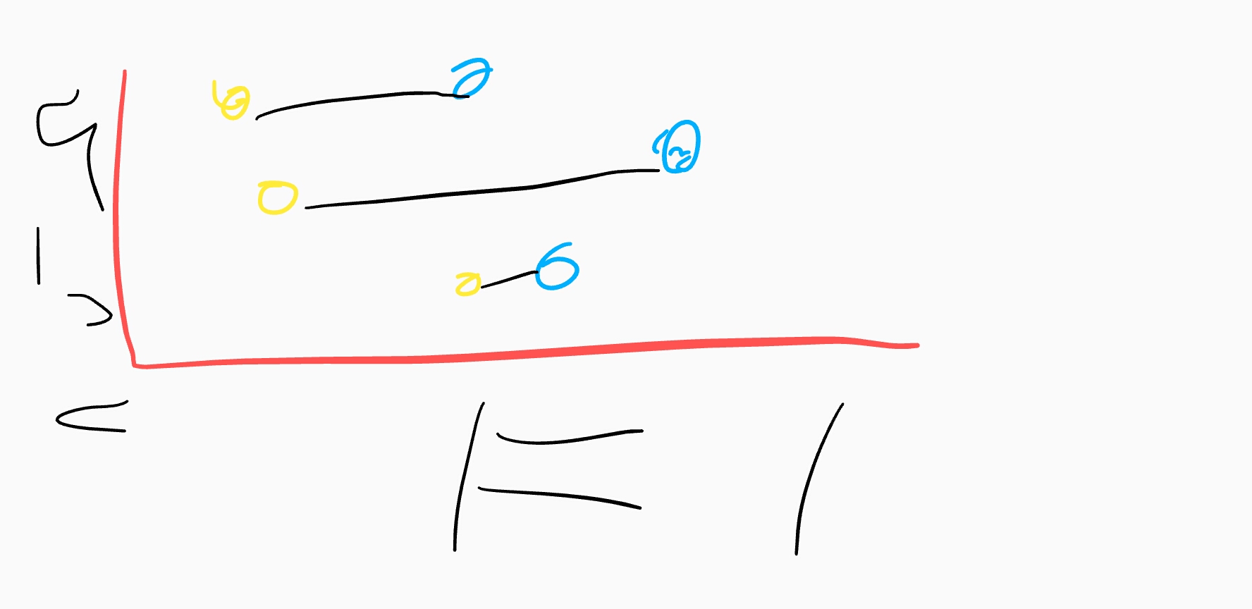
    But that’s not all. The width of the error bars separates the error lines and makes the comparison even harder. Compare the readability of error lines in the two examples below

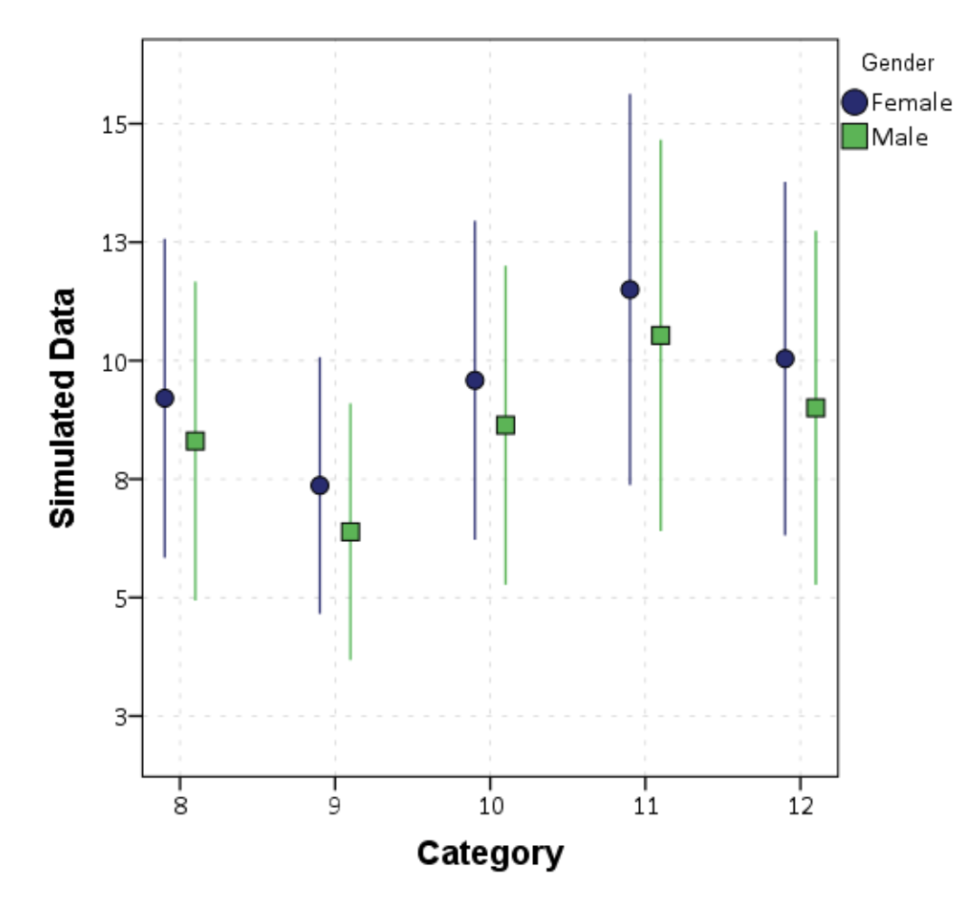
    The proximity of the error lines in the second example (take from this site) makes the comparison easier.

    Are there better alternatives?

    Yes. First, I recommend reading the “Error bars considered harmful” paper that I already mentioned above. It not only explains why, but also surveys several alternatives

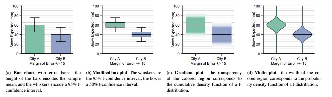
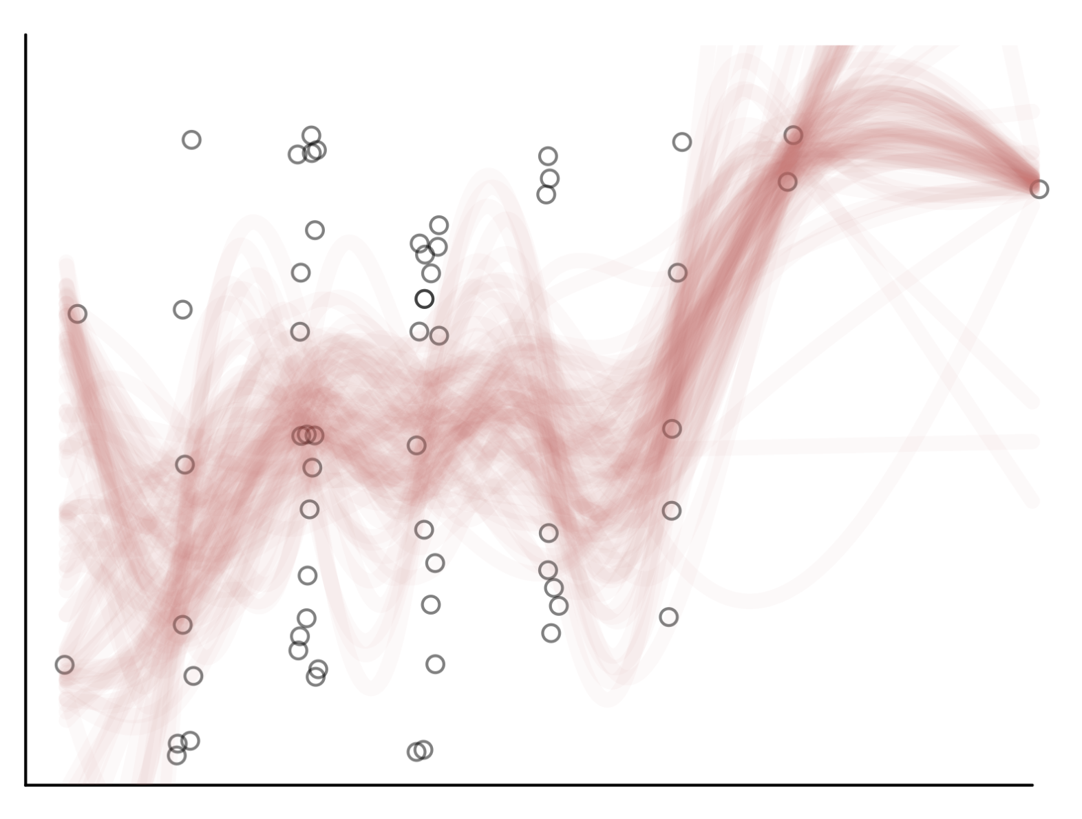
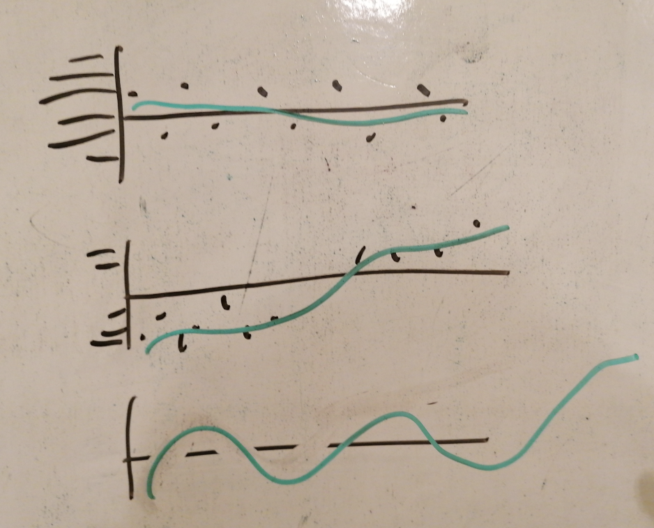
    Nathan Yau from flowingdata.com had anextensive post about different ways to visualize uncertainty. He reviewed ranges, shades, rectangles, spaghetti charts and more.

    Claus Wilke’s book “Fundamentals of Data Visualization” has a dedicated chapter to uncertainty with and even more detailed review [link].

    Visualize uncertainty about the future” is a Science article that deals specifically with forecasts

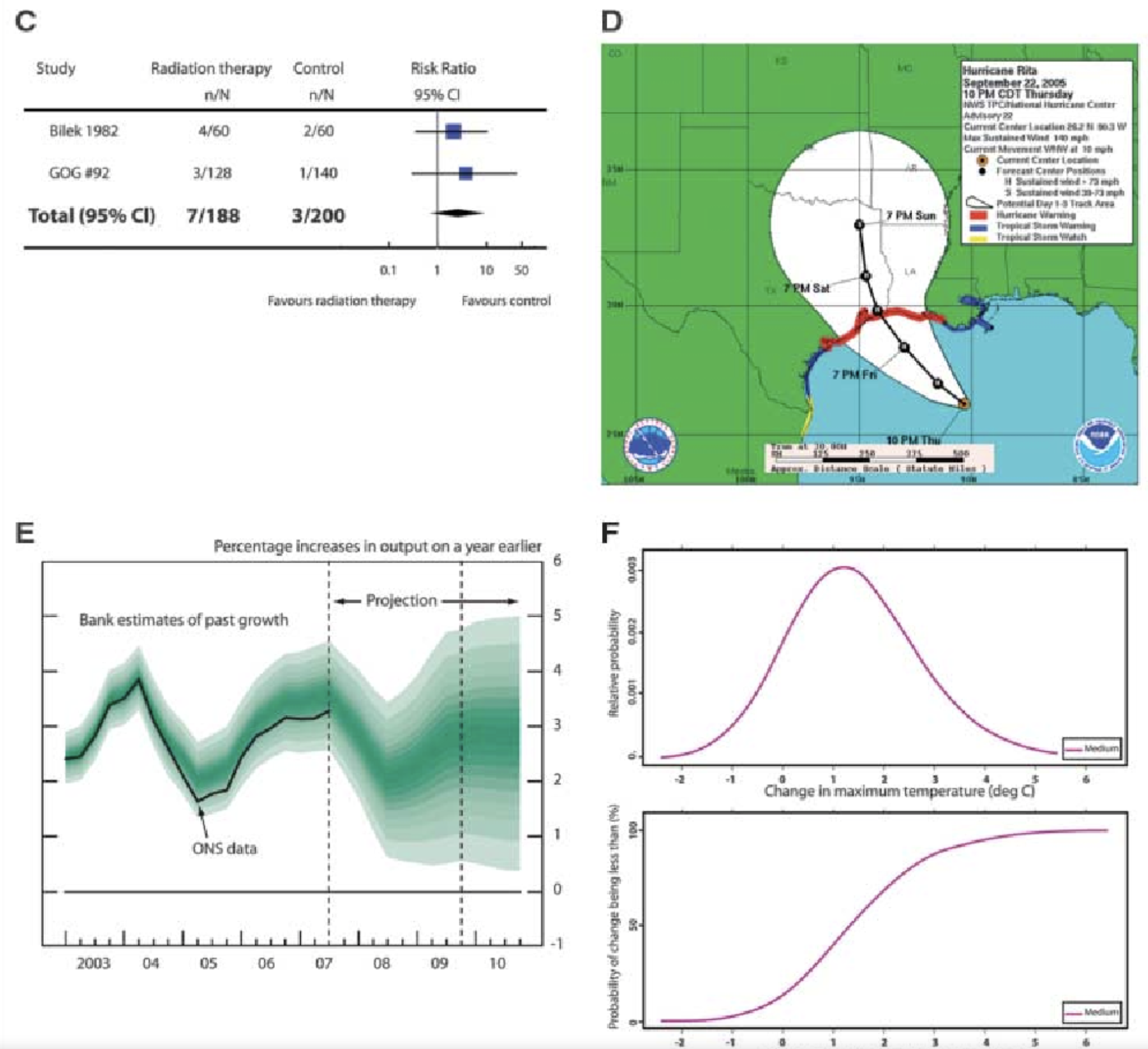
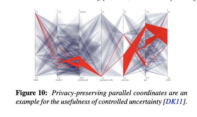
    Robert Kosara from Tableu experimented with visualizing uncertainty in parallel coordinates.

    There are many more examples and experiments, but I think that I will stop right now.

    The bottom line

    Communicating uncertainty is important.

    Know your tools.

    Try avoiding error bars.

    Bars and bars don’t combine well, therefore, try harder avoiding error bars in bar charts.

    October 7, 2019 - 3 minute read -
    because you can data visualisation Data Visualization dataviz gigerenzer uncertainty blog
  • You don't need a fast way to increase your reading speed by 25%. Or, don't suppress subvocalization

    You don't need a fast way to increase your reading speed by 25%. Or, don't suppress subvocalization

    October 6, 2019

    Not long ago, I wrote a post about a fast hack that increased my reading speed by tracking the reading with a finger. I think that the logic behind using a tracking finger is to suppress subvocalization. I noticed that, at least in my case, suppressing subvocalization reduces the fun of reading. I actually enjoy hearing the inner voice that reads the book “with me”.

    October 6, 2019 - 1 minute read -
    reading reading-speed blog
  • Bootstrapping the right way?

    Bootstrapping the right way?

    October 6, 2019

    Many years ago, I terribly overfit a model which caused losses of a lot of shekels (a LOT). It’s not that I wasn’t aware of the potential overfitting. I was. Among other things, I used several bootstrapping simulations. It turns out that I applied the bootstrapping in a wrong way. My particular problem was that I “forgot” about confounding parameters and that I “forgot” that peeping into the future is a bad thing.

    Anyhow, Yanir Seroussi, my coworker data scientist, gave a very good talk on bootstrapping.

    October 6, 2019 - 1 minute read -
    bootstrapping data science overfitting reblog blog
  • How do I look like?

    How do I look like?

    October 3, 2019

    From time to time, people (mostly conference organizers) ask for a picture of mine. Feel free using any of these images

    • Me in front of a whiteboard, pointing at a graph
    • Me in front of a screen that shows a bar chart
    • Me speaking on a stage
    October 3, 2019 - 1 minute read -
    me photo blog
  • Visualizations with perceptual free-rides

    Visualizations with perceptual free-rides

    October 2, 2019

    Dr. Richard Brath is a data visualization expert who also blogs from time to time. Each post in Richard’s blog provides a deep, and often unexpected to me, insight into one dataviz aspect or another.

    October 2, 2019 - 1 minute read -
    bar plot data visualisation Data Visualization dataviz reblog richard-brath blog
  • Book review. Indistractable by Nir Eyal

    Book review. Indistractable by Nir Eyal

    September 29, 2019

    Nir Eyal is known for his book “Hooked” in which he teaches how to create addictive products. In his new book “Indistractable”, Nir teaches how to live in the world full of addictive products. The book itself isn’t bad. It provides interesting information and, more importantly, practical tips and action items. Nir covers topics such as digital distraction, productivity and procrastination.

    Indistractable Control Your Attention Choose Your Life Nir Eyal 3D cover

    I liked the fact that the author “gives permission” to spend time on Facebook, Instagram, Youtube etc, as long as it is what you planned to do. Paraphrasing Nir, distraction isn’t distraction unless you know what it distracts you from. In other words, anything you do is a potential distraction unless you know what, why and when you are doing it.

    My biggest problem with this book is that I already knew almost everything that Nir wrote. Maybe I already read too many similar books and articles, maybe I’m just that smart (not really) but for me, most of Indistractable wasn’t valuable.

    Until I got to the chapter that deals with raising children (“Part 6, how to raise indistractable children”). I have to admit, when it comes to speaking about raising kids in the digital era, Nir is a refreshing voice. He doesn’t join the global hysteria of “the screens make zombies of our kids”. Moreover, Nir brings a nice collection of hysterical prophecies from the 15th, 18th and 20th centuries in which “experts” warned about the bad influence new inventions (such as printed books, affordable education, radio) had on the kids.

    Another nice touch is the fact that each chapter has a short summary that consists of three-four bullet points. Even nicer is the fact that Nir copied all the “Remember this” lists at the end of the book, which is very kind of him.

    The Bottom line. 4/5. Read.

    September 29, 2019 - 2 minute read -
    book review distraction nir-eyal procrastination productivity blog Productivity & Procrastination
  • 14-days-work-month — The joys of the Hebrew calendar

    14-days-work-month — The joys of the Hebrew calendar

    September 22, 2019

    Tishrei is the seventh month of the Hebrew calendar that starts with Rosh-HaShana — the Hebrew New Year. It is a 30 days month that usually occurs in September-October. One interesting feature of Tishrei is the fact that it is full of holidays: Rosh-HaShana (New Year), Yom Kippur (Day of Atonement), first and last days of Sukkot (Feast of Tabernacles) **. All these days are rest days in Israel. Every holiday eve is also a *de facto rest day in many industries (high tech included). So now we have 8 resting days that add to the usual Friday/Saturday pairs, resulting in very sparse work weeks. But that’s not all: the period between the first and the last Sukkot days are mostly considered as half working days. Also, the children are at home since all the schools and kindergartens are on vacation so we will treat those days as half working days in the following analysis.

    I have counted the number of business days during this 31-day period (one day before the New Year plus the entire month of Tishrei) between 2008 and 2023 CE, and this is what we get:

    Overall, this period consists of between 15 to 17 non-working days in a single month (31 days, mind you). This is how the working/not-working time during this month looks like this:

    Now, having some vacation is nice, but this month is absolutely crazy. There is not a single full working week during this month. It is very similar to the constantly interrupt work day, but at a different scale.

    So, next time you wonder why your Israeli colleague, customer or partner barely works during September-October, recall this post.

    (*) New Year starts in the seventh’s month? I know this is confusing. That’s because we number Nissan – the month of the Exodus from Egypt as the first month.

    (**)If you are an observing Jew, you should add to this list Fast of Gedalia, but we will omit it from this discussion

    September 22, 2019 - 2 minute read -
    holidays Israel RoshHaShana tishrei blog
  • A fast way to increase your reading speed by 25%

    A fast way to increase your reading speed by 25%

    September 19, 2019

    I was sceptic but I tried, measured, and arrived to the conclusion. First, I set a timer to 60 seconds and read some text. I managed to read seventeen lines. Then, I used my finger to guide my eyes the same way kids do when they learn reading. It turned out that I was able to read lines of text. By simply using my finger. Impressive.

    September 19, 2019 - 1 minute read -
    reading reading-speed blog
  • Book review: The Formula by A. L Barabasi

    Book review: The Formula by A. L Barabasi

    September 16, 2019

    The bottom line: read it but use your best judgement 4/5

    I recently completed reading “The Formula. The Universal Laws of Success” by Albert-László Barabási. Barabási is a network science professor who co-authored the “preferential attachment” paper (a.k.a. the Barabási-Albert model). People who follow him closely are ether vivid fabs or haters accusing him of nonsense science.

    For several years, A-L Barabási is talking and writing about the “science of success” (yeah, I can hear some of my colleagues laughing right now). Recently, he summarized the research in this area in an easy-to-read book with the promising title “The Formula. The Universal Laws of Success.” The main takeaways that I took from this book are:

    • Success is about us, not about you. In other words, it doesn’t matter how hard you work and how good your work is, if “we” (i.e., the public) don’t know about it, or don’t see it, or attribute it to someone else.
    • Be known for your expertise. Talk passionately about your job. The people who talk about an idea will get the credit for it. Consider the following example from the book. Let’s say, prof. Barabasi and the Pope write a joint scientific paper. If the article is about network science, it will be perceived as if the Pope helped Barabasi with writing an essay. If, on the other hand, if it is a theosophical book, we will immediately assume that the Pope was the leading force behind it.
    • It doesn’t matter how old you are; the success can come to you at any age. It is a well-known fact that most successful people broke into success at a young age. What Barabási claims is that the reason for that is not a form of ageism but the fact that the older people try less. According to this claim, as long as you are creative and work hard, your most significant success is ahead of you.
    • Persistence pays. This is another claim that Barabasi makes in his book. It is related to the previous one but is based on a different set of observations (did you know that Harry Potter was rejected twelve times before it was published?). I must say that I’m very skeptical about this one. Right now, I don’t have the time to explain my reasons, and I promise to write a dedicated post.

    Keep in mind that the author uses academic success (the Nobel prize, citation index, etc.) as the metric for most of his conclusions. This limitation doesn’t bother him, after all, Barabási is a full-time University professor, but most of us should add another grain of salt to the conclusions.

    Overall, if you find yourself thinking about your professional future, or if you are looking for a good career advice, I recommend reading this book.

    September 16, 2019 - 2 minute read -
    barabasi book review success blog Career advice
  • Pseudochart. It's like a pseudocode but for charts

    Pseudochart. It's like a pseudocode but for charts

    September 9, 2019

    Pseudocode is an informal high-level description of the operating principle of a computer program or other algorithm. People write pseudocode to isolate the “bigger picture” of an algorithm. Pseudocode doesn’t care about the particular implementation details that are secondary to the problem, such as memory management, dealing with different encoding, etc. Writing out the pseudocode version of a function is frequently the first step in planning the implementation of complex logic.

    Similarly, I use sketches when I plan non-trivial charts, and when I discuss data visualization alternatives with colleagues or students.

    One can use a sheet of paper, a whiteboard, or a drawing application. You may recognize this approach as a form of “paper prototyping,” but it deserves its own term. I suggest calling such a sketch a “pseudochart”*. Like a piece of pseudocode, the purpose of a pseudochart is to show the visualization approach to the data, not the final graph itself.

    • Initially, I wanted to use the term “pseudograph” but the network scientists already took it for themselves.

    ** The first sentence of this post is a taken from the Wikipedia.

    September 9, 2019 - 1 minute read -
    data visualisation Data Visualization dataviz pseudochart blog
  • My blog in Hebrew

    My blog in Hebrew

    September 9, 2019

    As much as I love thinking that I live in a global world, most people whom I know speak Hebrew. From time to time, someone would tell me “nice post, but why not in Hebrew?”. So, from now on, I will try to translate all my new posts to Hebrew. I will try. Not promising anything. My Hebrew blog lives at https://he.gorelik.net/blog-feed

    September 9, 2019 - 1 minute read -
    blog
  • Please leave a comment to this post

    Please leave a comment to this post

    September 4, 2019

    Please leave a comment to this post. It doesn’t matter what, it can be a simple Hi or an interesting link. It doesn’t matter when or where you see it. I want to see how many real people are actually reading this blog.

    [caption id=”attachment_media-15” align=”alignnone” width=”1880”]close up of text

    Photo by Pixabay on Pexels.com[/caption]

    September 4, 2019 - 1 minute read -
    перекличка feedback blog
  • Word Sequentialization

    Word Sequentialization

    September 2, 2019
    September 2, 2019 - 1 minute read -
    blog
  • My slide deck from the NDR conference in Iași

    My slide deck from the NDR conference in Iași

    June 11, 2019

    I have published the slide deck from my talk at the NDR conference in Iași, Romania.

    Enjoy.

    [slideshare id=149244993&doc=20190604abcofdatavisualizationiasi-190611185232]

    June 11, 2019 - 1 minute read -
    data visualisation Data Visualization dataviz presentation blog
  • Why you should speak at conferences?

    Why you should speak at conferences?

    June 6, 2019

    In this post, I will try to convince you that speaking at a conference is an essential tool for professional development.

    Many people are afraid of public speaking, they avoid the need to speak in front of an audience and only do that when someone forces them to. This fear has deep evolutional origins (thousands of years ago, if dozens of people were staring at you that would probably mean that you were about to become their meal). However, if you work in a knowledge-based industry, your professional career can gain a lot if you force yourself to speak.

    Two days ago, I spoke at NDR, a machine learning/AI conference in Iași, Romania. That was a very interesting conference, with a diverse panel of speakers from different branches of the data-related industry. However, the talk that I enjoyed the most was mine. Not because I’m a narcist self-loving egoist. What I enjoyed the most were the questions that the attendees asked me during the talk, and in the coffee breaks after it. First of all, these questions were a clear signal that my message resonated with the audience, and they cared about what I had to say. This is a nice touch to one’s ego. But more importantly, these questions pointed out that there are several topics that I need to learn to become more professional in what I’m doing. Since most of the time, we don’t know what we don’t know, such an insight is almost priceless.

    That is why even (and especially) if you are afraid of public speaking, you should jump into the cold water and do it. Find a call for presentations and submit a proposal TODAY.

    And if you are afraid of that awkward silence when you ask “are there any questions” and nobody reacts, you should read my post “Any Questions? How to fight the awkward silence at the end of the presentation”.

    June 6, 2019 - 2 minute read -
    conference fear iasi presentation presenting public speaking romania speaking blog
  • Iași, Romania

    Iași, Romania

    June 5, 2019

    The NDR conference in Iași is over. It’s a good time to sit, relax and work.

    June 5, 2019 - 1 minute read -
    blog
  • Curated list of established remote tech companies

    Curated list of established remote tech companies

    May 23, 2019

    Someone asked me about distributed companies or companies that offer remote positions. Of course, my first response was Automattic but that person didn’t think that Automattic was a good fit for them. So I googled and was surprised to discover that my colleague, Yanir Seroussi, maintains a list of companies that offer remote jobs.

    I work at Automattic, one of the biggest distributed-only companies in the world (if not the biggest one). Recently, Automattic founder and CEO, Matt Mullenweg started a new podcast called (surprise) Distributed.

    May 23, 2019 - 1 minute read -
    automattic distributed distributed work matt remote-workig working-remotely blog Career advice
  • כוון הציר האפקי במסמכים הנכתבים מימין לשמאל

    כוון הציר האפקי במסמכים הנכתבים מימין לשמאל

    May 21, 2019

    אני מחפש דוגמאות נוספות

    יש לכם דוגמה של גרף עברי ״הפוך״? גרפים בערבית או פארסי? שלחו לי.

    This post is a Hebrew translation of the post “X-axis direction in Right-To-Left languages (part two)

    ספרי לימוד

    בעבר כתבתי על העניין שלי בגרפים בשפות שנכתבות מימין לשמאל. לאחרונה קיבלתי לידי שני ספרי לימוד במתמטיקה - האחד מירדן והשני מהרשות הפלסטינית.

    תוכנית הלימוד של הרשות הפלסטינית מבוססת על התוכנית הירדנית. בשני המקרים הופתעתי לגלות שהשכנים שלנו לא משתמשים באותיות ערביות כדי ״לכתוב מתמטיקה״ - כמעט ואין שימוש באותיות לטיניות או יווניות. לא רק זה, כל כוון הכתיבה בספרים אלו - מימין מימין לשמאל. לא רק זה, גם הסימנים המוכרים לנו כגון סימן השורש ״הפוכים״. הנה דוגמה מהספר הפלסטיני.

    Screenshot: Arabic text, Arabic math notation and a graph

    והנה דוגמה ירדנית.

    מה אנחנו רואים כאן?

    • שימוש בספריות ״הודיות־ערביות״
    • אותיות ערביות س (שין) ו־ص (ס׳אד) משמשות במקום ה־x וה־y המוכרים. אות קאף (ق) שמשמשת לציון פונקציות
    • כוון הכתיבה וגם הסימונים עצמם ״הפוכים״ ממה שאנחנו רגילים לראות בספרים בעברית או באנגלית

    לאור כל זאת, ניתן היה לצפות שכוון הציר האופקי יהיה גם ״הפוך״ - מימין לשמאל. אך לא כך הדבר

    מה עם ספרי לימוד בעברית?

    הנה דוגמה מספר לימוד של כיתה ה׳. גם כאשר הקטגוריות בגרף נכתבות בעברית, הכוון שלהם הוא כוון ״אנגלי״ - משמאל לימין.

    שלחו לי עוד דוגמאות

    יש לכם דוגמה של גרף עברי ״הפוך״? גרפים בערבית או פארסי? שלחו לי.

    May 21, 2019 - 2 minute read -
    arabic Data Visualization dataviz hebrew RTL blog
  • X-axis direction in Right-To-Left languages (part two)

    X-axis direction in Right-To-Left languages (part two)

    May 19, 2019

    I need more examples

    Do you have more examples of graphs written in Arabic, Farsi, Urdu or another RTL language? Please send them to me.

    Textbook examples

    I already wrote about my interest in data visualization in Right-To-Left (RTL) languages. Recently, I got copies of high school calculus books from Jordan and the Palestinian Authority.

    Both Jordan and PA use the same (Jordanian) school program. In both cases, I was surprised to discover that they almost never use Latin or Greek letters in their math notation. Not only that, the entire direction of the the mathematical notation is from right to left. Here’s an illustrative example from the Palestinian book.

    Screenshot: Arabic text, Arabic math notation and a graph

    And here is an example from Jordan

    What do we see here?

    • the use of Arabic numerals (which are sometimes called Eastern Arabic numerals)
    • The Arabic letters س (sin) and ص (saad) are used “instead of” x and y (the Arabic alphabet doesn’t have the notion of capital letters). The letter qaf (ق) is used as the archetypical function name (f). For some reason, the capital Greek Delta is here.
    • More interestingly, the entire math is “mirrored”, compared to the Left-To-Write world – including the operand order. Not only the operand order is “mirrored”, many other pieces of math notation are mirrored, such as the square root sign, limits and others.

    Having said all that, one would expect to see the numbers on the X-axis (sorry, the س-axis) run from right to left. But no. The numbers on the graph run from left to right, similarly to the LTR world.

    What about mathematics textbooks in Hebrew?

    Unfortunately, I don’t have a copy of a Hebrew language book in calculus, so I will use fifth grade math book

    Despite the fact that the Hebrew text flows from right to left, we (the Israelis) write our math notations from left to right. I have never saw any exceptions of this rule.

    In this particular textbook, the X axis is set up from left to right. This direction is obvious in the upper example. The lower example lists months – from January to December. Despite the fact the the month names are written in Hebrew, their direction is LTR. Note that this is not an obvious choice. In many version of Excel, for example, the default direction of the X axis in Hebrew document is from right to left.

    I need more examples

    Do you have more examples of graphs written in Arabic, Farsi, Urdu or another RTL language? Please send them to me.

    May 19, 2019 - 2 minute read -
    arabic blog Data Visualization dataviz farsi hebrew RTL
  • Older posts Newer posts