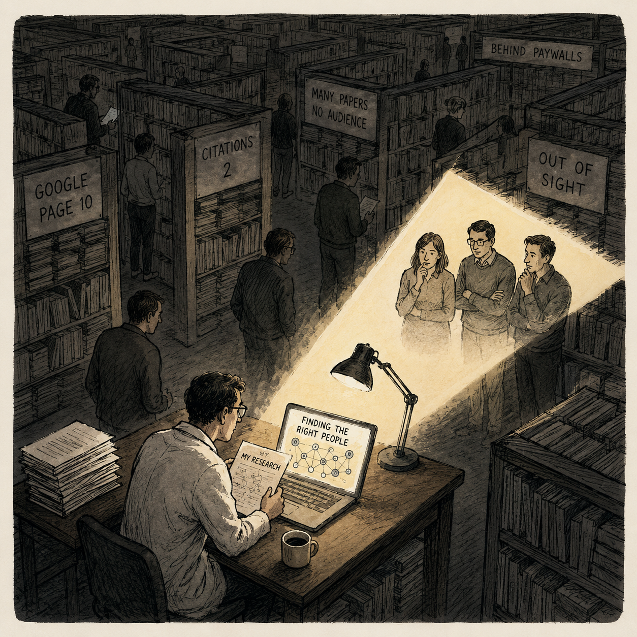
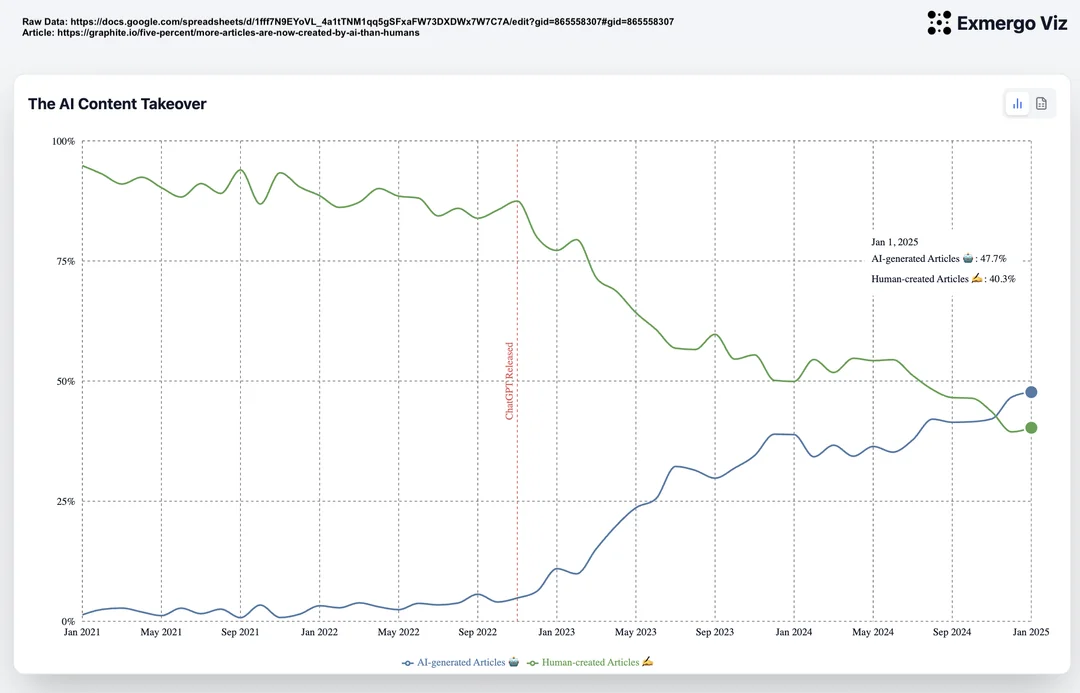
I use Claude Code every day, and I love it. Ever since the ChatGPT wave of 2022, we have been hearing that the work of programming is about to be automated away. I teach in a computer science department, so I watch it land from the front of the room: fewer students each year want to learn to program, and I hear the same prediction from colleagues who have written code their whole lives.
The prediction of the end of programming is not new.
I’ve grown suspicious of it, because I’ve now read it with a date attached, and the earliest date is 1959.
Here is the pattern. Every ten or fifteen years since then, someone announces that programmers are about to become unnecessary. The pitch barely changes: the machine now speaks your language, so the specialist in the middle can go home. And every time, two things happen that don’t fit the prediction. The specific kind of programming under attack really does fade. And the number of people who program goes up. Not sideways. Up.
The people who make this prediction are not stupid, and they are not dilettantes. They are experienced industry leaders, academics, and journalists who have spent their lives around programming, and they are genuinely convinced the end is near. That is what makes the pattern worth taking seriously rather than laughing off.
And still, the prediction keeps being half right in the way that makes it feel completely wrong.
1959: the machine will speak English, so you won’t need a programmer
COBOL was designed in 1959 and 1960 by a committee that, as the record puts it, “agreed unanimously that more people should be able to program.” The language was to “make maximal use of English” and be “suitable for inexperienced programmers,” even at the expense of power. That’s why COBOL reads like MOVE amount TO total instead of a row of symbols. The hope riding on top of it was louder than the spec: if the code looks like English, a manager could read it, maybe even write it, and the programming priesthood would lose its monopoly.
Sixty-five years later, managers still do not write COBOL. But plenty of people who would never have called themselves programmers ended up writing something. The circle of people who program got wider. It did not close.
1965 and 1967: the machine will think, so it will program itself
Then the general optimism arrived. In 1965 Herbert Simon wrote that “machines will be capable, within twenty years, of doing any work that a man can do”. In 1967 Marvin Minsky wrote that “within a generation … the problems of creating ‘artificial intelligence’ will be substantially solved”. Writing programs was quietly filed under “any work a man can do.” If the machine was about to do everything, it was certainly about to do this.
1973: then the money stopped
The trouble with a promise that large is that it can be defunded in a single document. In 1973 James Lighthill delivered a report to the British Science Research Council that concluded, flatly, “in no part of the field have the discoveries made so far produced the major impact that was then promised.” The British government used it to end most academic AI funding. The first AI winter followed. The lesson I take from Lighthill is not that the skeptics were right. It’s that overselling has a bill, and when it comes due, the honest work gets cut alongside the hype.
1981: application development without programmers
The eighties opened with the promise moved into the product name. In 1981 James Martin published a book literally titled Application Development Without Programmers, which is where the term “fourth-generation language” got its formal start. The same year, a small British company shipped a program called The Last One. Its creator explained the name: it was meant to be “the last human-produced program that needs to be written.” You picked options from menus and it generated the BASIC for you.
What actually came of the 4GL wave was SQL, spreadsheets, and report builders. Every one of those let more people do more without a programmer. Every one of those also created new categories of work, and demand for programmers kept climbing straight through the decade that promised to end it.
1982: an entire country bet on it
Japan’s Ministry of International Trade and Industry launched the Fifth Generation Computer Systems project in 1982: roughly ¥57 billion, about 320 million dollars, over ten years, to build machines that reasoned in logic and talked to people in something close to natural language. It is now generally filed as a commercial failure. Ordinary hardware from Sun and Intel outran the specialized machines before the decade was out.
1987: “a profession with no future”
The feeling that this time is finally different is not new either, and I have a clipping to prove it. On Friday, 4 September 1987, the Israeli daily Maariv ran a piece under the headline “תכנות - מקצוע ללא עתיד”: programming, a profession with no future.

Maariv, Friday 4 September 1987. The headline reads “programming, a profession with no future.”
It quotes a specialist, Ezra Ben-Kochav, making a case that would sound at home in any 2026 keynote. “The programming component in systems keeps shrinking over the years,” he says. The cause, in his telling, is the arrival of fourth-generation languages, “artificial-intelligence languages,” and application generators, tools that demand far less professional knowledge and cut a project’s development time in half. Operating systems, he adds, are getting friendly enough that you need less skill to run them.
Then comes the line that made me keep the clipping. Ben-Kochav cites studies from the United States showing that fewer and fewer students were choosing to study computer science, and names the reason: the shrinking demand for people in the field. I read that, thought of the drop in my own department, and then checked the date. Thirty-nine years ago. In the decades that followed, the profession it was burying became one of the largest and best paid on earth.
The tell: even the replacement was called an apprentice
Here is the detail that convinced me the pattern is real and not just a run of bad marketing. The most serious academic attempt to automate programming in that era, MIT’s Programmer’s Apprentice (Charles Rich and Richard Waters, from the mid-1970s on), was explicitly designed as an assistant, not a replacement. The apprentice handled the mundane details; the human made the higher-level connections and checked the apprentice’s work.
That is almost exactly the division of labor I have with my AI assistant today. The people who understood the problem best, forty years ago, landed on “apprentice,” not “successor.” They had the right word the whole time.
What the numbers actually did
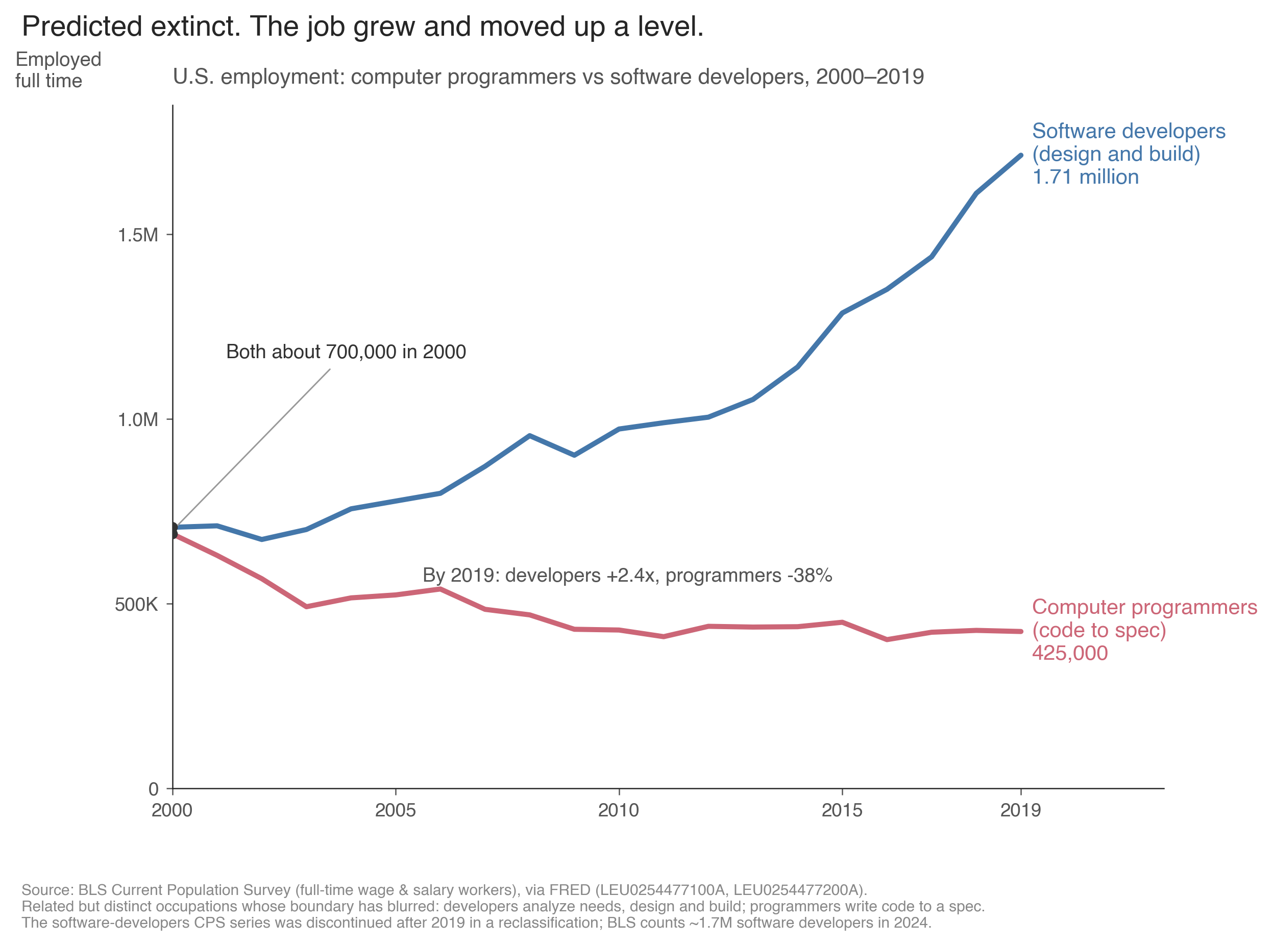
In 2000 the two occupations were the same size, about 700,000 workers each. By 2019 “software developer” had grown to 1.71 million while “computer programmer” fell to 425,000. They are related but distinct jobs: a developer analyzes needs, designs the software, and builds it; a programmer writes code to a design someone else produced. Source: BLS Current Population Survey (full-time wage and salary workers), via FRED. The developer series was retired after 2019 in a reclassification; BLS counts about 1.7 million software developers in 2024.
This is the part that makes the whole cycle legible, once you notice that “programmer” and “developer” are not the same job. A computer programmer, in the way the statistics count it, writes code to a design somebody else handed over. A software developer figures out what to build, then builds it. The narrow role is the one that’s dying: it stood at 121,200 jobs in 2024, which Fortune reported is the lowest level since 1980.
So the work didn’t disappear, and it didn’t simply change its name badge. It moved up a level. The job of turning a finished spec into code, the part a machine can most plausibly take, shrank. The job of deciding what the spec should be, and standing behind it, grew to about 1.7 million software developers, median wage $133,080, with another 15 percent growth projected over the decade. Every wave of “no more programmers” took aim at the narrow role and kept missing the broad one, because the broad one is mostly deciding, and deciding is the part nobody has automated.
So is this time different?
Yes and no.
The yes is real: the machine genuinely writes the code now, in a way no 4GL ever managed. But look at what writing the code always was. Writing the syntax was hard the way a chore is hard, real skill and real hours, and easy to mistake the effort for the essence. It was a “chore,” though, not the “mission.” The mission was to decide, exactly, what the program should do, and to answer for that decision. That is the programming, and it is the one thing sixty-five years of tooling never took off our hands.
Read the whole list again through that lens and it stops being a run of failed predictions and turns into a single, patient process. Each wave automated a chore and left the mission alone. COBOL took the chore of writing assembly. The 4GLs took the chore of hand-building the same forms and reports. The AI is taking the chore of writing the syntax. None of them touched the mission, because the mission was never the typing. The prediction keeps failing for one reason: from the outside, the chore looks like the job. It is the visible, effortful, teachable part, so people mistake it for the point. It never was the point.
In my own week, the AI’s most valuable move isn’t writing the code. It’s the command that stops and makes me state my assumptions and answer “why” before it builds anything. That is specifying: pinning down what the thing should do precisely enough that even a machine can’t wander off. Specifying is the mission with the typing stripped away, and no wave of tooling ever made it easier.
If I had to bet on where the job goes next, I’d bet up, not out. The work that grows is the work closest to deciding what to build: naming the problem, choosing the shape of the system, drawing the lines between the pieces. We already have a word for the person who does that, “architect,” and it’s telling that the people whose job is to classify jobs keep inventing new versions of it. The US occupational taxonomy had no “database architect” code until 2018; it added one because the role had quietly become real. I’d expect more of that. Not “no more programmers,” but the center of gravity of the work sliding toward whoever decides the structure, whatever we end up calling them. Will we keep calling them “software developers”? “programmers”? “architects”? “product managers”? I don’t know. But the work is moving up the abstraction ladder, and the machine keeps taking the rung below. It writes more of the code every year; a person still has to be accountable for what the code is for.
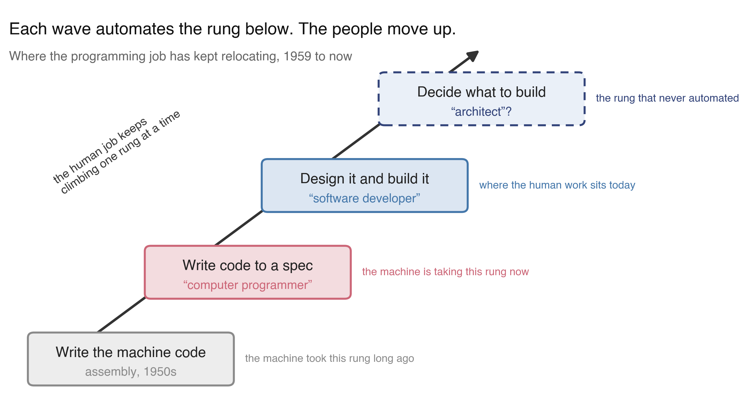
A schematic, not data. Each wave of tooling automates the rung below, and the human work climbs to the next one. The top rung, deciding what to build, is the one that has never automated. The “architect” rung is my guess at the next name for it, not a measured trend.
So I might be completely wrong. Everyone on this list was certain, and most of them were wrong, which means certainty is clearly not the safe side of this bet. What I’ll commit to is narrower. I’ve now watched the “no more programmers” headline get published, with a straight face, roughly once a decade since 1959, over a line that never stopped climbing. The next time it runs, notice that you’ve read it before. Then ask for better odds than “this time for sure.”