• Gender salary gap in the Israeli high-tech — now the code

    Gender salary gap in the Israeli high-tech — now the code

    February 7, 2018

    Several people have asked me about the technology I used to create the graphs in my recent post about the gender salary gap in the Israeli high-tech. Like 99% of the graphs I create, I used matplotlib. I have uploaded the notebook that I used for that post to Github. Here’s the link. The published version uses seaborn style settings. The original one uses a slightly customized style.

    February 7, 2018 - 1 minute read -
    code data visualisation Data Visualization dataviz jupyter matplotlib python seaborn blog
  • The Monty Hall Problem simulator

    The Monty Hall Problem simulator

    February 6, 2018

    A couple of days ago, I told to my oldest daughter about the Monty Hall problem, the famous probability puzzle with a counter-intuitive solution. My daughter didn’t believe me. Even when I told her all about the probabilities, the added information, and the other stuff, she still couldn’t “feel” it. I looked for an online simulator and couldn’t find anything that I liked. So, I decided to create a simulation Jupyter notebook.

    Illustration: Screenshot of a Jupyter notebook that shows the output of one round of Monty Hall simulation

    I’ve uploaded the notebook to GitHub, in case someone else wants to play with it [link].

    February 6, 2018 - 1 minute read -
    gambling jupyter jupyter-notebook monty-hall-problem probability statistics blog
  • In defense of double-scale and double Y axes

    In defense of double-scale and double Y axes

    February 5, 2018

    If you had a chance to talk to me about data visualization, you know that I dislike the use of double Y-axis for anything except for presenting different units of the same measurement (for example inches and meters). Of course, I’m far from being a special case. Double axis ban is a standard stand among all the people in the field of data visualization education. Nevertheless, double-scale axes (mostly Y-axis) are commonly used both in popular and technical publications. One of my data visualization students in the Azrieli College of Engineering of Jerusalem told me that he continually uses double Y scales when he designs dashboards that are displayed on a tiny screen in a piece of sophisticated hardware. He claimed that it was impossible to split the data into separate graphs, due to space constraints, and that the engineers that consume those charts are professional enough to overcome the shortcomings of the double scales. I couldn’t find any counter-argument.

    When I tried to clarify my position on that student’s problem, I found an interesting article by Financial Times commentator John Auther, called “Lies, Damned Lies and Statistics.” In this article, John Auther reviews the many problems a double scale can create. He also shows different alternatives (such as normalization). However, at the end of that article, John Auther also provides strong and valid arguments in favor of the moderate use of double scales. John Auther notices strange dynamics of two metrics

    [caption id=”attachment_2022” align=”alignnone” width=”1466”]A chart with two Y axes - one for EURJPY exchange rate and the other for SPX Index

    Screenshot from the article https://t.co/UYVqZpSzdS (Financial Times)[/caption]

    It is extraordinary that two measures with almost nothing in common with each other should move this closely together. In early 2007 I noticed how they were moving together, and ended up writing an entire book attempting to explain how this happened.

    It is relatively easy to modify chart scales so that “two measures with almost nothing in common […] move […] closely together”. However, it is hard to argue with the fact that it was the double scale chart that triggered that spark in the commentator’s head. He acknowledges that normalizing (or rebasing, as he puts it) would have resulted in a similar picture

    [caption id=”attachment_2023” align=”alignnone” width=”1462”]Graph that depicts the dynamics of two metrics, brought to the same scale

    Screenshot from the article https://t.co/UYVqZpSzdS (Financial Times)[/caption]

    But

    However, there is one problem with rebasing, which is that it does not take account of the fact that a stock market is naturally more variable than a foreign exchange market. Eye-balling this chart quickly, the main message might be that the S&P was falling faster than the euro against the yen. The more important point was that the two were as correlated as ever. Both stock markets and foreign exchange carry trades were suffering grievous losses, and they were moving together — even if the S&P was moving a little faster.

    I am not a financial expert, so I can’t find an easy alternative that will provide the insight John Auther is looking for while satisfying my purist desire to refrain from using double Y axes. The real question, however, is whether such an alternative is something one should be looking for. In many fields, double scales are the accepted language. Thanks to the standard language, many domain experts are able to exchange ideas and discover novel insights. Reinventing the language might bring more harm than good. Thus, my current recommendations regarding double scales are:

    Avoid double scales when possible, unless its a commonly accepted practice. In which case, be persistent and don’t lie.

    February 5, 2018 - 3 minute read -
    best-practice data visualisation Data Visualization dataviz double-scale opinion blog
  • What is the best way to collect feedback after a lecture or a presentation?

    What is the best way to collect feedback after a lecture or a presentation?

    February 4, 2018

    I consider teaching and presenting an integral part of my job as a data scientist. One way to become better at teaching is to collect feedback from the learners. I tried different ways of collecting feedback: passing a questionnaire, Polldaddy surveys or Google forms, or simply asking (no, begging) the learners to send me an e-mail with the feedback. Nothing really worked. The response rate was pretty low. Moreover, most of the feedback was a useless set of responses such as “it was OK”, “thank you for your time”, “really enjoyed”. You can’t translate this kind of feedback to any action.

    Recently, I figured out how to collect the feedback correctly. My recipe consists of three simple ingredients.

    Collecting feedback. The recipe.

    working time: 5 minutes

    Ingredients

    * Open-ended mandatory questions: 1 or 2
    * Post-it notes: 1 - 2 per a learner
    * Preventive amnesty: to taste
    

    Procedure

    Our goal is to collect constructive feedback. We want to improve and thus, are mainly interested in aspects that didn’t work well. In other words, we want the learners to provide constructive criticism. Sometimes, we may learn from things that worked well. You should decide whether you have enough time to ask for positive feedback. If your time is limited, skip it. Criticism is more valuable than praises.

    Pass post-it notes to your learners.

    Next, start with preventive amnesty, followed by mandatory questions, followed by another portion of preventive amnesty. This is what I say to my learners.

    [Preventive amnesty] Criticising isn’t easy. We all tend to see criticism as an attack and to react accordingly. Nobody likes to be attacked, and nobody likes to attack. I know that you mean well. I know that you don’t want to attack me. However, I need to improve.

    [Mandatory question] Please, write at least two things you would improve about this lecture/class. You cannot pass on this task. You are not allowed to say “everything is OK”. You will not leave this room unless you handle me a post-it with two things you liked the less about this class/lecture.

    [Preventive amnesty] I promise that I know that you mean good. You are not attacking me, you are giving me a chance to improve.

    That’s it.

    When I teach using the Data Carpentry methods, each of my learners already has two post-it notes that they use to signal whether they are done with an assignment (green) or are stuck with it (red). In these cases, I ask them to use these notes to fill in their responses – one post-it note for the positive feedback, and another one for the criticism. It always works like a charm.

    A pile of green and red post-it notes with feedback on them

    February 4, 2018 - 2 minute read -
    data science feedback presentation presenting teaching blog
  • Data is the new

    Data is the new

    February 3, 2018

    I stumbled upon a rant titled Data is not the new oil — Tech Insights

    You’ve heard it many times and so have I: “Data is the new oil” Well it isn’t. At least not yet. I don’t care how I get oil for my car or heating. I simply decide what to cook and where to drive when I want. I’m unconcerned which mechanism is used to refine oil […]

    Funny, in my own rant “data is not the new gold”, I claimed that “oil” was a better analogy for data than gold. Obviously, any “X is the new Y” sentences are problematic but it’s still funny how we like them.

    February 3, 2018 - 1 minute read -
    data science rant blog
  • Yes, your friends are more successful than you are. On

    Yes, your friends are more successful than you are. On "The Majority Illusion in Social Networks"

    February 2, 2018

    Recently, I re-read “The Majority Illusion in Social Networks” (by Lerman, Yan and Wu).

    The starting point of this paper is the friendship paradox – a situation when a node in a network has fewer friends that its friends have. The authors expand this paradox to what they call “the majority illusion” – a situation in which a node may observe that the majority of its friends have a particular property, despite the fact that such a property is rare in the entire network.

    An illustration of the “majority illusion” paradox. The two networks are identical, except for which three nodes are colored. These are the “active” nodes and the rest are “inactive.” In the network on the left, all “inactive” nodes observe that at least half of their neighbors are “active,” while in the network on the right, no “inactive” node makes this observation.F

    Besides pointing out the existence of majority illusion phenomenon, the authors used synthetic networks to characterize the situations in which this phenomenon is most prevalent.

    Quoting the authors:

    the paradox is stronger in networks in which the better-connected nodes are active, and also in networks with a heterogeneous degree distribution. […] The paradox is strongest in networks where low degree nodes have the tendency to connect to high degree nodes. […] Activating the high degree nodes in such networks biases the local observations of many nodes, which in turn impacts collective phenomena

    The conditions listed in the quote above describe a lot of known social networks. The last sentence in that quote is of a special interest. It explains the contagious nature of many actions, from sharing a meme to buying a new car.

    February 2, 2018 - 2 minute read -
    life social-network-analysis blog
  • Analysis of A Beautiful Storm: Internal Communication at Automattic

    Analysis of A Beautiful Storm: Internal Communication at Automattic

    February 2, 2018

    My teammate’s post on data.blog

    February 2, 2018 - 1 minute read -
    blog
  • Gender salary gap in the Israeli high-tech

    Gender salary gap in the Israeli high-tech

    February 1, 2018

    A large and popular Israeli Facebook group, “The High-Tech Troubles,” has recently surveyed its participants. The responders provided personal, demographic, and professional information. The group owners have published the aggregated results of that survey. In this post, I analyze a particular aspect of these findings, namely, how the responders’ gender and experience affect their salary. It is worth noting that this survey is by no means a representative one. It’s most noticeable but not the only problem is the participation bias. Another problem is the fact that the result tables do not contain any information about the number of responders in any group. Without this information, it is impossible to compute confidence intervals of any findings. Despite these problems, the results are interesting and worth noting.

    The data that I used in my analysis is available in this spreadsheet. The survey organizers promise that they excluded groups and categories with insufficiently few answers, and we have to trust them in that. The results are divided into twenty professional categories such as ‘Account Management,’ ‘Data Science’, ‘Support’ and ‘CXO’ (which stands for an executive role). The salary groups are organized in exponential bins according to the years of experience: 0-1, 1-2, 2-4, 4-7; and more than seven years of experience. Some of the cell values are missing, I assume that these are the categories with too few responders. I took a look at the gap between the salary reported by women and the compensation reported by men.

    Let’s take a look at the most complete set of data – the groups of people with 1-2 years of experience. As we may see from the figure below, in thirteen out of twenty groups (65%), women get less money than men.
    Gender compensation gap, 1-2 years of experience. Women earn less in 13 of 20 categories

    Among the workers with 1 - 2 years of experience, the most discriminating fields are executives and security researchers. It is interesting to note the difference between two closely related fields: Data Science and BI/Data Analysts. The former is considered a more lucrative position. On average, the male data scientists get 11% more than their female colleagues, while male data analysts get 13% less than their female counterparts. I wonder how this difference relates to my (very limited) observation that most of the people who call themselves a BI expert are females, while most of the data scientists whom I know are males.

    As we have seen, there is no much gender equality for the young professionals. What happens when people gain experience? How does the gender compensation gap change after eight years of professional life? The situation is even worse. In fourteen, out of sixteen available fields, women get less money than men. The only field in which it pays to be a woman is the executive roles, where the women get 19% more than the men.

    Gender compensation gap, more than 7 years of experience. Women earn less in 14 of 16 categories

    To complete the picture, let’s look at the gap dynamics over the years in all the occupation fields in that report.

    Gender gap dynamics. 20 professional fields over different experience bins

    What do we learn from these findings?

    These findings are real. We cannot use the non-representativity of these data, and the lack of confidence intervals to dismiss these findings. I don’t expect the participants to lies, neither do I not expect any bias from the participation patterns. It is true that I can’t obtain confidence intervals for these results. However, the fact that the vast majority of the groups lie on one side of the equality line suggests the overall validity of the gender gap notion. How can we fix this gap? I frankly don’t know. As a father of three daughters (9, 12, and 14 years old), I talk to them about this gap. I make sure they are aware of this problem so that, when it’s their turn to negotiate compensation, they are aware of the systematic bias. I hope that this knowledge will give them the right tools to fight for justice.

    February 1, 2018 - 3 minute read -
    Data Visualization gender gender-inequality Israel salary work blog
  • Don't take career advises from people who mistreat graphs this badly

    Don't take career advises from people who mistreat graphs this badly

    January 4, 2018

    Recently, I stumbled upon a report called “Understanding Today’s Chief Data Scientist” published by an HR company called Heidrick & Struggles. This document tries to draw a profile of the modern chief data scientist in today’s Big Data Era. This document contains the ugliest pieces of data visualization I have seen in my life. I can’t think of a more insulting graphical treatment of data. Publishing graph like these ones in a document that tries to discuss careers in data science is like writing a profile of a Pope candidate while accompanying it with pornographic pictures.

    Before explaining my harsh attitude, let’s first ask an important question.

    What is the purpose of graphs in a report?

    There are only two valid reasons to include graphs in a report. The first reason is to provide a meaningful glimpse into the document. Before a person decided whether he or she wants to read a long document, they want to know what is it about, what were the methods used, and what the results are. The best way to engage the potential reader to provide them with a set of relevant graphs (a good abstract or introduction paragraph help too). The second reason to include graphs in a document is to provide details that cannot be effectively communicating by text-only means.

    That’s it! Only two reasons. Sometimes, we might add an illustration or two, to decorate a long piece of text. Adding illustrations might be a valid decision provided that they do not compete with the data and it is obvious to any reader that an illustration is an illustration.

    Let the horror begin!

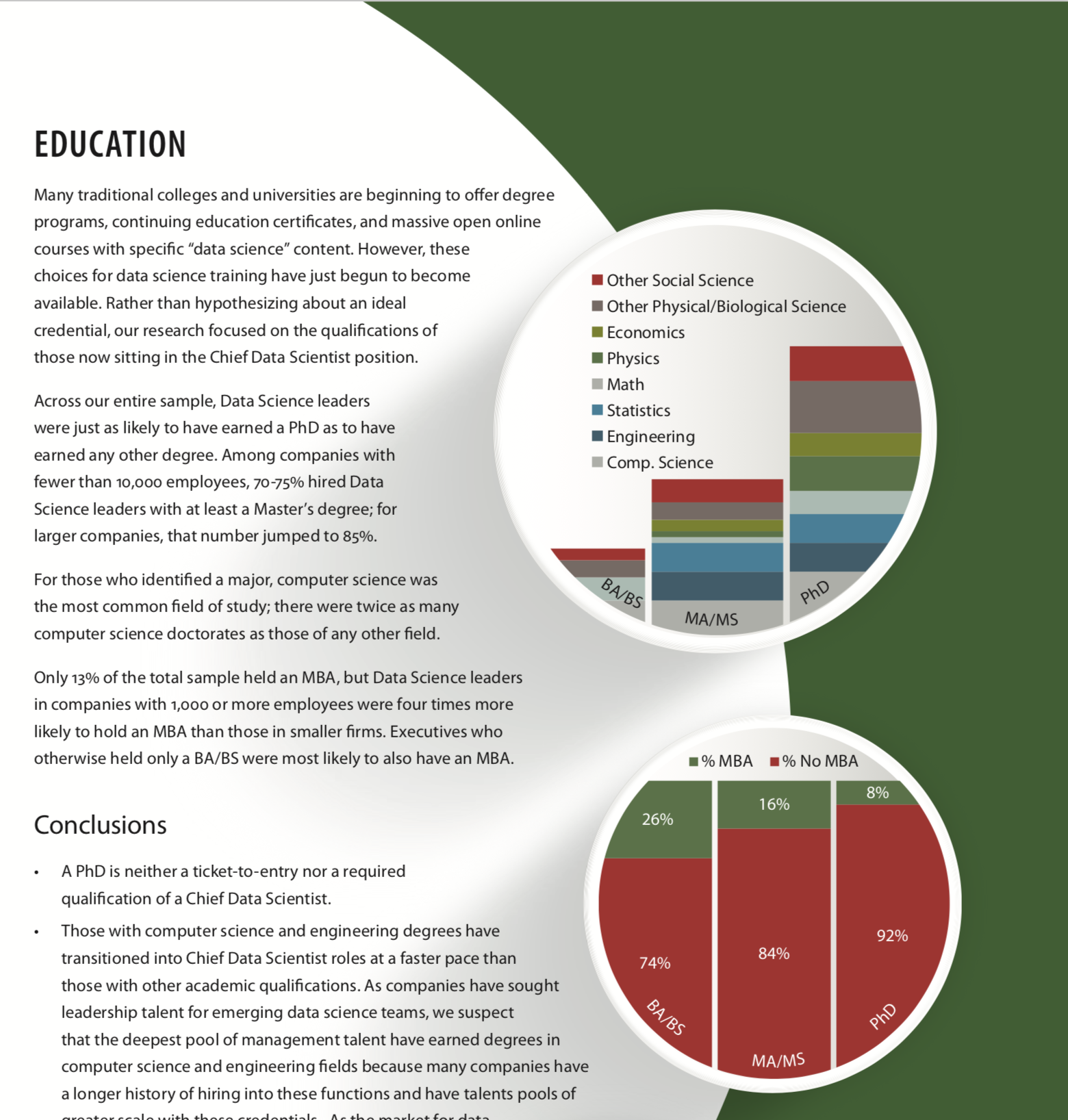
    The first graph in the H&S report stroke me with its absurdness.

    Example of a bad chart. I have no idea what it means

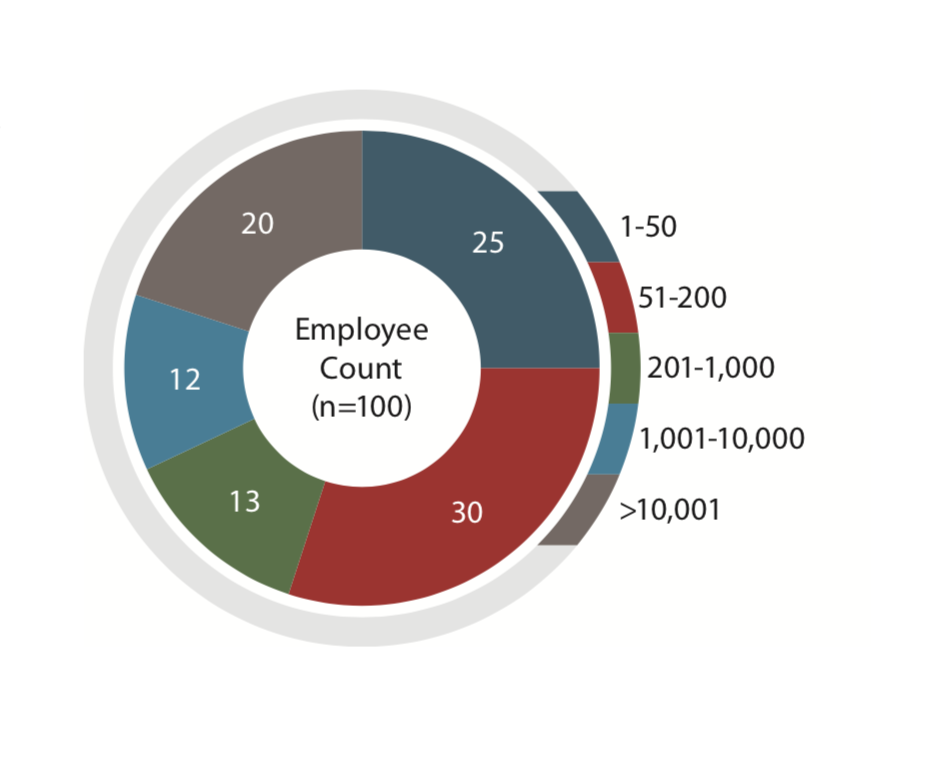
    At first glance, it looks like an overly-artistic doughnut chart. Then, you want to understand what you are looking at. “OK”, you say to yourself, “there were 100 employees who belonged to five categories. But what are those categories? Can someone tell me? Please? Maybe the report references this figure with more explanations? Nope. Nothing. This is just a doughnut chart without a caption or a title. Without a meaning.

    I continued reading.

    Two more bad charts. The graphs are meaningless!

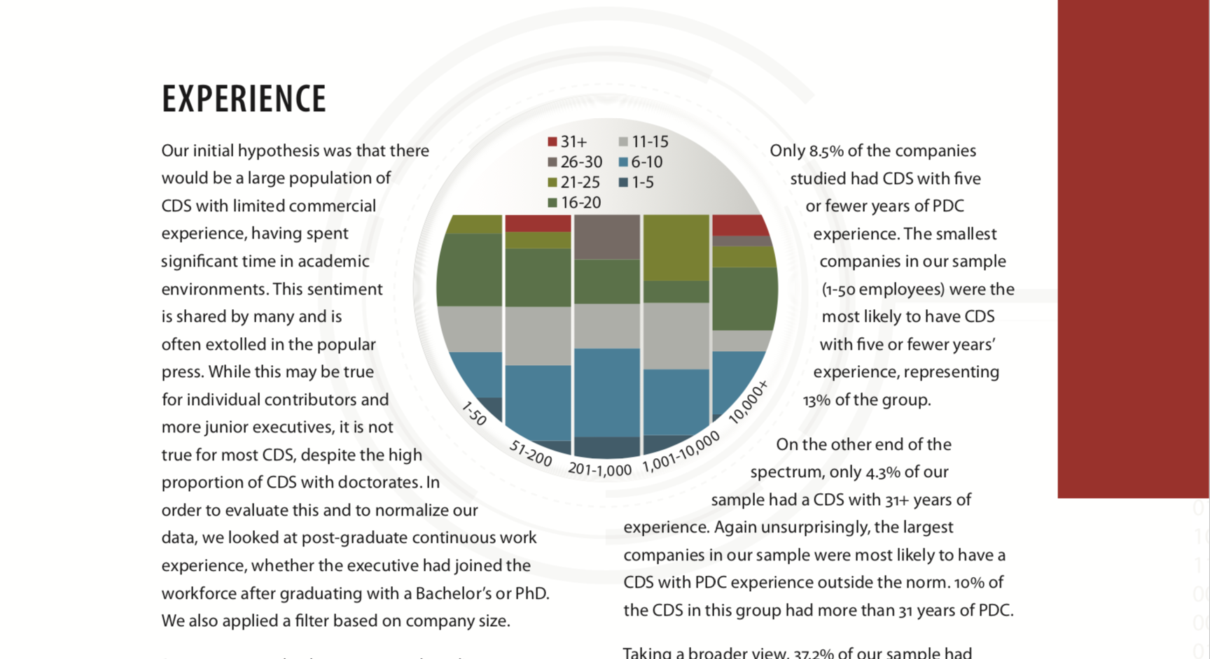
    OK, so the H&S geniuses decided to hide the origin or their bar charts. Had they been students in a dataviz course I teach, I would have given them a zero. Ooookeeyy, it’s not a college assignment, as long as we can reconstruct the meaning from the numbers and the labels, we are good, right? I tried to do just that and failed. I tried to use the numbers in the text to help me filling the missing information and failed. All in all, these two graphs are a meaningless graphical junk, exactly like the first one.

    The fourth graph gave me some hope.

    Not an ideal pie chart but at least we can understand it

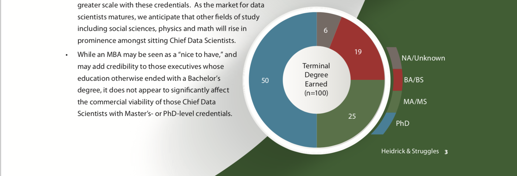
    Sure, this graph will not get the “best dataviz” award, but at least I understand what I’m looking at. My hope was too early. The next graph was as nonsense as the first three ones.

    Screenshot with an example of another nonsense graph

    Finally, the report authors decided that it wasn’t enough to draw smartly looking color segments enclosed in a circle. They decided to add some cool looking lines. The authors remained faithful to their decision to not let any meaning into their graphical aids
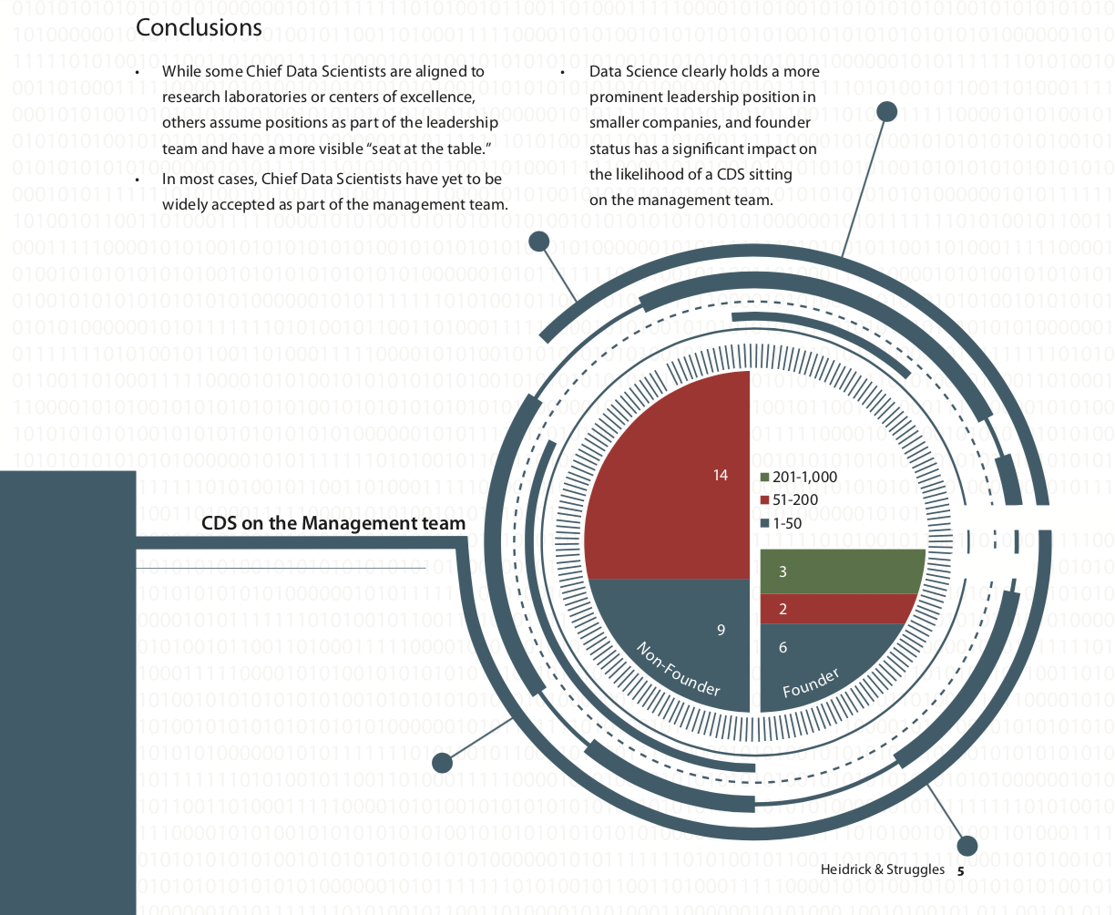
Screenshot with an example of a nonsense chart

    .

    Can’t we treat these graphs as illustrations?

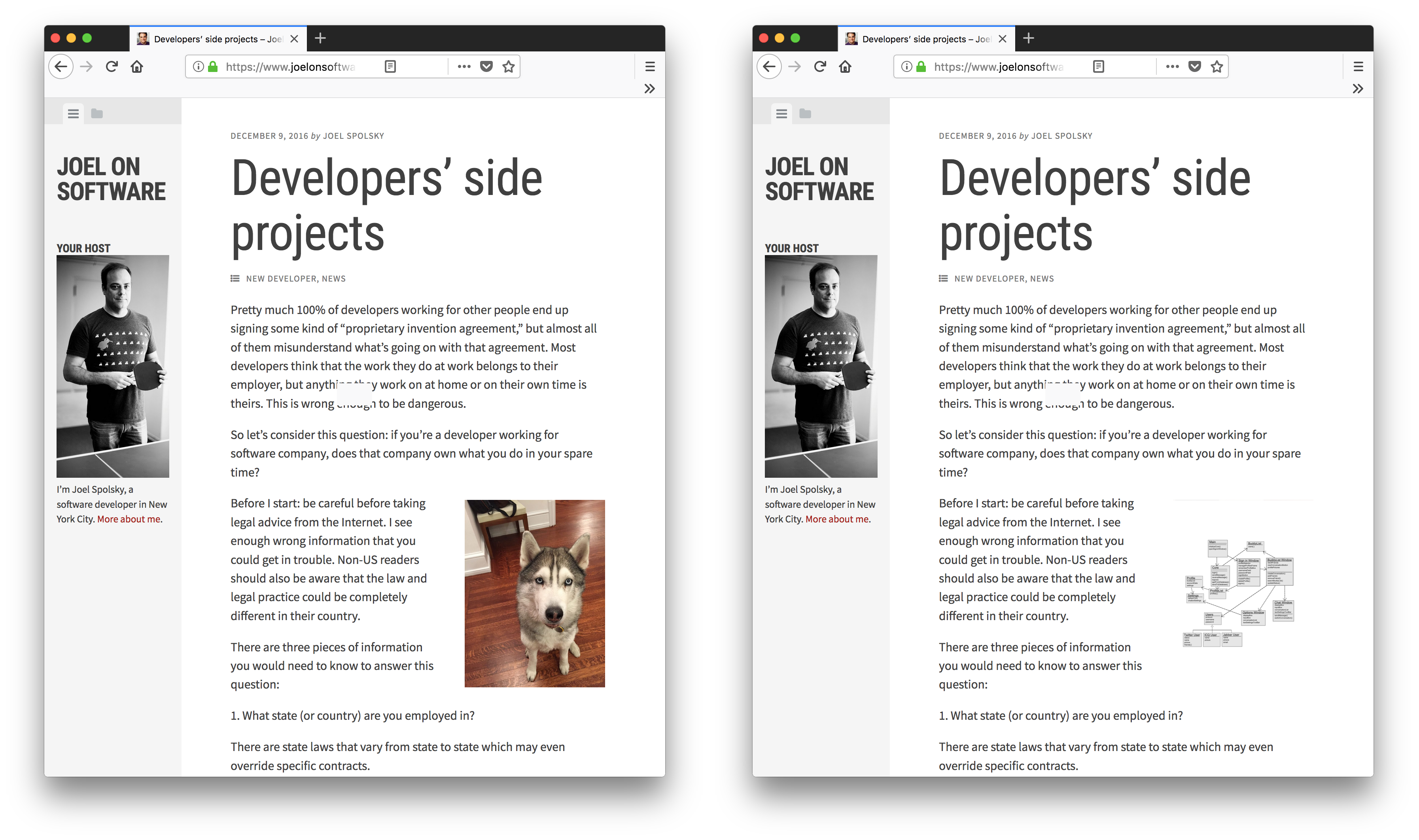
    Before co-founding the life-changing StackOverflow, Joel Spolsky was, among other things, an avid blogger. His blog, JoelOnSoftware, was the first blog I started following. Joel writes mostly about the programming business and. In order not to intimidate the readers with endless text blocks, Joel tends to break the text with illustrations. In many posts, Joel uses pictures of a cute Husky as an illustration. Since JoelOnSoftware isn’t a cynology blog, nobody gets confused by the sudden appearance of a Husky. Which is exactly what an illustration is - a graphical relief that doesn’t disturb. But what would happen if Joel decided to include a meaningless class diagram? Sure a class diagram may impress the readers. The readers will also want to understand it and its connection to the text. Once they fail, they will feel angry, and rightfully so

    Two screenshots of Joel's blog. One with a Husky, another one with a meaningless diagram

    The bottom line

    The bottom line is that people have to respect the rules of the domain they are writing about. If they don’t, their opinion cannot be trusted. That is why you should not take any pieces of advice related to data (or science) from H&S. Don’t get me wrong. It’s OK not to know the “grammar” of all the possible business domains. I, for example, know nothing about photography or dancing; my English is far from being perfect. That is why, I don’t write about photography, dancing or creative writing. I write about data science and visualization. It doesn’t mean I know everything about these fields. However, I did study a lot before I decided I could write something without ridiculing myself. So should everyone.

    January 4, 2018 - 4 minute read -
    best-practice career critique data science Data Visualization dataviz blog Career advice
  • AI and the War on Poverty, by Charles Earl

    AI and the War on Poverty, by Charles Earl

    January 2, 2018

    It’s such a joy to work with smart and interesting people. My teammate, Charles Earl, wrote a post about machine learning and poverty. It’s not short, but it’s worth reading.

    A.I. and Big Data Could Power a New War on Poverty is the title of on op-ed in today’s New York Times by Elisabeth Mason. I fear that AI and Big Data is more likely to fuel a new War on the Poor unless a radical rethinking occurs. In fact this algorithmic War on the Poor […]

    via AI and the War on Poverty — Charlescearl’s Weblog

    January 2, 2018 - 1 minute read -
    ai artificial-intelligence machine learning blog
  • Одна голова хорошо, а две лучше; или как не забросить свой блог

    Одна голова хорошо, а две лучше; или как не забросить свой блог

    December 31, 2017

    Запись моего доклада на WordCamp Moscow (август 2017г.) доступна онлайн.

    The recording of my presentation at WordCamp Moscow (Aug 2017) is finally available online: Two Heads are Better Than One - on blogging persistence (Russian)

    https://videopress.com/v/QEUQ1aKw

    December 31, 2017 - 1 minute read -
    blogging persistence presentation research russian video blog
  • Do New Year's Resolutions Work? Data Suggests They Do!

    Do New Year's Resolutions Work? Data Suggests They Do!

    December 26, 2017

    My latest post on https://data.blog. I enjoyed preparing it, and like its results very much. Happy New Year, everyone.

    December 26, 2017 - 1 minute read -
    blog
  • The Keys to Effective Data Science Projects — Operationalize

    The Keys to Effective Data Science Projects — Operationalize

    December 20, 2017

    Recently, I’ve stumbled upon an interesting series of posts about effective management of data science projects. One of the posts in the series says:

    “Operationalization” – a term only a marketer could love. It really just means “people using your solution”.

    The main claim of that post is that, at some point, bringing actual users to your data science project may be more important than improving the model. This is exactly what I meant in my “when good enough is good enough” post (also available on YouTube)

    December 20, 2017 - 1 minute read -
    blog data science project-management Career advice
  • We're Reading About Artificially Intelligent Harry Potter Fan Fiction, Verifying Online Identities, and More

    We're Reading About Artificially Intelligent Harry Potter Fan Fiction, Verifying Online Identities, and More

    December 19, 2017
    December 19, 2017 - 1 minute read -
    blog
  • Buzzword shift

    Buzzword shift

    December 18, 2017

    Many years ago, I tried to build something that today would have been called “Google Trends for Pubmed”. One thing that I’ve found during that process was how the emergence of HIV-related research reduced the number of cancer studies and how, several years later, the HIV research boom settled down, while letting the cancer research back.

    I recalled about that project of mine when I took a look at the Google Trends data for, a once popular buzz-phrases, “data mining” and pattern recognition. Sic transit gloria mundi.

    Screenshot of Google Trends data for (in decreasing order): "Machine Learning" , "Data Science", "Data Mining", "Pattern Recognition"

    It’s not surprising that “Data Science” was the less popular term in 2004. As I already mentioned, “Data Science” is a relatively new term. What does surprise me is the fact that in the past, “Machine Learning” was so less popular that “Data Mining”. Even more surprising is the fact that Google Trends ranks “Machine Learning” almost twice as high, as “Data Science”. I was expecting to see the opposite.

    “Pattern Recognition,” that, in 2004, was as (not) popular as “Machine Learning” become even less popular today. Does that mean that nobody is searching for patterns anymore? Not at all. The 2004 pattern recognition experts are now machine learning professors senior data scientists or if they work in academia, machine learning professors.

    PS: does anybody know the reason behind the apparent seasonality in “Data Mining” trends?

    December 18, 2017 - 1 minute read -
    data-mining data science machine learning pattern-recognition trend blog
  • On alert fatigue 

    On alert fatigue 

    December 17, 2017

    I developed an anomaly detection system for Automattic internal dashboard. When presenting this system (“When good enough is just good enough”), I used to tell that in our particular case, the cost of false alerts was almost zero. I used to explain this claim by the fact that no automatic decisions were made based on the alerts, and that the only subscribers of the alert messages were a limited group of colleagues of mine. Automattic CFO, Stu West, who was the biggest stakeholder in this project, asked me not to stop claiming the “zero cost” claim. When the CFO of the company you work for asks you to do something, you comply. So, I stopped saying “zero cost” but I still listed the error costs as a problem I can safely ignore for the time being. I didn’t fully believe Stu, which is evident from the speaker notes of my presentation deck:

    [caption id=”attachment_1942” align=”alignnone” width=”2298”]Screenshot of the presentation speaker notes.

    My speaker notes. Note how “error costs” was the first problem I dismissed.[/caption]

    I recalled about Stu’s request to stop talking about “zero cost” of false alerts today. Today, I noticed more than 10 unread messages in the Slack channel that receives my anomaly alerts. The oldest unread message was two weeks old. The only reason this could happen is that I stopped caring about the alerts because there were too many of them. I witnessed the classical case of “alert fatigue”, described in “The Boy Who Cried Wolf”, many centuries ago.

    The lesson of this story is that there is no such a thing as zero-cost false alarms. Lack of specificity is a serious problem.

    Screenshot: me texting Stu that he was right

    Feature image by Ray Hennessy

    December 17, 2017 - 2 minute read -
    a2f2 alert anomaly-detection data science fatigue machine learning blog
  • What's the most important thing about communicating uncertainty?

    What's the most important thing about communicating uncertainty?

    December 14, 2017

    Sigrid Keydana, in her post Plus/minus what? Let’s talk about uncertainty (talk) — recurrent null, said

    What’s the most important thing about communicating uncertainty? You’re doing it

    Really?

    Here, for example, a graph from a blog post

    Thousands of randomly looking points. From https://myscholarlygoop.wordpress.com/2017/11/20/the-all-encompassing-figure/

    The graph clearly “communicates” the uncertainty but does it really convey it? Would you consider the lines and their corresponding confidence intervals very uncertain had you not seen the points?

    What if I tell you that there’s a 30% Chance of Rain Tomorrow? Will you know what it means? Will a person who doesn’t operate on numbers know what it means? The answer, to both these questions, is “no”, as is shown by Gigerenzer and his collaborators in a 2005 paper).

    Screenshot: many images for the 2016 US elections

    Communicating uncertainty is not a new problem. Until recently, the biggest “clients” of uncertainty communication research were the weather forecasters. However, the recent “data era” introduced uncertainty to every aspect of our personal and professional lives. From credit risk to insurance premiums, from user classification to content recommendation, the uncertainty is everywhere. Simply “doing” uncertainty communication, as Sigrid Keydana from the Recurrent Null blog suggested isn’t enough. The huge public surprise caused by the 2016 US presidential election is the best evidence for that. Proper uncertainty communication is a complex topic. A good starting point to this complex topic is a paper Visualizing Uncertainty About the Future by David Spiegelhalter.

    December 14, 2017 - 2 minute read -
    best-practice data science Data Visualization dataviz uncertainty blog
  • Doing the Math on Key Words and Top Level Domains

    Doing the Math on Key Words and Top Level Domains

    December 12, 2017

    My post on data.blog

    December 12, 2017 - 1 minute read -
    blog
  • The Y-axis doesn't have to be on the left

    The Y-axis doesn't have to be on the left

    December 10, 2017

    Line charts are great to convey the evolution of a variable over the time. This is a typical chart. It has three key components, the X-axis that represents the time, the Y-axis that represents the tracked value, and the line itself.

    A typical line chart. The Y-axis is on the left

    Usually, you will see the Y-axis at the left part of the graph. Unless you design for a Right-To-Left language environment, placing the Y-axis on the left makes perfect sense. However, left-side Y-axis isn’t a hard rule.

    In many cases, more importance is given to the most recent data point. For example, it might be interesting to know a stock price dynamics but today’s price is what determines how much money I can get by selling my stock portfolio.

    What happens if we move the axis to the right?

    A slightly improved version. The Y-axis is on the right, adjacent to the most recent data point

    Now, today’s price of XYZ stock is visible more clearly. Let’s make the most important values explicitly clear:

    The final version. The Y-axis is on the right, adjacent to the most recent data point. The axis ticks correspont to actual data points

    There are two ways to obtain right-sided Y axis in matplotib. The first way uses a combination of

    [code language=”python”]
    ax.yaxis.tick_right() ax.yaxis.set_label_position(“right”)
    [/code]

    The second one creates a “twin X” axis and makes sure the first axis is invisible. It might seem that the first option is easier. However, when combined with seaborn’s despine function, strange things happen. Thus, I perform the second option. Following is the code that I used to create the last version of the graph.

    [code language=”python”]
    np.random.seed(123) days = np.arange(1, 31)
    price = (np.random.randn(len(days)) * 0.1).cumsum() + 10

    fig = plt.figure(figsize=(10, 5))
    ax = fig.gca()
    ax.set_yticks([]) # Make 1st axis ticks disapear.
    ax2 = ax.twinx() # Create a secondary axis
    ax2.plot(days,price, ‘-‘, lw=3)
    ax2.set_xlim(1, max(days))
    sns.despine(ax=ax, left=True) # Remove 1st axis spines
    sns.despine(ax=ax2, left=True, right=False)
    tks = [min(price), max(price), price[-1]]
    ax2.set_yticks(tks) ax2.set_yticklabels([f’min:\n{tks[0]:.1f}’, f’max:\n{tks[1]:.1f}’, f’{tks[-1]:.1f}’])
    ax2.set_ylabel(‘price [$]’, rotation=0, y=1.1, fontsize=’x-large’)
    ixmin = np.argmin(price); ixmax = np.argmax(price);
    ax2.set_xticks([1, days[ixmin], days[ixmax], max(days)])
    ax2.set_xticklabels([‘Oct, 1’,f’Oct, {days[ixmin]}’, f’Oct, {days[ixmax]}’, f’Oct, {max(days)}’ ])
    ylm = ax2.get_ylim()
    bottom = ylm[0]
    for ix in [ixmin, ixmax]: y = price[ix] x = days[ix] ax2.plot([x, x], [bottom, y], ‘-‘, color=’gray’, lw=0.8) ax2.plot([x, max(days)], [y, y], ‘-‘, color=’gray’, lw=0.8)
    ax2.set_ylim(ylm) [/code]

    Next time when you create a “something” vs time graph, ask yourself whether the last available point has a special meaning to the viewer. If it does, consider moving the Y axis to the left part of your graph and see whether it becomes more readable.

    This post was triggered by a nice write-up by Plotting a Course: Line Charts by a new blogger David (he didn’t mention his last name) from https://thenumberist.wordpress.com/

    December 10, 2017 - 3 minute read -
    Data Visualization dataviz matplotlib python blog
  • Epitaphs in the Graveyard of Mathematics

    Epitaphs in the Graveyard of Mathematics

    December 2, 2017

    The excellent Ben Odrin wrote a hilarious post with fictitious tombstones of famous mathematicians. This is only one example :

    I decided to jump on that bandwagon

    not real Paul Errdos tombstone.

    December 2, 2017 - 1 minute read -
    erdos fun tombstone blog
  • The fastest way to get first N items in each group of a Pandas DataFrame

    The fastest way to get first N items in each group of a Pandas DataFrame

    November 27, 2017

    In my work, the speed of code writing and reading is usually more important than the speed of its execution. Right now, I’m facing a challenge of optimizing the running time of a fairly complex data science project. After a lot of profiling, I identified the major time consumers. One of such time-consuming steps involved grouping a Pandas DataFrame by a key, sorting each group by a score column, and taking first N elements in each group. The tables in this step are pretty small not more than one hundred elements. But since I have to perform this step many times, the running time accumulates to a substantial fraction.

    Let’s first construct a toy example

    [code lang=”python”]
    N = 100
    x = np.random.randint(1, 5, N).astype(int)
    y = np.random.rand(N)
    d = pd.DataFrame(dict(x=x, y=y))
    [/code]

    I’ll use %%timeit cell magic which runs a Jupyter cell many times, and measures the time it takes to run the code.

    [code lang=”python”]

    %%timeit
    d.groupby( ‘x’ ).apply( lambda t: t.head(K) ).reset_index(drop=True)

    [/code]

    This is the output:

    3.19 ms ± 253 µs per loop (mean ± std. dev. of 7 runs, 100 loops each)
    

    I suspected that head() was not the most efficient way to take the first lines. I tried .iloc

    [code lang=”python”]

    %%timeit
    d.groupby( ‘x’ ).apply( lambda t: t.iloc[0:K] ).reset_index(drop=True)

    [/code]

    2.92 ms ± 86.9 µs per loop (mean ± std. dev. of 7 runs, 100 loops each)
    

    A 10% improvement. Not bad but not excellent either. Then I realized that Pandas groupby object have their own head function

    [code lang=”python”]

    %%timeit
    d.groupby( ‘x’ ).head( K ).reset_index(drop=True)

    [/code]

    674 µs ± 23.7 µs per loop (mean ± std. dev. of 7 runs, 1000 loops each)
    

    647 microseconds instead of 3.2 milliseconds. The improvement is by almost a factor of five!

    It’s not enough to have the right tool, it’s important to be aware of it, and to use it right. I wonder whether there is even faster way to obtain this job.

    November 27, 2017 - 2 minute read -
    data science optimization pandas python blog
  • How to make a graph less readable? Rotate the text labels

    How to make a graph less readable? Rotate the text labels

    November 23, 2017

    This is my “because you can” rant.

    Here, you can see a typical situation. You have some sales data that you want to represent using a bar plot.

    01_default

    Immediately, you notice a problem: the names on the X axis are not readable. One way to make the labels readable is to enlarge the graph.02_large_image

    Making larger graphs isn’t always possible. So, the next default solution is to rotate the text labels.

    03_rotated

    However, there is a problem. Rotated text is read more slowly than standard horizontal text. Don’t believe me? This is not an opinion but rather a result of empirical studies [ref], [ref]. Sometimes, rotated text is unavoidable. Most of the time, it is not.

    So, how do we make sure all the labels are readable without rotating them? One option is to move them up and down so that they don’t hinder each other. It is easily obtained with Python’s matplotlib

    [code language=”python”]
    plt.bar(range(len(people)), sales)
    plt.title(‘October sales’)
    plt.ylabel(‘$US’, rotation=0, ha=’right’)
    ticks_and_labels = plt.xticks(range(len(people)), people, rotation=0)
    for i, label in enumerate(ticks_and_labels[1]): label.set_y(label.get_position()[1] - (i % 2) * 0.05)
    [/code]

    (note, that I also rotated the Y axis label, for even more readability)

    05_alternate_labels

    Another approach that will work with even longer labels and that requires fewer code lines it to rotate the bars, not the labels.

    07_horizontal_plot

    … and if you don’t have a compelling reason for the data order, you might also consider sorting the bars. Doing so will not only make it prettier, it will also make it easier to compare between similar values. Use the graph above to tell whether Teresa Jackson’s sales were higher or lower than those of Marie Richardson’s. Now do the same comparison using the graph below.

    08_horizontal_plot_sorted

    To sum up: the fact you can does not mean you should. Sometimes, rotating text labels is the easiest solution. The additional effort needed to decipher the graph is the price your audience pays for your laziness. They might as well skip your graphs your message won’t stick.

    This was my because you can rant.

    Featured image by Flickr user gullevek

    November 23, 2017 - 2 minute read -
    because you can best-practice Data Visualization dataviz blog
  • On machine learning, job security, professional pride, and network trolling

    On machine learning, job security, professional pride, and network trolling

    November 21, 2017

    If you are a data scientist, I am sure you wondered whether deep neural networks will replace you at your job one day. Every time I read about reports of researchers who managed to trick neural networks, I wonder whether the researchers were thinking about their job security, or their professional pride while performing the experiments. I think that the first example of such a report is a 2014 paper by Christian Szegedy and his colleagues called “Intriguing properties of neural networks”. The main goal of this paper, so it seems, was to peek into the black box of neural networks. In one of the experiments, the authors designed minor, invisible perturbation of the original images. These perturbations diminished the classification accuracy of a trained model.

    Screen Shot 2017-11-21 at 16.50.05.png

    In the recent post “5 Ways to Troll Your Neural Network” Ben Orlin describes five different ways to “troll a network”.

    Image credit: Figure 5 from “Intriguing properties of neural networks”.

    November 21, 2017 - 1 minute read -
    data science deep-learning job-security machine learning neural-networks blog
  • Interactive Network Visualization in Python with NetworkX and PyQt5 Tutorial

    Interactive Network Visualization in Python with NetworkX and PyQt5 Tutorial

    November 20, 2017

    Unfortunately, there is no widely accepted, ready to use, standard way to interactively visualize networks in python. The following post shows yet another attempt to build an ad-hoc app.

    November 20, 2017 - 1 minute read -
    blog
  • Which of these two pictures should I choose for my gravatar?

    Which of these two pictures should I choose for my gravatar?

    November 16, 2017

    Which of these two pictures should I choose for my gravatar?

    Screen Shot 2017-11-10 at 20.49.24.png

    Both were taken by Luca Sartoni

    November 16, 2017 - 1 minute read -
    gravatar photo question blog
  • Older posts Newer posts