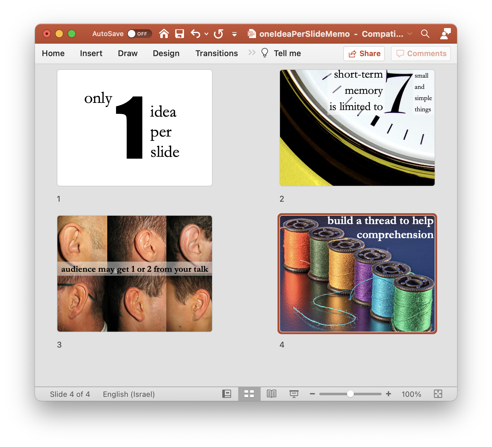
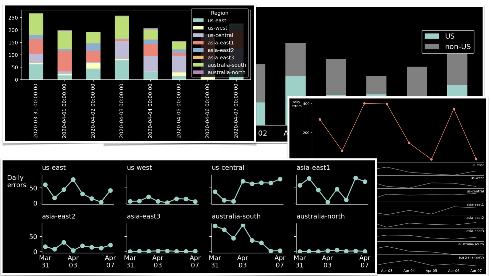
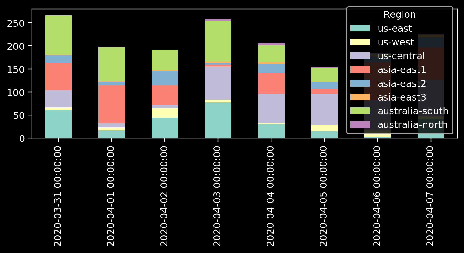
A fellow data analyst asked a question? What do we do when we need to draw a stacked bar chart that has too many colors? How do we select the colors so that they are nice but also are easily distinguishable? To answer this question, let’s look at the data similar to what appeared in the original question. I also tried to recreate the actual chart’s style
So, how do we select colors?
The answer to this question is pretty complicated. To have a set of easily distinguishable colors, one needs to model the color perception in a typical human being properly. Luckily, a tool called I Want Hue that’s based on a solid theory explained here. The problem, however, isn’t in colors.
This is not the right question
Distinguishing between eight colors in a graph is a challenging task. Selecting the right color scheme might help, but it won’t solve this fundamental problem. Moreover, stacked bar plots are tricky due to another complication.
We, the humans, are somewhat good are comparing positions but not as good at comparing sizes. This is why comparing the heights of the bars is relatively easy. It is easy because the bars start at the same line, and our task is to compare the bar end position, not the bar size. Reading the heights of the lowest segment in the bars is also an easy task for the same reason: we don’t compare the sizes but the heights.
However, comparing the sizes of the middle components is more challenging. As a result, the intermediate parts of a graph don’t add useful information but rather add noise. Thus, let us explain two options. First, we will reduce the number of groups. Next, we will explore what happens when reducing the number of groups is not an option.
Option 1. Reduce the number of categories
It is hard to advise about data visualization when I don’t know what conclusion the author wants to convey. However, I am sure that in many cases, the number of categories that are relevant to the viewer is much smaller than the number of types that are relevant to the analyst. The viewer might not care about all the hard job you did while collecting the data; what they are about is an insight. For example, if we reduce the discussion to two groups: the USA and non-USA data centers, the graph becomes much more readable.
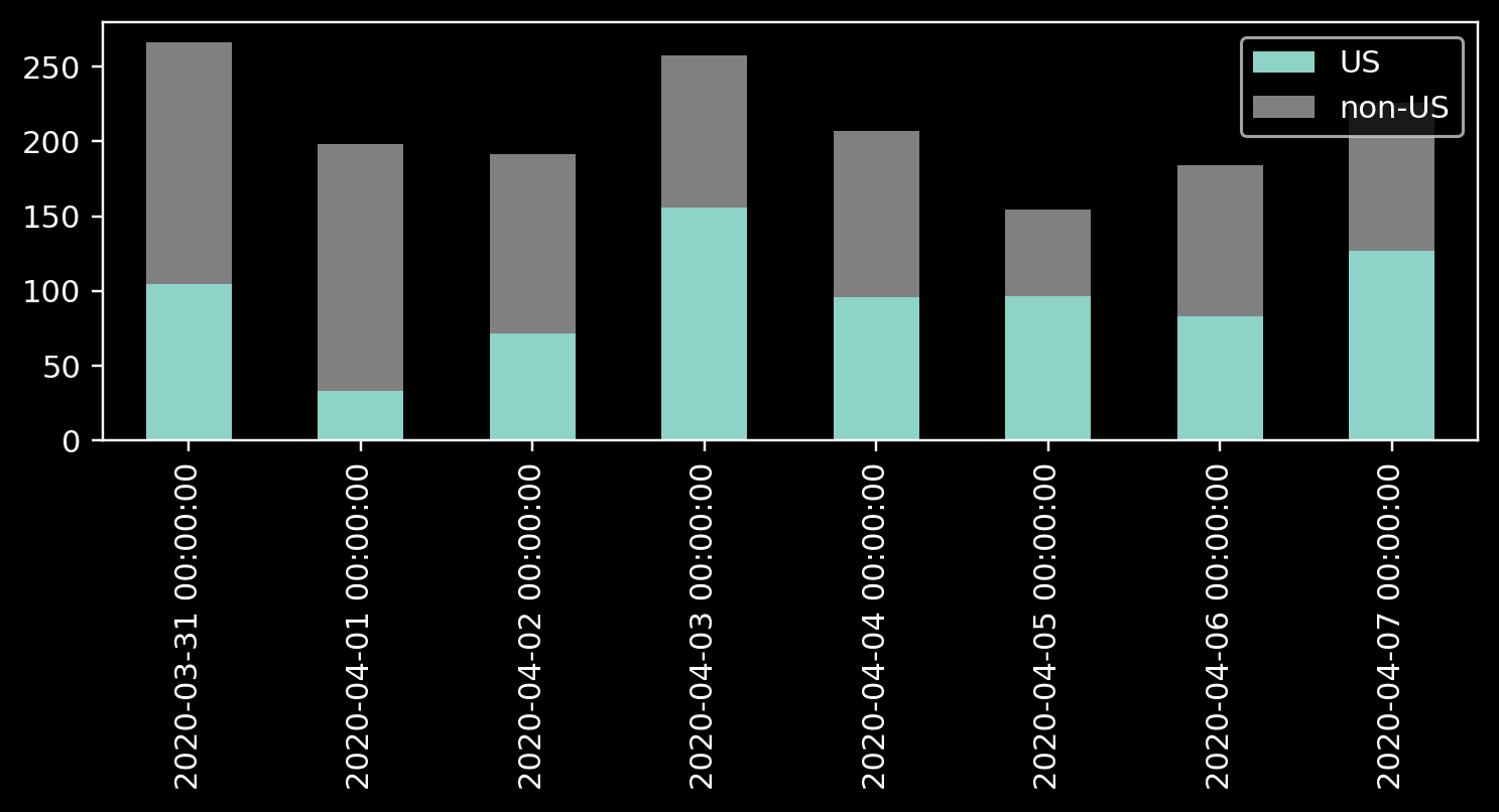
Note how two groups in a stacked graph pose no problem in deciphering the sizes. If we take care of readability and improve the data-ink ratio, we get a nice data visualization piece.
Option 2. When reducing the number of categories is not an option
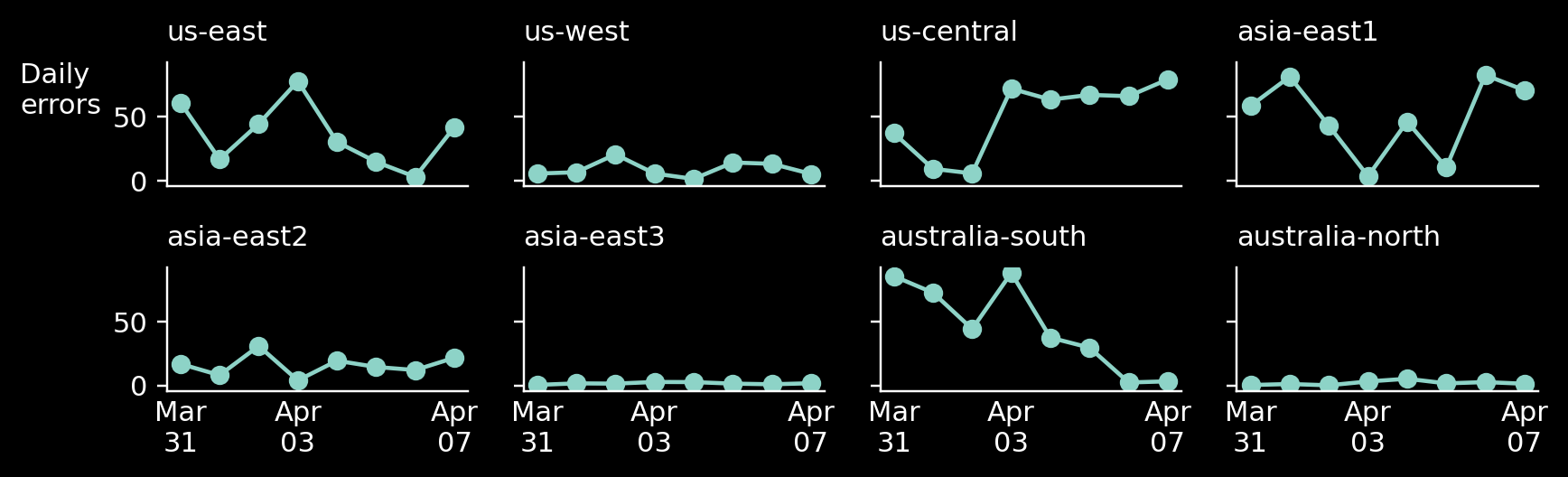
But what if reducing the number of categories is not an option? If you are absolutely sure that the audience absolutely needs to see all the information, you can split the different groups into separate subgraphs.
Have you noticed that the X-axis in our case represents time? In this case, we can replace the bars with an evolution plot and create a separate chart for each category in the data set. I took special care to keep the Y-axis scale equal between all the graphs so that the viewer can easily distinguish between data centers with a lot of errors and data centers with only a few of them. Here’s the result:
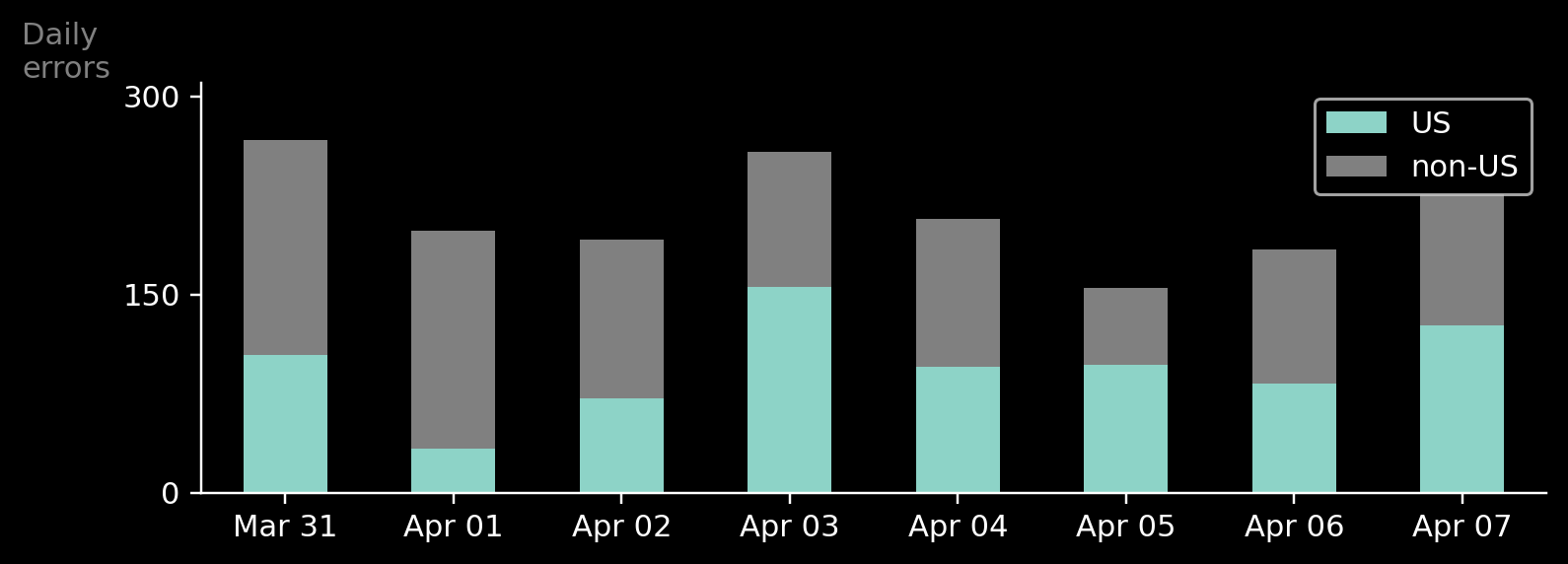
But what if the overall error rate is of greater importance than the individual groups. In that case, we can plot them in a larger graph and add the separate groups below, in smaller, un-emphasized subplots.

Summary – the Why and the What define the How
When you have a technical question about improving a graph, make sure you ask yourself “why.” Why is, does technical problems matter? Why will it improve the chart? To answer this question, you will have to ask another question: “what?”. “What is it that I want to say.” The easiest way to force yourself to ask these questions is to force yourself to add titles to every graph you create (see my how to suck less in data visualization post for more details).
Once you have your conclusion ready, you will notice that you don’t need a technical solution but rather a conceptual one. In this case, we solved the technical problem of looking for eight distinct colors by reducing the number of categories to two or splitting one elaborate graph into several straightforward ones.
So, remember, the Why and the What define the How
Python code that was used to generate all this graphs is available on [gist](https://gist.github.com/bgbg/6c645a5fc48e61b1a917c9d1d66fa72f)


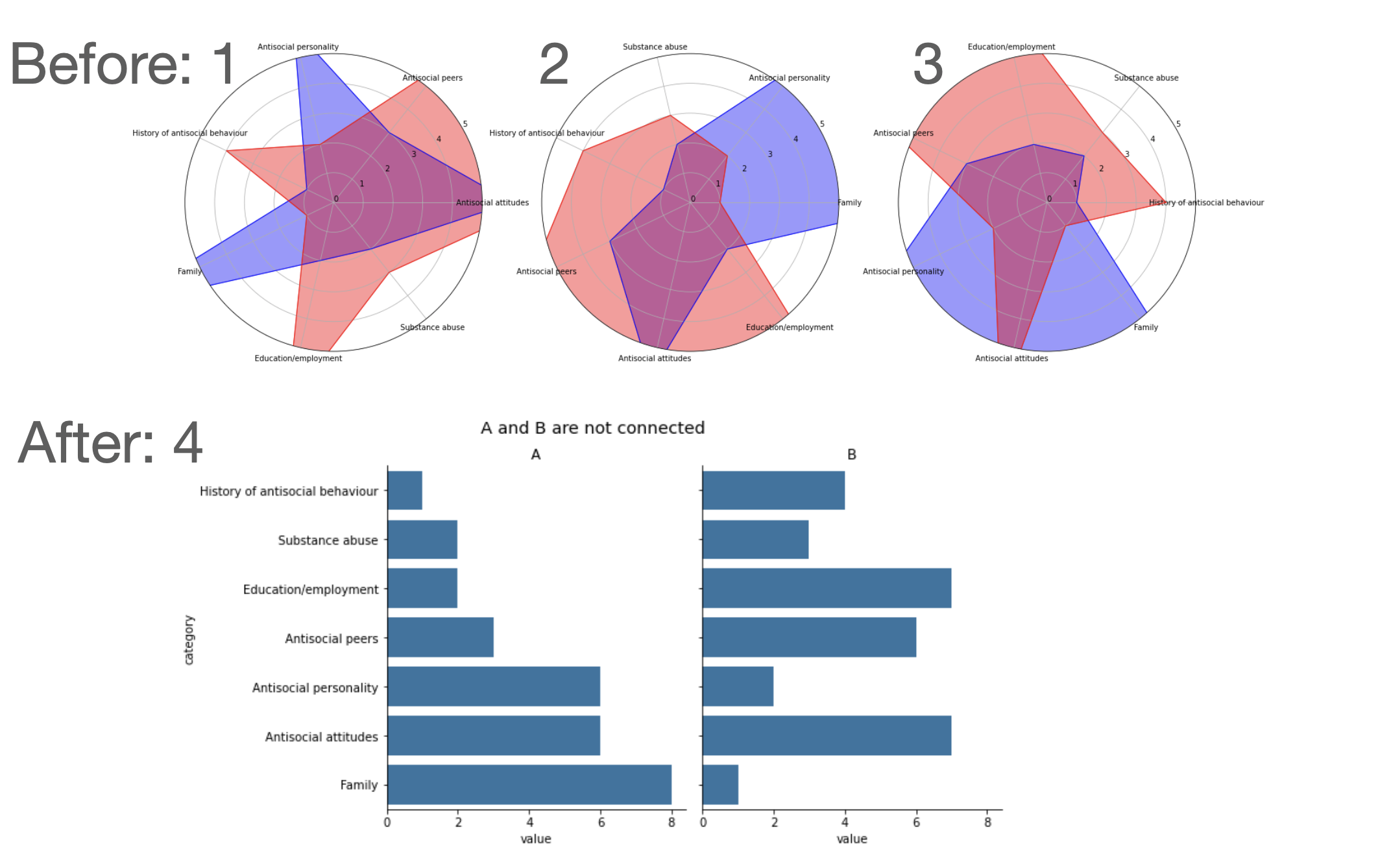
 From
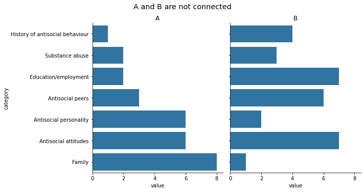
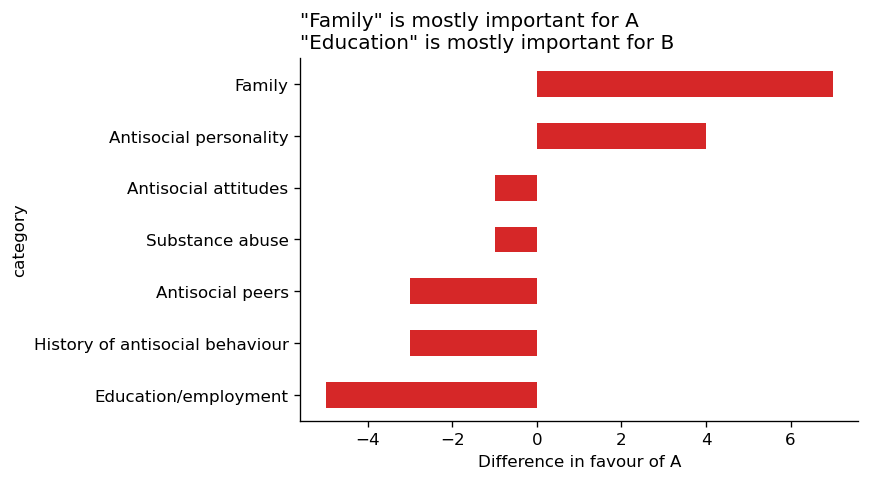
From