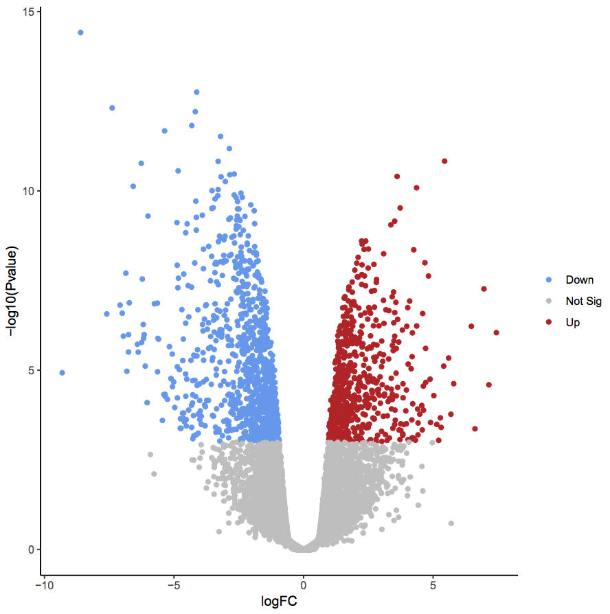
Graphical comparison of changes in large populations with “volcano plots”

I recently rediscovered a volcano plot — a scatter plot that aims to visualize changes in large populations.

Volcano plots are very technical and specialized and, most probably, are not a good fit for explanatory data visualization. However, they can be useful during the exploration phase, and they come with a set of well-established metrics.

Moreover, if you are lucky enough to have well-behaved data, the plots look very cool

Visualization of RNA-Seq results with Volcano Plot
From here

Of course, in real life, the data is messy. Add bad visualization practices to the mess and you get a marvel like this one

From here

The bottom line: if you have two populations to compare, consider volcano plots. But do remember dataviz good practices.

The information is beautiful. The graphs are shit!

I apologize for my harsh language, but recently I was exposed to a bunch of graphs on the “information is beautiful” site, and I was offended (well, ot really, but let’s pretend I was). I mean, I’m a liberal person, and I don’t care what graphs people do in their own time. Many people visit that site because they try to learn good visualization practices, but some charts on that site are wrong. Very wrong.

Here’s the gem:

I deliberately don’t share the link to this site. I don’t want let Google think it’s valuable in any way.

Now, the geniuses from “Information is beautiful” (let’s call them IB for brevety) wanted to share with us some positive stats. How nice of them. So what they did? They gathered together nine pairs of metrics collected at two different time points: one in the past and one furthermore in history. They used nice colors to create some sleeky shapes. So, what’s the problem? What’s wrong with that?

Everything is wrong!

Let’s start from my guess that they cherry-picked the stats with “positive” changes. Secondly, the comparison of this sort is mostly meaningless if we compare points at different years. What stopped the authors of that tasteless “infographic” from collecting data from the same years? I guess, their laziness. That’s how we ended up comparing the number of death penalties in 1990 and 2016, but the malaria deaths numbers are for 2000 and 2016, and dying mothers are compared for years 2000 and 2017?

Now, let’s talk about data viz.

Take a look at this graph.

The only time we use shapes like that is when we want to convey information about uncertainty. To do that, the X-axis represents the thing we are measuring, and the Y-axis represents our certainty about the current value. When we compare to uncertain measurements, we may judge the difference between these measurements by the distance between the curve peaks, and the width of the curve represents the uncertainty.

Here’s a good example from [this link]:

Can you see how the metric of interest is on the X-axis? The width of each bell curve represents the uncertainty and the difference between any pair of cases is the difference on the horizontal (X) axis, not the vertical one.

Instead, what do the IB authors did? They obviously like sleek looking shapes but know nothing about how to use them. They could have used two bars and let the viewer compare their heights. But nooooo! Bars are not c3wl! Bars are boring! Instead, they took probability density curves (that’s how they are technically called) and made them pretend to be bars.

Bars. Is this THAT hard?

I can hear some of you saying, “Stop being so purist! What’s wrong with comparing the heights of bell curves?” I’ll tell you what’s wrong! Data visualization is a language. As with any language, it has some rules and traditions. If you hear me saying, “me go home,” you will understand me without any problem. However, you will silently judge me for my poor use of the English language. I know that, and since English is my third language, I use all the help to make as few mistakes as possible. The same is correct with data visualization. Please respect its rules and traditions, even if (and especially if) are not fluent in it.

I never write more than two sentences in English without Grammarly

Visit the worst practice tag in this blog to see more bad examples

Lie factor in ad graphs

It’s fun to look at the visit statistics and to discover old stories. I wrote this post in 2016. For a reason I don’t know, this post has been one of the most viewed posts in my blogs during the last week. 

So, I decided to publish it again. I won’t add any new examples, but if you want to see more stuff, type [lying with data visualization] in your favorite search engine

Lie factor in ad graphs

What do you do when you have spare time? I tend to throw graphs from ads to a graph digitizer to compute the “lie factor”. Take the following graph for example. It appeared in an online ad campaign a couple of years ago. In this campaign, one of the four Israeli health care providers bragged about the short waiting times in their phone customer support. According to the Meuheded (the health care provider who run the campaign), their customers had to wait for one minute and one second, compared to 1:03, 1:35, and 2:39 in the cases of the competitors. Look how dramatic the difference is:

Screen Shot 2018-02-16 at 18.34.38

The problem?

If the orange bar represents 61 seconds, then the dark blue one stands for 123 seconds, almost twice as much, compared to the actual numbers, the green bar is 4:20 minutes, and the light-blue one is approximately seven minutes, and not 2:39, as the number says.

Screen Shot 2018-02-16 at 18.32.53

I can’t figure out what guided the Meuhedet creative team in selecting the bar heights. What I do know that they lied. And this lie can be quantified.


Nice but useless data visualization

Network visualization can mesmerize and hypnotize. Chord diagrams are especially cool because they are so colorful and smooth. The problem is that sometimes, the result doesn’t provide any actual value, and serves as a cute illustration. Cute illustrations are cute; they help put some “easiness” to the text without the risk of looking too unprofessional. 

Take the two examples below.

One example (taken from here) shows worldwide migration patterns in a clear and useful way. You can take a look at the graph and make real conclusions.

The other example (taken from here) is mostly a useless illustration.

The only “conclusion” that a viewer can make out of this graph is “everything is connected with everything.”

This type of conclusion is OK for an ad or a general overview of a problem, but it is NOT a valid way to end a discussion. 

The case of meaningless comparison

Exposé, an Australian-based data analytics company, published a use case in which they analyze the benefits of a custom-made machine learning solution. The only piece of data in their report [PDF] was a graph which shows the observed and the predicted

Screenshot that shows two time series curves: one for the observed and one for the predicted values

Graphs like this one provide an easy-to-digest overview of the data but are meaningless with respect to our ability to judge model accuracy. When predicting values of time series, it is customary to use all the available data to predict the next step. In cases like that, “predicting” the next value to be equal to the last available one will result in an impressive correlation. Below, for example, is my “prediction” of Apple stock price. In my model, I “predict” tomorrow’s prices to be equal to today’s closing price plus random noise.

Two curves representing two time series - Apple stock price and the same data shifted by one day

Look how impressive my prediction is!

I’m not saying that Exposé constructed a nonsense model. I have no idea what their model is. I do say, however, that their communication is meaningless. In many time series, such as consumption dynamics, stock price, etc, each value is a function of the previous ones. Thus, the “null hypothesis” of each modeling attempt should be that of a random walk, which means that we should not compare the actual values but rather the changes. And if we do that, we will see the real nature of the model. Below is such a graph for my pseudo-model (zoomed to the last 20 points)

diff_series


Suddenly, my bluff is evident.

To sum up, a direct comparison of observed and predicted time series can only be used as a starting point for a more detailed analysis. Without such an analysis, this comparison is nothing but a meaningless illustration.

Lie factor in ad graphs

What do you do when you have spare time? I tend to throw graphs from ads to a graph digitizer to compute the “lie factor”. Take the following graph for example. It appeared in an online ad campaign a couple of years ago. In this campaign, one of the four Israeli health care providers bragged about the short waiting times in their phone customer support. According to the Meuheded (the health care provider who run the campaign), their customers had to wait for one minute and one second, compared to 1:03, 1:35, and 2:39 in the cases of the competitors. Look how dramatic the difference is:

Screen Shot 2018-02-16 at 18.34.38

The problem?

If the orange bar represents 61 seconds, then the dark blue one stands for 123 seconds, almost twice as much, compared to the actual numbers, the green bar is 4:20 minutes, and the light-blue one is approximately seven minutes, and not 2:39, as the number says.

Screen Shot 2018-02-16 at 18.32.53

I can’t figure out what guided the Meuhedet creative team in selecting the bar heights. What I do know that they lied. And this lie can be quantified.


Don’t take career advises from people who mistreat graphs this badly

Recently, I stumbled upon a report called “Understanding Today’s Chief Data Scientist” published by an HR company called Heidrick & Struggles. This document tries to draw a profile of the modern chief data scientist in today’s Big Data Era. This document contains the ugliest pieces of data visualization I have seen in my life. I can’t think of a more insulting graphical treatment of data. Publishing graph like these ones in a document that tries to discuss careers in data science is like writing a profile of a Pope candidate while accompanying it with pornographic pictures.

Before explaining my harsh attitude, let’s first ask an important question.

What is the purpose of graphs in a report?

There are only two valid reasons to include graphs in a report. The first reason is to provide a meaningful glimpse into the document. Before a person decided whether he or she wants to read a long document, they want to know what is it about, what were the methods used, and what the results are. The best way to engage the potential reader to provide them with a set of relevant graphs (a good abstract or introduction paragraph help too). The second reason to include graphs in a document is to provide details that cannot be effectively communicating by text-only means.

That’s it! Only two reasons. Sometimes, we might add an illustration or two, to decorate a long piece of text. Adding illustrations might be a valid decision provided that they do not compete with the data and it is obvious to any reader that an illustration is an illustration.

Let the horror begin!

The first graph in the H&S report stroke me with its absurdness.

Example of a bad chart. I have no idea what it means

At first glance, it looks like an overly-artistic doughnut chart. Then, you want to understand what you are looking at. “OK”, you say to yourself, “there were 100 employees who belonged to five categories. But what are those categories? Can someone tell me? Please? Maybe the report references this figure with more explanations? Nope.  Nothing. This is just a doughnut chart without a caption or a title. Without a meaning.

I continued reading.

Two more bad charts. The graphs are meaningless!

OK, so the H&S geniuses decided to hide the origin or their bar charts. Had they been students in a dataviz course I teach, I would have given them a zero. Ooookeeyy, it’s not a college assignment, as long as we can reconstruct the meaning from the numbers and the labels, we are good, right? I tried to do just that and failed. I tried to use the numbers in the text to help me filling the missing information and failed. All in all, these two graphs are a meaningless graphical junk, exactly like the first one.

The fourth graph gave me some hope.

Not an ideal pie chart but at least we can understand it

Sure, this graph will not get the “best dataviz” award, but at least I understand what I’m looking at. My hope was too early. The next graph was as nonsense as the first three ones.

Screenshot with an example of another nonsense graph

Finally, the report authors decided that it wasn’t enough to draw smartly looking color segments enclosed in a circle. They decided to add some cool looking lines. The authors remained faithful to their decision to not let any meaning into their graphical aidsScreenshot with an example of a nonsense chart.

Can’t we treat these graphs as illustrations?

Before co-founding the life-changing StackOverflow, Joel Spolsky was, among other things, an avid blogger. His blog, JoelOnSoftware, was the first blog I started following. Joel writes mostly about the programming business and. In order not to intimidate the readers with endless text blocks, Joel tends to break the text with illustrations. In many posts, Joel uses pictures of a cute Husky as an illustration. Since JoelOnSoftware isn’t a cynology blog, nobody gets confused by the sudden appearance of a Husky. Which is exactly what an illustration is – a graphical relief that doesn’t disturb. But what would happen if Joel decided to include a meaningless class diagram? Sure a class diagram may impress the readers. The readers will also want to understand it and its connection to the text. Once they fail, they will feel angry, and rightfully so

Two screenshots of Joel's blog. One with a Husky, another one with a meaningless diagram

The bottom line

The bottom line is that people have to respect the rules of the domain they are writing about. If they don’t, their opinion cannot be trusted. That is why you should not take any pieces of advice related to data (or science) from H&S. Don’t get me wrong. It’s OK not to know the “grammar” of all the possible business domains. I, for example, know nothing about photography or dancing; my English is far from being perfect. That is why, I don’t write about photography, dancing or creative writing. I write about data science and visualization. It doesn’t mean I know everything about these fields. However, I did study a lot before I decided I could write something without ridiculing myself. So should everyone.