Category: blog
-
Sixty-five years of "no more programmers"
I use Claude Code every day, and I love it. Ever since the ChatGPT wave of 2022, we have been hearing that the work of programming is about to be automated away. I teach in a computer science department, so I watch it land from the front of the room: fewer students each year want to learn to program, and I hear the same prediction from colleagues who have written code their whole lives.
-
My Claude super tool is a folder of markdown files

-
I only care what a few people think. The few are now machines.
“I only care about what a few people think of my work and they are already aware of what I produce. Think of me as a ‘professional loser.’”
-
Where is my $400,000?
Where is my $400,000?
-
I finished the billing months ago. I never switched it on.
I finished the billing months ago. I never switched it on.
-
She could've been Erdős-1, but she was shy
She could’ve been Erdős-1, but she was shy
-
It's not the Matthew effect. It's the Daniel effect.
It’s not the Matthew effect. It’s the Daniel effect.
-
The 'not ready to share' antipattern
The ‘not ready to share’ antipattern
-
Why your acquaintances, not your closest friends, bring you the next opportunity
Why your acquaintances, not your closest friends, bring you the next opportunity
-
Is it ethical to use AI to promote your research?
Is it ethical to use AI to promote your research?
-
Why the wording of your abstract affects how often you get cited
Why the wording of your abstract affects how often you get cited
-
When Your Code Is Avoiding the Question Your Startup Needs Answered
When Your Code Is Avoiding the Question Your Startup Needs Answered
-
When your LLM pipeline silently returns zero
When your LLM pipeline silently returns zero
-
Not a Bug but a Feature
Not a Bug but a Feature
-
Customers see your tunnel vision before you do
Customers see your tunnel vision before you do
-
LLMs sharpen the Matthew effect in citations
LLMs sharpen the Matthew effect in citations
-
An Illustrated Guide to Academic Publishing
An Illustrated Guide to Academic Publishing
-
Where you debut probably decides where you stay
Where you debut probably decides where you stay
-
I built the wrong dashboard for two weeks
I built the wrong dashboard for two weeks
-
Rules don't change how people write. Contrasts do.
Rules don’t change how people write. Contrasts do.
-
The worst way to visualize geographic data
The worst way to visualize geographic data
-
The hardest part of being a solo founder wasn't what I thought
The hardest part of being a solo founder wasn’t what I thought
-
AI Articles Overtook Human Articles. That Is Not Automatically Bad
AI Articles Overtook Human Articles. That Is Not Automatically Bad
-
Simplification and ultra-personalization: two responses to a harsh critique
Simplification and ultra-personalization: two responses to a harsh critique
-
When rigid blocs break, they break together
When rigid blocs break, they break together
-
Promoted papers keep pulling ahead: what the Kudlow RCT looks like at 36 months
Promoted papers keep pulling ahead: what the Kudlow RCT looks like at 36 months
-
Hardened as Fuck
When in some places work meetings start with people introducing their preferable pronouns, in Israel we start with a briefing about the closest bomb shelter. When in other places people skip important meetings to take care of their pet goats (true story), in Israel people join meetings on Zoom from Army Reserve Service during breaks from patrols or other duties.
-
AI adoption vastly lags its capability: a better graph
After my previous post about Anthropic’s spider chart, several people asked me how I would actually go about fixing it. So here is how – with a single prompt.
-
Lecture and workshop proposals
I have put together a collection of lecture, workshop, and course proposals on AI and AI-assisted programming. Each one is tailored to a specific audience and comes in three delivery formats: a one-hour lecture, a three-hour hands-on workshop, and a multi-session course.
-
Anthropic: great research, not-so-great graph
Anthropic has published an interesting study about labor market impacts of AI: Labor market impacts of AI: A new measure and early evidence.
-
The tech changed, the questions barely did.
The tech changed, the questions barely did.
-
Everything Is in Front of Us – We Only Need Imagination

-
One short prompt message that made my vibe coding life easier
One short prompt message that made my vibe coding life easier
-
How Sausages Are Made (and How a Vibe Research Was Born)
How Sausages Are Made (and How a Vibe Research Was Born)
-
Celebration time
Celebration time
-
A Bird in the Hand… and Two? Even Better!
A Bird in the Hand… and Two? Even Better!
-
Not a meeting – a ceremony 🥴
Not a meeting – a ceremony 🥴
-
I don’t believe I need to say this in 2025 🙄
I don’t believe I need to say this in 2025 🙄
-
Hardened as Fuck

-
Is my hypothesis crazy?
Is my hypothesis crazy?
-
My new thesis
My new thesis
-
AWS – WTF?
AWS – WTF?
-
Untitled
Untitled
-
Untitled
Untitled
-
I just became a CEO
I just became a CEO
-
Untitled
Untitled
-
Go fuck yourself
Go fuck yourself
-
Don't want to deal with a problem? Put it under a spotlight
Two weeks ago, I published a research paper Ethnic Divisions Within Unity: Insights into Intra-Group Segregation from Israel’s Ultra-Orthodox Society. It is my first paper in so many aspects
-
Dual axis with shared x-axis — a much better way
I recently came across a financial update with a plot that looks like the one below: a bar plot of revenue with a line plot of growth rate. The growth rate is on a secondary y-axis, and the x-axis is shared between the two plots. This type of plots are very common in financial reports, and they are often used to show the relationship between two variables that have different scales. However, they are also often criticized for being misleading, as the two variables are not directly comparable. In this post, I will show a better way to visualize this type of data. But first, what’s wrong with the plot below?
-
The value of a dedicated data science approach in HR
This document outlines why HR departments in large organizations benefit from a dedicated data science approach, highlighting impacts beyond recruitment. In short, my thesis is as follows: as organizations scale, so does the complexity of understanding their internal dynamics. Data tools become essential to analyzing large organizations, as they enable HR to identify patterns and insights that can drive strategic improvements across key areas.
-
Common mistakes in A/B testing in production
I performed my first A/B tests ten years ago. Here are the most common mistakes I made
-
Visualizing Likert scale studies (yes/no/don't know)
A Likert scale study is a type of survey that measures respondents’ attitudes or opinions across a range of agreement levels.
-
Resilience and innovation: Israel’s path forwardR
This post shares my recent experiences witnessing the resilience and innovation of Israelis. From mobilizing workers and students to volunteer efforts and professional development, we continually advance under challenging conditions.
-
The Power of Knowledge Sharing and Public Speaking
For the past three and a half years, I’ve hosted the Hebrew podcast This Week in the Middle East Podcast . Despite not being a Middle Eastern studies expert and knowing little Arabic, my passion and curiosity have led me on a remarkable journey of sharing knowledge and public speaking.
-
Don't be afraid to explain. Really, don't
In data visualization, much like in any form of communication, it’s vital to keep the main point front and center. That’s precisely why I’m a proponent of a clean, minimalistic approach to crafting data visuals, coupled with the inclusion of descriptive titles for each graph. These titles aren’t just fluff; they serve as a psychological lever, aiding in persuading your audience of your argument. Moreover, the act of titling forces a second look at the graph to ensure it accurately represents your intended message.
-
When a Model Fales, Make a Modelade
Or, How to Extract Value from Failed Projects
-
Single-handedly Development: A Recipe for Troubles
-
Feedback Fertilizer, Shit Sandwiches, and Other Musings on Growing Careers Like PlantsF
-
Sometimes, good enough is good enough
-
Director Matters. My new newsletter
So, I started a substack newsletter called “Direction Matters” (I hope you like the word play).
-
Prompt engineers, the sexiest job of the third decade of the 21st century (?), or Don't study prompt engineering as a career move, you'll waste your time
Do you recall when data scientists were the talk of the town? Dubbed the sexiest job of the 21st century, they boasted a unique blend of knowledge and skills. I still remember the excitement I felt when I realized that the work I did had a name, and the warm feeling I got when I saw those cool Venn diagrams showing just how awesome data scientists were. Well, it’s time for data scientists to step aside and make way for the new heroes in town: the Prompt Engineers!
-
Not a feature but a bug. Why having only superstars in your team can be a disaster.
Read this to learn about well-rounded teams that can effectively collaborate and communicate. As an experienced team leader and builder, contact me to learn more about my services and how I can help you achieve better outcomes.
-
Modern tools make your skills obsolete. So what?
Read this if you are a data scientist (or another professional) worried about your career.
-
Chances are that you don't need a data scientist, and three things to consider before hiring one.
Read this if you are considering hiring data scientists
-
Data Science Reality Check: My Predictions Come True (or, A Piece of Advice to Young Data Scientists)
Read this if you’re a data scientist or consider becoming one.
-
How creative can you be? Very much so!
I think that I’m in love with Midjourney. Look how easy it is to be creative when you have AI at your disposal!
-
14-days-work-month — The joys of the Hebrew calendar
Tishrei is the seventh month of the Hebrew calendar that starts with Rosh-HaShana — the Hebrew New Year. It is a 30 days month that usually occurs in September-October. One interesting feature of Tishrei is the fact that it is full of holidays: Rosh-HaShana (New Year), Yom Kippur (Day of Atonement), first and last days of Sukkot (Feast of Tabernacles) **. All these days are rest days in Israel. Every holiday eve is also a *de facto rest day in many industries (high tech included). So now we have 8 resting days that add to the usual Friday/Saturday pairs, resulting in very sparse work weeks. But that’s not all: the period between the first and the last Sukkot days are mostly considered as half working days. Also, the children are at home since all the schools and kindergartens are on vacation so we will treat those days as half working days in the following analysis.
-
Book review: Extreme ownership
TL;DR Own your wins, own your failures, stay calm and make decisions. Read it. 5/5
-
New position, new challenge
I will skip the usual “I’m thrilled and excited…”. I’ll just say it.
As of today, I am the CTO of wizer.me, a platform for teachers and educators to create and share interactive worksheets. -
Back to in-person presentations
Today, I gave my first in-person presentation since the pandemic. It was awesome! I was talking about the study I performed with Nabeel Sulieman about data visualization in environments that use right-to-left writing systems.
-
An example of a very bad graph
An example of a very bad graph
-
Weekend in Haifa
Haifa on Friday. Street art, atmosphere, food.
-
On proper selection of colors in graphs
How do you properly select a colormap for a graph? What makes the rainbow color map a wrong choice, and what are the proper alternatives?
-
Book review: The Hard Things About Hard Things by Ben Horowitz
TL;DR War stories and pieces of advice from the high tech industry veteran.
-
14-days-work-month — The joys of the Hebrew calendar
Tishrei is the seventh month of the Hebrew calendar that starts with Rosh-HaShana — the Hebrew New Year. It is a 30 days month that usually occurs in September-October. One interesting feature of Tishrei is the fact that it is full of holidays: Rosh-HaShana (New Year), Yom Kippur (Day of Atonement), first and last days of Sukkot (Feast of Tabernacles) **. All these days are rest days in Israel. Every holiday eve is also a *de facto rest day in many industries (high tech included). So now we have 8 resting days that add to the usual Friday/Saturday pairs, resulting in very sparse work weeks. But that’s not all: the period between the first and the last Sukkot days are mostly considered as half working days. Also, the children are at home since all the schools and kindergartens are on vacation so we will treat those days as half working days in the following analysis.
-
:-(
Usually, I keep my blog for professional news only, but this time, I’ll make an exception.
-
Opening a new notebook in my productivity system

-
Another example of the power of data visualization
I stumbled upon a great graph that tells a complex story compellingly.
-
Do you want to know how the majority of Israelis see the shitty situation we are in?
To all my friends outside Israel. Do you want to know how the majority of Israelis see the shitty situation we are in? This short video does a good job summarizing it.
-
Managing remotely. A podcast interview with Martin Remy
My podcast is mostly in Hebrew, but this interview was recorded in English. I hope you will enjoy it
-
Another evolution of my offline productivity system
This week, I mark an important milestone in my professional life. It is an excellent opportunity to start a new productivity notebook and tell you about the latest evolution of the best productivity system I know.
-
Experiment report

-
A new phase in my professional life
I’m excited to announce that I’m joining MyBiotics Pharma Ltd as the company’s Head of Data and Bioinformatics. I have been working with this fantastic company and its remarkable people as a freelancer for fourteen fruitful months. But today, I join the MyBiotics family as a full-time member. Together, we will strive to better understanding the interactions between humans and their microbiome to improve health and well-being.
-
Black lives matter. Lior Pachter
Almost one year after it was originally published, I stumbled upon this powerful post.
-
Super useful videos for advanced data visualizers
The great Robert Kosara, also known as the “eager eyes” has started publishing a series of videos he calls Chart Appreciation. In these videos, Robert takes a piece of data visualization from a reputable and known source, and discusses why this particular piece is so good, what decisions were made that made it possible, what alternatives are, and more. If you consider yourself an intermediate or advanced practitioner of data visualization, you should subscribe. Here’s one example.
-
Career advise. Upgrading data science career
From time to time, people send me emails asking for career advice. Here’s one recent exchange.
-
Interview 27: Racial discrimination and fair machine learning

-
Five things I wish people knew about real-life machine learning
Deena Gergis is a data science lead at Bayer. I recently discovered Deena’s article on LinkedIn titled “Five Things I Wish I Knew About Real-Life AI.” I think that this article is a great piece of a career advice for all the current and aspiring data scientists, as well as for all the professionals who work with them. Let’ me take Deena’s headings and add my 2 cents.
-
One of the first dataviz blogs that I used to follow is now a book. Better Posters
I started following data visualization news and opinions quite a few years ago. One of the first bloggers who were active in this area NeurDojo, by the (now) professor Zen Faulkes. On of Zen’s spin-off blogs was devoted to better posters. This poster blog is called, surprisingly enough, Better Posters. Since I’m not in academia anymore, stopped caring about posters many years ago. Today, I stumbled upon this blog and was pleasantly surprised to discover that Better Posters is still active and that it is also now a book.
-
On startup porn
Danny Lieberman managed teams of programmers before I couldn’t read, so when Danny writes a post as bold and blunt as this, you should read it.
-
Working with the local filesystem and with S3 in the same code
As data people, we need to work with files: we use files to save and load data, models, configurations, images, and other things. When possible, I prefer working with local files because it’s fast and straightforward. However, sometimes, the production code needs to work with data stored on S3. What do we do? Until recently, you would have to rewrite multiple parts of the code. But not anymore. I created a
sshaloshpackage that solves so many problems and spares a lot of code rewriting. Here’s how you work with it: -
Book review. The Persuasion Slide by Richard Dooley
TL;DR Very shallow and uninformative. It could be an OK series of blog posts for complete novices, but not a book.
-
Graphical comparison of changes in large populations with "volcano plots"
I recently rediscovered a volcano plot – a scatter plot that aims to visualize changes in large populations.
-
Book review: Manager in shorts by Gal Zellermayer
TL;DR Nice’n’easy reading for novice managers
-
You might not love working at a distributed company if...
A couple of weeks go, I wrote a post about an unexpected hitch of working in a distributed team. Yesterday, my ex-coworker, Ann McCarthy wrote a related, more elaborative post on the same issue. It’s worth reading.
-
One idea per slide. It’s not that complicated
I wrote this post in 2009, I published it in March 2020, and am republishing it again
-
Innumeracy
Innumeracy is the “inability to deal comfortably with the fundamental notions of number and chance”.
I wish there was a better term for “innumeracy”, a term that would reflect the importance of analyzing risks, uncertainty, and chance. Unfortunately, I can’t find such a term. Nevertheless, the problem is huge. In this long post, Tom Breur reviews many important aspects of “numeracy”. I already shared this post a long time ago, but it’s worth sharing again. -
Before and after — stacked bar charts
A fellow data analyst asked a question? What do we do when we need to draw a stacked bar chart that has too many colors? How do we select the colors so that they are nice but also are easily distinguishable? To answer this question, let’s look at the data similar to what appeared in the original question. I also tried to recreate the actual chart’s style
-
The Problem With Slope Charts (by Nick Desbarats)
Slope charts are often suggested as a valid alternative to clustered bar charts, especially for “before and after” cases.
-
Before and after: Alternatives to a radar chart (spider chart)
A radar chart (sometimes called “spider charts”) look cool but are, in fact,
pretty lame. So much so that when the data visualization author Stephen Few mentioned them in his book Show me the numbers, he did so in a chapter called “Silly graphs that are best forsaken.” -
Another language
بعد حوالي سنتين من الدراسة ، بحس حالي جاهز لإضافة اللغة العربية إلى قائمة اللغات في ال-LinkedIn
-
Basic data visualization video course (in Hebrew)
I had the honor to record an introductory data visualization course for high school students as a part of the Israeli national distance learning project. The course is in Hebrew, and since it targets high schoolers, it does not require any prior knowledge.
-
Text Visualization Browser
I’ve stumbled upon an exciting project – text visualization browser. It’s a web page that allows one to search for different text visualization techniques using keywords and publication time.
-
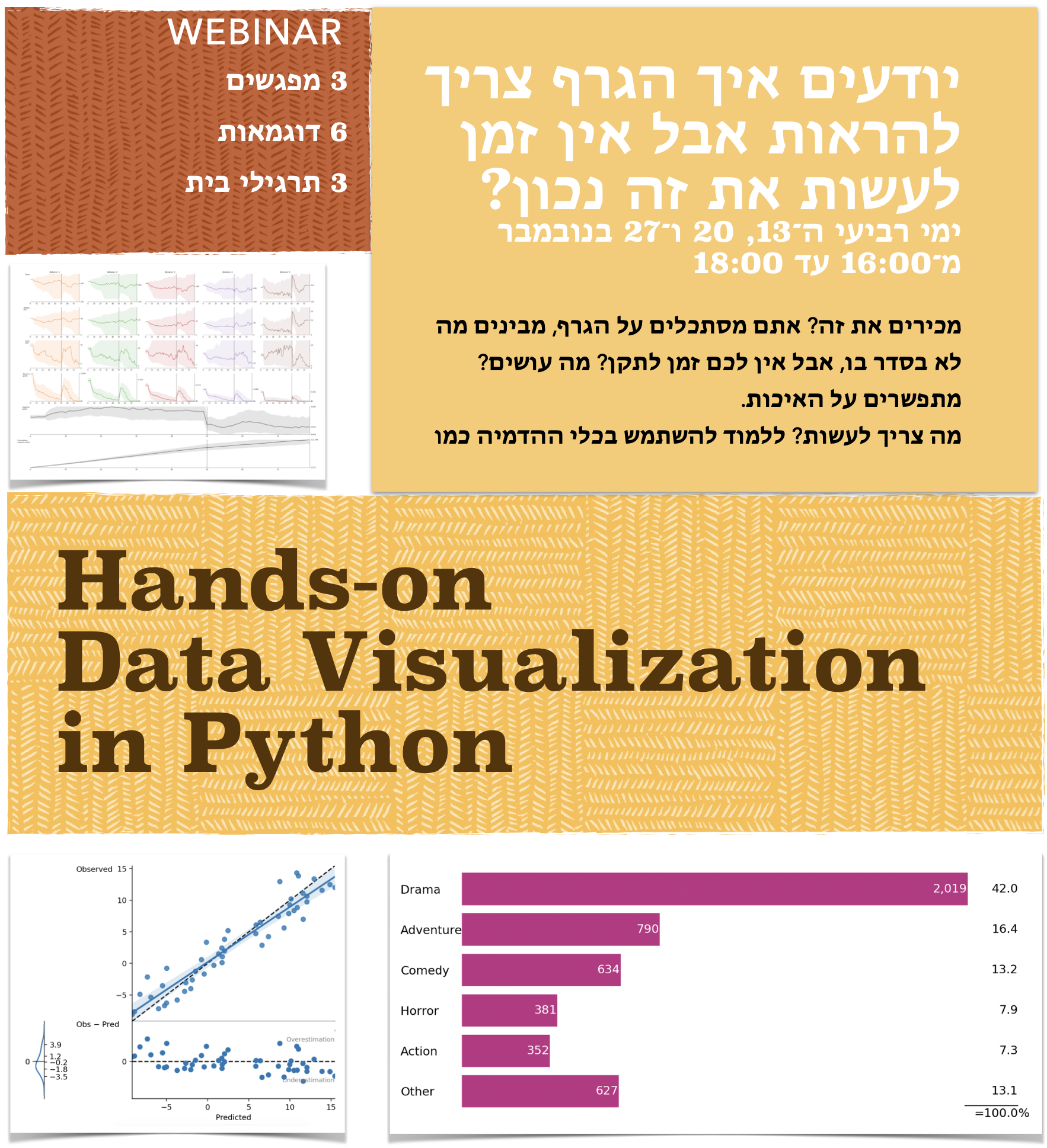
Hands-on Data Visualization in Python
-
Sharing the results of your Python code
If you work, but nobody knows about your results or cares about them, have you done any work at all?
-
New notebook, new plans

-
The information is beautiful. The graphs are shit!
I apologize for my harsh language, but recently I was exposed to a bunch of graphs on the “information is beautiful” site, and I was offended (well, ot really, but let’s pretend I was). I mean, I’m a liberal person, and I don’t care what graphs people do in their own time. Many people visit that site because they try to learn good visualization practices, but some charts on that site are wrong. Very wrong.
-
The Empirical Metamathematics of Euclid and Beyond — Stephen Wolfram Blog
I am seldomly jealous of people, but when I am, I’m jealous of Stephen Wolfram
-
Boris Gorelik on the biggest missed opportunity in data visualization — Data for Breakfast

-
15-days-work-month — The joys of the Hebrew calendar
Tishrei is the seventh month of the Hebrew calendar that starts with Rosh-HaShana — the Hebrew New Year. It is a 30 days month that usually occurs in September-October. One interesting feature of Tishrei is the fact that it is full of holidays: Rosh-HaShana (New Year), Yom Kippur (Day of Atonement), first and last days of Sukkot (Feast of Tabernacles) **. All these days are rest days in Israel. Every holiday eve is also a *de facto rest day in many industries (high tech included). So now we have 8 resting days that add to the usual Friday/Saturday pairs, resulting in very sparse work weeks. But that’s not all: the period between the first and the last Sukkot days are mostly considered as half working days. Also, the children are at home since all the schools and kindergartens are on vacation so we will treat those days as half working days in the following analysis.
-
Career advice. Becoming a freelancer immediately after finishing a masters degree
Will Cray [link] is a fresh M.Sc. in Computer Science and considers becoming a freelancer in the Machine Learning / Artificial Intelligence / Data Science field. Will asked for advice on the LocallyOptimistic.com community Slack channel. Here’s will question (all the names in this post are used with people’s permissions).
-
Exploring alternatives to population pyramids
A population pyramid also called an “age-gender-pyramid”, is a graphical illustration that shows the distribution of various age groups in a population (typically that of a country or region of the world), which forms the shape of a pyramid when the population is growing [citation from Wikipedia].
-
The Mysterious Status of .blog Domains
When the .blog TLD was started by Automattic, employees were given the option to reserve a domain for free. In return […], they asked that the domain be used as a primary domain (no forwarding to a different site), and that the site be updated with new content at least once a month. This requirement was the last argument for me NOT taking boris.blog – I didn’t want to make this commitment, plus I like gorelik.net a lot.
-
ASCII histograms are quick, easy to use and to implement
From time to time, we need to look at a distribution of a group of values. Histograms are, I think, the most popular way to visualize distributions. “Back in the old days,” when most of my work was done in the console, and when creating a plot from Python was required too many boilerplate code lines, I found a neat function that produced histograms using ASCII characters.
-
A short compilation of productivity blog posts
This post contains a bunch of links to blogs that write about productivity.
-
Many is not enough: Counting simulations to bootstrap the right way — Yanir Seroussi
An interesting post by my former coworker, Yanir Seroussi.
-
There are three things one can watch forever: fire burning, water falling, and computation progress bars
-
Book review: The Abyss: Bridging the Divide between Israel and the Arab World
TL;DR If you are an Israeli and don’t feel like learning the behind the scenes stories, skip it. Otherwise, I do recommend reading this book. I enjoyed it a lot 4.5/5
-
What is the biggest problem of the Jet and Rainbow color maps, and why is it not as evil as I thought?
There was a consensus among the data visualization purists that the rainbow color map, and it’s close cousin Jet are bad. Really bad. These colormaps used to be popular at the beginning of the computational data visualization era. However, their popularity decreased in the last five years or so. The sentiment isn’t as bad as it used to be a couple of years ago, but still.
-
If you don't teach yet, start! It will make you a better professional.
Many people know me as a data scientist. However, I also teach, which is sort of unnoticed to many of my friends and colleagues. I created a page dedicated to my teaching activity. Talk to me if you want to organize a course or a workshop.
-
How to suck less in data visualization and professional communication
In technical communication, the main thing is to keep the main thing the main thing. There are multiple ways to ensure this principle. Some of these ways require careful chart fine-tuning. However, there is one tool that is easy to master, fast to apply, and that provides a high return on the investment rate. I refer to chart titles. In this talk, I had two main theses. My first thesis is that most of you suck in communication (and not only data visualization).
-
Meet me at the online data science / AI conference
I will be talking about data visualization at the next NDR conference on July 28. All the conferences organized by the NDR team are well organized and of a very high value. I hope to keep the level high.
-
35 (and more) Ways Data Go Bad — Stats With Cats Blog
If you plan working data analysis or processing, read the excellent post in the “stats with cats blog” titled “35 Ways Data Go Bad” post. I did experience each and every one of the 35 problems. However, this list is far from being complete. One should add the comprehensive list of Falsehoods Programmers Believe About Time.
-
Unexpected hitch of working in a distributed team
It has been about half a year after I became a freelance data scientist. Before my career change, I worked in a distributed team for more than five years. Today, I suddenly realized that working in a distributed team has a significant problem, inherent to its distributed, multinational, nature.
-
Hybrid digital/analog tangible week planning
Here’s a neat method that helps me organize my week, increase my productivity and fight procrastination.
-
Before and after. Even excellent graphs can be improved
Being a data visualization consultant, I can’t help looking for dataviz problems in graphs that I see. Even if the graph is good. Even if I know that I would not be able to create a graph that good. Even if the overall graph is excellent, and the problems are minor, or maybe especially when the graph is excellent, and the problems are minor.
-
Data visualization is not only dots, bars, and pies
Look at this wonderful piece of data visualization (taken from here). If you know the terms “tertiary structure” and “glycan”, there is NO way you miss the message that the author of this figure wanted to convey.
-
Multilingual protest in Acre, Israel

-
How to become a Python professional in 42 hours?
Here’s an appealing ad that I saw
-
Standardizing bidirectional language support in interfaces and visualization
I’m honored to take part in standardizing bidirectional language support in interfaces and visualization, as a part of an expert group formed for the Hebrew Support in Computerized Systems Committee at the SII-the standards institution of Israel.
-
Book review. Five Stars by Carmine Gallo
TL;DR Good motivation to improve communication. Inadequate source of information on how to achieve that
-
The delicate art of fine trolling
I’m reading the a 1991 paper by Barbara Tversky that deals with the directional representation of time. One sentence in the paper interview says
-
Lie factor in ad graphs
It’s fun to look at the visit statistics and to discover old stories. I wrote this post in 2016. For a reason I don’t know, this post has been one of the most viewed posts in my blogs during the last week.
-
StellarGraph — another promising network analysis library for Python and Scala
Network (graph) analysis is a complicated topic. There are several tools available for this task with different pros and cons. Recently, I stumbled upon another tool StellarGraph. StellarGraph authors claim to provide excellent performance; NumPy, Pandas, TensorFlow integration, an impressive set of algorithms, inter compatibility with Neo4j (THE graph database); and much more. The documentation looks very clear and extensive too.
-
The hazard of being a wizard. On balance between specialization and the risk to become obsolete.
A wizard is a person who continually improves his or her professional skill in a particular and defined field. I learned about this definition of wizardness from the book “Managing project, people and yourself” by Nikolay Toverosky (the book is in Russian).
-
Bioinformatics career advice and a story about a Soviet shoemaker
When I was in elementary school (back in the USSR of the mid 80’s), I had a friend whose father was a shoemaker. Due to the crazy stupid way the Soviet economy worked, a Soviet shoemaker was much richer than a physician or an engineer. But this is not the story. The story is that one day this friend’s father had a chat with me about selecting a profession. This man’s point was that for as long as people have feet and need shoes on their feet, a shoemaker would be required and well-earning occupation. Guess what? People still have feet, and still, ware shoes, but I don’t see too many successful shoemakers anymore.
-
The difference between statistically meaningful and practically meaningful. An interview with me
Recently, I gave an interview to the Techie Leadership site. Andrei Crudu, the interviewer, made a helpful outline of the conversation. I marked the most important parts in bold.
-
Is Distributed Work a Divide and Conquer Strategy?
Before becoming a freelance data scientist, I used to work at Automattic, which I used to regard as my dream job. Not every current and ex-Automattician share that rosy point of view. Antimattic is an anonymous blog that allows ex-Automattic employees to vent their feelings about what used to be their workplace. One recent post on that blog raises a fascinating question about distributed (or work from home, or remote) companies. “Is Distributed Work a Divide and Conquer Strategy?” I have to admit that I haven’t thought about this perspective before. It looks like we will see more and more companies switching to remote work. It’s an interesting interpretation of the “future of work.”
-
Logarithmic scale misinforms. Period
-
Book review: The Year Without Pants. WordPress.com and the future of work by Scott Berkun
TL;DR Interesting “history of work” book (definitely not “future of work”) with insights on transition-state organizations. Read it if history of work is your thing, or if you work in a small company that grows rapidly. 4.5/5 (due to the personal connection)
-
"Why it burns when you P" and other statistics rants
Do you sometimes Google for something only to find stuff written by yourself?
I teach a course called “data-based decision making.” While googling for examples of statistics misuse, I stumbled upon an interesting blog post that I wrote about one and a half years ago. -
Visualising Odds Ratio — Henry Lau
Besides being a freelancer data scientist and visualization expert, I teach. One of the toughest concepts to teach and to visualize is odds ratio. Today, I stumbled upon a very interesting post that deals exactly with that
-
Calling bullshit on "persistence leads to success"
Did you know that J.K. Rowling, the author of Harry Potter, submitted her books 13 times before it was accepted? Did you know that Thomas Edison tried again and again, even though his teachers thought he was “too stupid to learn anything?” Did you know that Lior Raz (Fauda’s creator and lead actor) was an anonymous actor for more than ten years before he broke the barrier of anonymity? What do these all people have in common? They persisted, and they succeeded. BUT, and there is a big but.
-
COVID-19 vs. influenza dataviz. The order is now correct
May
-
On a person that falls into the water. Or why thinking short-time is a good strategy in times of crisis
At the beginning of the COVID-19 crisis, I tried to explain to my daughter (and to myself) the rationale behind the draconic measures the governments take to fight with the crisis. One rationalization that I found was an analogy of a person that falls into the water. In this situation, the person needs to act FAST to stabilize the situation. Only than, he or she can start planning their steps.
-
Inbox Zero
-
Bad advice from a reputable source is bad advice.
Would you buy a grammar book with a clear spelling mistake on its cover? I hope not. That’s what happened to IBM when it published it’s new data visualization guide. I didn’t bother reading the manual because of what IBM decided to use as the first image of their guide.
-
Why is it (almost) impossible to set deadlines for data science projects?
I wrote this post in 2017. For some reason, it started gaining traffic in the last two weeks. I reviewed this post and couldn’t find any new insights. But maybe you can help me.
-
Online data science conference on May, 28
NDR is a family of machine learning/data science conferences. Their next conference will be held online on May, 28 and the agenda looks great.
-
The quintessence of data visualization usefulness
I have to admit, I was skeptical at the beginning of the COVID-19 crisis. I started becoming skeptical now when it seems that the crisis didn’t hit my country too hard. But then I saw the graphs in this Financial Times article, and the skepticism disapeared. The graphs are accompanied by hundreds of words, but there is no need for reading the text to understand almost everything.
-
Finally We May Have a Path to the Fundamental Theory of Physics… and It’s Beautiful — Stephen Wolfram Blog
OK, so Stephen Wolfram (a mega celebrity in the computational intelligence world and, among other things a physicist) claims that he may have found a path to the Fundamental Theory of Physics. The blog post is long, and I hope to be able to finish reading it in a week or two. The accompanying technical text is a 450-page tome available on a dedicated site.
-
Book review: Never Split the Difference by Chris Voss
TL;DR: Dull on the surface but has a lot of good points
-
The missing graves
Today, Israel marks Holocaust Day. Many words have been written about the Holocaust, and I want to write about missing graves.
If you visit a Jewish cemetery, you might see a lot of gravestones with additional memorial plates. -
Why is forecasting s-curves hard?
Constance Crozier (@clcrozier on Twitter) shared an interesting simulation in which she tried to fit a sigmoid curve (s-curve) to predict a plateau in a time-series. The result was a very intuitive and convincing animation that shows how wrong her initial forecasts were.
-
On oranizing a data org in a company, job titles, and more
My colleague, Simon Ouderkik, recorded a REALLY interesting interview with Stephen Levin of Zapier and Emilie Schario of Gitlab on organizing data org in a company, job titles, career ladders, and other important stuff.
-
If there is only one document you can read about data visualization, this is the one
I’m sorting my teaching material, and I found this gem. The UK Government Statistical Service published a guideline for effective data visualization and tables. If you know a busy person who doesn’t have time to study data visualization and can only read one document, this document is for them (it has less than 40 pages full of examples). Click o the image above to go to the guideline
-
Data giraffe is sometimes a feature, not a problem
I wrote about data giraffes two weeks ago. Usually, “data giraffes” are a problem and we need to work hard in order to solve it. Sometimes, they are a useful feature. Take a look at this NYT front page that shows the number of new unemployment applications in the United States over the time
-
Everything is NOT just fine (repost)
My job wasn’t affected by the COVID madness in almost any way. I used to work from home before, and I work from home now, none on my customers cancelled any projects, the health system in Israel is still functioning, all of my relatives are in good health, everything is just fine! I know how unusual I am in the current world, with the skyrocketing unemployment, non-functioning governments, and three-digit body counts. I was about to write about that, but then I read AnnMaria’s post.
-
Blogging isn't what it used to be. Podcasting is on the rise
More than two years ago, I took a look at Google Trends for three phrases “start a blog”, “create a blog”, and “create a site”. I was surprised by the high volume of blog searches, compared to “create a site”.
-
A super-important read on the COVID-19 situation. I'm finally convinced
Until now I was very sceptical about the COVID-19 measures taken by many the governments around the world, especially the Israeli one. Today, finally, I read a post that addressed the three issues I was pointing to:
-
Data scientist? Thinking of working in a distributed company?
Data scientist? Thinking of working in a distributed company? The team at Automattic in which I used to work is looking for a Machine Learning specialist. It’s an awesome team. Give it a try https://automattic.com/work-with-us/machine-learning-engineer/
-
The single most important thing about remove 1:1 meetings
The COVID-19 lockdown forced many organizations to a remote work mode. Recently, I spoke with three managers from three “conventional” companies and all the three told me how surprisingly efficient their 1:1 meetings became. This is how one of them described the situation “I prepare the agenda, we log in, boom, boom, boom, and we are done”.
-
COVID-19 vs. influenza dataviz (an update)
-
An interesting solution of the data giraffe problem
A data giraffe is a situation where a very prominent data point shades everything else. I learned this term from a post by Pini Yakuel and immediately liked it a lot.
-
Another piece of career advice
Here’s another email that I got with the question about switching to the data science career
-
No signs (yet?) of the COVID-19 pandemic on StackOverflow job postings
I suppose that you knot that THE software developement Q&A site has its own job board. I suspected that the Corona pandemic would lead to a sharp decrease in the number of job postings on that board. I scraped the data, and it looks like for now, there are no drastic changes in the amount of postings published in the last couple of days.
-
Tips for making remote presentations
Before becoming a freelancer data scientist, I used to work in a distributed company. Remote communication, including remote presentations were the norm for me, long before the remote work experiment no one asked for. In this post, I share some tips for delivering better presentations remotely.
-
The cardiovascular safety of antiobesity drugs—analysis of signals in the FDA Adverse Event Report System Database
I am glad and proud to announce that a paper which I helped to prepare and publish is available on the Nature’s group site.
-
Please leave a comment to this post
Please leave a comment to this post. It doesn’t matter what, it can be a simple Hi or an interesting link. It doesn’t matter when or where you see it. I want to see how many real people are actually reading this blog.
-
תרשים עוגה כחלופה הולמת לגרף עמודות
קראתי היום פוסט המדגים איך תרשימי עוגה יכולים להיות יותר יעילים מחלופות. מעניין שהפוסט משתמש פרלמנט הגרמני כמקרה דוגמה.
https://serialmentor.com/dataviz/visualizing-proportions.html -
One idea per slide. It’s not that complicated
A lot of texts that talk about presentation design cite a very clear rule: each slide has to contain only one idea. Here’s a slide from a presentation deck that says just that.
-
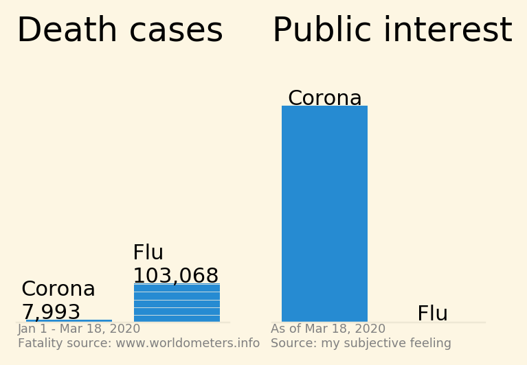
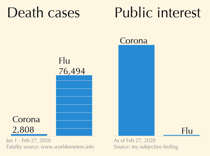
Corona virus vs flu, visualized
-
Three most common mistakes in data visualization
People ask me for good intro video to data visualization. I tend to ask them to look for one of my lectures. To save the search, here’s one of the most relevant talks that I gave
-
5 Basics of Consulting Success: Part 1
Being a data science freelancer, and a long-time AnnMaria’s fan, I HAVE to repost here latest post on consulting success
-
Career advice. A clinical pharmacist, epidemiologist, and a Ph.D. student wants to become a data scientist.
From time to time, I get emails from people who seek advice in their career paths. If I have time, I write them an extended reply and if they agree, I publish the questions and my replies here, in my blog. Here’s one such email exchange. All similar pieces of advice, as well as other rants about a career in data science, can be found here.
-
Not a wasted time
Being a freelancer data scientist, I get to talk to people about proposals that don’t materialize into projects. These conversations take time, but strangely enough, I enjoy them very much, I also find these conversations educating. How else could I have learned about a business model X, or what really happens behind the scenes of company Y?
-
This how scientific satisfaction looks like
I can’t elaborate yet, but in case you wondered how scientific satisfaction looks like, here’s a perfect illustration.
-
Which coffee is this?
Gilad Almosnino is an internationalization expert. I’m reading his post “Eight emojis that will create a more inclusive experience for Middle Eastern markets,” in which he mentions “Turkish or Arabic Coffee,” which reminded me of my last visit to Athens. When, in one restaurant, I asked for a Turkish coffee, the waiter looked at me harshly and said: “It’s not Turkish coffee; it’s Greek coffee!”
-
Further Research is Needed
Do you believe in telepathy? Yesterday, I submitted final proofs of a paper in which I actively participated. During the proofreading, I noticed that our abstract ends with “further research is needed” and scratched my head. I submitted the proofs and then then, I saw this pearl in my blog feed
-
Book review: Great mental models by Shane Parrish
TL;DR shallow and disappointing
-
Which data scientists can refuse more computing power?
Which data scientists can refuse more computing power? None. My collection of computing devices has a new addition a Soviet arithmometer Felix M.
-
TicToc — a flexible and straightforward stopwatch library for Python.
Many years ago, I needed a way to measure execution times. I didn’t like the existing solutions so I wrote my own class. As time passed by, I added small changes and improvements, and recently, I decided to publish the code on GitHub, first as a gist, and now as a full-featured Github repository, and a pip package.
-
Dispute for the sake of Heaven, or why it's OK to have a loud argument with your co-worker
Any dispute that is for the sake of Heaven is destined to endure; one that is not for the sake of Heaven is not destined to endure
Chapters of the Fathers 5:27
-
The difference between python decorators and inheritance that cost me three hours of hair-pulling
I don’t have much hair on my head, but recently, I encountered a funny peculiarity in Python due to which I have been pulling my hair for a couple of hours. In retrospect, this feature makes a lot of sense. In retrospect.
-
In playing cards, the Queen is worth less than the King? Is it time for a change?
Queeng is an ambitious project to change the way we play cards.
-
Does Zipf's Law Apply to Alzheimer's Patients?
Today, I read a post about Ziph’s law and Alzheimer’s disease. I liked the post very much and decided to press the “like” button only to discover that I already “liked” this post more than two years ago.
-
The first things a statistical consultant needs to know — AnnMaria's Blog
You know that I’m a data science consultant now, don’t you? You know that AnnMaria De Mars, Ph.D. (the statistician, game developer, the world Judo champion) is one of my favorite bloggers, and her blog is the second blog I started to follow don’t you?
-
Book review. Replay by Ken Grimwood
TL;DR: excellent fiction reading, makes you think about your life choices. 5/5
-
ASCII histograms are quick, easy to use and to implement
-
The tombs of the righteous
Some people, in face of important changes visit tombs of the righteous for a blessing. I went to see WEIZAC – Israel’s first computer (and one of the first ones in the world) that was built in 1955.
-
How I got a dream job in a distributed company and why I am leaving it
One night, in January 2014, I came back home from work after spending two hours commuting in each direction. I was frustrated and started Googling for “work from home” companies. After a couple of minutes, I arrived at https://automattic.com/work-with-us/. Surprisingly to me, I couldn’t find any job postings for data scientists, and a quick LinkedIn search revealed no data scientists at Automattic. So I decided to write a somewhat arrogant letter titled “Why you should call me?”. After reading the draft, I decided that it was too arrogant and kept it in my Drafts folder so that I can sleep over it. A couple of days later, I decided to delete that mail. HOWEVER, entirely unintentionally, I hit the send button. That’s how I became the first data scientist hired by Automattic (Carly Staumbach, the data scientist and the musician, was already Automattician, but she arrived there by an acquisition).
-
Software commodities are eating interesting data science work — Yanir Seroussi
If you read my shortish post about staying employable as a data scientist, you might like a longer post by a colleague, Yanir Seroussi. In his post, Yanir lists four possible paths for a data scientist: (1) become an engineer; (2) reinvent the wheel; (3) search for niches; and (4) expand the cutting edge.
-
Career advice. A research pharmacist wants to become a data scientist.
Recently, I received an email from a pharmacist who considers becoming a data scientist. Since this is not a first (or last) similar email that I receive, I think others will find this message exchange interesting.
-
Athens, Greece

-
New year, new notebook
On November 7, 2016, I started an experiment in personal productivity. I decided to use a notebook for thirty days to manage all of my tasks. The thirty days ended more than three years ago, and I still use notebooks to manage myself. Today, I started the thirteenth notebook.
-
Don't we all like a good contradiction?
I am a huge fan of Gerd Gigerenzer who preaches numeracy and uncertainty education. One of Prof. Gigerenzer’s pivotal theses is “Fast and Frugal Heuristics” which is also popularized in his book “Gut Feelings” (listen to this podcast if you don’t want to read the book). I like this approach.
-
Staying employable and relevant as a data scientist
One common wisdom is that creative jobs are immune to becoming irrelevant. This is what Brian Solis, the author of “Lifescale” says on this matter
-
Is security through obscurity back?
HBR published an opinion post by Andrew Burt, called “The AI Transparency Paradox.” This post talks about the problems that were created by tools that open up the “black box” of a machine learning model.
-
I will speak at the NDR conference in Bucharest
NDR is a family of machine learning conferences in Romania. Last year, I attended the Iași edition of that conference, gave a data visualization talk, and enjoyed every moment. All the lectures (including mine, obviously) were interesting and relevant. That is why, when Vlad Iliescu, one of the NDR organizers, asked me whether I wanted to talk in Bucharest at NDR 2020, I didn’t think twice.
-
Book review. A Short History of Nearly Everything by Bill Bryson
TL;DR: a nice popular science book that covers many aspects of the modern science
-
Cow shit, virtual patient, big data, and the future of the human species
Yesterday, a new episode was published in the Popcorn podcast, where the host, Lior Frenkel, interviewed me. Everyone who knows me knows how much I love talking about myself and what I do. I definitely used this opportunity to talk about the world of data. Some people who listened to this episode told me that they enjoyed it a lot. If you know Hebrew, I recommend that you listen to this episode
-
Data visualization as an engineering task - a methodological approach towards creating effective data visualization
In June 2019, I attended the NDR AI conference in Iași, Romania where I also gave a talk. Recently, the organizers uploaded the video recording to YouTube.
-
A tangible productivity tool (and a book review)
One month ago, I stumbled upon a book called “[Personal Kanban: Mapping Work Navigating Life](https://amzn.to/33DM4l4)” by Jim Benson (all the book links use my affiliate code). Never before, I saw a more significant discrepancy between the value that the book gave me and its actual content. -
Knowledge Graphs & NLP @ EMNLP
I stumbled upon a very detailed and useful summary of a recent conference on empirical methods in natural language processing. I have to say, Michael Galkin, the author of this review, did an excellent job. His blog, https://medium.com/@mgalkin, is worth following.
-
Data science tools with a graphical user interface
A Quora user asked about data science tools with a graphical user interface. Here’s my answer. I should mention though that I don’t usually use GUI for data science. Not that I think GUIs are bad, I simply couldn’t find a tool that works well for me.
-
Working in a distributed company. Communication styles
I work at Automattic, one of the largest distributed companies in the world. Working in a distributed company means that everybody in this company works remotely. There are currently about one thousand people working in this company from about seventy countries. As you might expect, the international nature of the company poses a communication challenge. Recently, I had a fun experience that demonstrates how different people are.
-
Sometimes, you don't really need a legend
This is another “because you can” rant, where I claim that the fact that you can do something doesn’t mean that you necessarily need to.
-
What do we see when we look at slices of a pie chart?
What do we see when we look at slices of a pie chart? Angles? Areas? Arc length? The answer to this question isn’t clear and thus “experts” recommend avoiding pie charts at all.
-
The problem with citation count as an impact metric
Inspired by A citation is not a citation is not a citation by Lior Patcher, this rant is about metrics.
-
Book review. The War of Art by S. Pressfield
TL;DR: This is a long motivational book that is “too spiritual” for the cynic materialist that I am.
-
Data visualization with statistical reasoning: seeing uncertainty with the bootstrap — Dataviz - Stats - Bayes
On Sunday, I wrote about bootstrapping. On Monday, I wrote about visualization uncertainty. Let’s now talk about bootstrapping and uncertainty visualization.
-
On MOOCs
When Massive Online Open Courses (a.k.a MOOCs) emerged some X years ago, I was ecstatic. I was sure that MOOCs were the Big Boom of higher education. Unfortunately, the MOOC impact turned out to be very modest. This modest impact, combined with the high production cost was one of the reasons I quit making my online course after producing two or three lectures. Nevertheless, I don’t think MOOCs are dead yet. Following are some links I recently read that provide interesting insights to MOOC production and consumption.
-
Error bars in bar charts. You probably shouldn't
This is another post in the series Because You Can. This time, I will claim that the fact that you can put error bars on a bar chart doesn’t mean you should.
-
You don't need a fast way to increase your reading speed by 25%. Or, don't suppress subvocalization
Not long ago, I wrote a post about a fast hack that increased my reading speed by tracking the reading with a finger. I think that the logic behind using a tracking finger is to suppress subvocalization. I noticed that, at least in my case, suppressing subvocalization reduces the fun of reading. I actually enjoy hearing the inner voice that reads the book “with me”.
-
Bootstrapping the right way?
Many years ago, I terribly overfit a model which caused losses of a lot of shekels (a LOT). It’s not that I wasn’t aware of the potential overfitting. I was. Among other things, I used several bootstrapping simulations. It turns out that I applied the bootstrapping in a wrong way. My particular problem was that I “forgot” about confounding parameters and that I “forgot” that peeping into the future is a bad thing.
-
How do I look like?
From time to time, people (mostly conference organizers) ask for a picture of mine. Feel free using any of these images
-
Visualizations with perceptual free-rides
Dr. Richard Brath is a data visualization expert who also blogs from time to time. Each post in Richard’s blog provides a deep, and often unexpected to me, insight into one dataviz aspect or another.
-
Book review. Indistractable by Nir Eyal
Nir Eyal is known for his book “Hooked” in which he teaches how to create addictive products. In his new book “Indistractable”, Nir teaches how to live in the world full of addictive products. The book itself isn’t bad. It provides interesting information and, more importantly, practical tips and action items. Nir covers topics such as digital distraction, productivity and procrastination.
-
14-days-work-month — The joys of the Hebrew calendar
Tishrei is the seventh month of the Hebrew calendar that starts with Rosh-HaShana — the Hebrew New Year. It is a 30 days month that usually occurs in September-October. One interesting feature of Tishrei is the fact that it is full of holidays: Rosh-HaShana (New Year), Yom Kippur (Day of Atonement), first and last days of Sukkot (Feast of Tabernacles) **. All these days are rest days in Israel. Every holiday eve is also a *de facto rest day in many industries (high tech included). So now we have 8 resting days that add to the usual Friday/Saturday pairs, resulting in very sparse work weeks. But that’s not all: the period between the first and the last Sukkot days are mostly considered as half working days. Also, the children are at home since all the schools and kindergartens are on vacation so we will treat those days as half working days in the following analysis.
-
A fast way to increase your reading speed by 25%
I was sceptic but I tried, measured, and arrived to the conclusion. First, I set a timer to 60 seconds and read some text. I managed to read seventeen lines. Then, I used my finger to guide my eyes the same way kids do when they learn reading. It turned out that I was able to read lines of text. By simply using my finger. Impressive.
-
Book review: The Formula by A. L Barabasi
The bottom line: read it but use your best judgement 4/5
-
Pseudochart. It's like a pseudocode but for charts
Pseudocode is an informal high-level description of the operating principle of a computer program or other algorithm. People write pseudocode to isolate the “bigger picture” of an algorithm. Pseudocode doesn’t care about the particular implementation details that are secondary to the problem, such as memory management, dealing with different encoding, etc. Writing out the pseudocode version of a function is frequently the first step in planning the implementation of complex logic.
-
My blog in Hebrew
As much as I love thinking that I live in a global world, most people whom I know speak Hebrew. From time to time, someone would tell me “nice post, but why not in Hebrew?”. So, from now on, I will try to translate all my new posts to Hebrew. I will try. Not promising anything. My Hebrew blog lives at https://he.gorelik.net/blog-feed
-
Please leave a comment to this post
Please leave a comment to this post. It doesn’t matter what, it can be a simple Hi or an interesting link. It doesn’t matter when or where you see it. I want to see how many real people are actually reading this blog.
-
Word Sequentialization
-
My slide deck from the NDR conference in Iași
I have published the slide deck from my talk at the NDR conference in Iași, Romania.
-
Why you should speak at conferences?
In this post, I will try to convince you that speaking at a conference is an essential tool for professional development.
-
Iași, Romania
The NDR conference in Iași is over. It’s a good time to sit, relax and work.
-
Curated list of established remote tech companies
Someone asked me about distributed companies or companies that offer remote positions. Of course, my first response was Automattic but that person didn’t think that Automattic was a good fit for them. So I googled and was surprised to discover that my colleague, Yanir Seroussi, maintains a list of companies that offer remote jobs.
-
כוון הציר האפקי במסמכים הנכתבים מימין לשמאל
אני מחפש דוגמאות נוספות
-
Talking about productivity methods
The best way to procrastinate is to research productivity.
Boris Gorelik
-
An interesting way to beat procrastination when working from home
Working from home (or a coffee shop, or a library) is great. However, there is one tiny problem: the temptation not to work is sometimes much bigger than the temptation in a traditional office. In the traditional office you are expected to look busy which is the first step to do an actual work. When you work from home, nobody cares if you get up to have a cup of coffee or water the plants. This is GREAT but sometimes this freedom is too much. Sometimes, you wish someone would give you that look to encourage you to keep working.
-
The third wave data scientist - a useful point of view
In 2019, it’s hard to find a data-related blogger who doesn’t write about the essence and the future of data science as a profession. Most of these posts (like this one for example) are mostly useless both for existing data scientists who think about their professional plans and for people who consider data science as their career.
-
To specialize, or not to specialize, that is the data scientists' question
In my last post on data science career, I heavily promoted the idea that a data scientist needs to find his or her specialization. I back my opinion with my experience and by citing other people opinions. However, keep in mind that I am not a career advisor, I never surveyed the job market, and I might not know what I’m talking about. Moreover, despite the fact that I advocate for specialization, I think that I am more of a generalist.
-
The data science umbrella or should you study data science as a career move (the 2019 edition)?
TL/DR: Studying data science is OK as long as you know that it’s only a starting point.
-
Please leave a comment to this post
Please leave a comment to this post. It doesn’t matter what, it can be a simple Hi or an interesting link. It doesn’t matter when or where you see it. I want to see how many real people are actually reading this blog.
-
בניית אתרים עם תמיכה בארץ
מדי פעם אנשים ששומעים שאני עובד בחברה שמפעילה את וורדפרקס.קום מבקשים ממני עזרה אם בניית האתר שלהם. אני חוקר נתונים, לא בונה אתרים. ברור שהחברה בה אני עובד עושה המון מאמצים כדי לאפשר לאנשים לבנות אתרים בעצמם, אבל לפעםמים אנשים צריכים להאציל את הסמכות הזאת למומחים, רוצים גמישות ושליטה וגם תמיכה. אני מכיר אישית את דידי אריאלי מהאתר ״קליקי בניית אתרים״ שעושה בדיוק את זה: בנייה ותחזוקת אתרים מותאמים אישית. מה שנחמד הוא שדידי נאמן לעקרונות הקוד הפתוח: הלקוח לא קשור אליו ושומר על השליטה בתוכן ובקוד של האתר.
-
Chișinău Jewish cemetery
Two years ago I visited Chișinău (Kishinev), the city in Moldova where I was born and where I grew up until the age of fifteen. Today I saw a post with photos from the ancient Chișinău Jewish cemetery and recalled that I too, took many pictures from that sad place. Less than half of the original cemetery survived to these days. The bigger part of it was demolished in the 1960s in favor of a park and a residential area. If you scroll through the pictures below, you will be able to see how they used tombstones to build the park walls.
-
How to Increase Retention and Revenue in 1,000 Nontrivial Steps
The journey of a thousand miles begins with one step. My coworker, Yanir Seroussi, wrote about the work of data scientists in the marketing team.
-
On procrastination, or why too good can be bad
I’m a terrible procrastinator. A couple of years ago, I installed RescueTimeto fight this procrastination. The idea behind RescueTime is simple — it tracks the sites you visit and the application you use and classifies them according to how productive you are. Using this information, RescueTime provides a regular report of your productivity. You can also trigger the productivity mode, in which RescueTime will block all the distractive sites such as Facebook, Twitter, news sites, etc. You can also configure RescueTime to trigger this mode according to different settings. This sounded like a killer feature for me and was the main reason behind my decision to purchase a RescueTime subscription. Yesterday, I realized how wrong I was.
-
"Why it burns when you P" and other statistics rants
“Sunday grumpiness” is an SFW translation of Hebrew phrase that describes the most common state of mind people experience on their first work weekday. My grumpiness causes procrastination. Today, I tried to steer this procrastination to something more productive, so I searched for some statistics-related terms and stumbled upon a couple of interesting links in which people bitch about p-values.
-
Hackers beware: Bootstrap sampling may be harmful
Anything is better when bootstrapped. Read my co-worker’s post on bootstrapping. Also make sure following the links Yanir gives to support his claims
-
I have 101 followers!
Yesterday, the follower list of my blog exceeded one hundred followers! Even though I know that some of these followers are bots, this number makes me happy! Thank you all (humans and bots) for clicking the “follow” button.
-
A Brand Image Analysis of WordPress and Automattic on Twitter
My coworker analyzed Twitter social network around Automattic, WordPress, and other related projects.
-
Against A/B tests
Traditional A/B testsing rests on a fundamentally flawed premise. Most of the time, version A will be better for some subgroups, and version B will be better for others. Choosing either A or B is inherentlyinferior to choosing a targeted mix of A and B.
Michael Kaminsky locallyoptimistic.com
-
Links Worth Sharing: What Makes People Successful
-
Useful redundancy — when using colors is not completely useless
The maximum data-ink ratio principle implies that one should not use colors in their graphs if the graph is understandable without the colors. The fact that you can do something, such as adding colors, doesn’t mean you should do it. I know it. I even have a dedicated tag on this blog for that. Sometimes, however, consistent use of colors serves as a useful navigation tool in a long discussion. Keep reading to learn about the justified use of colors.
-
On the importance of perspective
Stalin was a relatively short man, his height was 1.65 m. Khrushchev was even shorter, his height was 1.60. It seems that the difference wasn’t enough for the official Soviet propaganda of that time. Take a look at this photo. We can clearly see that Stalin is taller than Khrushchev.
-
Microtext Line Charts
Why adding text labels to graph lines, when you can build graph lines using text labels? On microtext lines
-
איך אומרים דאטה ויזואליזיישן בעברית?
This post is written in Hebrew about a Hebrew issue. I won’t translate it to English.
-
Innumeracy
Innumeracy is “inability to deal comfortably with the fundamental notions of number and chance”.
I which there was a better term for “innumeracy”, a term that would reflect the importance of analyzing risks, uncertainty, and chance. Unfortunately, I can’t find such a term. Nevertheless, the problem is huge. In this long post, Tom Breur reviews many important aspects of “numeracy”. -
Working Remotely and the Virtue of Aggressive Transparency
Excellent post by my colleague Simon Ouderkirk on working in a distributed company. It’s a three-year-old post. I wonder how I missed it.
-
Data visualization in right-to-left languages
If you speak Arabic or Farsi, I need your help. If you don’t speak, share this post with someone who does.
-
A World Without the Number 6 — Math with Bad Drawings
What will happen if number 6 disappears one day? Ben Orlin, the author of “Math with bad drawings” elaborates on this interesting thought experiment in this 2017 post.

-
Can error correction cause more error? (The answer is yes)
This is an interesting thought experiment. Suppose that you have some appliance that acts in a normally distributed way. For example, a nerf gun. Let’s say now that you aim and fire the gun. What happens if you miss by some amount of X? Should you correct your aim in the opposite direction? My intuition says “yes.” So does the intuition of many other people with whom I talked about this problem. However, when we start thinking about this problem, we realize that the intuition is wrong. Since we aim the gun, our assumption should be that the deviation is zero. A single observation is not sufficient to reject this assumption. By continually adjusting the data generating process based on a single observation, we reduce the precision (increase the dispersion).
Below is a simulation of adjusted and non-adjusted processes (the code is here). The broader spread of the adjusted data (blue line) is evident. -
Me
-
Conference Recap: EuroSciPy 2018 — Data for Breakfast
See my recap of the recent EuroSciPy, published on https://data.blog
-
"Any questions?" How to fight the awkward silence at the end of a presentation?
If you ever gave or attended a presentation, you are familiar with this situation: the presenter asks whether there are any questions and … nobody asks anything. This is an awkward situation. Why aren’t there any questions? Is it because everything is clear? Not likely. Everything is never clear. Is it because nobody cares? Well, maybe. There are certainly many people that don’t care. It’s a fact of life. Study your audience, work hard to make the presentation relevant and exciting but still, some people won’t care. Deal with it.
-
Graphing Highly Skewed Data – Tom Hopper
My colleague, Chares Earl, pointed me to this interesting 2010 post that explores different ways to visualize categories of drastically different sizes.
-
On privacy, security, and irony
About a week ago, I met Justin Mayer and had a really interesting chat with him about internet privacy. Today, his 30-minutes talk on that subject appeared in my youtube suggestion list
-
Back to Mississippi: Black migration in the 21st century. By Charles Earl
I wonder how this analysis of remained unnoticed by the social media
-
Please leave a comment to this post
Please leave a comment to this post. It doesn’t matter what. It doesn’t matter when or where you see it. I want to see how many real people are actually reading this blog.
-
16-days-work-month — The joys of the Hebrew calendar
Tishrei is the seventh month of the Hebrew calendar that starts with Rosh-HaShana — the Hebrew New Year. It is a 30 days month that usually occurs in September-October. One interesting feature of Tishrei is the fact that it is full of holidays: Rosh-HaShana (New Year), Yom Kippur (Day of Atonement), first and last days of Sukkot (Feast of Tabernacles) **. All these days are rest days in Israel. Every holiday eve is also a *de facto rest day in many industries (high tech included). So now we have 8 resting days that add to the usual Friday/Saturday pairs, resulting in very sparse work weeks. But that’s not all: the period between the first and the last Sukkot days are mostly considered as half working days. Also, the children are at home since all the schools and kindergartens are on vacation so we will treat those days as half working days in the following analysis.
-
Sometimes, less is better than more
Today, during the EuroSciPy conference, I gave a presentation titled “Three most common mistakes in data visualization and how to avoid them”. The title of this presentation is identical to the title of the presentation that I gave in Barcelona earlier this year. The original presentation was approximately one and a half hours long. I knew that EuroSciPy presentations were expected to be shorter, so I was prepared to shorten my talk to half an hour. At some point, a couple of days before departing to Trento, I realized that I was only allocated 15 minutes. Fifteen minutes! Instead of ninety.
-
An even better data visualization workshop
-
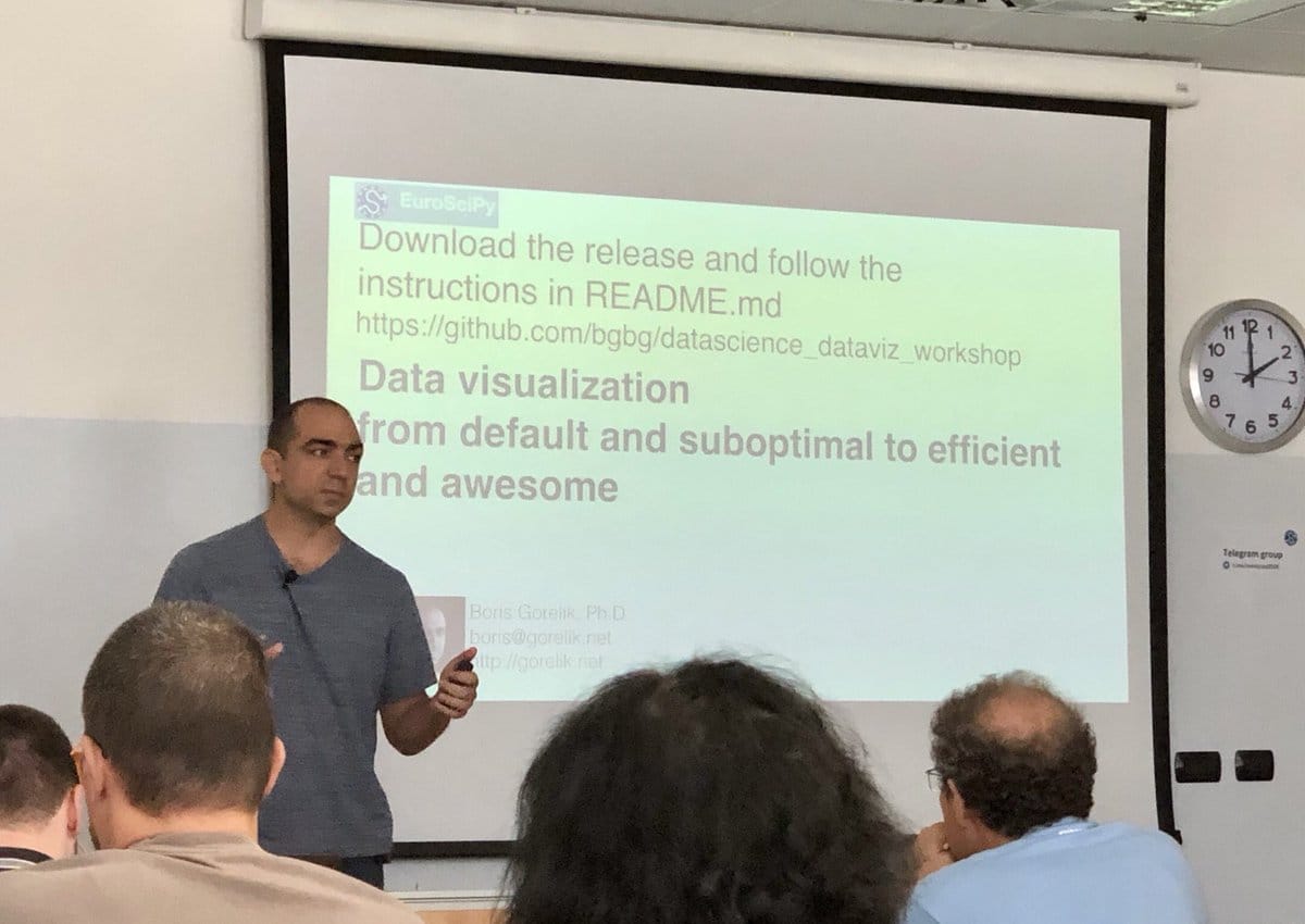
Meet me at EuroSciPy 2018
I am excited to run a data visualization tutorial, and to give a data visualization talk during the 2018 EuroSciPy meeting in Trento, Italy.
-
Value-Suppressing Uncertainty Palettes – UW Interactive Data Lab – Medium
Uncertainty is one of the most neglected aspects of number-based communication and one of the most important concepts in general numeracy. Comprehending uncertainty is hard. Visualizing it is, apparently, even harder.
-
Investigating Seasonality in a Time Series: A Mystery in Three Parts
Excellent piece (part one of three) about time series analysis by my colleague Carly Stambaugh
-
Me

-
Evolution of a complex graph. Part 1. What do you want to say?
From time to time, people ask me for help with non-trivial data visualization tasks. A couple of weeks ago, a friend-of-a-friend-of-a-friend showed me a set of graphs with the following note:
-
Hugo the cat
[gallery ids=”2190,2189” type=”rectangular” link=”none”]
-
C for Conclusion
From time to time, I give a lecture about most common mistakes in data visualization. In this lection, I say that not adding a graph’s conclusion as a title is an opportunity wasted
-
Meaningless slopes
That fact that you can doesn’t mean that you should! I will say it once again.That fact that you can doesn’t mean that you should! Look at this slopegraph that was featured by “Information is Beautiful”
-
In defense of three-dimensional graphs
“There is only one thing worse than a pie chart. It’s a 3-D pie chart”. This is what I used to think for quite a long time. Recently, I have revised my attitude towards pie charts, mainly due to the works of Rober Kosara from Tableau. I am no so convinced that pie charts can be a good visualization choice, I even included a session “Pie charts as an alternative to bar charts” in my recent workshop.
-
Today's workshop material
Today, I hosted a data visualization workshop, as a part of the workshop day adjacent to the fourth Israeli Data Science Summit. I really enjoyed this workshop, especially the follow-up questions. These questions are the reason I volunteer talking about data visualization every time I can. It may sound strange, but I learn a lot from the questions people ask me.
-
Prerequisites for the upcoming data visualization workshop
I have been told that the data visualization workshop (“Data Visualization from default to outstanding. Test cases of tough data visualization”) is completely sold out. If you plan to attend this workshop, please check out the repository that I created for it [link]. In that repository, you will find a list of pre-requisites that you absolutely need to meet before the workshop. Also, it will be very helpful if you could fill this poll which will help me prepare for the workshop.
-
If you know matplolib and are in Israel on May 27th, I need your help
So, the data visualization workshop is fully booked. The organizers told me to expect 40-50 attendees and I need some assistance. I am looking for a person who will be able to answer technical questions such as “I got a syntax error”, “why can’t I see this graph?”, “my graph has different colors”.
-
I will host a data visualization workshop at Israel’s biggest data science event
TL/DR
-
Whoever owns the metric owns the results — don't trust benchmarks
Other factors being equal, what language would you choose for heavy numeric computations: Python or PHP? This is not a language war but a serious question. For me, the choice seems to be obvious: I would choose Python, and I’m not the only one. In this survey, for example, 45% of data scientist use Python, compared to 24% who use PHP. The two sets of data scientists aren’t mutually exclusive, but we do see the picture.
-
When "a pile of shit" is a compliment — On context importance in remote communication
What would you do, if someone left a “Pile of Poo” emoji as a reaction to your photo in your team Slack channel?
-
Three most common mistakes in data visualization and how to avoid them. Now, the slides
Yesterday, I talked in front of the Barcelona Data Science and Machine Learning Meetup about the most common mistakes in data visualization. I enjoyed talking with the local community very much. Judging by the feedback I received during and after the talk, they too, enjoyed my presentation. I uploaded my slides to Slideshare.
-
Engineering Data Science at Automattic
Data Scientist? Data Engineer? Analyst? My teammate, Yanir Seroussi writes about bridging the gaps between the different professions.
-
Live in Barcelona. Three most common mistakes in data visualization.
On Thursday, March 20, I will give a talk titled “Three most common mistakes in data visualization and how to avoid them.” I will be a guest of the Barcelona Data Science and Machine Learning Meetup Group. Right now, less than twenty-four hours after the lecture announcement, there are already seventeen people on the waiting list. I feel a lot of responsibility and am very excited.
-
Visiting the outer space isn't such a big deal
I know a lot of people who dreamt of being a cosmonaut or an astronaut. I was one of them. Did you know that visiting the outer space isn’t such a big deal? Since the Yuri Gagarin’s first flight to space in 1961, 557 more people flew to space. Unfortunately, not all of them survived the trip [ref].
-
On algorithmic fairness & transparency
My teammate, Charles Earl has recently attended the Conference on Fairness, Accountability, andTransparency (FAT*). The conference site is full of very interesting material, including proceedings and video recording of lectures and tutorials.
-
Five misconceptions about data science
One item on my todo list is to write a post about “three common misconceptions about data science. Today, I found this interesting post that lists misconceptions much better than I would have been able to do. Plus, they list five of them. That 67% more than I intended to do ;-)
-
Blogging isn't what it used to be
From time to time, I assume something, evaluate that assumption, and discover that the reality is opposite to what I thought it was. That’s exactly what happened when I thought about the dynamics of Google searches for “create a site,” compared to the searches for “create a blog.” I was sure that there would be much more searches for “create a site.” I was wrong
-
ASCII histograms are quick, easy to use and implement
-
Mammogram, breast cancer, and manipulative statistics
Here’s a quiz
-
One of the reasons I don't like R
I never liked R. I didn’t like it for the first time I tried to learn it, I didn’t like it when I had to switch to R as my primary work tool at my previous job. And didn’t like it one and a half year later, when I was comfortable enough to add R to my CV, right before leaving my previous job.
-
Overfitting reading list
Overfitting is a situation in which a model accurately describes some data but not the phenomenon that generates that data. Overfitting was a huge problem in the good old times, where each data point was expensive, and researchers operated on datasets that could fit a single A4 sheet of paper. Today, with mega- giga- and tera-bytes datasets, overfitting is … still a problem. A very painful one. Following is a short reading list on overfitting.
-
Tips on making remote presentations
Today, I made a presentation to the faculty of the Chisinau
Institute of Mathematics and Computer Science. The audience gathered in a conference room in Chisinau, and I was in my home office in Israel. -
The best productivity system I know
I am an awful procrastinator. I realized that, many years ago. Once I did, I started searching for productivity tips and systems. Of course, most of these searches are another form of procrastination. After all, it’s much more fun to read about productivity than writing that boring report. In 2012, I discovered a TiddlyWiki that implements AutoFocus – a system developed by Mark Forster (AutoFocus instructions: link, TiddlyWiki page link)
-
Once again on becoming a data scientist
My stand on learning data science is known: I think that learning “data science” as a career move is a mistake. You may read this long rant of mine to learn why I think so. This doesn’t mean that I think that studying data science, in general, is a waste of time.
-
The case of meaningless comparison
Exposé, an Australian-based data analytics company, published a use case in which they analyze the benefits of a custom-made machine learning solution. The only piece of data in their report [PDF] was a graph which shows the observed and the predicted
-
I should read more about procrastination. Maybe tomorrow.
You’ve been there: you need to complete a project, submit a report, or document your code. You know how important all these tasks are, but you can’t find the power to do so. Instead, you’re researching those nice pictures the Opportunity rover sent to the Earth, type random letters in Google to see where they will lead you to, tidy up your desk, or make another cup of coffee. You are procrastinating.
-
Lie factor in ad graphs
What do you do when you have spare time? I tend to throw graphs from ads to a graph digitizer to compute the “lie factor”. Take the following graph for example. It appeared in an online ad campaign a couple of years ago. In this campaign, one of the four Israeli health care providers bragged about the short waiting times in their phone customer support. According to the Meuheded (the health care provider who run the campaign), their customers had to wait for one minute and one second, compared to 1:03, 1:35, and 2:39 in the cases of the competitors. Look how dramatic the difference is:
-
Never read reviews before reading a book (except for this one). On "Surely You're Joking, Mr. Feynman!"
Several people suggested that I read “Surely You’re Joking, Mr. Feynman!”. That is why, when I got my new Kindle, “Surely You’re Joking, Mr. Feynman!” was the first book I bought.
Richard Feynman was a trained theoretical physics who co-won the Nobel Prize. From reading the book, I discovered that Feynman was also a drummer, a painter, an expert on Native American mathematics, safecracker, a samba player, and an educator. The more I read this book, the more astonished I was about Feynman’s personality and his story. -
Is Data Science a Science?
Is Data Science a Science? I think that there is no data scientist who doesn’t ask his- or herself this question once in a while. I recalled this question today when I watched a fascinating lecture “Theory, Prediction, Observation” made by Richard Feynman in 1964. For those who don’t know, Richard Feynman was a physicist who won the Nobel Prize, and who is considered one of the greatest explainers. In that particular lecture, Prof. Feynman talked about science as a sequence of Guess ⟶ Compute Consequences ⟶ Compare to Experiment
-
Why deeply caring about the analysis isn't always a good thing?
Does Caring About the Analysis Matter?
-
Does chart junk really damage the readability of your graph?

-
On statistics and democracy, or why exposing a fraud may mean nothing
“stat” in the word “statistics” means “state”, as in “government/sovereignty”. Statistics was born as a state effort to use data to rule a country. Even today, every country I know has its own statistics authority. For many years, many governments, have been hiding the true statistics from the public, under the assumption that knowledge means power. I was reminded of this after reading Charles Earl’s (my teammate) post “Mathematicians, rock the vote!”, in which he encourages mathematicians to fight gerrymandering. Gerrymandering is a dubious practice in the American voting system, where a regulatory body forms voting districts in such a way that the party that appointed that body has the highest chance to win. Citing Charles:
-
What is the best way to handle command line arguments in Python?
The best way to handle command line arguments with Python is
[defopt](http://evanunderscore/defopt: Effortless argument parser). It works like magic. You write a function, add a proper docstring using any standard format (I use [numpy doc]), and see the magic -
Measuring the wall time in python programs
-
Why bar charts should always start at zero?
In the data visualization world, not starting a bar chart at zero is a “BIG NO”. Some people protest. “How come can anyone tell me how to start my bar chart? The Paper/Screen can handle anything! If I want to start a bar chart at 10, nobody can stop me!”
-
Gender salary gap in the Israeli high-tech — now the code
Several people have asked me about the technology I used to create the graphs in my recent post about the gender salary gap in the Israeli high-tech. Like 99% of the graphs I create, I used matplotlib. I have uploaded the notebook that I used for that post to Github. Here’s the link. The published version uses seaborn style settings. The original one uses a slightly customized style.
-
The Monty Hall Problem simulator
A couple of days ago, I told to my oldest daughter about the Monty Hall problem, the famous probability puzzle with a counter-intuitive solution. My daughter didn’t believe me. Even when I told her all about the probabilities, the added information, and the other stuff, she still couldn’t “feel” it. I looked for an online simulator and couldn’t find anything that I liked. So, I decided to create a simulation Jupyter notebook.
-
In defense of double-scale and double Y axes
If you had a chance to talk to me about data visualization, you know that I dislike the use of double Y-axis for anything except for presenting different units of the same measurement (for example inches and meters). Of course, I’m far from being a special case. Double axis ban is a standard stand among all the people in the field of data visualization education. Nevertheless, double-scale axes (mostly Y-axis) are commonly used both in popular and technical publications. One of my data visualization students in the Azrieli College of Engineering of Jerusalem told me that he continually uses double Y scales when he designs dashboards that are displayed on a tiny screen in a piece of sophisticated hardware. He claimed that it was impossible to split the data into separate graphs, due to space constraints, and that the engineers that consume those charts are professional enough to overcome the shortcomings of the double scales. I couldn’t find any counter-argument.
-
What is the best way to collect feedback after a lecture or a presentation?
I consider teaching and presenting an integral part of my job as a data scientist. One way to become better at teaching is to collect feedback from the learners. I tried different ways of collecting feedback: passing a questionnaire, Polldaddy surveys or Google forms, or simply asking (no, begging) the learners to send me an e-mail with the feedback. Nothing really worked. The response rate was pretty low. Moreover, most of the feedback was a useless set of responses such as “it was OK”, “thank you for your time”, “really enjoyed”. You can’t translate this kind of feedback to any action.
-
Data is the new
I stumbled upon a rant titled Data is not the new oil — Tech Insights
-
Yes, your friends are more successful than you are. On "The Majority Illusion in Social Networks"
Recently, I re-read “The Majority Illusion in Social Networks” (by Lerman, Yan and Wu).
-
Analysis of A Beautiful Storm: Internal Communication at Automattic
My teammate’s post on data.blog
-
Gender salary gap in the Israeli high-tech
A large and popular Israeli Facebook group, “The High-Tech Troubles,” has recently surveyed its participants. The responders provided personal, demographic, and professional information. The group owners have published the aggregated results of that survey. In this post, I analyze a particular aspect of these findings, namely, how the responders’ gender and experience affect their salary. It is worth noting that this survey is by no means a representative one. It’s most noticeable but not the only problem is the participation bias. Another problem is the fact that the result tables do not contain any information about the number of responders in any group. Without this information, it is impossible to compute confidence intervals of any findings. Despite these problems, the results are interesting and worth noting.
-
Don't take career advises from people who mistreat graphs this badly
Recently, I stumbled upon a report called “Understanding Today’s Chief Data Scientist” published by an HR company called Heidrick & Struggles. This document tries to draw a profile of the modern chief data scientist in today’s Big Data Era. This document contains the ugliest pieces of data visualization I have seen in my life. I can’t think of a more insulting graphical treatment of data. Publishing graph like these ones in a document that tries to discuss careers in data science is like writing a profile of a Pope candidate while accompanying it with pornographic pictures.
-
AI and the War on Poverty, by Charles Earl
It’s such a joy to work with smart and interesting people. My teammate, Charles Earl, wrote a post about machine learning and poverty. It’s not short, but it’s worth reading.
-
Одна голова хорошо, а две лучше; или как не забросить свой блог
Запись моего доклада на WordCamp Moscow (август 2017г.) доступна онлайн.
-
Do New Year's Resolutions Work? Data Suggests They Do!
My latest post on https://data.blog. I enjoyed preparing it, and like its results very much. Happy New Year, everyone.
-
We're Reading About Artificially Intelligent Harry Potter Fan Fiction, Verifying Online Identities, and More
-
Buzzword shift
Many years ago, I tried to build something that today would have been called “Google Trends for Pubmed”. One thing that I’ve found during that process was how the emergence of HIV-related research reduced the number of cancer studies and how, several years later, the HIV research boom settled down, while letting the cancer research back.
-
On alert fatigue
I developed an anomaly detection system for Automattic internal dashboard. When presenting this system (“When good enough is just good enough”), I used to tell that in our particular case, the cost of false alerts was almost zero. I used to explain this claim by the fact that no automatic decisions were made based on the alerts, and that the only subscribers of the alert messages were a limited group of colleagues of mine. Automattic CFO, Stu West, who was the biggest stakeholder in this project, asked me not to stop claiming the “zero cost” claim. When the CFO of the company you work for asks you to do something, you comply. So, I stopped saying “zero cost” but I still listed the error costs as a problem I can safely ignore for the time being. I didn’t fully believe Stu, which is evident from the speaker notes of my presentation deck:
-
What's the most important thing about communicating uncertainty?
Sigrid Keydana, in her post Plus/minus what? Let’s talk about uncertainty (talk) — recurrent null, said
-
Doing the Math on Key Words and Top Level Domains
My post on data.blog
-
The Y-axis doesn't have to be on the left
Line charts are great to convey the evolution of a variable over the time. This is a typical chart. It has three key components, the X-axis that represents the time, the Y-axis that represents the tracked value, and the line itself.
-
Epitaphs in the Graveyard of Mathematics
The excellent Ben Odrin wrote a hilarious post with fictitious tombstones of famous mathematicians. This is only one example :
-
The fastest way to get first N items in each group of a Pandas DataFrame
In my work, the speed of code writing and reading is usually more important than the speed of its execution. Right now, I’m facing a challenge of optimizing the running time of a fairly complex data science project. After a lot of profiling, I identified the major time consumers. One of such time-consuming steps involved grouping a Pandas DataFrame by a key, sorting each group by a score column, and taking first N elements in each group. The tables in this step are pretty small not more than one hundred elements. But since I have to perform this step many times, the running time accumulates to a substantial fraction.
-
How to make a graph less readable? Rotate the text labels
This is my “because you can” rant.
-
On machine learning, job security, professional pride, and network trolling
If you are a data scientist, I am sure you wondered whether deep neural networks will replace you at your job one day. Every time I read about reports of researchers who managed to trick neural networks, I wonder whether the researchers were thinking about their job security, or their professional pride while performing the experiments. I think that the first example of such a report is a 2014 paper by Christian Szegedy and his colleagues called “Intriguing properties of neural networks”. The main goal of this paper, so it seems, was to peek into the black box of neural networks. In one of the experiments, the authors designed minor, invisible perturbation of the original images. These perturbations diminished the classification accuracy of a trained model.
-
Interactive Network Visualization in Python with NetworkX and PyQt5 Tutorial
Unfortunately, there is no widely accepted, ready to use, standard way to interactively visualize networks in python. The following post shows yet another attempt to build an ad-hoc app.
-
Which of these two pictures should I choose for my gravatar?
Which of these two pictures should I choose for my gravatar?
-
We're Reading About Simplifying Without Distortion and Adversarial Image Classification
Weekly reading list from the data.blog team
-
Another set of ruthless critique pieces
You know that I like reading a ruthless critique of others’ work – I like telling myself that by doing so I learn good practices (in reality, I suspect I’m just a case what we call in Hebrew שמחה לאיד – the joy of some else’s failure).
-
Good information + bad visualization = BAD
I went through my Machine Learning tag feed. Suddenly, I stumbled upon a pie chart that looked so terrible, I was sure the post would be about bad practices in data visualization. I was wrong. The chart was there to convey some information. The problem is that it is bad in so many ways. It is very hard to appreciate the information in a post that shows charts like that. Especially when the post talks about data science that relies so much on data visualization.
-
What are the best practices in planning & interpreting A/B tests?
Compiled by my teammate Yanir Serourssi, the following is a reading list an A/B tests that you should read even if you don’t plan to perform an A/B test anytime soon. The list is Yanir’s. The reviews are mine. Collective intelligence in action :-)
-
How to make a racist AI without really trying (a reblog)
Perhaps you heard about Tay, Microsoft’s experimental Twitter chat-bot, and how within a day it became so offensive that Microsoft had to shut it down and never speak of it again. And you assumed that you would never make such a thing, because you’re not doing anything weird like letting random jerks on Twitter re-train […]
-
Please leave a comment on this post
Please leave a comment on this post. It doesn’t matter what you want to write. It can be short or long. Any comment. I need to know that humans read this blog. If you feel really generous, tell me how you found this blog, what you think of it.
-
Data Science or Data Hype?
In his blog post Big Data Or Big Hype? , Rick Ciesla is asking a question whether the “Big Data” phenomenon is “a real thing” or just a hype? I must admit that, until recently, I was sure that the term “Data Science” was a hype too – an overbroad term to describe various engineering and scientific activities. As time passes by, I become more and more confident that Data Science matures into a separate profession. I haven’t’ yet decided whether the word “science” is fully appropriate in this case is.

-
Do you REALLY need the colors?
Seaborn is a Python visualization library based on matplotlib. It provides a high-level interface for drawing attractive statistical graphics. Look at this example from the seaborn documentation site
-
Numpy vs. Pandas: functions that look the same, share the same code but behave differently
I can’t imagine how my professional life would have looked like without pandas, THE data analysis library for Python. Pandas shares much of its functionality and syntax with numpy, a fundamental package for scientific computing with Python. The reason for that is that, under the hood, pandas uses numpy. This similarity is very convenient as it allows passing numpy arrays to many pandas functions and vice versa. However, sometimes it sabs you in the back. Here is a nice example that I discovered after hours (OK, minutes) of debugging.
-
When scatterplots are better than bar charts, and why?
From time to time, you might hear that graphical method A is better at representing problem X than method B. While in case of problem Z, the method B is much better than A, but C is also a possibility. Did you ever ask yourselves (or the people who tell you that) “Says WHO?”
-
Because you can — a new series of data visualization rants
Here’s an old joke:
-
Although it is easy to lie with statistics, it is easier to lie without
I really recommend reading this (longish) post by Tom Breur called “Data Dredging” (and following his blog. The post is dedicated to overfitting – the most scaring problem in machine learning. Overfitting is easy to do and is hard to avoid. It is a serious problem when working with “small data” but is also a problem in the big data era. Read “Data Dredging” for an overview of the problem and its possible cures.
-
Gartner: More than 40% of data science tasks will be automated by 2020. So what?
Recently, I gave a data science career advice, in which I suggested the perspective data scientists not to study data science as a career move. Two of my main arguments were (and still are):
-
1461
I teach data visualization to in Azrieli College of Engineering in Jerusalem. Yesterday, during my first lesson, I was talking about the different ways a chart design selection can lead to different conclusions, despite not affecting the actual data. One of the students hypothesized that the preception of a figure can change as a function of other graphs shown together. Which was exactly tested in a research I recently mentioned here. I felt very proud of that student, despite only meeting them one hour before that.
-
Who doesn't like some merciless critique of others' work?
Stephen Few is the author of (among others) “Show Me The Numbers”. Besides writing about what should **be done, in the field of data visualization, Dr. Few also writes a lot about what should **not be done. He does that in a sharp, merciless way which makes it very interesting reading (although, sometimes Dr. Few can be too harsh). This time, it was the turn of the Tableau blog team to be at the center of Stephen Few’s attention, and not for the good reason.
-
Why is it (almost) impossible to set deadlines for data science projects?
In many cases, attempts to set a deadline to a data science project result in a complete fiasco. Why is that? Why, in many software projects, managers can have a reasonable time estimate for the completion but in most data science projects they can’t? The key points to answer this question are complexity and, to a greater extent, missing information. By “complexity” I don’t (only) mean the computational complexity. By “missing information” I don’t mean dirty data. Let us take a look at these two factors, one by one.
-
What is the best thing that can happen to your career?
Today, I’ve read a tweet by Sinan Aral (@sinanaral) from the MIT:
-
We're Reading About Bias in AI, SpaceX, and More
Reading list from the curators of data.blog
-
Can the order in which graphs are shown change people's conclusions?
When I teach data visualization, I love showing my students how simple changes in the way one visualizes his or her data may drive the potential audience to different conclusions. When done correctly, such changes can help the presenters making their point. They also can be used to mislead the audience. I keep reminding the students that it is up to them to keep their visualizations honest and fair. In his recent post, Robert Kosara, the owner of https://eagereyes.org/, mentioned another possible way that may change the perceived conclusion. This time, not by changing a graph but by changing the order of graphs exposed to a person. Citing Robert Kosara:
-
Advice for aspiring data scientists and other FAQs — Yanir Seroussi

-
How to be a better teacher?
If you know me in person or follow my blog, you know that I have a keen interest in teaching. Indeed, besides being a full-time data scientist at Automattic, I teach data visualization anywhere I can. Since I started teaching, I became much better in communication, which is one of the required skills of a good data scientist.
In my constant strive for improving what I do, I joined the Data Carpentry instructor training. Recently, I got my certification as a data carpentry instructor. -
What you need to know to start a career as a data scientist
It’s hard to overestimate how I adore StackOverflow. One of the recent blog posts on StackOverflow.blog is “What you need to know to start a career as a data scientist” by Julia Silge. Here are my reservations about that post:
-
Graffiti from Chișinău, Moldova
I’ve stumbled upon a nice post by Jackie Hadel where she shared some graffiti pictures from - Chișinău, the town I was born at. I left Chișinău in 1990 and first visited it in this March. I also took several graffiti pictures which I will share here. Chișinău is also known by its Russian name Kishinev.
-
Identifying and overcoming bias in machine learning
Data scientists build models using data. Real-life data captures real-life injustice and stereotypes. Are data scientists observers whose job is to describe the world, no matter how unjust it is? Charles Earl, an excellent data scientist, and my teammate says that the answer to this question is a firm “NO.” Read the latest data.blog post to learn Charles’ arguments and best practices.
-
Before and after — the Hebrew holiday season chart
Sometimes, when I see a graph, I think “I could draw a better version.” From time to time, I even consider writing a blog post with the “before” and “after” versions of the plot. Last time I had this desire was when I read the repost of my own post about the crazy month of Hebrew holidays. I created this graph three years ago. Since then, I have learned A LOT. So I thought it would be a good opportunity to apply my over-criticism to my own work. This is the “before” version:
-
Pseudo-rehearsal: A simple solution to catastrophic forgetting for NLP
Frequently, training a machine learning model in a single session is impossible. Most commonly, this happens when one needs to update a model with newly obtained observations. The generic term for such an update is “online learning.” In the scikit-learn world, this concept is also known as partial fit. The problem is that some models or their implementations don’t allow for partial fit. Even if the partial fitting is technically possible, the weight assigned to the new observations is may not be under your control. What happens when you re-train a model from scratch, or when the new observations are assigned too high weights? Recently, I stumbled upon an interesting concept of Pseudo-rehearsal that addresses this problem. Citing Matthew Honnibal:
Sometimes you want to fine-tune a pre-trained model to add a new label or correct some specific errors. This can introduce the “catastrophic forgetting” problem. Pseudo-rehearsal is a good solution: use the original model to label examples, and mix them through your fine-tuning updates.
-
16-days work month — The joys of the Hebrew calendar
Tishrei is the seventh month of the Hebrew calendar that starts with Rosh-HaShana — the Hebrew New Year. It is a 30 days month that usually occurs in September-October. One interesting feature of Tishrei is the fact that it is full of holidays: Rosh-HaShana (New Year), Yom Kippur (Day of Atonement), first and last days of Sukkot (Feast of Tabernacles) **. All these days are rest days in Israel. Every holiday eve is also a *de facto rest day in many industries (high tech included). So now we have 8 resting days that add to the usual Friday/Saturday pairs, resulting in very sparse work weeks. But that’s not all: the period between the first and the last Sukkot days are mostly considered as half working days. Also, the children are at home since all the schools and kindergartens are on vacation, so we will treat those days as half working days in the following analysis.
-
On data beauty and communication style
There’s an interesting mini-drama going on in the data visualization world. The moderators of DataIsBeautiful invited Stephen Few for an ask-me-anything (AMA) session. Stephen Few is a data visualization researcher and an opinionated blogger. I use his book “Show Me the Numbers” when I teach data visualization. Both in his book and even more so, on his blog, Dr. Few is not afraid of criticizing practices that fail to meet his standards of quality. That is why I wasn’t surprised when I read Stephen Few’s public response to the AMA invitation:
-
Accepting payments on a WordPress.com site? Easy!
This is an exciting feature available to any WordPress.com Premium and Business users, and on Jetpack sites running version 5.2 or higher. The button looks like this:
-
On procrastination
I don’t know anyone, except my wife, who doesn’t consider themselves procrastinator. I procrastinate a lot. Sometimes, when procrastinating, I read about procrastination. Here’s a list of several recent blog posts about this topic. Read these posts if you have something more important to do*.
-
Fashion, data, science
Zalando is an e-commerce company that sells shoes, clothing and other fashion items. Zalando isn’t a small company. According to Wikipedia, it’s 2015 revenue was almost 3 billion Euro. As you might imagine, you don’t run this kind of business without proper data analysis. Recently, we had Thorsten Dietzsch, a product manager for personalization at the fashion e-commerce at Zalando, joining our team meeting to tell us about how data science works at Zalando. It was an interesting conversation, which is now publically available online.
-
Anomaly detection in time series — now the video
Two months ago, on the PyCon-IL conference, I gave a lecture called “Time Series Analysis: When “Good Enough” is Good Enough”. You may find the written version of this talk here. Today, the conference organizers published all the conference talks on YouTube. Here’s mine:
-
Эээх-ухнем. Как не забросить свой блог
Как это не печально, большинство начинающих блоггеров забрасывают свой блог вскоре после его открытия. Что отличает успешных (стойких?) блоггеров от тех, которым не удаётся продержаться? Стоит ли вести коллективные блоги, и если да, как важно распределение труда между авторами?
В этой лекции мы попытаемся пролить свет на эти вопросы, анализируя поведение более пяти миллионов пользователей WordPress.com. -
This Week in Data Reading
-
Avoiding being a 'trophy' data scientist
In this excellent post, Peadar Coyle lists several anti-patterns in running a data science team. This is an excellent post to read (and a blog to follow).
-
A successful failure
Almost half a year ago, I decided to create an online data visualization course. After investing hundreds of hours, I managed to release the first lecture and record another one. However, I decided not to publish new lectures and to remove the existing one from the net. Why? The short answer is a huge cost-to-benefit ratio. For a longer answer, you will have to keep reading this post.
-
The first lesson of the data visualization course is available
The first lesson of the course Data Visualization Beyond the Tutorial is online! Go to the lesson page to watch the lesson video. There’s also an assignment!
-
Correction about the course start date
The first lecture of the data visualization course will be published on July 7 (7/7/17). There was a typo in the original announcement.
-
I have created an online data visualization course

-
Data is NOT the new gold
A couple of days ago, I read the excellent post by Bob Rudis about data ethics and the importance of keeping users’ data safe. In this post, Bob recited the mantra I have heard for the past several years that “data is the new gold.” Comparing something to gold implies that it is scarce, unchangeable and has zero utility value. Data is neither, it’s ubiquitous, ever-changing and has some utility value of its own.
-
"Deliver first, improve later"
This is the approach behind “minimal viable product”. It is also valid for data science solutions.
-
Time Series Analysis: When “Good Enough” is Good Enough
My today’s talk at PyCon Israel in a post format.
-
The strange loop in deep learning — a recommended reading
https://medium.com/intuitionmachine/the-strange-loop-in-deep-learning-38aa7caf6d7d
-
Don't study data science as a career move; you'll waste your time!
March 2019: Two years after the completion of this post I wrote a follow-up. Read it here.
-
Come to PyData at the Bar Ilan University to hear me talking about anomaly detection
On June 12th, I’ll be talking about anomaly detection and future forecasting when “good enough” is good enough. This lecture is a part of PyCon Israel that takes place between June 11 and 14 in the Bar Ilan University. The conference agenda is very impressive. If “python” or “data” are parts of your professional life, come to this conference!
-
This Week in Data Reading (and Watching!)
Data-related reading and watching recommendations by me and my teammates
-
This Week in Data Reading
My input to This Week’s data reading on data.blog
-
Welcoming New Colleagues — a Data-Based Story
My latest post on data.blog
-
Chart legends and the Muttonchops
Adding legends to a graph is easy. With matplotlib, for example, you simply call
plt.legend()and voilà, you have your legends. The fact that any major or minor visualization platform makes it super easy to add a legend doesn’t mean that it should be added. At least, not in graphs that are supposed to be shared with the public. -
Near Kibbutz Hulda, Israel
-
Evolution of a Plot: Better Data Visualization, One Step at a Time
My latest post on data.blog
-
16-days work month — The joys of the Hebrew calendar
Tishrei is the seventh month of the Hebrew calendar that starts with Rosh-HaShana — the Hebrew New Year. It is a 30 days month that usually occurs in September-October. One interesting feature of Tishrei is the fact that it is full of holidays: Rosh-HaShana (New Year), Yom Kippur (Day of Atonement), first and last days of Sukkot (Feast of Tabernacles) **. All these days are rest days in Israel. Every holiday eve is also a *de facto rest day in many industries (high tech included). So now we have 8 resting days that add to the usual Friday/Saturday pairs, resulting in very sparse work weeks. But that’s not all: the period between the first and the last Sukkot days are mostly considered as half working days. Also, the children are at home since all the schools and kindergartens are on vacation, so we will treat those days as half working days in the following analysis.
-
Interview with a WordPress.com data scientist
Two weeks ago, I gave an interview to Matthew Kaboomis Loomis from http://www.buildyourownblog.net. This was my first time, and I was pretty nervous. During the interview, Matthew and I talked about the recent findings that I have published in my previous post. Surprisingly, I really enjoyed the interview.
-
A problem shared is a problem halved
Social factors that promote persistent blogging
-
Comparing the incomparable — expanding the time map concept
We are surrounded by discrete events: posts and comments, purchases from the online store, page visits are all examples of discrete events. Some of these events happen periodically; others happen sporadically. Some happen once in a while; others are generated every microsecond. There are many ways to visualise such streams, the most naive one being a one-dimensional plot in which events are placed on a time axis, as demonstrated in the figure below for three simple cases.