Being a data visualization consultant, I can’t help looking for dataviz problems in graphs that I see. Even if the graph is good. Even if I know that I would not be able to create a graph that good. Even if the overall graph is excellent, and the problems are minor, or maybe especially when the graph is excellent, and the problems are minor.
This is a nice graph published by Nevo Benita on Linkedin.
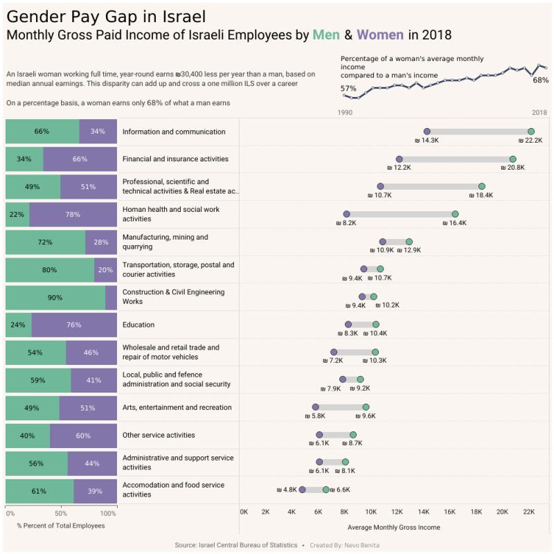
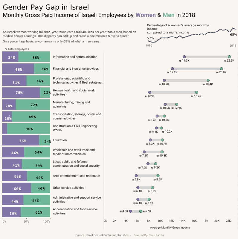
The graph presents the gap between the men and the women in the Israeli job market. As I said, the graph is excellent. However, there are several small problems that, like grains of sand in a chocolate mousse, stand in the way. Let’s take a look at them.
The time-series line in the upper right part of the graph shows good use of the real estate. The problem is that the X-axis ticks (the years) look as if they belong to the chart below. It takes some time to realize that the numbers are years of the upper graph, and not the X-axis of the graph below. Moving the numbers upwards by several pixels would have fixed that.
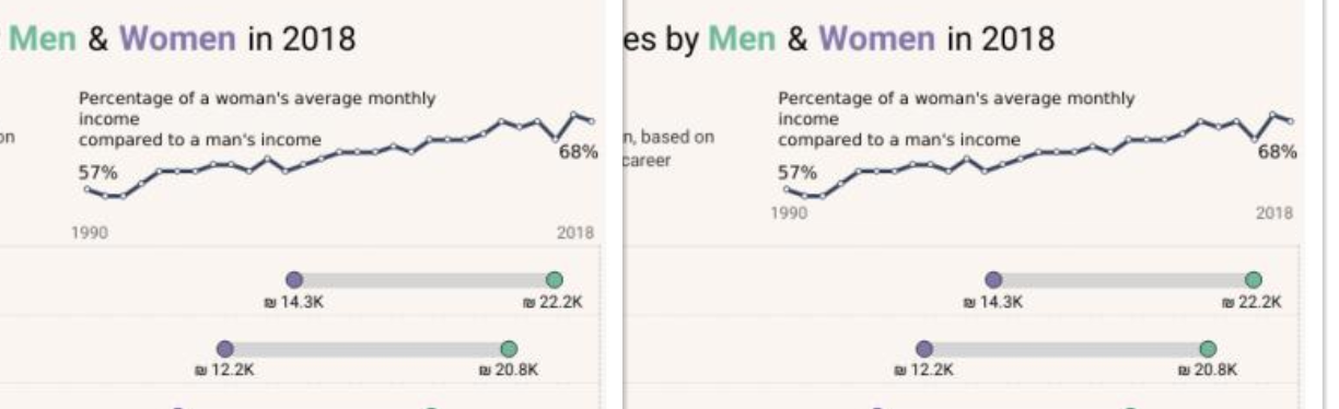 *Now, it is more clear that “1990” and “2018” relate to the time-series graph above.
Before (left) and after (right). *
Let’s talk about the left-side bar chart. It took me a while to understand what it is. As a matter of fact, I managed to write a critique paragraph about that bar chart, how it is unclear what the percentages are, and how they were computed. Only then had I noticed the explanation below. Such confusion isn’t the viewer’s fault. Since we usually scan images from top to bottom, moving the title to the top of the chart will reduce this confusion. The word “percent” is also redundant in that title since it comes after the percent sign.
 Moving the explanation to the top makes it easier to notice. Before (left) and after (right)
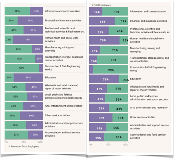
The last point that is worth optimizing is the color order. Consistent element order in an image makes navigation and comprehension much easier. When the order is preserved, our brain can use mental shortcuts without losing much information. When these shortcuts are broken, the brain has to work harder. What am I talking about? The graph author made the correct decision to use different font colors in the graph title to specify which color stands for which gender. This way, we don’t need a separate legend, and this is good. The title is an ordered sequence of words. The visualizer could use this order to create the order heuristic that is so helpful. Such a heuristic isn’t always possible. Fortunately for the visualizer (and sadly for the society), the salary gap in all the occupations in this graph have the same direction: men earn more than women. As a result, the rightmost part has all the green dots on the right, and the purple dots are on the left. This direction is opposite to the gender direction in the title and the color direction in the bar chart. To fix this situation, I made sure that the color that stands for the women (purple) is always to the left of the color that designates the men (green).
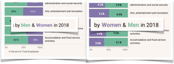 Keeping the color order. Before (left) and after (right)
So, this is the final result. I hope you can see why I like it better.
That’s how I took and excellent graph and made it even more awesome.


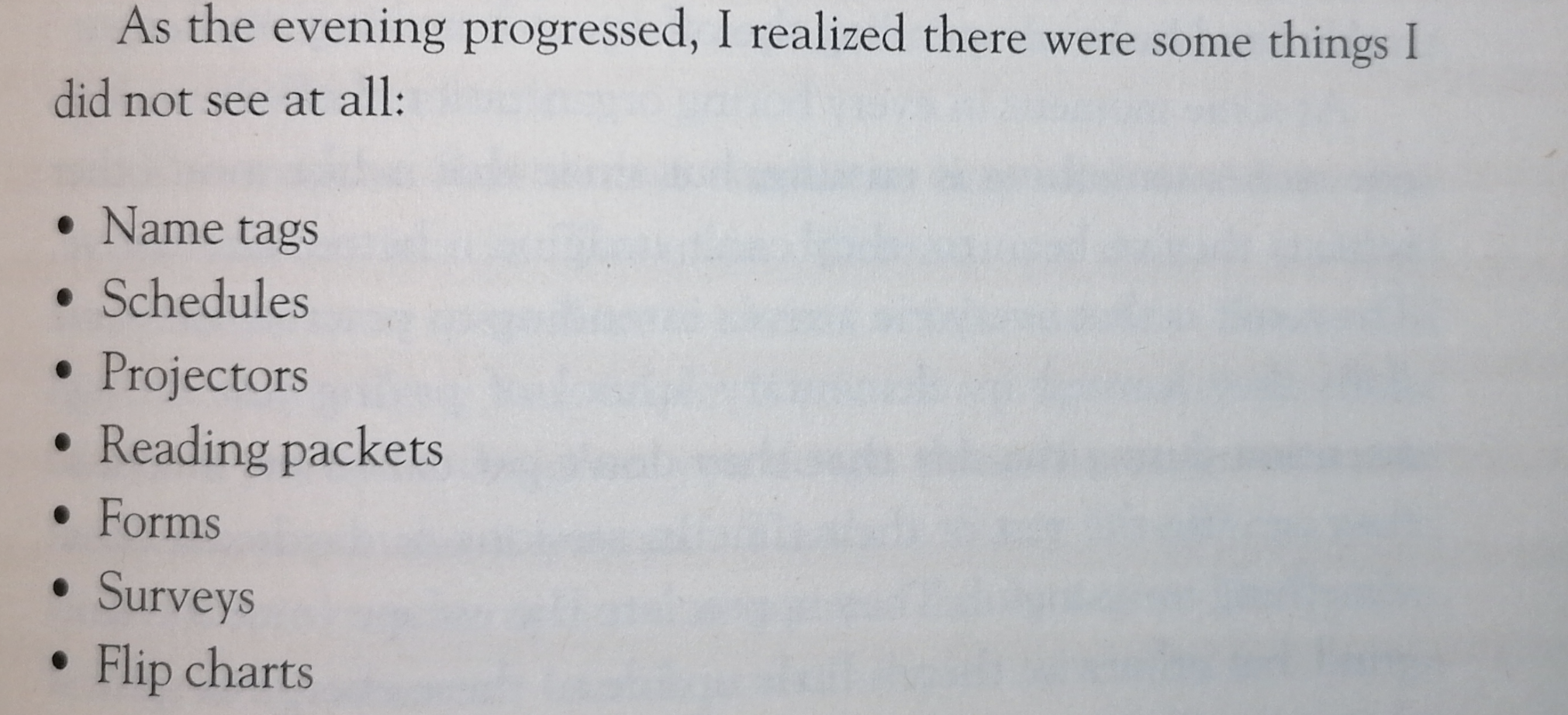
 Slight feeling of a hamster-wheel while reading this book