بعد حوالي سنتين من الدراسة ، بحس حالي جاهز لإضافة اللغة العربية إلى قائمة اللغات في ال-LinkedIn
After about two years of study, I feel ready to add Arabic to LinkedIn’s language list

بعد حوالي سنتين من الدراسة ، بحس حالي جاهز لإضافة اللغة العربية إلى قائمة اللغات في ال-LinkedIn
After about two years of study, I feel ready to add Arabic to LinkedIn’s language list
I had the honor to record an introductory data visualization course for high school students as a part of the Israeli national distance learning project. The course is in Hebrew, and since it targets high schoolers, it does not require any prior knowledge.
I got paid for this job. However, when I divide the money that I received for this job by the time I spent on it, I get a ridiculously low rate. On the other hand, I enjoyed the process, and I view this as my humble donation to the public education system.
Since a government agency makes the course site, it’s UI is complete shit. For example, the site doesn’t support playlists, and the user is expected to search through the video clips by their titles. To fix that, I created a page that lists all the videos in the right order.
https://he.gorelik.net/course/
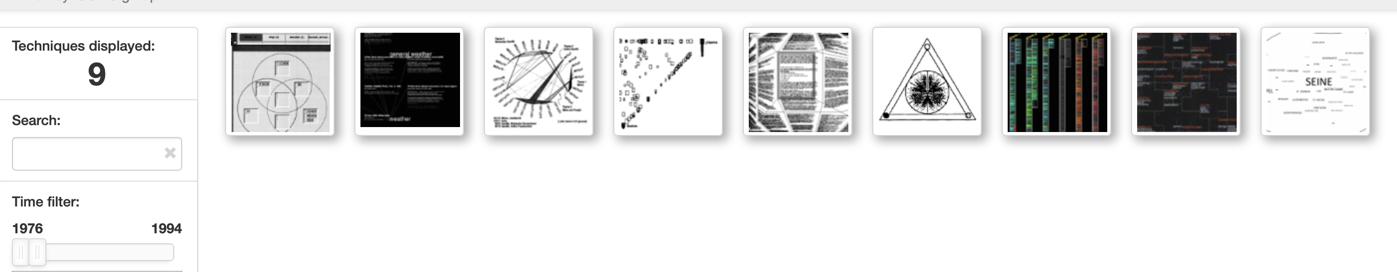
I’ve stumbled upon an exciting project – text visualization browser. It’s a web page that allows one to search for different text visualization techniques using keywords and publication time.
 Text visualization browser https://textvis.lnu.se
The ability to limit the search to various years gives a nice historical perspective on this interesting topic
This site’s information is based on a 2015 paper Text visualization techniques: Taxonomy, visual survey, and community insights. I wish the authors updated it with more recent data, though.

If you work, but nobody knows about your results or cares about them, have you done any work at all?
A proverbial tree in the proverbial forest. Photo by veeterzy on Pexels.com
As a data scientist, the product of my work is usually an algorithm, an analysis, or a model. What is a good way to share these results with my clients?
Since 99% of my time, I write in Python, I fell in love with a framework called Panel (http://panel.holoviz.org/). Panel allows you to create and serve basic interactive UI around data, an analysis, or a method. It plays well with API frameworks such as FastAPI or Flask. The only problem is that to share this work. Sometimes, it is enough to run a local demo server, but if you want to share the work with someone who doesn’t sit next to you, you have to host it somewhere and to take care of access rights. For this purpose, I have a cheap cloud server ($5/month), which is more than enough for my personal needs.
If you can share the entire work publicly, some services can pick up your Jupyter notebooks from Github and interactively serve them. I know of voila and Binder)
Recently, Streamlit.io is entering this niche. It currently only allows sharing public repos, but promises to add a paid service for your private code. I’m eager to see that.

This notebook is a part of my productivity system. Read more on productivity and procrastination here.
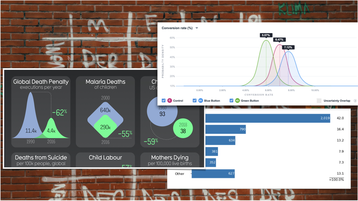
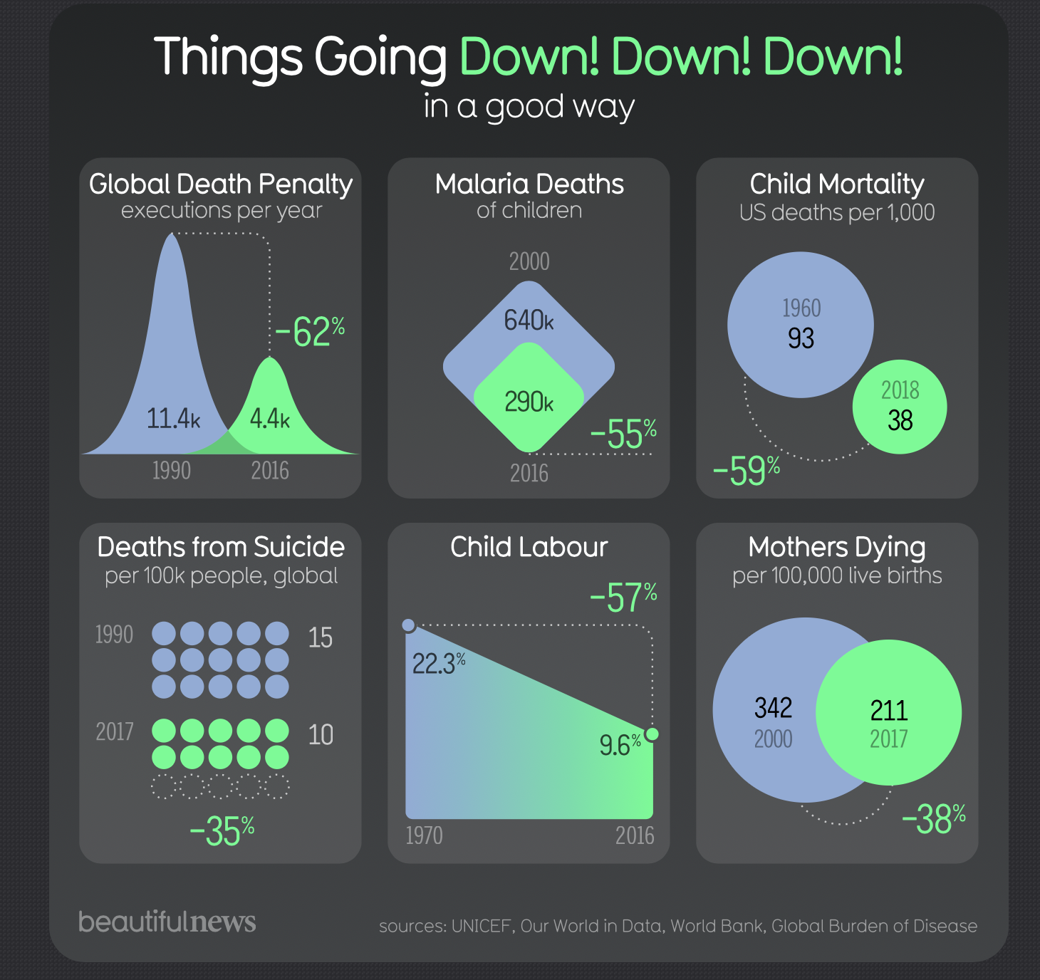
I apologize for my harsh language, but recently I was exposed to a bunch of graphs on the “information is beautiful” site, and I was offended (well, ot really, but let’s pretend I was). I mean, I’m a liberal person, and I don’t care what graphs people do in their own time. Many people visit that site because they try to learn good visualization practices, but some charts on that site are wrong. Very wrong.
Here’s the gem:
I deliberately don’t share the link to this site. I don’t want let Google think it’s valuable in any way.
Now, the geniuses from “Information is beautiful” (let’s call them IB for brevety) wanted to share with us some positive stats. How nice of them. So what they did? They gathered together nine pairs of metrics collected at two different time points: one in the past and one furthermore in history. They used nice colors to create some sleeky shapes. So, what’s the problem? What’s wrong with that?
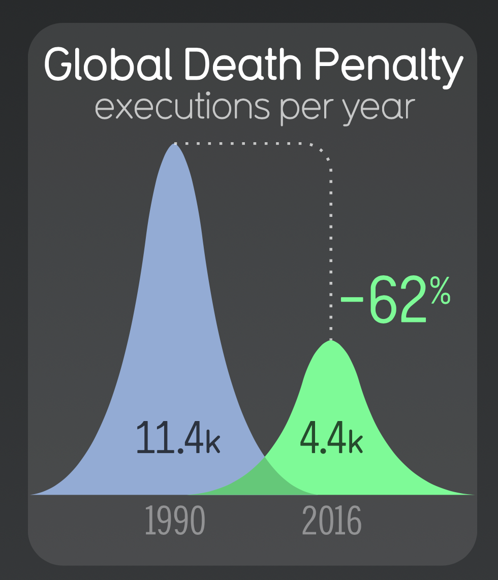
Let’s start from my guess that they cherry-picked the stats with “positive” changes. Secondly, the comparison of this sort is mostly meaningless if we compare points at different years. What stopped the authors of that tasteless “infographic” from collecting data from the same years? I guess, their laziness. That’s how we ended up comparing the number of death penalties in 1990 and 2016, but the malaria deaths numbers are for 2000 and 2016, and dying mothers are compared for years 2000 and 2017?
Take a look at this graph.
The only time we use shapes like that is when we want to convey information about uncertainty. To do that, the X-axis represents the thing we are measuring, and the Y-axis represents our certainty about the current value. When we compare to uncertain measurements, we may judge the difference between these measurements by the distance between the curve peaks, and the width of the curve represents the uncertainty.
Here’s a good example from [this link]:
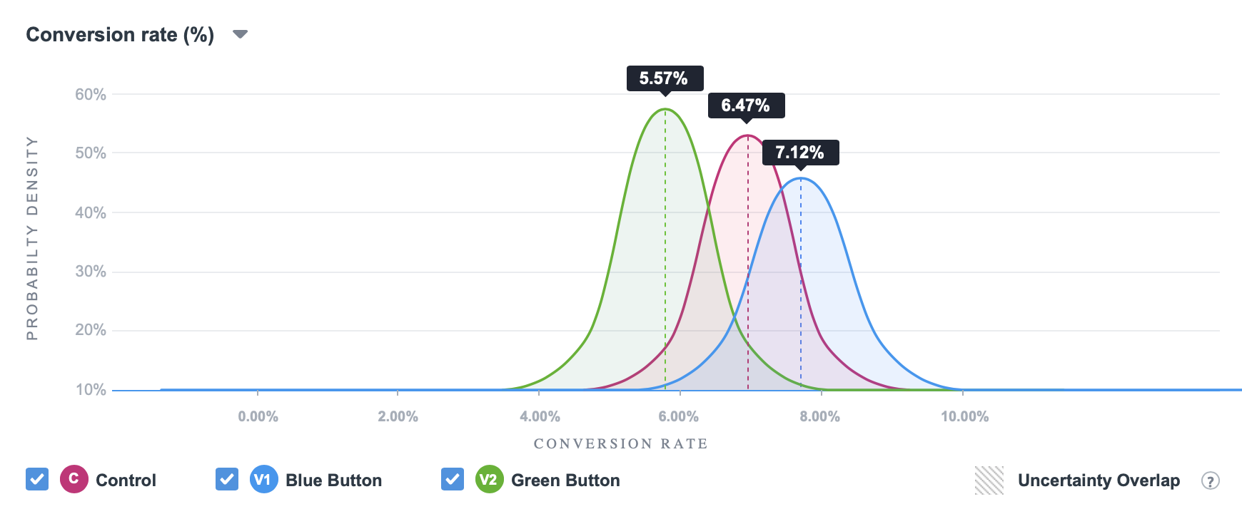
Can you see how the metric of interest is on the X-axis? The width of each bell curve represents the uncertainty and the difference between any pair of cases is the difference on the horizontal (X) axis, not the vertical one.
Instead, what do the IB authors did? They obviously like sleek looking shapes but know nothing about how to use them. They could have used two bars and let the viewer compare their heights. But nooooo! Bars are not c3wl! Bars are boring! Instead, they took probability density curves (that’s how they are technically called) and made them pretend to be bars.
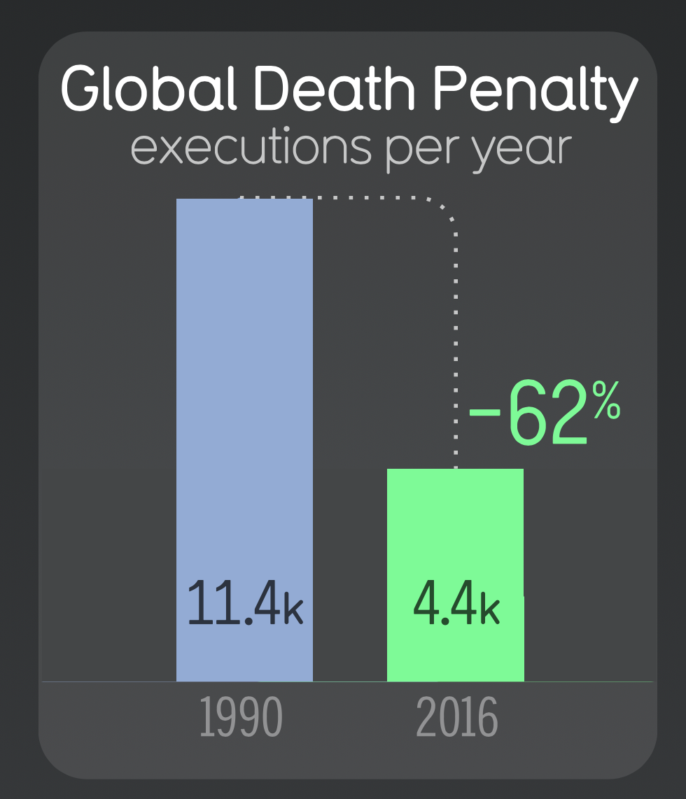 Bars. Is this THAT hard?
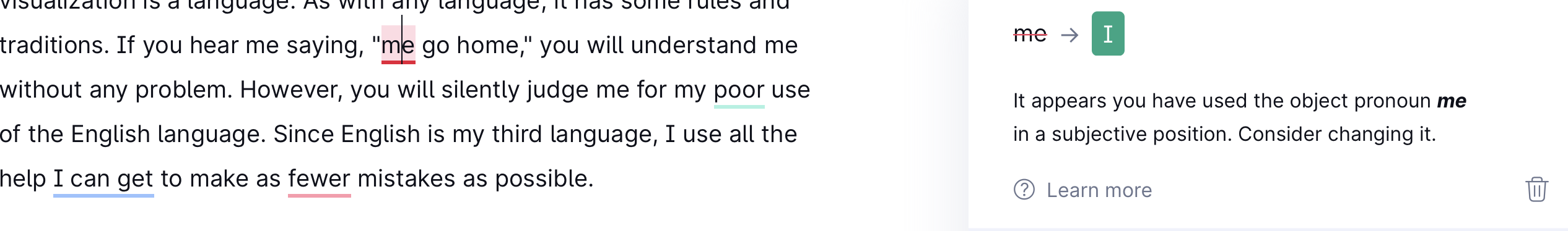
I can hear some of you saying, “Stop being so purist! What’s wrong with comparing the heights of bell curves?” I’ll tell you what’s wrong! Data visualization is a language. As with any language, it has some rules and traditions. If you hear me saying, “me go home,” you will understand me without any problem. However, you will silently judge me for my poor use of the English language. I know that, and since English is my third language, I use all the help to make as few mistakes as possible. The same is correct with data visualization. Please respect its rules and traditions, even if (and especially if) are not fluent in it.
 I never write more than two sentences in English without Grammarly
Visit the worst practice tag in this blog to see more bad examples

I am seldomly jealous of people, but when I am, I’m jealous of Stephen Wolfram
Towards a Science of Metamathematics One of the many surprising things about our Wolfram Physics Project is that it seems to have implications even beyond physics. In our effort to develop a fundamental theory of physics it seems as if the tower of ideas and formalism that we’ve ended up inventing are actually quite general,…
The Empirical Metamathematics of Euclid and Beyond — Stephen Wolfram Blog

My guest talk at Automattic.
Boris Gorelik recently joined us to present on The Biggest Missed Opportunity in Data Visualization based on his recent talk at the NDR conference. Boris was a data scientist at Automattic, is now a data science consultant, and blogs regularly on data visualization and productivity. Some of highlights (along with a handy timestamp) include: Keep […]
Boris Gorelik on the biggest missed opportunity in data visualization — Data for Breakfast
https://video.wordpress.com/embed/unSMD0ZA?preloadContent=metadata&hd=1
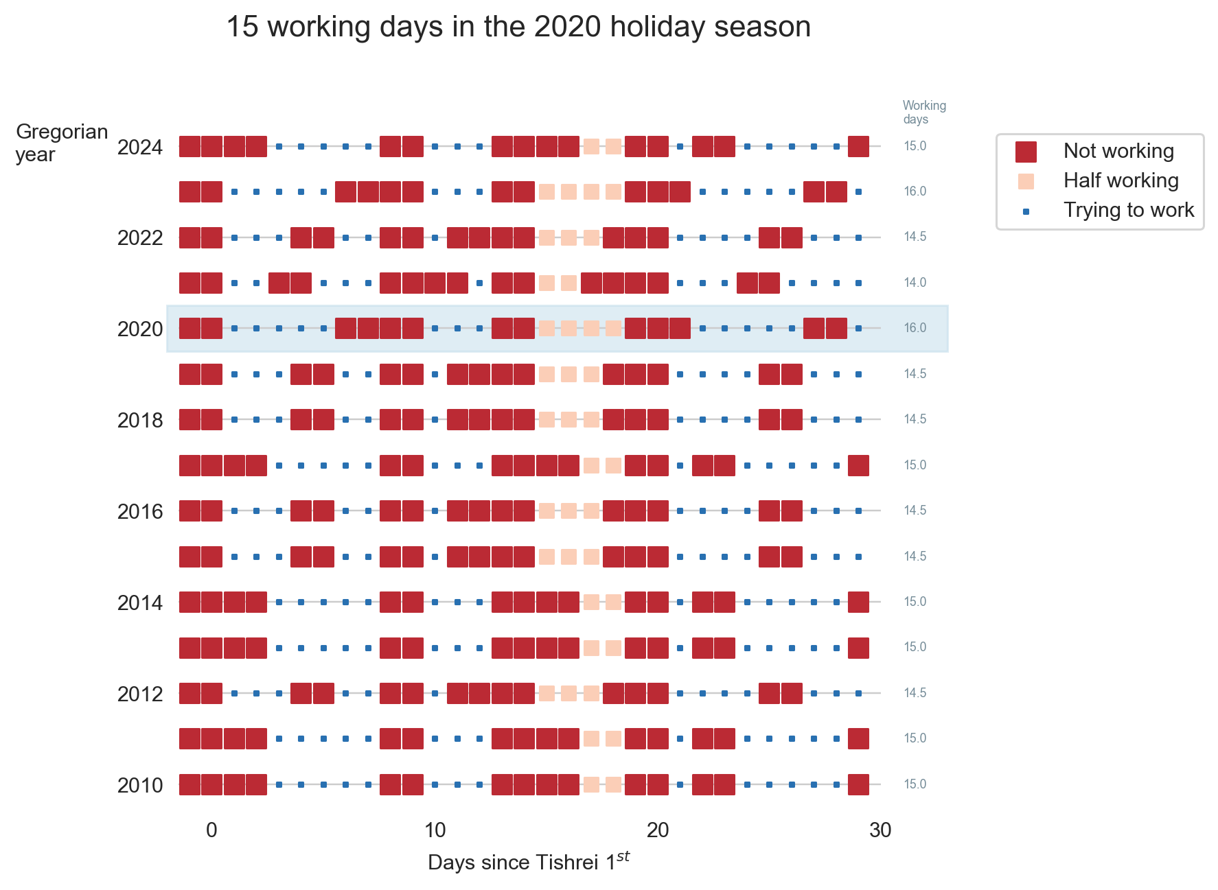
Tishrei is the seventh month of the Hebrew calendar that starts with Rosh-HaShana — the Hebrew New Year. It is a 30 days month that usually occurs in September-October. One interesting feature of Tishrei is the fact that it is full of holidays: Rosh-HaShana (New Year), Yom Kippur (Day of Atonement), first and last days of Sukkot (Feast of Tabernacles) **. All these days are rest days in Israel. Every holiday eve is also a *de facto rest day in many industries (high tech included). So now we have 8 resting days that add to the usual Friday/Saturday pairs, resulting in very sparse work weeks. But that’s not all: the period between the first and the last Sukkot days are mostly considered as half working days. Also, the children are at home since all the schools and kindergartens are on vacation so we will treat those days as half working days in the following analysis.
I have counted the number of business days during this 31-day period (one day before the New Year plus the entire month of Tishrei) between for a perios of several years.
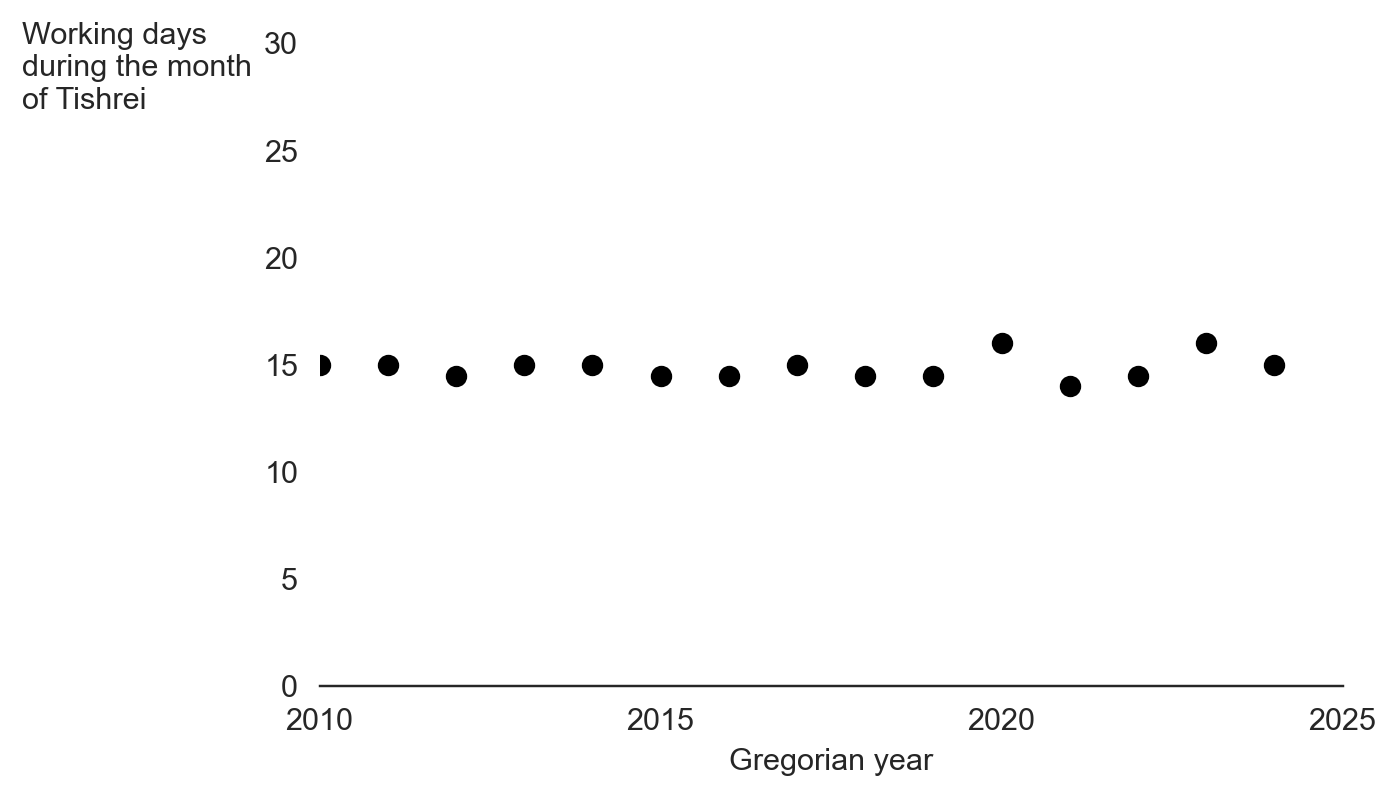
Overall, this period consists of between 15 to 17 non-working days in a single month (31 days, mind you). This is how the working/not-working time during this month looks like this:
Now, having some vacation is nice, but this month is absolutely crazy. There is not a single full working week during this month. It is very similar to the constantly interrupt work day, but at a different scale.
So, next time you wonder why your Israeli colleague, customer or partner barely works during September-October, recall this post.
(*) New Year starts in the seventh’s month? I know this is confusing. That’s because we number Nissan – the month of the Exodus from Egypt as the first month.
(**)If you are an observing Jew, you should add to this list Fast of Gedalia, but we will omit it from this discussion

Will Cray [link] is a fresh M.Sc. in Computer Science and considers becoming a freelancer in the Machine Learning / Artificial Intelligence / Data Science field. Will asked for advice on the LocallyOptimistic.com community Slack channel. Here’s will question (all the names in this post are used with people’s permissions).
Read more career advices [here].
Let’s begin.
Will Cray
I’m hoping to start a career as a freelancer in the AI space after finishing my Master’s in CS with a focus in AI. I don’t, however, have any industry experience in AI or data science. Do you all think it’s feasible to start a freelancing career without any industry experience? If so, do you have any tips on how to do it successfully?
[I worked for] two years at a major tech company, but I was a systems engineer. It was experience that isn’t necessarily relevant to what I want to work on as a freelancer.
Let’s divide the response to Will’s questions into two parts that correspond to Slack’s two discussion threads.
This is a copy/paste from Slack.
Michael Kaminsky
 LocallyOptimistic.com – a valuable source for data folks
My hunch is that it’s going to be pretty tough to get started, though not impossible. You’re probably looking at a pretty lean year or two to build up a reputation out of the gate
Michael Kaminsky
AI work in general is sort of difficult to contract out — so you might have more luck if you team up with a larger consulting outfit that can handle the other non-AI parts of the work
Michael Kaminsky
very rarely is someone like “we have all of the data pipeline and pieces working, now we just need to hire someone to do the AI part” — in general, the model-fitting part of an AI project is the easiest and fastest
Will Cray
Thank you so much for the info–it’s really helping me getting a better understanding of the landscape. Would your opinion, especially regarding that last message, change if the AI work I was doing was more custom model/agent design and training, rather than doing something quick like .fit() in sklearn?
Michael Kaminsky
ummm maybe? but like who needs custom model/agent design and training that doesn’t already have in-house data scientists working on it?
Michael Kaminsky
I don’t want to dissuade you, but my point is that you should think about who your customers are, and how you can market your services in such a way that it will provide them value. If you don’t have a clear map of the three concepts in italics, it could get rough — you can definitely figure it out by doing it, but that’s what you’ll be up against
Will Cray
You mentioned “larger consulting outfits” earlier–do you have any examples of organizations that you think could be a good fit?
Michael Kaminsky
so Brooklyn Data Company and 4 mile consulting are the two that jump to my mind — they specialize in BI and data but might want flex capacity into DS — they might be able to give you deal flow, etc. I know there are a number of others, maybe even folks in this channel
This is a copy/paste from Slack with some later edits and additions.
Boris Gorelik
Another thing to consider is what your risks are. If there are people who depend on you financially, starting with a freelance career might be too risky, especially if you don’t have 1-2 (better 2) customers who already committed to paying you for your services.
If you can afford several months without a steady income, or no income at all, being a freelancer might expose you to a larger variety of companies and business models in the market. I know some people who used to work as freelancers and gradually “adopted” one customer and moved to full employment. In these cases, freelance projects were, in fact, mutual trial periods where both sides decided whether there is a good fit.
Will Cray
I greatly appreciate this insight. I have little risks. I’m single, my living expenses are low, and I have some financial runway. Part of the reason I like the idea of freelancing is for the reason you stated–I’ll get to see many different business models. As an aspiring entrepreneur, I think diversity of experiences and exposure would be useful to me. I also think being flexible in how many hours I work will allow me to allocate more time to developing my own ideas/projects; although, I understand that’s a luxury that comes with being an established freelancer. I don’t have any clients currently. Do you have any recommendations for channels to try and garner clients?
Boris Gorelik
As an aspiring entrepreneur, I think ….
Even though a freelancer and an entrepreneur’s legal status may be the same, they are different occupations and careers. An entrepreneur creates and realizes business models; a freelancer sells their time and expertise to fulfill someone else’s ideas. That’s true that most of the time (not always), combining freelance with entrepreneurship is easier than combining entrepreneurship with being a full-time employee in a traditional company.
Do you have any recommendations for channels to try and garner clients?
Nothing except the regular facebook/linkedin/ but mostly friends and former coworkers and, in your case, teachers/lecturers. I got my first job interview via my Ph.D. advisor. Later, when I helped in hiring processes, I asked him and other professors to refer me to proper candidates. So yeah, make sure your professors know your status.

A population pyramid also called an “age-gender-pyramid”, is a graphical illustration that shows the distribution of various age groups in a population (typically that of a country or region of the world), which forms the shape of a pyramid when the population is growing [citation from Wikipedia].
In some cases, the pyramid provides interesting insights into the entire population. In this post, I will explore ways to make some of these insights more visible.
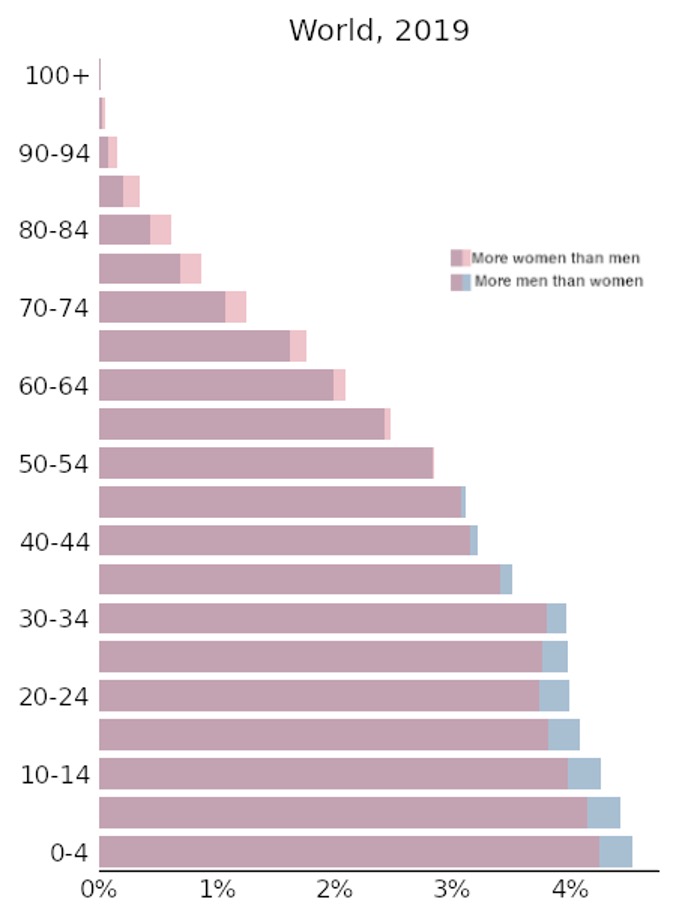
Let’s start with the basic case. If you have two-three hours of spare time, you can go to the site devoted to population pyramids – https://www.populationpyramid.net. There, you will find population pyramids for every country in the world. The site provides present and past data, as well as future forecasts. To understand how insightful age pyramids can be, look at the graph that represents the entire world.
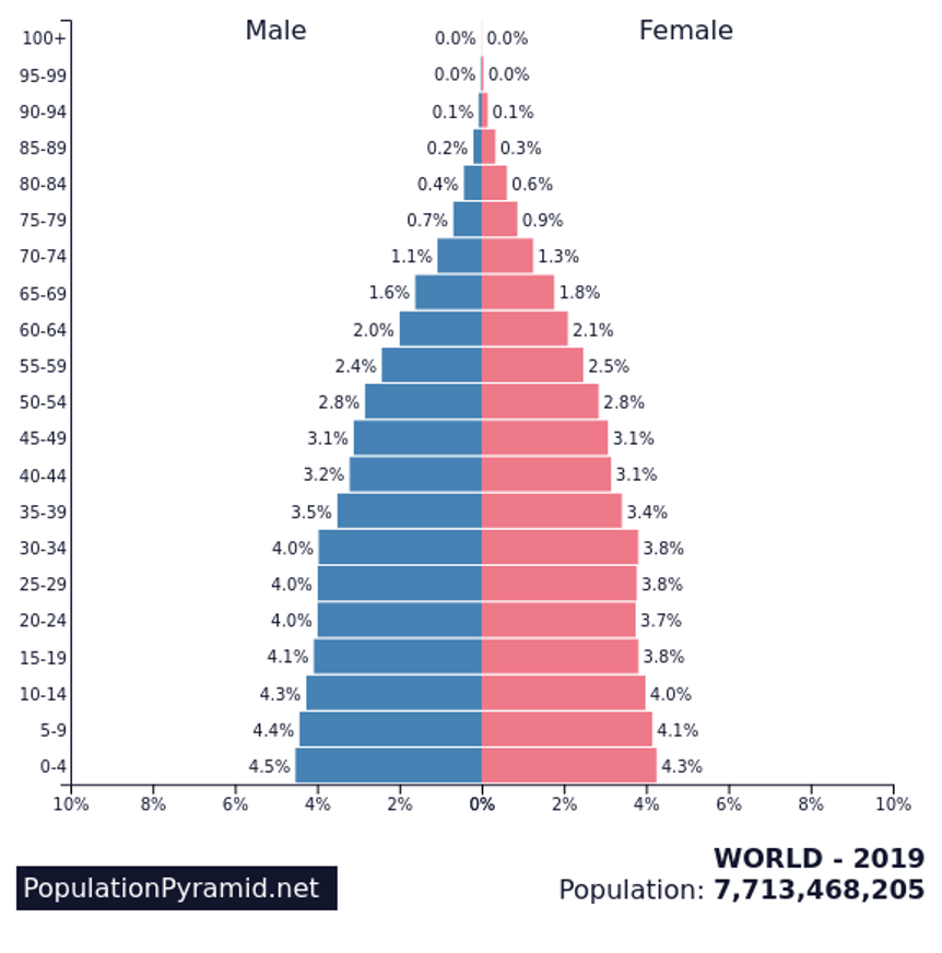
(this and most other images in this post are from the site http://populationpyramid.net/)
You can clearly see that the world is mostly young, that the amount of people declines as the age progresses, and that there is a rough balance between men and women in the world, at least before the ages of 70+.
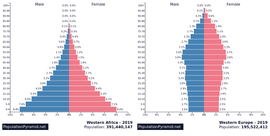
Now, examine the stark difference between the populations of Western Africa and Western Europe. Citing the late professor Hans Rosling, we can still see two worlds, one with large families and short lives, and one with small families and long lives.
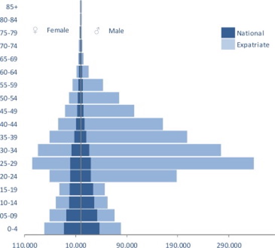
Another starking example of an age pyramid is the following
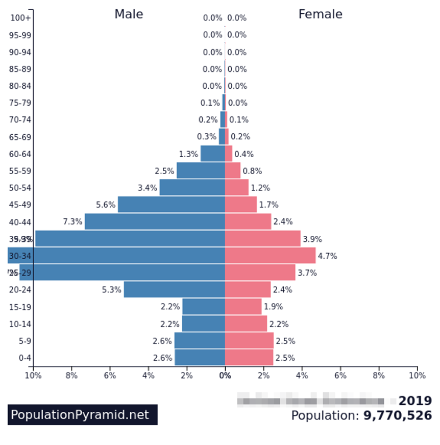
Do you want to guess what country is that? This particular graph shows the age distribution of the United Arab Emirates. Such a vast distortion in symmetry and age distribution stems from the fact that more than 80% of the UAE’s population is composed of expats who come to this rich country to work. The pyramid below (taken from [this article]) sheds some light to the population composition of UAE. (Note that the genders in this graph are reversed).
The male-female disbalance in the UAE and some other Gulf countries is very striking and cannot be missed. But what about other, more subtle cases? Take a look at the world graph above. If you follow the numbers on the bars, you will notice that more boys are born than girls, but there are more old ladies than old gents in the world. Can we make such differences less subtle?
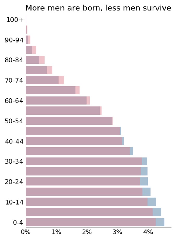
To answer this question, we need to understand why we find it hard to compare almost equal bars. The reason for that is that our eyes (or brains) are not so good at comparing sizes. They do, however, do a much better job comparing positions. Thus, if we overlap these bars, we will see the small differences in a much more precise manner.
(I thank the data visualization expert Bella Graf from InfoServiz.co.il for the idea of this graph).
Now, the subtle differences in gender composition are more visible.
When I teach data visualization, I always tell my students to add a meaningful title to the graph. By “meaningful,” I mean a title that does not answer the question “what” but rather “so what”? (See my posts “How to suck less in data visualization,” and “C for conclusion”). What would a good title for this graph be? Let’s try the following
OK, so now, when we have a title, we can ask ourselves, “does the graph show what it says it shows”? And the answer is no. Right now, the title talks about differences, but we don’t see the differences. We see the differences and other stuff. Let’s look only at the differences.
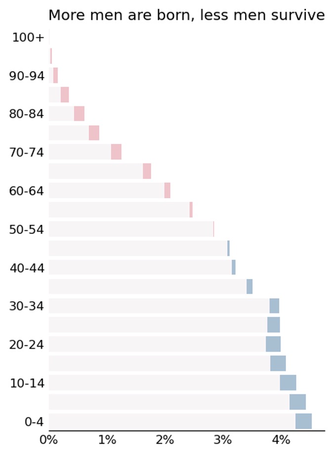
I don’t like this.
What about this?
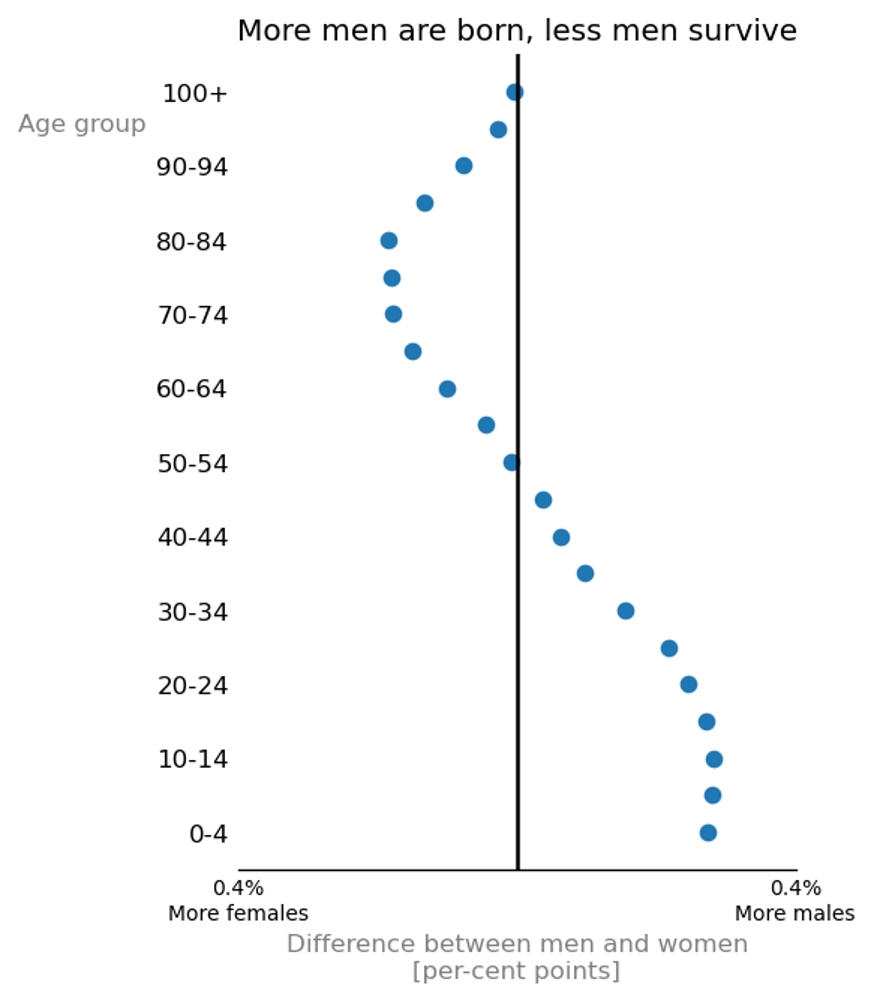
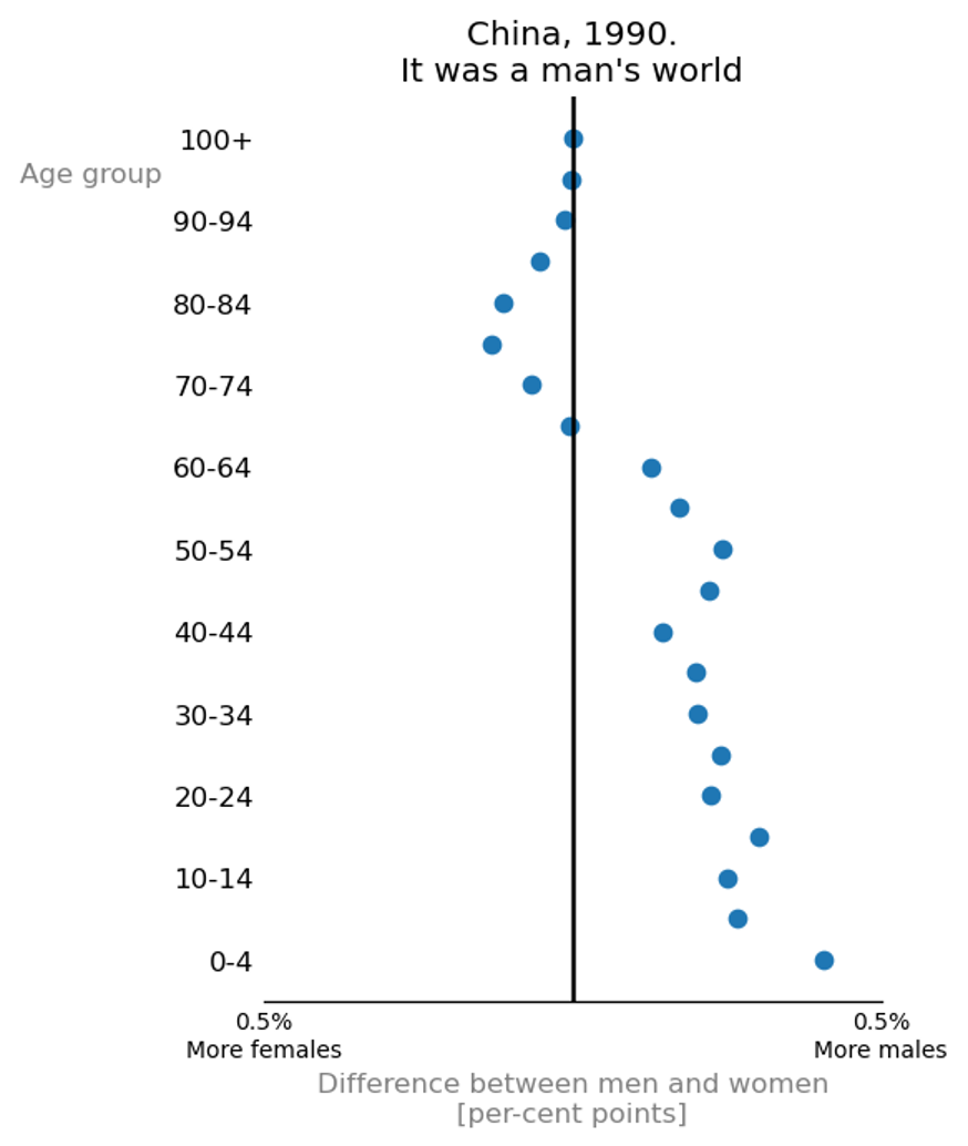
Now, this is not an age pyramid. That’s for sure. This graph doesn’t show the wealth of data that the classical pyramid shows. On the other hand, it does offer one thing, and it does it very well. Look, for example, at the male/female distortion in China in 1990.
You may find the code I used to create the graphs in this post [on GitHub].

When the .blog TLD was started by Automattic, employees were given the option to reserve a domain for free. In return […], they asked that the domain be used as a primary domain (no forwarding to a different site), and that the site be updated with new content at least once a month. This requirement was the last argument for me NOT taking boris.blog – I didn’t want to make this commitment, plus I like gorelik.net a lot.
Recently, there were some not so nice developments about .blog names that were given away to Automatticians. The complains about this situation are usually anonymously, but I think that in this case, anonymity isn’t the right approach. That is why, I decided to share here an anonymous post from the Antimattic blog. Although I am not the author of this original post, and I don’t share the views of some of the posts written there, I do share the concerns expressed in this particular article. Posting in return for a domain name might have been a reasonable request at the beginning of the .blog TLD to help promoting its adaptation. But now, several years after this TLD is active, this requirement is simply not OK. To read the original post, click the screenshot below.
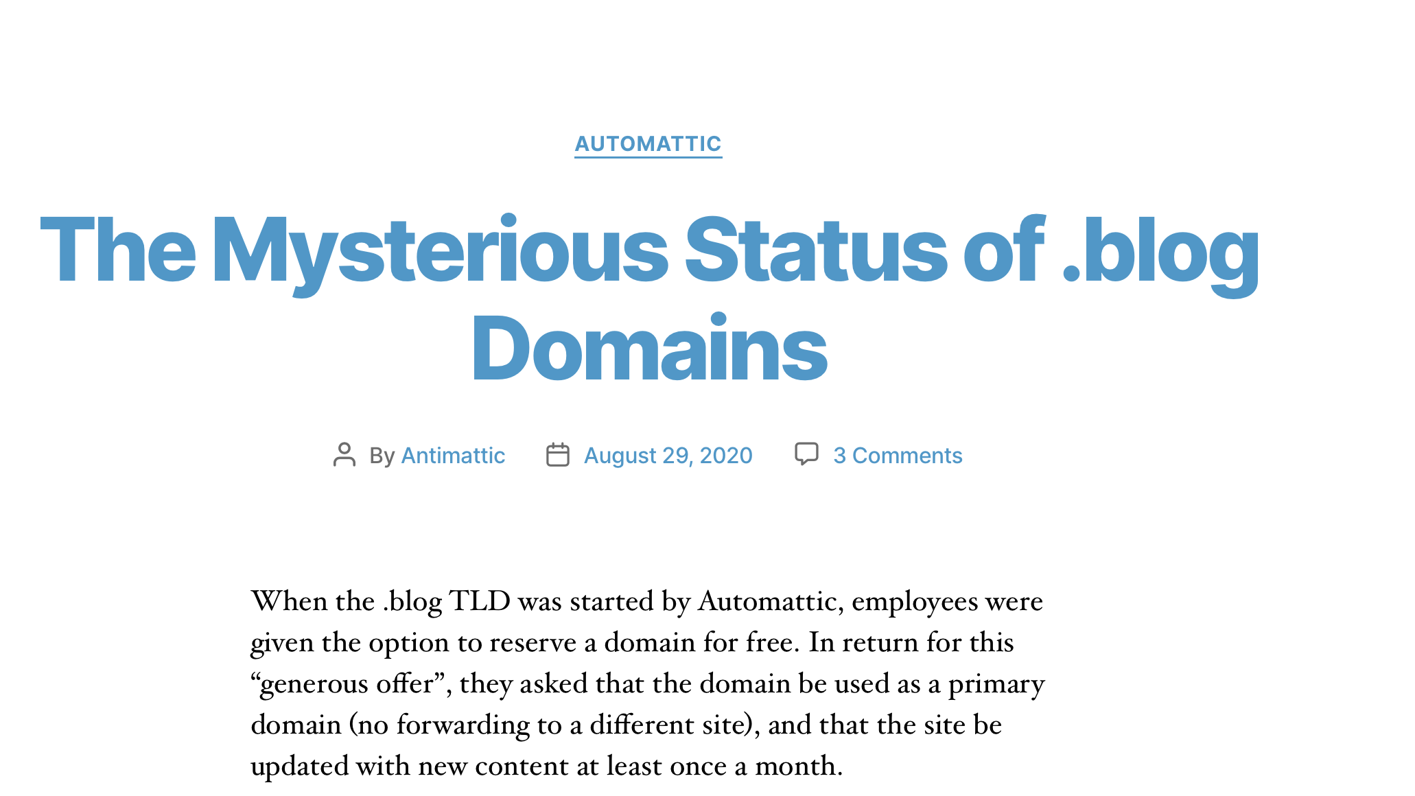
The first paragraph of this post is a verbatim copy from Antimattic.
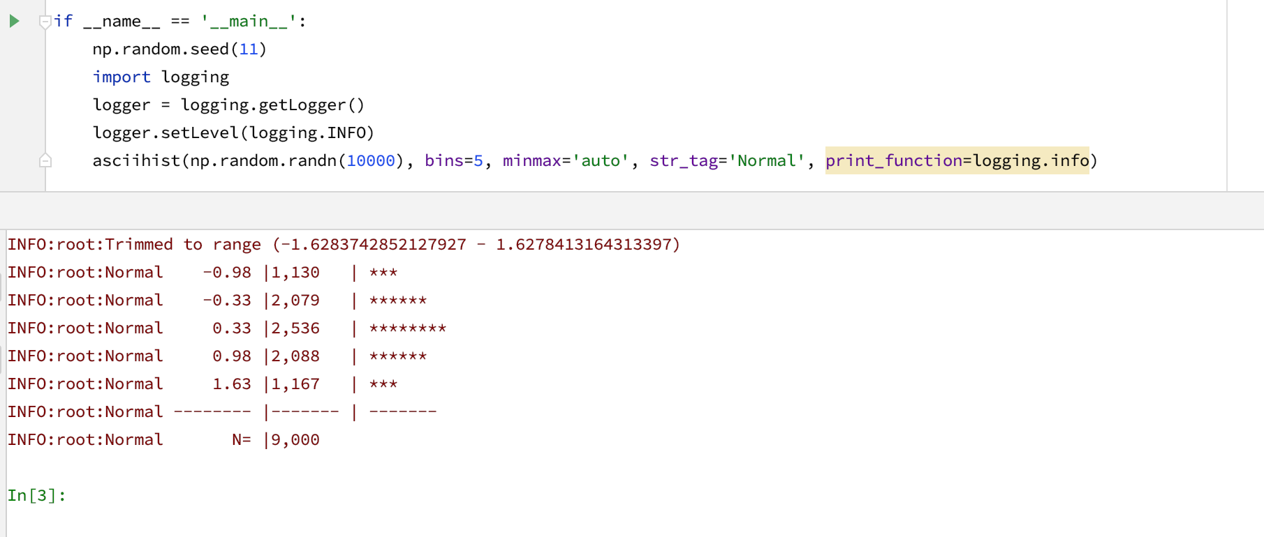
From time to time, we need to look at a distribution of a group of values. Histograms are, I think, the most popular way to visualize distributions. “Back in the old days,” when most of my work was done in the console, and when creating a plot from Python was required too many boilerplate code lines, I found a neat function that produced histograms using ASCII characters.
Recently, I updated the python function that I use to create ASCII histograms. The updated function [link] uses more modern formatting and includes several signal-to-noise improvements. One can also use it with custom output functions, such as logging.info.

This post contains a bunch of links to blogs that write about productivity.
This is not an exclusively productivity blog. The authors of this collective effort write about other interesting things. I read some posts, and I liked them
2. Self care
Do you know that feeling when you feel bad and don’t have the energy to do anything about that? This post is for you.

3. Saying NO
Being a freelancer, I have to practice saying NO. Saying NO isn’t only good for productivity but also for your mental health. Interesting post.


An interesting post by my former coworker, Yanir Seroussi.
Previously, I encouraged readers to test different approaches to bootstrapped confidence interval (CI) estimation. Such testing can done by relying on the definition of CIs: Given an infinite number of independent samples from the same population, we expect a ci_level CI to contain the population parameter in exactly ci_level percent of the samples. Therefore, we […]
Many is not enough: Counting simulations to bootstrap the right way — Yanir Seroussi

TL;DR If you are an Israeli and don’t feel like learning the behind the scenes stories, skip it. Otherwise, I do recommend reading this book. I enjoyed it a lot 4.5/5
The Abyss: Bridging the Divide between Israel and the Arab World went to print slightly after the outbreak of the “Arab Spring.” The author, Eli Avidar, is a former Israeli intelligence officer and diplomat. Among other things, Eli Avidar served as the head of the Israeli diplomatic mission to Qatar in 1999. Today, Eli Avidar is a Knesset member for the right-wing Yisrael Beiteinu party. Even though so many things have changed since the book was published, I didn’t find any claim that Eli Avidar made, and that turned out to be wrong, nine years after the publication.
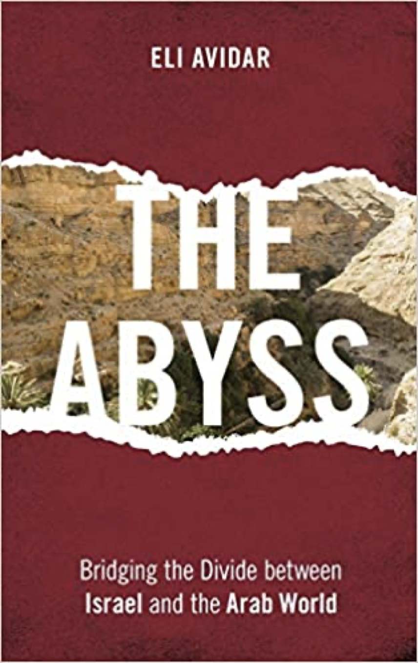
I enjoyed reading this book a lot despite the fact that most of Eli Avidar’s claims are not new to me. Most of them are widely known to all the Israelis, and the real question is not whether you are aware of these claims, but whether you agree with them and what conclusions you make out of them.
On the other hand, The Abyss is an interesting storybook full of behind the scenes anecdotes and gossip. All who know me know how much I like gossips. It also provides a great introspection of how the (Jewish-)Israeli society sees the Arab-Israeli conflict, and what it feels towards it.
Should you read the book? If you are an Israeli and don’t feel like learning the behind the scenes stories, you may skip it. Otherwise, I do recommend reading this book. I don’t know how accurate is Avidar’s description of the Arab world, but his analysis of the Israeli behavior and attitude is very accurate. If you ever cough yourself wondering “What the fuck do the Israelis think?”, this book might shed some light for you. That is why I write this review in English, despite my tendency to review Hebrew books in my Hebrew blog.

Fun fact. I finished reading this book on August the 13th. I closed the book, opened Twitter, and saw my feed FULL with news about the upcoming normalization treaty between Israel and UAE.

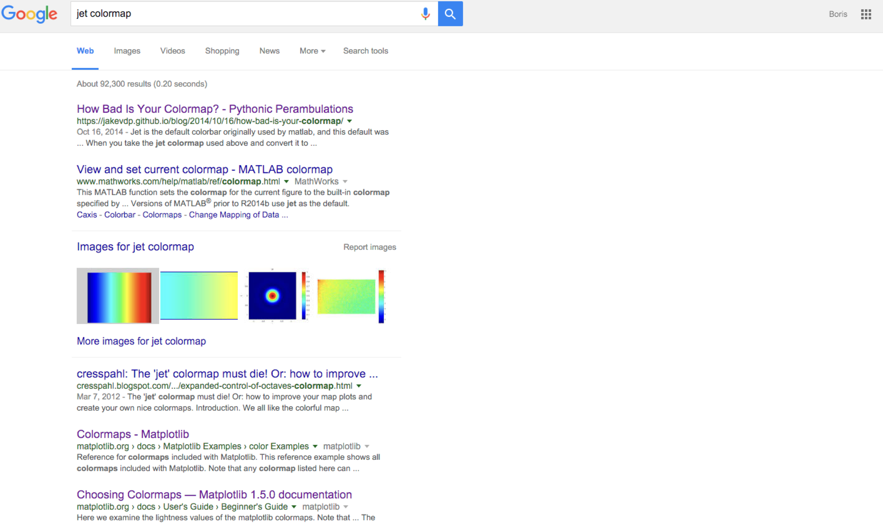
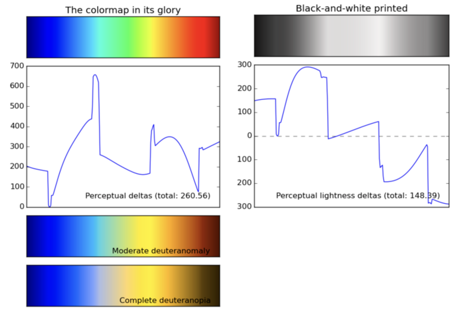
There was a consensus among the data visualization purists that the rainbow color map, and it’s close cousin Jet are bad. Really bad. These colormaps used to be popular at the beginning of the computational data visualization era. However, their popularity decreased in the last five years or so. The sentiment isn’t as bad as it used to be a couple of years ago, but still.
 A screenshot from circa 2016. Today we are less fanatic than that
What is the biggest problem of the rainbow colormap? The most apparent problem with this particular colormap is that it not perceptually uniform. By “perceptually uniform,” I mean that equal changes in the value that we encode using a colormap should correspond to same changes in the color perception. This is not the case with the rainbow or the Jet colormaps. They have distinct bright and dark stripes within the number range, making them the wrong choice to encode numerical data. The situation is even worse for people with impaired color vision.
 Can you be less perceptually uniform?
The solution to this problem was proposed in the form of better colormaps. The first one that I know of is Parula by Matlab, and it’s opensource alternative Viridis that is available in matplotlib and many other plotting libraries. (Watch this video about viridis to get a good introduction to color perception and color maps).
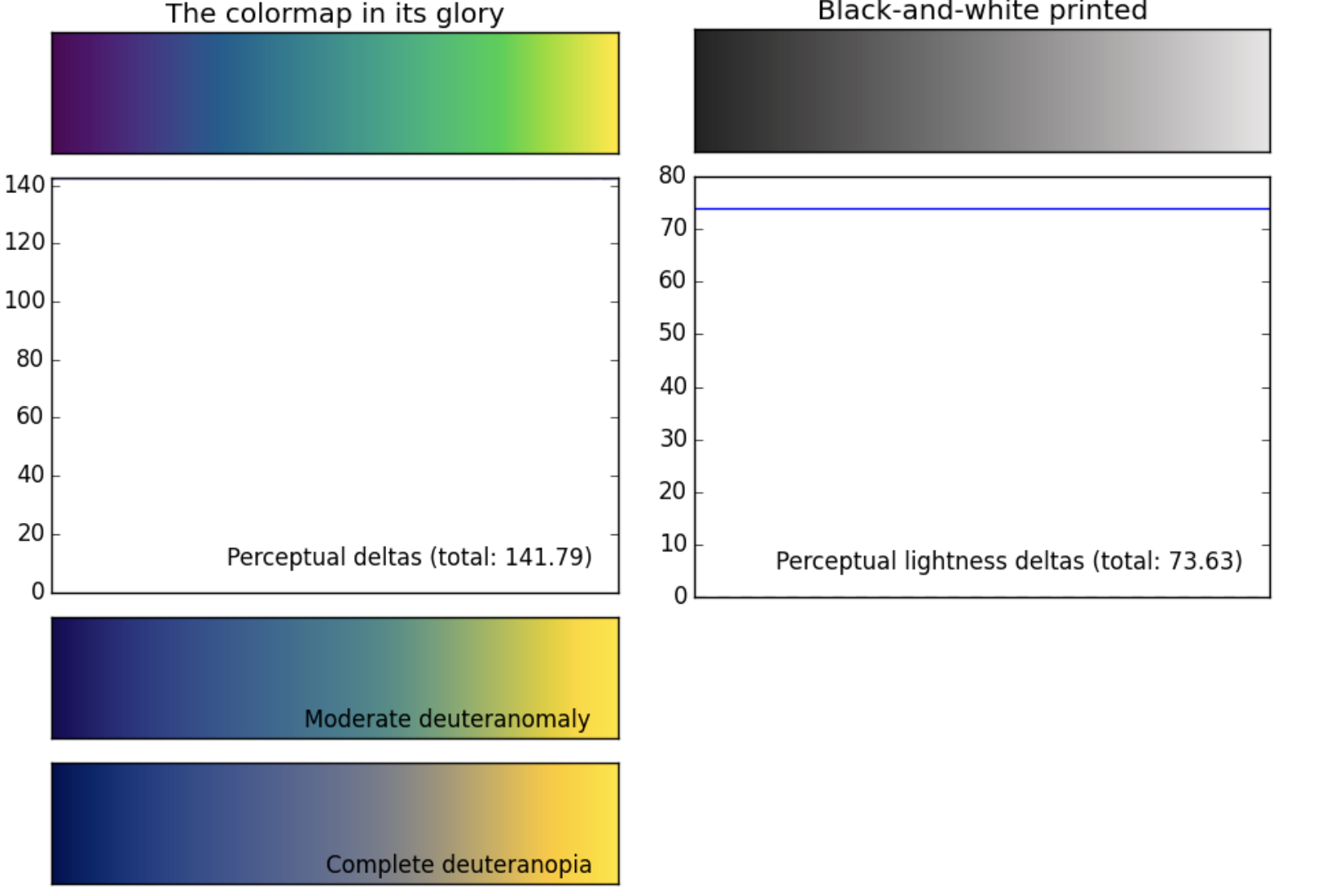 Viridis, the new rainbow
Everything was nice and good, and I was trashing the rainbow colormap whenever I could. Until yesterday, when I read about Turbo, the improved rainbow colormap developed by Google.
In the long and interesting blog post that describes Turbo, Anton Mikhailov, a software engineer in Google, describes several relevant applications of a “good rainbow” scheme.
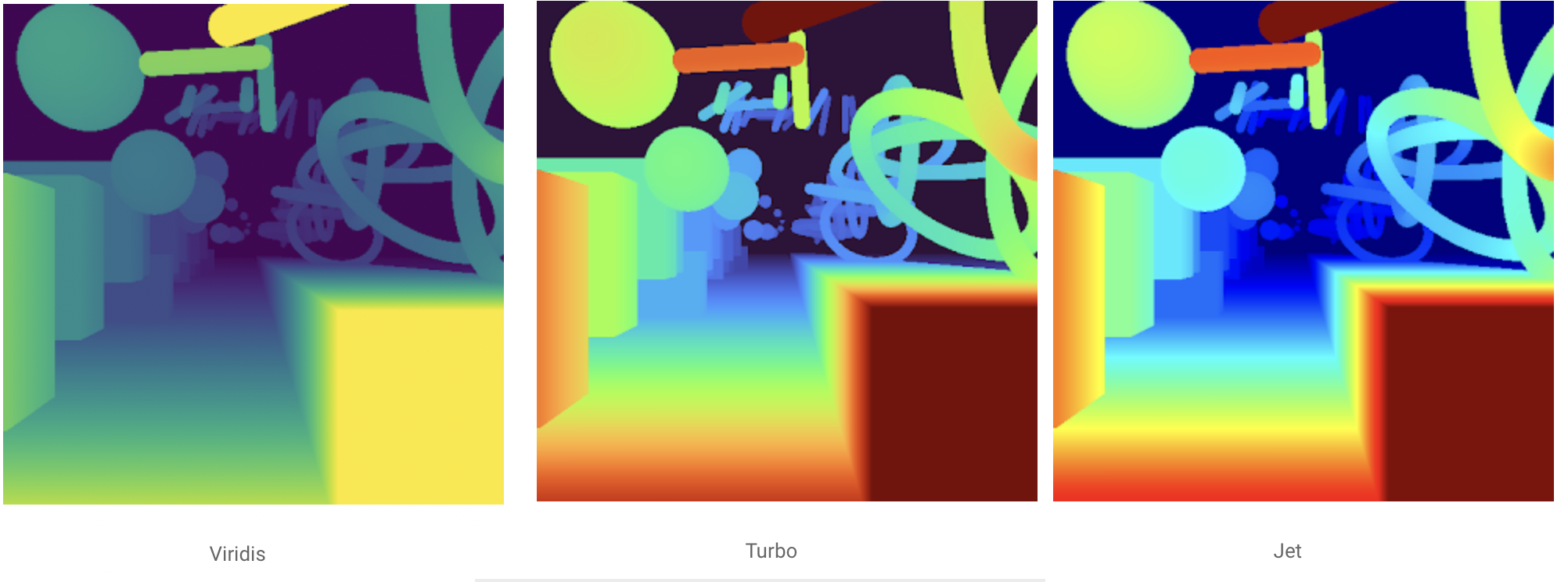
According to Anton, “Because of rapid color and lightness changes, Jet accentuates detail in the background that is less apparent with Viridis** **and even Inferno. Depending on the data, some detail may be lost entirely to the naked eye. The background in the following images is barely distinguishable with Inferno (which is already punchier than Viridis), but clear with Turbo.”
I must admit that I’m convinced.
The biggest problem with that is mentioned concerning the original rainbow scheme that its brightness varies too much. However, it turns out that the color saturation and hue attract our attention more than the lightness (here’s the reference which I haven’t read yet). As such, it makes sense to construct a colormap that relies more on color and hue changes.
Moreover, in many cases, the interesting details appear in the extreme values of the data range, not in the middle. In thes cases, a properly applied rainbow-like color scheme becomes a valid choice.
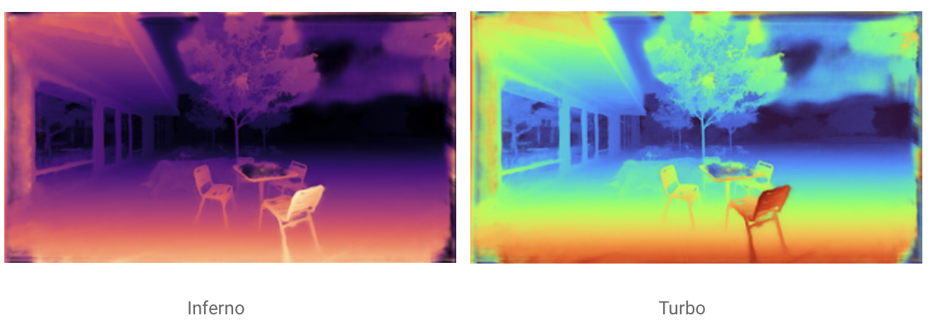
The bottom line is that one should not refrain from using rainbow(-like) color maps in their visualizations anymore, provided that they use a modern implementation. Luckily, it’s even available in matplotlib

Many people know me as a data scientist. However, I also teach, which is sort of unnoticed to many of my friends and colleagues. I created a page dedicated to my teaching activity. Talk to me if you want to organize a course or a workshop.
I also highly recommend teaching as way of learning. So, if you don’t teach yet, start! It will make you a better professional.
In technical communication, the main thing is to keep the main thing the main thing. There are multiple ways to ensure this principle. Some of these ways require careful chart fine-tuning. However, there is one tool that is easy to master, fast to apply, and that provides a high return on the investment rate. I refer to chart titles. In this talk, I had two main theses. My first thesis is that most of you suck in communication (and not only data visualization).
My second thesis is that you can quickly improve your graphs by merely adding a good title. The importance of good titles is not new to my preaching, but I thought it was an excellent thing to formalize this thesis a bit, and I’m thankful to the NDR organizers for giving me this opportunity.
Following is the slide stack from my NDR presentation.
https://www.slideshare.net/borisgorelik/the-biggest-missed-opportunity-in-data-visualization
I will be talking about data visualization at the next NDR conference on July 28. All the conferences organized by the NDR team are well organized and of a very high value. I hope to keep the level high.
And here’s the brief description of my talk
See you

If you plan working data analysis or processing, read the excellent post in the “stats with cats blog” titled “35 Ways Data Go Bad” post. I did experience each and every one of the 35 problems. However, this list is far from being complete. One should add the comprehensive list of Falsehoods Programmers Believe About Time.
When you take your first statistics class, your professor will be a kind person who cares about your mental well-being. OK, maybe not, but what the professor won’t do is give you real-world data sets. The data may represent things you find in the real world but the data set will be free of errors. […]

It has been about half a year after I became a freelance data scientist. Before my career change, I worked in a distributed team for more than five years. Today, I suddenly realized that working in a distributed team has a significant problem, inherent to its distributed, multinational, nature.
My team was always spread over multiple time zones. Sometimes, the time zone span was so broad, that we could never find a time slot where all the team members were ordinarily awake. Automattic, the company I used to work for, is a firm believer in asynchronous communication, but from time to time, you HAVE to meet over a Zoom/Slack/Whatever call. Since I wasn’t a manager, the number of live calls that I had to attend was kept to a minimum, and yet, I found myself at least twice a week in a 10 pm Zoom call. I don’t know what about you, but my brain keeps working for at least two outs after log off. Thus, twice a week, I would find myself going to bed after one o’clock at night. As a result, I was sleep deprived for the majority of the week.
Only now have I noticed the fact that my sleep has improved so much after the career change. I know that people who work in “colocated” teams also find themselves in late night phone calls, but working in a distributed group means that you’ll do it regularly.

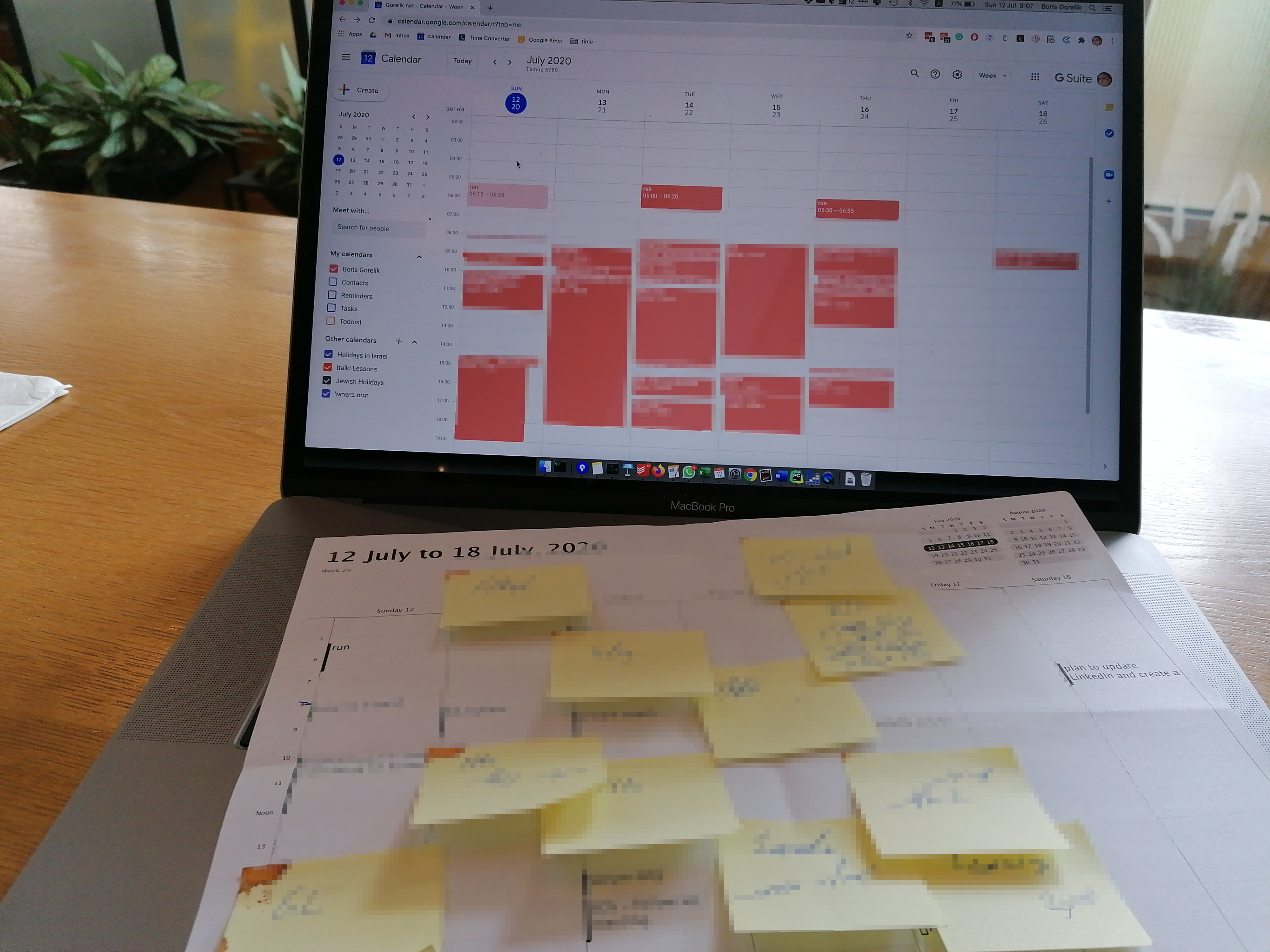
Here’s a neat method that helps me organize my week, increase my productivity and fight procrastination.
Being a freelancer data scientist, I’m involved in three hands-on projects for two clients. I also manage/mentor two data scientists in two other projects, and participate in strategic discussions for a customer of mine, and in a startup in which I invest. Oh, I am also in the final stages of writing a paper. I never imagined I would be in the situation with so many balls that I need to keep in the air. How do I manage to keep sanity?
This is what I do. Following the advice in “15 Secrets Successful People Know About Time Management”, I try to keep as many items in my calendar as possible. When my workweek starts, I print out the weekly schedule on a sheet of paper. Then, I apply the tangible GTD hack that I learned from another book [link] and write out all my projects on a bunch of small post-it notes. These notes allow me “dumping” all my brain contents into an external medium, which frees up my brain to spend more CPU cycles on processing, rather than remembering and worrying.
Next comes the fun part, I get to play with my cards by arranging them on the weekly schedule. The geometry of the post-it notes and the sheet of paper ensures that I allocate reasonably larget chunks of time for each “big thing.” It also reminds me that the amount of time each day is limited, and I can’t stick too many plans into a day or a week. (No, I won’t be able to finalize the paper, complete the analysis for a retail shop, learn a chapter in Bayesian statistics book, before the end of today).
After I’m done, I copy each post-it note into my calendar. Thanks to the integration with Todoist (an excellent productivity tool), all these tasks end up in my todo list, where I can further work with them.
To sum up:
Oh, did you notice the appointments between 5 and 6 am? This is my sports activity. Sometimes working out charges me for the entire day. Sometimes, all I want to do for the entire day is to have a nap :-)